How can I help you?
Style in Blazor Diagram Component
22 Jun 20267 minutes to read
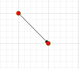
How to Customize the Connector Endpoint Handle
To customize the visual appearance of the connector endpoint handle in a diagram, apply the following CSS code:
<style>
    .e-diagram-endpoint-handle {
        fill: red;
        stroke: green;
    }
</style>
A complete working sample can be downloaded from GitHub
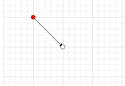
How to Customize the Connector Endpoint Handle When it is Connected
To customize the visual appearance of the connector endpoint handle in a connected state, apply the following CSS code:
<style>
    .e-diagram-endpoint-handle.e-connected {
    fill: red;
    stroke: green;
   }
</style>
A complete working sample can be downloaded from GitHub
How to Customize the Connector Endpoint Handle When it is Disabled
To customize the visual appearance of the connector endpoint handle when it is in a disabled state, apply the following CSS code to the Blazor application:
<style>
   .e-diagram-endpoint-handle.e-disabled {
    fill: red;
    opacity: 1;
    stroke: green;
   }
</style>
A complete working sample can be downloaded from GitHub
How to Customize the Bezier Connector Handle
To customize the appearance of the Bezier connector handle, apply the following CSS code to the Blazor application:
<style>
  .e-diagram-bezier-handle {
    fill: red;
    stroke: green;
  }
</style>
A complete working sample can be downloaded from GitHub
How to Customize the Bezier Connector Line
To customize the appearance of the Bezier connector line, apply the following CSS code to the Blazor diagram:
<style>
 .e-diagram-bezier-line {
  stroke: red;
}
</style>
A complete working sample can be downloaded from GitHub
How to Customize the Resize Handle
To customize the appearance of the resize handle, apply the following CSS code to the Blazor application:
<style>
    .e-diagram-resize-handle {
        fill: white;
        opacity: 1;
        stroke: white;
    }
</style>
A complete working sample can be downloaded from GitHub
How to Customize the Selector Pivot Line
To customize the appearance of the selector pivot line, apply the following CSS properties:
<style>
  .e-diagram-pivot-line {
    stroke: red;
  }
</style>
A complete working sample can be downloaded from GitHub
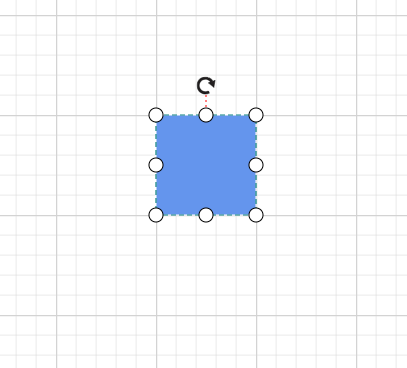
How to Customize the Selector Border
To customize the appearance of the selector border, apply the following CSS styles:
<style>
 .e-diagram-border {
    stroke: red;
  }
</style>
A complete working sample can be downloaded from GitHub
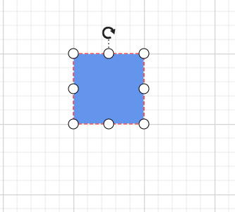
How to Customize Highlights for Selected Diagram Elements
To customize the appearance of the highlighter for selected diagram elements, apply the following CSS styles:
<style>
 .e-diagram-first-selection-indicator {
    stroke: red !important;
  }
  .e-diagram-selection-indicator {
    stroke: red !important;
  }
</style>
A complete working sample can be downloaded from GitHub
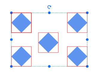
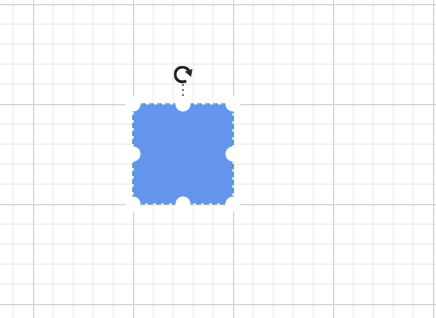
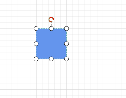
How to Customize the Rotate Handle
To customize the appearance of the rotation handle, apply the following CSS code to the Blazor diagram:
<style>
.e-diagram-rotate-handle {
    fill: red;
    stroke: green;
  }
</style>
A complete working sample can be downloaded from GitHub
How to Customize the Symbol Palette While Hovering Over a Symbol
To customize the visual appearance of symbols in the symbol palette during mouse hover, apply the following CSS code to the Blazor Diagram component:
<style>
.e-symbolpalette .e-symbol-hover:hover {
    background: red;
  }
</style>
A complete working sample can be downloaded from GitHub
How to Customize the Symbol Palette When a Symbol Is Selected
To customize the visual appearance of the symbol palette when a symbol is selected, apply the following CSS code to enhance the user interface:
<style>
.e-symbolpalette .e-symbol-selected {
    background: blue;
  }
</style>
A complete working sample can be downloaded from GitHub
How to Customize the Ruler
To customize the visual appearance of ruler properties, apply the following CSS code to the Blazor diagram:
<style>
.e-diagram .e-ruler {
    background-color: red;
    font-size: 13px;
  }
</style>
A complete working sample can be downloaded from GitHub
How to Customize the Ruler Overlap
To customize the visual appearance of ruler overlap properties, apply the following CSS code to the Blazor diagram component:
<style>
.e-diagram .e-ruler-overlap {
    background-color: red;
  }
</style>
A complete working sample can be downloaded from GitHub
How to Customize the Text Edit
To customize the appearance of the text edit properties, apply the following CSS code to the Blazor application:
<style>
 .e-diagram .e-diagram-text-edit {
    background: white;
    border-color: red;
    border-style: dashed;
    border-width: 1px;
    box-sizing: content-box;
    color: black;
    min-width: 50px;
  }
</style>
A complete working sample can be downloaded from GitHub
How to Customize the Text Edit on Selection
To customize the appearance of the text edit control when selected, apply the following CSS properties:
<style>
 .e-diagram-text-edit::selection {
    background: red;
    color: green;
  }
</style>
A complete working sample can be downloaded from GitHub
How to Customize the Highlighter
To customize the appearance of the highlighter, use the following CSS code:
<style>
.e-diagram-highlighter {
  stroke:red;
  stroke-width: 7;
}
</style>
A complete working sample can be downloaded from GitHub
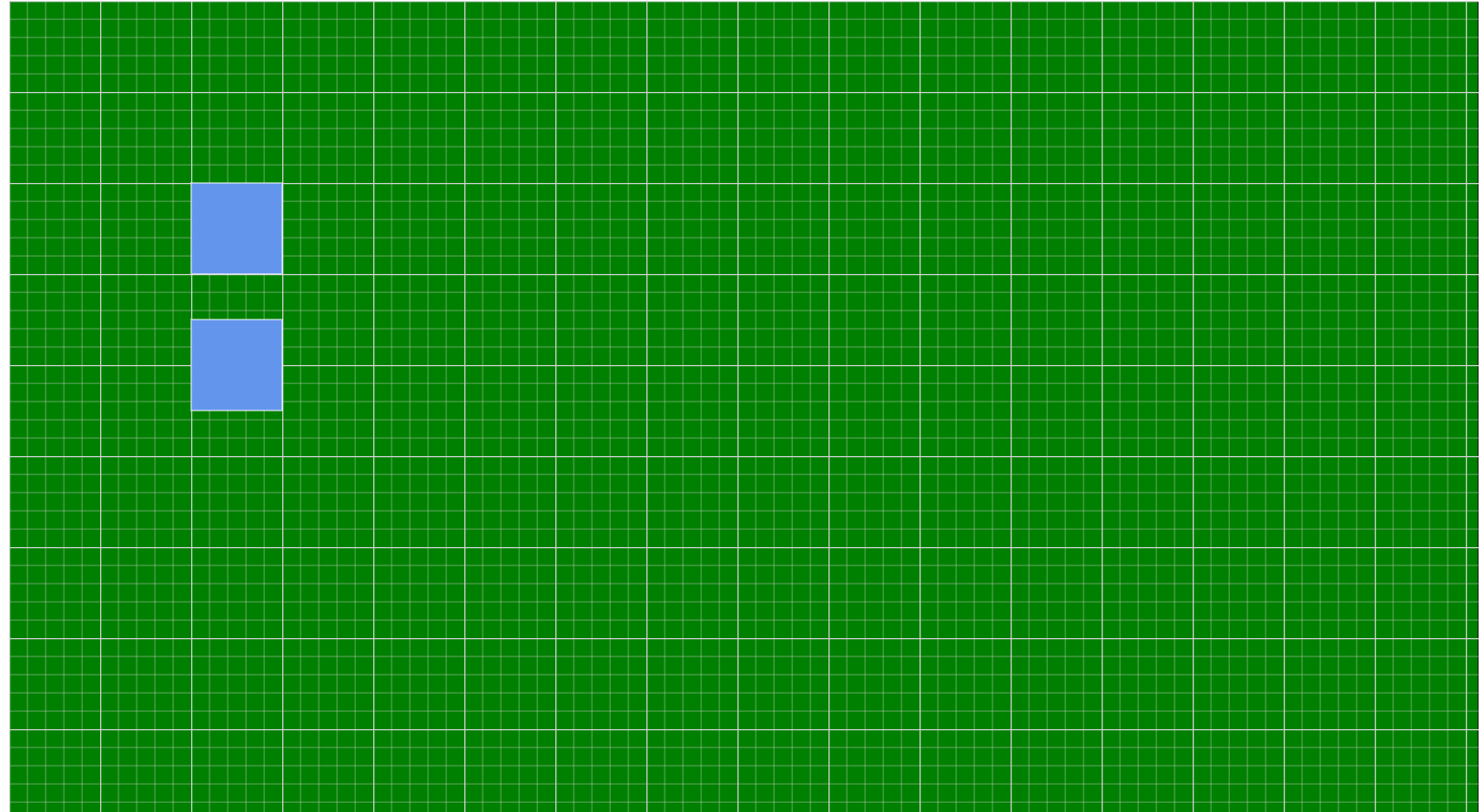
How to Customize the Diagram Background Color
To customize the background color of the diagram, apply the following CSS rule:
<style>
  .e-diagram {
      background-color: green;
  }
</style>
A complete working sample can be downloaded from GitHub
How to Customize the Overview Resize Handle
To customize the appearance of the overview resize handle, apply the following CSS code to the Blazor application:
<style>
    .overviewresizer
    {
          fill:blue;
    }
</style>
A complete working sample can be downloaded from GitHub
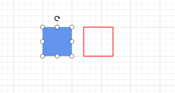
How to Customize the Helper
To customize the appearance of the helper element, apply the following CSS rules:
<style>
   .e-diagram-helper {
      stroke: red;
      stroke-width: 5px;
  }

</style>
A complete working sample can be downloaded from GitHub
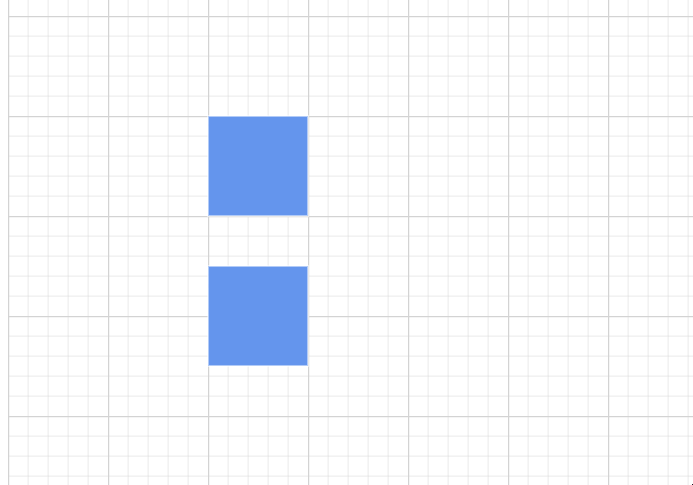
How to Customize the Grid
To customize the visual appearance of the diagram grid, apply the following CSS styles:
<style>
     .e-diagram-thin-grid {
       stroke: red;
   }

</style>
A complete working sample can be downloaded from GitHub
To customize the appearance of the thick grid lines in the diagram, apply the following CSS code:
<style>
     .e-diagram-thick-grid {
       stroke: red;
   }

</style>
A complete working sample can be downloaded from GitHub
How to Customize the Symbol Palette Symbols Background Color
To customize the background color of symbols in the symbol palette, apply the following CSS code:
<style>
     .e-symbol-draggable {
       stroke: red;
   }

</style>
A complete working sample can be downloaded from GitHub

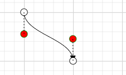
How to Customize the Orthogonal Segment Thumb
To customize the visual appearance of the orthogonal segment thumb, apply the following CSS code to the stylesheet:
<style>
     .e-diagram-ortho-segment-handle {
       stroke: red;
       stroke-width: 1px;
       fill: green;
   }
</style>
A complete working sample can be downloaded from GitHub
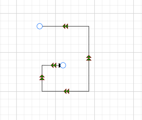
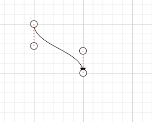
How to Customize the Bezier and Straight Segment Thumb
To customize the visual appearance of Bezier and Straight connector segments, apply the following CSS code:
<style>
  .e-diagram-bezier-segment-handle {
    fill: red;
    stroke: green;
  }
</style>
You can download a complete working sample from GitHub
