Dialog Buttons in Blazor Dialog Component
22 Jun 20267 minutes to read
The Blazor Dialog component supports rendering one or more action buttons in its footer using the DialogButtons Tag element. Inside this element, each button is defined using the DialogButton Tag. These buttons can be fully customized with various properties, including:
| DialogButtonOptions | Description |
|---|---|
| ChildContent | Allows you to define custom content (e.g., HTML or string) inside the button. |
| Content | Sets the text displayed on the button. |
| CssClass | Applies one or more custom CSS classes to style the button. |
| Disabled | Disables the button, preventing user interaction. |
| EnableRtl | Enables right-to-left (RTL) rendering for languages like Arabic or Hebrew. |
| IconCss | Specifies the CSS class for an icon to be displayed inside the button. |
| IconPosition | Determines the position of the icon (e.g., Left, Right, Top, Bottom). |
| IsFlat | Renders the button with a flat style (no background or border). |
| IsPrimary | Highlights the button as the primary action in the dialog. |
| IsToggle | Enables toggle behavior, allowing the button to switch between active/inactive states. |
| OnClick | Assigns a callback method to be executed when the button is clicked. |
| Type | Specifies the button type (e.g., Button, Submit, Reset). |
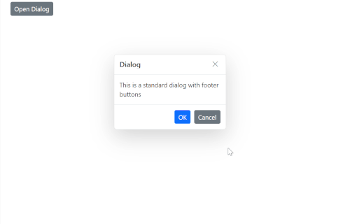
The following example demonstrates how to define basic action buttons in the Blazor Dialog.
@using Syncfusion.Blazor.Popups
@using Syncfusion.Blazor.Buttons

<div id="target">
    <SfButton @onclick="@OpenDialog">Open Dialog</SfButton>

    <SfDialog Target="#target" Width="250px" ShowCloseIcon="true" @bind-Visible="@IsVisible">
        <DialogTemplates>
            <Header> Dialog </Header>
             <Content>This is a standard dialog with footer buttons</Content>
        </DialogTemplates>
        <DialogButtons>
            <DialogButton Content="OK" IsPrimary="true" OnClick="@OnOkClick" />
            <DialogButton Content="Cancel" OnClick="@OnCancelClick" />
        </DialogButtons>
    </SfDialog>
</div>

<style>
    #target {
        min-height: 400px;
        height: 100%;
        position: relative;
    }
</style>

@code {
    private bool IsVisible { get; set; } = true;

    private void OpenDialog()
    {
        this.IsVisible = true;
    }

    private void OnOkClick()
    {
        // Place your OK logic here
        this.IsVisible = false;
    }

    private void OnCancelClick()
    {
        // Place your Cancel logic here
        this.IsVisible = false;
    }
}
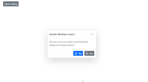
Add Icons to Dialog Buttons in Blazor Dialog Component
You can enhance the appearance of dialog footer buttons by adding icons using either the DialogButton element or the FooterTemplate property.
Using DialogButton Element
The DialogButton element allows you to define action buttons in the dialog footer with built-in support for icons. You can use the IconCss property to assign icon classes and customize their appearance.
@using Syncfusion.Blazor.Popups
@using Syncfusion.Blazor.Buttons

<SfButton @onclick="@OpenDialog">Open Dialog</SfButton>

<SfDialog Width="300px" ShowCloseIcon="true" CloseOnEscape="true" @bind-Visible="@IsVisible">
    <DialogTemplates>
        <Header>
            <div>Delete Multiple Items</div>
        </Header>
        <Content>
            <div>Are you sure you want to permanently delete all of these items?</div>
        </Content>
    </DialogTemplates>
    <DialogButtons>
        <DialogButton Content="Yes" IsPrimary="true" IconCss="e-icons e-ok-icon" OnClick="@CloseDialog" />
        <DialogButton Content="No" IconCss="e-icons e-close-icon" OnClick="@CloseDialog" />
    </DialogButtons>
</SfDialog>

<style>
    a, a:hover, .highcontrast #dialog a, .highcontrast #dialog a:hover {
        color: inherit;
        text-decoration: none;
    }

    .e-btn-icon.e-icons.e-ok-icon.e-icon-left:before {
        content: '\e7ff';
    }

    .e-btn-icon.e-icons.e-close-icon.e-icon-left:before {
        content: '\e825';
    }
</style>

@code {
    private bool IsVisible { get; set; } = true;

    private void OpenDialog()
    {
        this.IsVisible = true;
    }

    private void CloseDialog()
    {
        this.IsVisible = false;
    }
}
Using FooterTemplate Property
Alternatively, you can use the FooterTemplate property to fully customize the footer layout and include buttons with icons manually using Blazor Button.
@using Syncfusion.Blazor.Popups
@using Syncfusion.Blazor.Buttons

<SfButton @onclick="@OpenDialog">Open Dialog</SfButton>

<SfDialog Width="300px" ShowCloseIcon="true" CloseOnEscape="true" @bind-Visible="@IsVisible">
    <DialogTemplates>
        <Header> Delete Multiple Items </Header>
        <Content> Are you sure you want to permanently delete all of these items? </Content>
        <FooterTemplate>
            <SfButton CssClass="e-primary e-flat" @onclick="@CloseDialog">
                <span class='e-btn-icon e-icons e-ok-icon e-icon-left'></span>Yes
            </SfButton>
            <SfButton CssClass="e-flat" @onclick="@CloseDialog">
                <span class='e-btn-icon e-icons e-close-icon e-icon-left'></span>No
            </SfButton>
        </FooterTemplate>
    </DialogTemplates>
</SfDialog>

<style>
    a, a:hover, .highcontrast #dialog a, .highcontrast #dialog a:hover {
        color: inherit;
        text-decoration: none;
    }

    .e-btn-icon.e-icons.e-ok-icon.e-icon-left:before {
        content: '\e7ff';
    }

    .e-btn-icon.e-icons.e-close-icon.e-icon-left:before {
        content: '\e825';
    }
</style>

@code {
    private bool IsVisible { get; set; } = true;

    private void OpenDialog()
    {
        this.IsVisible = true;
    }

    private void CloseDialog()
    {
        this.IsVisible = false;
    }
}