Dialog Customization
22 Jun 20267 minutes to read
The Blazor Dialog component allows extensive customization options to enhance its appearance and behavior. You can modify its dimensions, support RTL layouts, apply custom styles, and animate its display.
Width
You can set the width of the dialog using the Width property.
<SfDialog Width="400px">
    <!-- Dialog content -->
</SfDialog>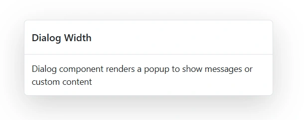
MinHeight
Set the minimum height of the dialog using the MinHeight property.
<SfDialog MinHeight="200px">
    <!-- Dialog content -->
</SfDialog>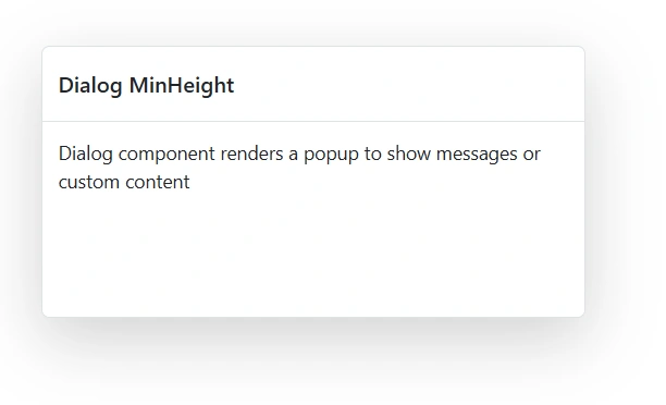
RTL Support
Enable RTL (Right-to-Left) layout using the EnableRtl property.
<SfDialog EnableRtl="true">
    <!-- Dialog content -->
</SfDialog>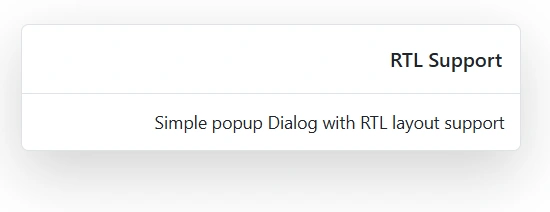
CssClass
Apply custom CSS classes using the CssClass property.
<SfDialog CssClass="success-dialog"
          Width="400px"
          Header="Success"
          ShowCloseIcon="true"
          Content="Dialog header and content are customized using the CssClass property">
</SfDialog>

<style>
    .success-dialog.e-dialog {
        border-color: #22c55e;
    }

    .success-dialog .e-dlg-header {
        color: #22c55e;
    }

    .success-dialog .e-dlg-content {
        background-color: #f0fdf4;
    }
</style>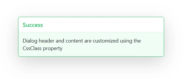
Animation
The Blazor Dialog can be animated during the open and close actions. Also, users can customize animation’s Delay, Duration and Effect by using the DialogAnimationSettings property.
To get started quickly with animation in Blazor Dialog Component, you can check the video below.
| delay | The Dialog animation will start with the mentioned delay |
| duration | Specifies the animation duration to complete with one animation cycle |
| effect |
Specifies the animation effects of Dialog open and close actions effect.
List of supported animation effects: 'Fade' | 'FadeZoom' | 'FlipLeftDown' | 'FlipLeftUp' | 'FlipRightDown' | 'FlipRightUp' | 'FlipXDown' | 'FlipXUp' | 'FlipYLeft' | 'FlipYRight' | 'SlideBottom' | 'SlideLeft' | 'SlideRight' | 'SlideTop' | 'Zoom'| 'None' If the user sets 'Fade' effect, then the Dialog will open with 'FadeIn' effect and close with 'FadeOut' effect |
In the following sample, Zoom effect is enabled. So, The Dialog will open with ZoomIn and close with ZoomOut effects.
@using Syncfusion.Blazor.Popups
@using Syncfusion.Blazor.Buttons
<div id="target">
<SfButton @onclick="@OpenDialog">Open Dialog</SfButton>

<SfDialog Width="500px" ID="defaultDialog" Header="Dialog Animation" Content="Dialog enabled with Fade and Zoom effect" Target="#target" ShowCloseIcon="true" @bind-Visible="@IsVisible">
    <DialogAnimationSettings Effect="@AnimationEffect" Duration=400 />
    <DialogButtons>
        <DialogButton Content="Hide" IsPrimary="true" OnClick="@CloseDialog" />
    </DialogButtons>
    <DialogPositionData X="center" Y="center"></DialogPositionData>
</SfDialog>
</div>


@code {
    private bool IsVisible { get; set; } = false;
    private DialogEffect AnimationEffect = DialogEffect.FadeZoom;

    private void OpenDialog()
    {
        this.IsVisible = true;
    }

    private void CloseDialog()
    {
        this.IsVisible = false;
    }
}

<style>
    #target {
        height: 500px;
    }
</style>
Dialog background color change
Use the following CSS to customize the background color of the Dialog.
<SfDialog Width="300px"
          Header="Background Color Dialog"
          Content="This dialog demonstrates background color customization."
          ShowCloseIcon="true">
</SfDialog>

<style>
    .e-dialog .e-dlg-header-content, .e-dialog .e-dlg-content {
        background-color: #f0f9ff;
    }
</style>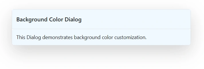
Dialog border customization with radius
Use the following CSS to customize the Dialog border and apply a border radius.
<SfDialog Width="300px"
          Header="Border Customized Dialog"
          Content="This dialog demonstrates border and radius customization."
          ShowCloseIcon="true">
</SfDialog>

<style>
    .e-dialog,.e-dialog .e-dlg-header-content,.e-dialog .e-dlg-content {
        border-radius: 0px !important;
        box-shadow: 5px 5px 5px #ff00d1;
    }
</style>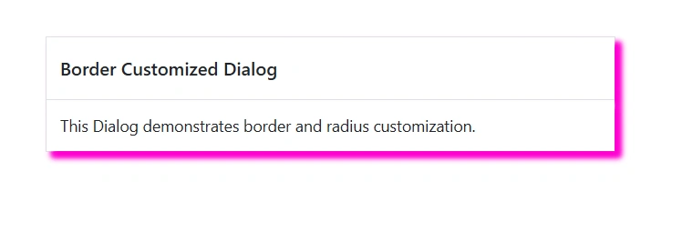
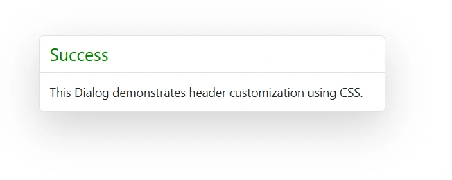
Customizing the dialog header
Use the following CSS to customize the dialog header properties.
.e-dialog .e-dlg-header {
    color: #22c55e;
    font-size: 20px;
    font-weight: normal;
}
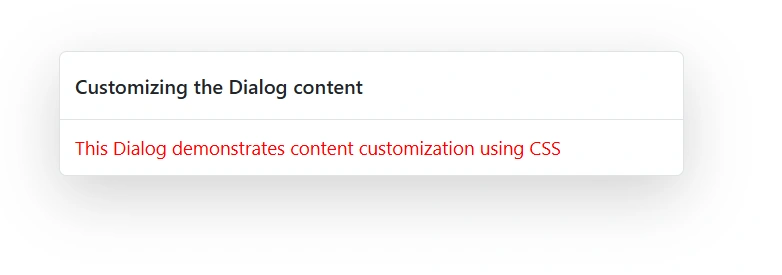
Customizing the dialog content
Use the following CSS to customize the dialog content properties.
.e-dialog .e-dlg-content {
    color: #f11014;
    font-size: 10px;
    font-weight: normal;
    line-height: normal;
}
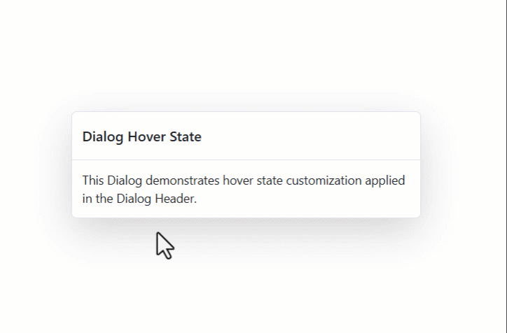
Customizing dialog hover state
Use the following CSS to customize the hover state of the dialog container.
.e-dialog:hover {
    box-shadow: 0 12px 25px #ff0000;
}
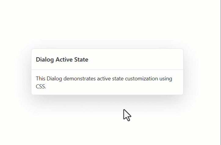
Customizing active dialog state
Use the following CSS to customize the active (focused) state of the dialog.
.e-dialog:active {
        box-shadow: 0 12px 25px #f318d9ad;
}
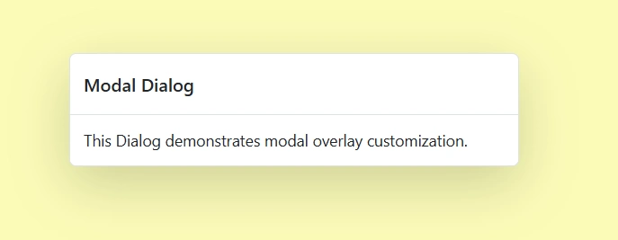
Customizing modal dialog overlay
Use the following CSS to customize the modal dialog overlay.
.e-dlg-overlay {
    background-color: #f1f1107f;
    opacity: 0.6;
}
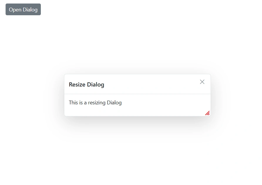
Customizing the dialog resize icon
Use the following CSS to customize the dialog resize icon.
/* To change the resize icon color */
    .e-dialog .e-south-east::before,
    .e-dialog .e-south-west::before {
        color: red;
    }
The above CSS demonstration uses the font awesome icon.
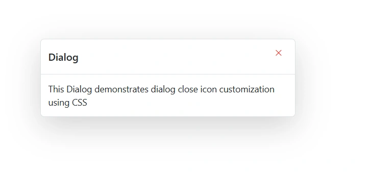
Customizing the dialog close button
Use the following CSS to customize the dialog close button.
/* To specify font size and color */
.e-dialog .e-btn .e-btn-icon.e-icon-dlg-close {
    font-size: 12px;
    color: red;
}
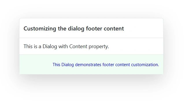
Customizing the dialog footer content
Use the following CSS to customize the dialog footer content.
/* To specify font color, background color and border color */
.e-dialog .e-footer-content {
        background-color: #f0fdf4;
        color: #593fed;
    }