Group dropdown listview items in Blazor Dropdown Menu Component
11 Jun 20262 minutes to read
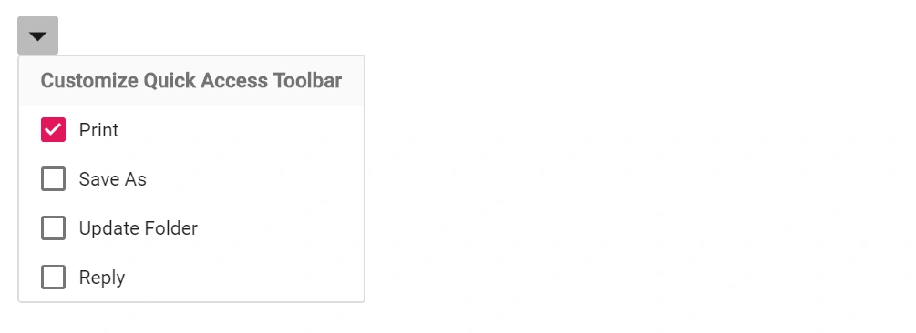
Header sections within the Dropdown Menu popup can be created by templating the popup with the ListView component. Assign a ListView instance (identified by its ID) to the PopupContent property of the Dropdown Menu component, and configure field mappings to group the items.
In the following example, the ListView is provided as PopupContent for the Dropdown Menu, and the GroupBy property of the ListView field settings generates grouped headers based on the Category field. The ShowCheckBox option enables multi-selection within each group.
@using Syncfusion.Blazor.SplitButtons
@using Syncfusion.Blazor.Lists
<SfDropDownButton CssClass="e-caret-hide" IconCss="e-icons e-down">
        <PopupContent>
            <SfListView ID="listview" DataSource="@Data" ShowCheckBox="true">
                <ListViewFieldSettings Text="Text" GroupBy="Category" TValue="ListData"></ListViewFieldSettings>
            </SfListView>
        </PopupContent>
    </SfDropDownButton>

@code {
    public List<ListData> Data = new List<ListData>{
        new ListData{ Class = "data", Text = "Print", Id = "data1", Category = "Customize Quick Access Toolbar" },
        new ListData{ Class = "data", Text = "Save As", Id = "data2", Category = "Customize Quick Access Toolbar" },
        new ListData{ Class = "data", Text = "Update Folder", Id = "data3", Category = "Customize Quick Access Toolbar"},
        new ListData{ Class = "data", Text = "Reply", Id = "data4", Category = "Customize Quick Access Toolbar" }
};

    public class ListData
    {
        public string Text { get; set; }
        public string Id { get; set; }
        public string Class { get; set; }
        public string Category { get; set; }
    }
}

<style>
    .e-down::before {
    content: '\e969'; /* Referred this icon from material theme */
    }
</style>