Styles and Appearances in Blazor Dropdown Menu Component
22 Jun 20262 minutes to read
To modify the appearance of the DropDownButton, override the component’s default CSS. The following CSS classes target the button and popup elements in different states. Custom styles can be added to the application’s stylesheet. Alternatively, create a custom theme using Theme Studio.
| CSS class | Purpose |
|---|---|
| .e-dropdown-btn | Customize the dropdown button. |
| .e-dropdown-btn:hover | Customize the dropdown button on hover. |
| .e-dropdown-btn.e-active | Customize the dropdown button in the active state. |
| .e-dropdown-popup | Customize the dropdown popup. |
| .e-dropdown-popup ul .e-item:hover | Customize popup items on hover. |
| .e-dropdown-popup ul .e-item:active | Customize popup items in the active state. |
Disable a Dropdown Menu
The Dropdown Menu component can be disabled by setting the Disabled property. To disable Dropdown Menu component, the disabled property can be set as true.
@using Syncfusion.Blazor.SplitButtons

<SfDropDownButton Disabled="true" Content="Message">
    <DropDownMenuItems>
        <DropDownMenuItem Text="Edit"></DropDownMenuItem>
        <DropDownMenuItem Text="Delete"></DropDownMenuItem>
        <DropDownMenuItem Text="Mark as Read"></DropDownMenuItem>
        <DropDownMenuItem Text="Like Message"></DropDownMenuItem>
    </DropDownMenuItems>
</SfDropDownButton>
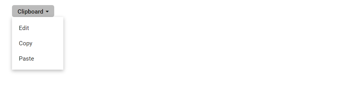
Create Dropdown Menu with Rounded Corner
Dropdown Menu with rounded corner can be achieved by adding the border-radius CSS property to button element.
In the following example, the e-round-corner class sets a 5px border-radius, which is applied to the DropDownButton via the CssClass property. Adjust the radius value as needed to align with your design system, and apply similar styling to .e-dropdown-popup if you want the menu panel to share the same rounded appearance.
@using Syncfusion.Blazor.SplitButtons

<SfDropDownButton CssClass="e-round-corner" Content="Clipboard">
    <DropDownMenuItems>
        <DropDownMenuItem Text="Edit"></DropDownMenuItem>
        <DropDownMenuItem Text="Copy"></DropDownMenuItem>
        <DropDownMenuItem Text="Paste"></DropDownMenuItem>
    </DropDownMenuItems>
</SfDropDownButton>

<style>
    .e-round-corner {
        border-radius: 5px;
    }
</style>