How can I help you?
Item template in Blazor Dropdown Menu Component
17 Nov 20253 minutes to read
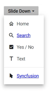
The ItemTemplate property in the DropDownButton component allows for the definition of custom templates to display dropdown items. This feature is especially useful for customizing the appearance and layout of dropdown items beyond the default options provided. By utilizing this property, diverse content such as icons, formatted text, and other visual elements can be integrated into the dropdown items for a more engaging and tailored user interface.
@using Syncfusion.Blazor.SplitButtons

<SfDropDownButton CssClass="custom-dropdown" Content="Custom Dropdown" Items="@DropdownItems">
    <ChildContent>
        <DropDownButtonEvents ItemSelected="ItemSelected"></DropDownButtonEvents>
    </ChildContent>
    <ItemTemplate>
        @{
            var menuItem = context;

            if (!string.IsNullOrEmpty(menuItem.Url))
            {
                // Render item as a link if URL is present
                <div>
                    <span class="e-menu-icon @menuItem.IconCss"></span>
                    <a href="@menuItem.Url" target="_blank" rel="noopener noreferrer">
                        <span class="custom-class">@menuItem.Text</span>
                    </a>
                </div>
            }
            else
            {
                // Render item as text if no URL is present
                <div>
                    <span class="e-menu-icon @menuItem.IconCss"></span>
                    <span class="custom-class">@menuItem.Text</span>
                </div>
            }
        }
    </ItemTemplate>
</SfDropDownButton>

@code {
    private List<DropDownMenuItem> DropdownItems = new List<DropDownMenuItem>
    {
        new DropDownMenuItem { Text = "Home", IconCss = "e-icons e-home" },
        new DropDownMenuItem { Text = "Search", IconCss = "e-icons e-search", Url = "http://www.google.com" },
        new DropDownMenuItem { Text = "Yes / No", IconCss = "e-icons e-check-box" },
        new DropDownMenuItem { Text = "Text", IconCss = "e-icons e-caption" },
        new DropDownMenuItem { Separator = true },
        new DropDownMenuItem { Text = "Syncfusion", IconCss = "e-icons e-mouse-pointer", Url = "http://www.syncfusion.com" }
    };

    private void ItemSelected(MenuEventArgs args)
    {
        var selectedItem = args.Item;
    }
}