How can I help you?
Placeholder and Float Label in DropDownList
4 Nov 20253 minutes to read
Placeholder
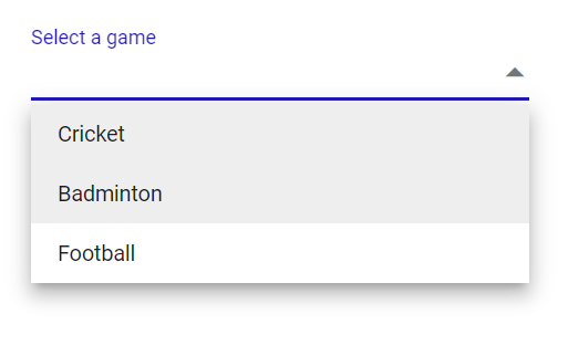
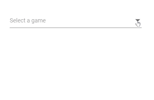
Use the Placeholder property to show a short hint describing the expected value. In the following example, “Select a game” is set as the placeholder and displayed in the input when no value is selected.
@using Syncfusion.Blazor.DropDowns;
<SfDropDownList TValue="string" TItem="string" Placeholder="Select a game" DataSource="@data" Width="300px"></SfDropDownList>

@code{
    List<string> data = new List<string>() { "Cricket", "Badminton","Football" };
}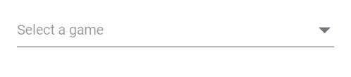
Color of the placeholder text
Change the placeholder color by targeting the placeholder selector (for example, input.e-input::placeholder) and applying the desired color value.
@using Syncfusion.Blazor.DropDowns

<SfDropDownList TValue="string" TItem="string" Placeholder="Select a game" DataSource="@data" Width="300px"></SfDropDownList>

@code{
    List<string> data = new List<string>() { "Cricket", "Badminton","Football" };
}
<style>
    .e-ddl.e-input-group input.e-input::placeholder {
    color: red;
}
</style>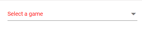
Add mandatory indicator using placeholder
Add a visual required indicator (such as *) to the floating label by targeting .e-float-text::after and setting the content style. This is a visual cue only; pair it with form validation to enforce required input.
@using Syncfusion.Blazor.DropDowns
@using Syncfusion.Blazor.Inputs

<SfDropDownList TValue="string" TItem="string" Placeholder="Select a game" FloatLabelType="FloatLabelType.Auto" DataSource="@data" Width="300px"></SfDropDownList>

@code{
    List<string> data = new List<string>() { "Cricket", "Badminton","Football" };
}
<style>
   .e-input-group.e-control-wrapper.e-control-container.e-float-input .e-float-text::after {
    content: "*";
    color: red;
}
</style>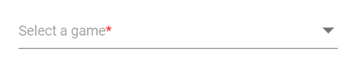
FloatLabel
Use the FloatLabelType property to control floating label behavior, where the Placeholder text moves above the input. FloatLabelType works only when a Placeholder is set. The default value is Never.
The floating label supports the following behaviors:
| Type | Description |
|---|---|
| Auto | Floats the label after focus or when a value is selected. |
| Always | Always displays the label above the input. |
| Never | Never floats the label when the placeholder is available. |
The FloatLabelType set to Auto is demonstrated in the following example.
@using Syncfusion.Blazor.DropDowns
@using Syncfusion.Blazor.Inputs

<SfDropDownList TValue="string" TItem="string" Placeholder="Select a game" FloatLabelType="FloatLabelType.Auto" DataSource="@data" Width="300px"></SfDropDownList>

@code{
    List<string> data = new List<string>() { "Cricket", "Badminton","Football" };
}
Customizing the float label element’s focusing color
Customize the floating label color on focus by targeting .e-input-focus .e-float-text.e-label-top and setting the color property.
@using Syncfusion.Blazor.DropDowns
@using Syncfusion.Blazor.Inputs

<SfDropDownList TValue="string" TItem="string" Placeholder="Select a game" FloatLabelType="FloatLabelType.Auto" DataSource="@data" Width="300px"></SfDropDownList>

@code{
    List<string> data = new List<string>() { "Cricket", "Badminton","Football" };
}
<style>
.e-float-input.e-input-group:not(.e-float-icon-left) .e-float-line::before,.e-float-input.e-control-wrapper.e-input-group:not(.e-float-icon-left) .e-float-line::before,.e-float-input.e-input-group:not(.e-float-icon-left) .e-float-line::after,.e-float-input.e-control-wrapper.e-input-group:not(.e-float-icon-left) .e-float-line::after {
    background-color: #2319b8;
}

.e-ddl.e-lib.e-input-group.e-control-wrapper.e-control-container.e-float-input.e-input-focus .e-float-text.e-label-top {
    color: #2319b8;
}
</style>