Style and Appearance in Dropdown List
10 Jun 202624 minutes to read
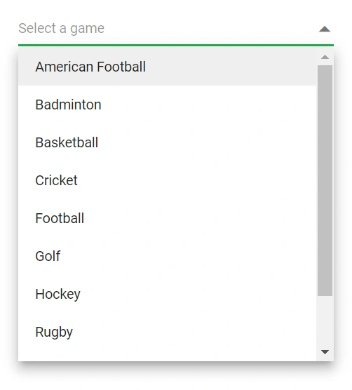
The following sections outline the CSS hooks and component properties that can be used to customize the DropDownList appearance.
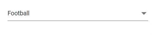
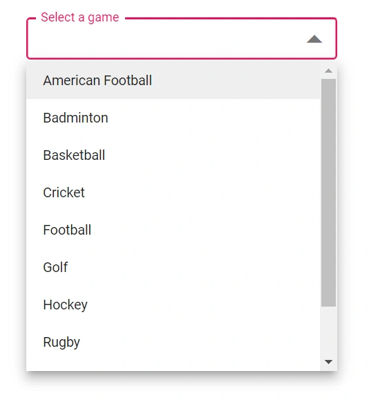
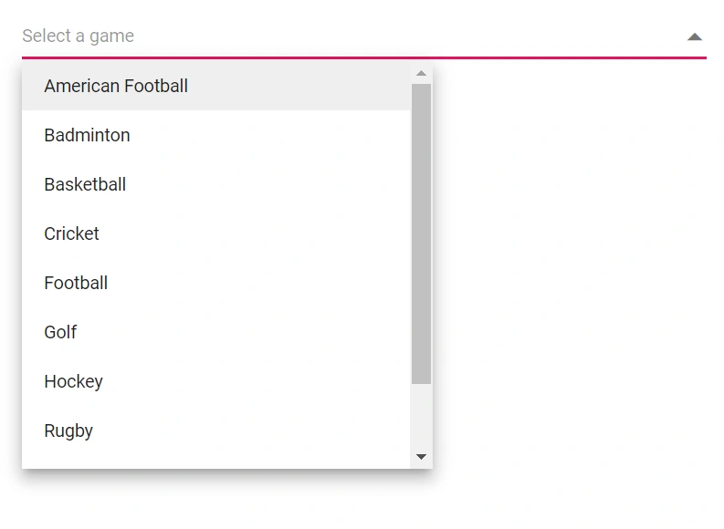
Read-only mode
Set the boolean Readonly property to make the DropDownList non-editable while still allowing focus and interaction that doesn’t change its value.
@using Syncfusion.Blazor.DropDowns;

<SfDropDownList TValue="string" TItem="Games" Placeholder="Select a game" Width="300px" DataSource="@LocalData" @bind-Value="GameValue" Readonly=true>
  <DropDownListFieldSettings Value="ID" Text="Text"></DropDownListFieldSettings>
</SfDropDownList>


@code {
    public string GameValue { get; set; } = "Game5";

    public class Games
    {
        public string ID { get; set; }
        public string Text { get; set; }
    }

    List<Games> LocalData = new List<Games> {
    new Games() { ID= "Game1", Text= "American Football" },
    new Games() { ID= "Game2", Text= "Badminton" },
    new Games() { ID= "Game3", Text= "Basketball" },
    new Games() { ID= "Game4", Text= "Cricket" },
    new Games() { ID= "Game5", Text= "Football" },
    new Games() { ID= "Game6", Text= "Golf" },
    new Games() { ID= "Game7", Text= "Hockey" },
    new Games() { ID= "Game8", Text= "Rugby"},
    new Games() { ID= "Game9", Text= "Snooker" },
    new Games() { ID= "Game10", Text= "Tennis"},
    };

}
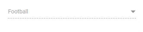
Disabled state
Set the boolean Enabled property to enable or disable the component entirely.
@using Syncfusion.Blazor.DropDowns;

<SfDropDownList TValue="string" TItem="Games" Placeholder="Select a game" Width="300px" DataSource="@LocalData" @bind-Value="GameValue" Enabled=false>
  <DropDownListFieldSettings Value="ID" Text="Text"></DropDownListFieldSettings>
</SfDropDownList>


@code {
    public string GameValue { get; set; } = "Game5";

    public class Games
    {
        public string ID { get; set; }
        public string Text { get; set; }
    }

    List<Games> LocalData = new List<Games> {
    new Games() { ID= "Game1", Text= "American Football" },
    new Games() { ID= "Game2", Text= "Badminton" },
    new Games() { ID= "Game3", Text= "Basketball" },
    new Games() { ID= "Game4", Text= "Cricket" },
    new Games() { ID= "Game5", Text= "Football" },
    new Games() { ID= "Game6", Text= "Golf" },
    new Games() { ID= "Game7", Text= "Hockey" },
    new Games() { ID= "Game8", Text= "Rugby"},
    new Games() { ID= "Game9", Text= "Snooker" },
    new Games() { ID= "Game10", Text= "Tennis"},
    };

}
CssClass
Use the CssClass property to append one or more custom CSS class names to the root element and style the component.
Some common class names:
-
e-success: Applies a success visual style (for example, green accent) to the input. -
e-warning: Applies a warning visual style (for example, orange accent) to the input. -
e-error: Applies an error visual style (for example, red accent) to the input. -
e-outline: Applies the outline style (Material theme support). -
e-multi-column: Creates a multi-column popup layout using templates (columns are aligned with custom CSS).
@using Syncfusion.Blazor.DropDowns;

<SfDropDownList TValue="string" TItem="Games" Placeholder="Select a game" DataSource="@LocalData" CssClass='@CssClass'>
  <DropDownListFieldSettings Value="ID" Text="Text"></DropDownListFieldSettings>
</SfDropDownList>

@code {
    public class Games
    {
        public string ID { get; set; }
        public string Text { get; set; }
    }

    List<Games> LocalData = new List<Games> {
    new Games() { ID= "Game1", Text= "American Football" },
    new Games() { ID= "Game2", Text= "Badminton" },
    new Games() { ID= "Game3", Text= "Basketball" },
    new Games() { ID= "Game4", Text= "Cricket" },
    new Games() { ID= "Game5", Text= "Football" },
    new Games() { ID= "Game6", Text= "Golf" },
    new Games() { ID= "Game7", Text= "Hockey" },
    new Games() { ID= "Game8", Text= "Rugby"},
    new Games() { ID= "Game9", Text= "Snooker" },
    new Games() { ID= "Game10", Text= "Tennis"},
    };

    public string CssClass { get; set; } = "e-success";
}
Customizing the disabled component’s text color
Target the disabled input selector (for example, .e-input[disabled]) and set -webkit-text-fill-color (and other color properties as needed) to change disabled text color.
@using Syncfusion.Blazor.DropDowns;

<SfDropDownList TValue="string" TItem="Games" Placeholder="Select a game" DataSource="@LocalData">
  <DropDownListFieldSettings Value="ID" Text="Text"></DropDownListFieldSettings>
</SfDropDownList>

@code {
  public class Games
  {
    public string ID { get; set; }
    public string Text { get; set; }
  }
  List<Games> LocalData = new List<Games> {
    new Games() { ID= "Game1", Text= "American Football" },
    new Games() { ID= "Game2", Text= "Badminton" },
    new Games() { ID= "Game3", Text= "Basketball" },
    new Games() { ID= "Game4", Text= "Cricket" },
    new Games() { ID= "Game5", Text= "Football" },
    new Games() { ID= "Game6", Text= "Golf" },
    new Games() { ID= "Game7", Text= "Hockey" },
    new Games() { ID= "Game8", Text= "Rugby"},
    new Games() { ID= "Game9", Text= "Snooker" },
    new Games() { ID= "Game10", Text= "Tennis"},
  };
}

<style>
.e-input-group.e-control-wrapper .e-input[disabled] {
    -webkit-text-fill-color: #0d9133;
}
</style>
Show the custom icon in dropdown icon
Customize the dropdown icon by targeting its CSS class .e-ddl-icon::before, which indicates the icon element displayed within the dropdown list component, and set the desired icon to the content property.
@using Syncfusion.Blazor.DropDowns;

<SfDropDownList TValue="string" TItem="Games" Placeholder="Select a game" Width="300px" DataSource="@LocalData" @bind-Value="GameValue">
  <DropDownListFieldSettings Value="ID" Text="Text"></DropDownListFieldSettings>
</SfDropDownList>


@code {
    public string GameValue { get; set; } = "Game5";

    public class Games
    {
        public string ID { get; set; }
        public string Text { get; set; }
    }

    List<Games> LocalData = new List<Games> {
    new Games() { ID= "Game1", Text= "American Football" },
    new Games() { ID= "Game2", Text= "Badminton" },
    new Games() { ID= "Game3", Text= "Basketball" },
    new Games() { ID= "Game4", Text= "Cricket" },
    new Games() { ID= "Game5", Text= "Football" },
    new Games() { ID= "Game6", Text= "Golf" },
    new Games() { ID= "Game7", Text= "Hockey" },
    new Games() { ID= "Game8", Text= "Rugby"},
    new Games() { ID= "Game9", Text= "Snooker" },
    new Games() { ID= "Game10", Text= "Tennis"},
    };

}

<style>
    .e-ddl.e-input-group.e-control-wrapper .e-ddl-icon::before {
        content: '\e304';
    }
</style>
Customize the dropdown icon for a specific component by adding a custom class through CssClass and scoping the icon style to that class.
@using Syncfusion.Blazor.DropDowns;

<SfDropDownList TValue="string" TItem="Games" Placeholder="Select a game" Width="300px" DataSource="@LocalData" @bind-Value="GameValue" CssClass="e-custom">
  <DropDownListFieldSettings Value="ID" Text="Text"></DropDownListFieldSettings>
</SfDropDownList>


@code {
    public string GameValue { get; set; } = "Game5";

    public class Games
    {
        public string ID { get; set; }
        public string Text { get; set; }
    }

    List<Games> LocalData = new List<Games> {
    new Games() { ID= "Game1", Text= "American Football" },
    new Games() { ID= "Game2", Text= "Badminton" },
    new Games() { ID= "Game3", Text= "Basketball" },
    new Games() { ID= "Game4", Text= "Cricket" },
    new Games() { ID= "Game5", Text= "Football" },
    new Games() { ID= "Game6", Text= "Golf" },
    new Games() { ID= "Game7", Text= "Hockey" },
    new Games() { ID= "Game8", Text= "Rugby"},
    new Games() { ID= "Game9", Text= "Snooker" },
    new Games() { ID= "Game10", Text= "Tennis"},
    };

}

<style>
    .e-custom.e-ddl.e-input-group.e-control-wrapper .e-ddl-icon::before {
        content: '\e304';
    }
</style>
Customizing the appearance of container element
Customize the appearance of the container element within the dropdown list component by targeting its CSS class .e-input, which indicates the parent element of the input, and allows you to apply any desired styles to the component.
@using Syncfusion.Blazor.DropDowns;

<SfDropDownList TValue="string" TItem="Games" Placeholder="Select a game" DataSource="@LocalData">
  <DropDownListFieldSettings Value="ID" Text="Text"></DropDownListFieldSettings>
</SfDropDownList>

@code {
  public class Games
  {
    public string ID { get; set; }
    public string Text { get; set; }
  }
  List<Games> LocalData = new List<Games> {
    new Games() { ID= "Game1", Text= "American Football" },
    new Games() { ID= "Game2", Text= "Badminton" },
    new Games() { ID= "Game3", Text= "Basketball" },
    new Games() { ID= "Game4", Text= "Cricket" },
    new Games() { ID= "Game5", Text= "Football" },
    new Games() { ID= "Game6", Text= "Golf" },
    new Games() { ID= "Game7", Text= "Hockey" },
    new Games() { ID= "Game8", Text= "Rugby"},
    new Games() { ID= "Game9", Text= "Snooker" },
    new Games() { ID= "Game10", Text= "Tennis"},
  };
}

<style>
.e-ddl.e-input-group.e-control-wrapper .e-input {
    font-size: 20px;
    font-family: emoji;
    color: #ab3243;
    background: #32a5ab;
}
</style>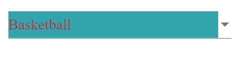
Customizing the dropdown icon’s color
Customize the dropdown icon by targeting its CSS class .e-ddl-icon.e-icons, which indicates the icon element displayed within the dropdown list component, and setting the desired color to the color property.
@using Syncfusion.Blazor.DropDowns;

<SfDropDownList TValue="string" TItem="Games" Placeholder="Select a game" DataSource="@LocalData">
  <DropDownListFieldSettings Value="ID" Text="Text"></DropDownListFieldSettings>
</SfDropDownList>

@code {
  public class Games
  {
    public string ID { get; set; }
    public string Text { get; set; }
  }
  List<Games> LocalData = new List<Games> {
    new Games() { ID= "Game1", Text= "American Football" },
    new Games() { ID= "Game2", Text= "Badminton" },
    new Games() { ID= "Game3", Text= "Basketball" },
    new Games() { ID= "Game4", Text= "Cricket" },
    new Games() { ID= "Game5", Text= "Football" },
    new Games() { ID= "Game6", Text= "Golf" },
    new Games() { ID= "Game7", Text= "Hockey" },
    new Games() { ID= "Game8", Text= "Rugby"},
    new Games() { ID= "Game9", Text= "Snooker" },
    new Games() { ID= "Game10", Text= "Tennis"},
  };
}

<style>
.e-ddl .e-input-group-icon.e-ddl-icon.e-icons, .e-ddl .e-input-group-icon.e-ddl-icon.e-icons:hover {
    color: #bb233d;
    font-size: 13px;
}
</style>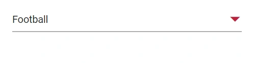
Customizing the focus color
Customize the focus indicator by targeting .e-input-focus::after and setting the background (or other) properties to match the desired focus style.
@using Syncfusion.Blazor.DropDowns;

<SfDropDownList TValue="string" TItem="Games" Placeholder="Select a game" DataSource="@LocalData">
  <DropDownListFieldSettings Value="ID" Text="Text"></DropDownListFieldSettings>
</SfDropDownList>

@code {
  public class Games
  {
    public string ID { get; set; }
    public string Text { get; set; }
  }
  List<Games> LocalData = new List<Games> {
    new Games() { ID= "Game1", Text= "American Football" },
    new Games() { ID= "Game2", Text= "Badminton" },
    new Games() { ID= "Game3", Text= "Basketball" },
    new Games() { ID= "Game4", Text= "Cricket" },
    new Games() { ID= "Game5", Text= "Football" },
    new Games() { ID= "Game6", Text= "Golf" },
    new Games() { ID= "Game7", Text= "Hockey" },
    new Games() { ID= "Game8", Text= "Rugby"},
    new Games() { ID= "Game9", Text= "Snooker" },
    new Games() { ID= "Game10", Text= "Tennis"},
  };
}

<style>
.e-ddl.e-input-group.e-control-wrapper.e-input-focus::before, .e-ddl.e-input-group.e-control-wrapper.e-input-focus::after {
    background: #c000ff;
}
</style>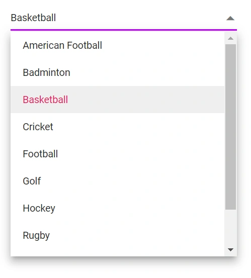
Customizing the outline theme’s focus color
When using the outline variant, target the e-outline style to adjust focus color specifically for outline-themed inputs.
@using Syncfusion.Blazor.DropDowns;

<SfDropDownList TValue="string" TItem="Games" Placeholder="Select a game" DataSource="@LocalData" CssClass="e-outline">
  <DropDownListFieldSettings Value="ID" Text="Text"></DropDownListFieldSettings>
</SfDropDownList>

@code {
  public class Games
  {
    public string ID { get; set; }
    public string Text { get; set; }
  }
  List<Games> LocalData = new List<Games> {
    new Games() { ID= "Game1", Text= "American Football" },
    new Games() { ID= "Game2", Text= "Badminton" },
    new Games() { ID= "Game3", Text= "Basketball" },
    new Games() { ID= "Game4", Text= "Cricket" },
    new Games() { ID= "Game5", Text= "Football" },
    new Games() { ID= "Game6", Text= "Golf" },
    new Games() { ID= "Game7", Text= "Hockey" },
    new Games() { ID= "Game8", Text= "Rugby"},
    new Games() { ID= "Game9", Text= "Snooker" },
    new Games() { ID= "Game10", Text= "Tennis"},
  };
}

<style>
.e-outline.e-input-group.e-input-focus:hover:not(.e-success):not(.e-warning):not(.e-error):not(.e-disabled):not(.e-float-icon-left),.e-outline.e-input-group.e-input-focus.e-control-wrapper:hover:not(.e-success):not(.e-warning):not(.e-error):not(.e-disabled):not(.e-float-icon-left),.e-outline.e-input-group.e-input-focus:not(.e-success):not(.e-warning):not(.e-error):not(.e-disabled),.e-outline.e-input-group.e-control-wrapper.e-input-focus:not(.e-success):not(.e-warning):not(.e-error):not(.e-disabled) {
    border-color: #b1bd15;
    box-shadow: inset 1px 1px #b1bd15, inset -1px 0 #b1bd15, inset 0 -1px #b1bd15;
}
</style>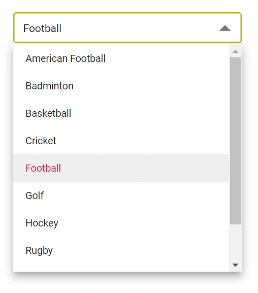
Use e-outline in the CssClass property to enable the outline theme.
@using Syncfusion.Blazor.DropDowns;
@using Syncfusion.Blazor.Inputs;

<SfDropDownList TValue="string" TItem="Games" Placeholder="Select a game" DataSource="@LocalData" Width="300px" CssClass="e-outline" FloatLabelType="FloatLabelType.Always">
  <DropDownListFieldSettings Value="ID" Text="Text"></DropDownListFieldSettings>
</SfDropDownList>

@code {
  public class Games
  {
    public string ID { get; set; }
    public string Text { get; set; }
  }
  List<Games> LocalData = new List<Games> {
    new Games() { ID= "Game1", Text= "American Football" },
    new Games() { ID= "Game2", Text= "Badminton" },
    new Games() { ID= "Game3", Text= "Basketball" },
    new Games() { ID= "Game4", Text= "Cricket" },
    new Games() { ID= "Game5", Text= "Football" },
    new Games() { ID= "Game6", Text= "Golf" },
    new Games() { ID= "Game7", Text= "Hockey" },
    new Games() { ID= "Game8", Text= "Rugby"},
    new Games() { ID= "Game9", Text= "Snooker" },
    new Games() { ID= "Game10", Text= "Tennis"},
  };
}
Customizing the background color of focus, hover, and active items
Adjust list item background and text colors for focused, active, and hovered states by targeting .e-list-item.e-item-focus, .e-list-item.e-active, and .e-list-item.e-hover.
@using Syncfusion.Blazor.DropDowns;

<SfDropDownList TValue="string" TItem="Games" Placeholder="Select a game" DataSource="@LocalData">
  <DropDownListFieldSettings Value="ID" Text="Text"></DropDownListFieldSettings>
</SfDropDownList>

@code {
  public class Games
  {
    public string ID { get; set; }
    public string Text { get; set; }
  }
  List<Games> LocalData = new List<Games> {
    new Games() { ID= "Game1", Text= "American Football" },
    new Games() { ID= "Game2", Text= "Badminton" },
    new Games() { ID= "Game3", Text= "Basketball" },
    new Games() { ID= "Game4", Text= "Cricket" },
    new Games() { ID= "Game5", Text= "Football" },
    new Games() { ID= "Game6", Text= "Golf" },
    new Games() { ID= "Game7", Text= "Hockey" },
    new Games() { ID= "Game8", Text= "Rugby"},
    new Games() { ID= "Game9", Text= "Snooker" },
    new Games() { ID= "Game10", Text= "Tennis"},
  };
}

<style>
.e-dropdownbase .e-list-item.e-item-focus, .e-dropdownbase .e-list-item.e-active, .e-dropdownbase .e-list-item.e-active.e-hover, .e-dropdownbase .e-list-item.e-hover {
    background-color: #1f9c99;
    color: #2319b8;
}
</style>
Customizing the appearance of pop-up element
Customize popup appearance by targeting popup and list item selectors (for example, .e-list-item.e-item-focus) and applying styles such as background and borders.
@using Syncfusion.Blazor.DropDowns;

<SfDropDownList TValue="string" TItem="Games" Placeholder="Select a game" DataSource="@LocalData">
  <DropDownListFieldSettings Value="ID" Text="Text"></DropDownListFieldSettings>
</SfDropDownList>

@code {
  public class Games
  {
    public string ID { get; set; }
    public string Text { get; set; }
  }
  List<Games> LocalData = new List<Games> {
    new Games() { ID= "Game1", Text= "American Football" },
    new Games() { ID= "Game2", Text= "Badminton" },
    new Games() { ID= "Game3", Text= "Basketball" },
    new Games() { ID= "Game4", Text= "Cricket" },
    new Games() { ID= "Game5", Text= "Football" },
    new Games() { ID= "Game6", Text= "Golf" },
    new Games() { ID= "Game7", Text= "Hockey" },
    new Games() { ID= "Game8", Text= "Rugby"},
    new Games() { ID= "Game9", Text= "Snooker" },
    new Games() { ID= "Game10", Text= "Tennis"},
  };
}

<style>
.e-dropdownbase .e-list-item, .e-dropdownbase .e-list-item.e-item-focus {
    background-color: #29c2b8;
    color: #207cd9;
    font-family: emoji;
    min-height: 29px;
}
</style>
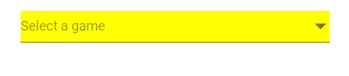
Change the HTML attributes
Add additional attributes (for example, style, class, title) to the root element using the HtmlAttributes property, which accepts a key-value dictionary.
@using Syncfusion.Blazor.DropDowns;

<SfDropDownList  TValue="string" TItem="Games" Placeholder="Select a game" Width="300px" DataSource="@LocalData" HtmlAttributes="@htmlAttribute" >
  <DropDownListFieldSettings Value="ID" Text="Text"></DropDownListFieldSettings>
</SfDropDownList>


@code {
    public class Games
    {
        public string ID { get; set; }
        public string Text { get; set; }
    }

    List<Games> LocalData = new List<Games> {
    new Games() { ID= "Game1", Text= "American Football" },
    new Games() { ID= "Game2", Text= "Badminton" },
    new Games() { ID= "Game3", Text= "Basketball" },
    new Games() { ID= "Game4", Text= "Cricket" },
    new Games() { ID= "Game5", Text= "Football" },
    new Games() { ID= "Game6", Text= "Golf" },
    new Games() { ID= "Game7", Text= "Hockey" },
    new Games() { ID= "Game8", Text= "Rugby"},
    new Games() { ID= "Game9", Text= "Snooker" },
    new Games() { ID= "Game10", Text= "Tennis"},
    };

    Dictionary<string, object> htmlAttribute = new Dictionary<string, object>()
    {
        {"class", "e-games" },
        {"name", "games" },
        {"style", "background-color: yellow; text-align: right" },
        {"title", "Syncfusion DropDownList" }
    };

}
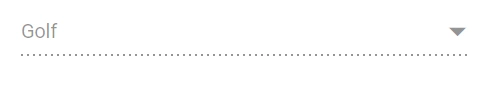
Change the InputAttributes
Add the additional input attributes such as disabled, value, and more to the root element.If you configured both the property and equivalent input attribute, then the component considers the property value.
@using Syncfusion.Blazor.DropDowns;

<SfDropDownList  TValue="string" TItem="Games" Placeholder="Select a game" DataSource="@LocalData" InputAttributes="@inputAttribute" >
  <DropDownListFieldSettings Value="ID" Text="Text"></DropDownListFieldSettings>
</SfDropDownList>


@code {
    public class Games
    {
        public string ID { get; set; }
        public string Text { get; set; }
    }

    List<Games> LocalData = new List<Games> {
    new Games() { ID= "Game1", Text= "American Football" },
    new Games() { ID= "Game2", Text= "Badminton" },
    new Games() { ID= "Game3", Text= "Basketball" },
    new Games() { ID= "Game4", Text= "Cricket" },
    new Games() { ID= "Game5", Text= "Football" },
    new Games() { ID= "Game6", Text= "Golf" },
    new Games() { ID= "Game7", Text= "Hockey" },
    new Games() { ID= "Game8", Text= "Rugby"},
    new Games() { ID= "Game9", Text= "Snooker" },
    new Games() { ID= "Game10", Text= "Tennis"},
    };

    Dictionary<string, object> inputAttribute = new Dictionary<string, object>()
    {
        {"enabled", false },
        {"value","Golf"}
    };

}
Set the various font family for dropdown list elements
The font-family of the dropdown list can be changed by overriding using the following selector. The overridden can be applied to specific component by adding a class name through the CssClass property.
In the following sample, the font family of the DropDownList, ListItem text in DropDownList and filterInput text are changed.
@using Syncfusion.Blazor.DropDowns;

<SfDropDownList @ref="dropdown" TValue="string" TItem="Games" Placeholder="Select a game" Width="300px" DataSource="@LocalData" CssClass="e-custom" AllowFiltering=true FilterBarPlaceholder="Search here">
  <DropDownListFieldSettings Value="ID" Text="Text"></DropDownListFieldSettings>
</SfDropDownList>


@code {
    SfDropDownList<string, Games> dropdown;
    public string GameValue { get; set; } = "Game5";

    public class Games
    {
        public string ID { get; set; }
        public string Text { get; set; }
    }

    List<Games> LocalData = new List<Games> {
    new Games() { ID= "Game1", Text= "American Football" },
    new Games() { ID= "Game2", Text= "Badminton" },
    new Games() { ID= "Game3", Text= "Basketball" },
    new Games() { ID= "Game4", Text= "Cricket" },
    new Games() { ID= "Game5", Text= "Football" },
    new Games() { ID= "Game6", Text= "Golf" },
    new Games() { ID= "Game7", Text= "Hockey" },
    new Games() { ID= "Game8", Text= "Rugby"},
    new Games() { ID= "Game9", Text= "Snooker" },
    new Games() { ID= "Game10", Text= "Tennis"},
    };

}

<style>
    /*Text in DropDownList*/
.e-custom.e-input-group input.e-dropdownlist {
    font-family: cursive;
}
/*Item Text in DropDownList*/
.e-custom.e-popup-open {
    font-family: cursive;
}
/*Dropdownlist filterInput font-family*/
.e-custom span.e-input-group.e-control-container.e-control-wrapper {
    font-family: cursive;
}

</style>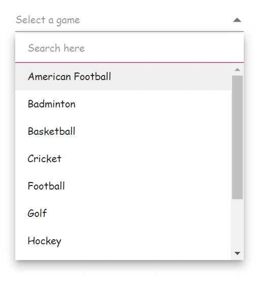
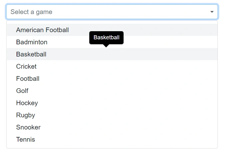
Show tooltip on list item
Achieve this behavior by integrating the tooltip component. When the mouse hovers over the DropDownList option, a tooltip appears with information about the hovered list item.
The following code demonstrates how to display a tooltip when hovering over the DropDownList option.
@using Syncfusion.Blazor.DropDowns;
@using Syncfusion.Blazor.Popups;

<SfTooltip @ref="TooltipObj" ID="Tooltip" Target=".e-list-item .name[title]">
</SfTooltip>

<SfDropDownList TItem="GameFields" TValue="string" Placeholder="Select a game" DataSource="@Games">
    <DropDownListFieldSettings Text="Text" Value="ID"></DropDownListFieldSettings>
    <DropDownListTemplates TItem="GameFields">
            <ItemTemplate>
                    <div class="name" title="@((context as GameFields).Text)"> @((context as GameFields).Text) </div>
            </ItemTemplate>
        </DropDownListTemplates>
    <DropDownListEvents TValue="string" TItem="GameFields" Opened="OnOpen" OnClose="OnClose"></DropDownListEvents>
</SfDropDownList>

@code{

    SfTooltip TooltipObj;
    public Boolean isOpen { get; set; } = false;

    public class GameFields
    {
        public string ID { get; set; }
        public string Text { get; set; }
    }

    private List<GameFields> Games = new List<GameFields>() {
        new GameFields(){ ID= "Game1", Text= "American Football" },
        new GameFields(){ ID= "Game2", Text= "Badminton" },
        new GameFields(){ ID= "Game3", Text= "Basketball" },
        new GameFields(){ ID= "Game4", Text= "Cricket" },
        new GameFields(){ ID= "Game5", Text= "Football" },
        new GameFields(){ ID= "Game6", Text= "Golf" },
        new GameFields(){ ID= "Game7", Text= "Hockey" },
        new GameFields(){ ID= "Game8", Text= "Rugby"},
        new GameFields(){ ID= "Game9", Text= "Snooker" },
        new GameFields(){ ID= "Game10", Text= "Tennis"},
    };

    public void OnOpen(PopupEventArgs args)
    {
        isOpen = true;
    }

    public void OnClose(PopupEventArgs args)
    {
        TooltipObj.CloseAsync();
    }

    protected override async Task OnAfterRenderAsync(bool firstRender)
    {
        if (isOpen)
        {
            await TooltipObj.RefreshAsync();
        }
    }
}
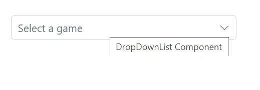
Tooltip using HTMLAttribute in dropdown component
To display the tooltip in the dropdown component not for individual popup items, add the Title attribute through the HTMLAttributes property. This updates the attribute on the root input element.
In the following example, the HtmlAttributes property is used to add the title attribute to the root input element of the DropDownList with the value DropDownList Component. This will display a tooltip with the text DropDownList Component when the user hovers over the input element.
@using Syncfusion.Blazor.DropDowns

<SfDropDownList TValue="string" TItem="Games" Placeholder="Select a game" DataSource="@LocalData" HtmlAttributes="htmlAttribute">
    <DropDownListFieldSettings Value="ID" Text="Text"></DropDownListFieldSettings>
</SfDropDownList>

@code {
    private Dictionary<string, object> htmlAttribute = new Dictionary<string, object>()
    {
        {"title", "DropDownList Component" }
    };

    public class Games
    {
        public string ID { get; set; }
        public string Text { get; set; }
    }
    List<Games> LocalData = new List<Games> {
        new Games() { ID= "Game1", Text= "American Football" },
        new Games() { ID= "Game2", Text= "Badminton" },
        new Games() { ID= "Game3", Text= "Basketball" },
        new Games() { ID= "Game4", Text= "Cricket" },
        new Games() { ID= "Game5", Text= "Football" },
        new Games() { ID= "Game6", Text= "Golf" },
        new Games() { ID= "Game7", Text= "Hockey" },
        new Games() { ID= "Game8", Text= "Rugby"},
        new Games() { ID= "Game9", Text= "Snooker" },
        new Games() { ID= "Game10", Text= "Tennis"},
    };
}
Customize selected item opacity
Adjust the opacity of selected (and selected + hovered) items by targeting .e-dropdownbase .e-list-item.e-active and related states to achieve a transparent or subdued look.
@using Syncfusion.Blazor.DropDowns;

<SfDropDownList @ref="dropdown" TValue="string" TItem="Games" Placeholder="Select a game" Width="300px" DataSource="@LocalData" CssClass="e-custom" AllowFiltering=true FilterBarPlaceholder="Search here">
  <DropDownListFieldSettings Value="ID" Text="Text"></DropDownListFieldSettings>
</SfDropDownList>


@code {
    SfDropDownList<string, Games> dropdown;
    public string GameValue { get; set; } = "Game5";

    public class Games
    {
        public string ID { get; set; }
        public string Text { get; set; }
    }

    List<Games> LocalData = new List<Games> {
    new Games() { ID= "Game1", Text= "American Football" },
    new Games() { ID= "Game2", Text= "Badminton" },
    new Games() { ID= "Game3", Text= "Basketball" },
    new Games() { ID= "Game4", Text= "Cricket" },
    new Games() { ID= "Game5", Text= "Football" },
    new Games() { ID= "Game6", Text= "Golf" },
    new Games() { ID= "Game7", Text= "Hockey" },
    new Games() { ID= "Game8", Text= "Rugby"},
    new Games() { ID= "Game9", Text= "Snooker" },
    new Games() { ID= "Game10", Text= "Tennis"},
    };

}

<style>

.e-dropdownbase .e-list-item.e-active,

.e-dropdownbase .e-list-item.e-active.e-hover {

    opacity: 0.1;

}

</style>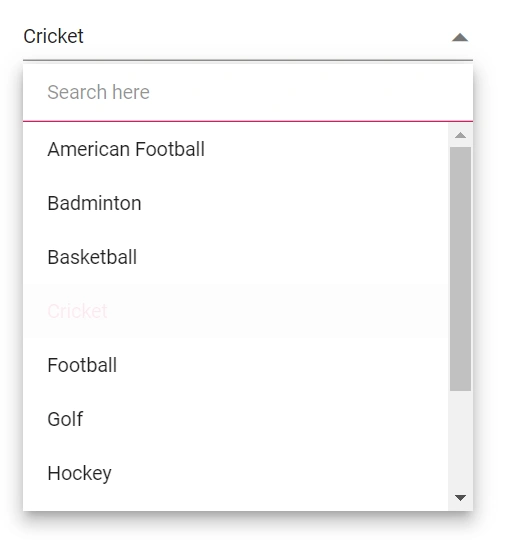
Customizing the height
Height of DropDownList
Use PopupHeight to change the popup height.
@using Syncfusion.Blazor.DropDowns;

<SfDropDownList  TValue="string" TItem="Games" Placeholder="Select a game" Width="300px" DataSource="@LocalData" PopupHeight="500px" CssClass="e-custom">
  <DropDownListFieldSettings Value="ID" Text="Text"></DropDownListFieldSettings>
</SfDropDownList>

@code {
    public class Games
    {
        public string ID { get; set; }
        public string Text { get; set; }
    }

    List<Games> LocalData = new List<Games> {
    new Games() { ID= "Game1", Text= "American Football" },
    new Games() { ID= "Game2", Text= "Badminton" },
    new Games() { ID= "Game3", Text= "Basketball" },
    new Games() { ID= "Game4", Text= "Cricket" },
    new Games() { ID= "Game5", Text= "Football" },
    new Games() { ID= "Game6", Text= "Golf" },
    new Games() { ID= "Game7", Text= "Hockey" },
    new Games() { ID= "Game8", Text= "Rugby"},
    new Games() { ID= "Game9", Text= "Snooker" },
    new Games() { ID= "Game10", Text= "Tennis"},
    };

}

<style>
    .e-custom.e-input-group, .e-custom.e-input-group.e-control-wrapper {
        height: 50px;
    }

</style>
Width of DropDownList
To change only the popup width, use PopupWidth. By default, the popup width matches the component width. Use Width to change the component width.
@using Syncfusion.Blazor.DropDowns;

<SfDropDownList  TValue="string" TItem="Games" Placeholder="Select a game" DataSource="@LocalData" Width="500px" PopupWidth="300px">
  <DropDownListFieldSettings Value="ID" Text="Text"></DropDownListFieldSettings>
</SfDropDownList>

@code {
    public class Games
    {
        public string ID { get; set; }
        public string Text { get; set; }
    }

    List<Games> LocalData = new List<Games> {
    new Games() { ID= "Game1", Text= "American Football" },
    new Games() { ID= "Game2", Text= "Badminton" },
    new Games() { ID= "Game3", Text= "Basketball" },
    new Games() { ID= "Game4", Text= "Cricket" },
    new Games() { ID= "Game5", Text= "Football" },
    new Games() { ID= "Game6", Text= "Golf" },
    new Games() { ID= "Game7", Text= "Hockey" },
    new Games() { ID= "Game8", Text= "Rugby"},
    new Games() { ID= "Game9", Text= "Snooker" },
    new Games() { ID= "Game10", Text= "Tennis"},
    };

}
Disable specific items in DropDownList
Prevent selection of specific items by applying custom CSS classes to the popup via CssClass and marking list items as disabled (for example, adding e-disabled and e-overlay via JS interop).
@inject IJSRuntime JSRuntime;
@using Syncfusion.Blazor.DropDowns

<SfDropDownList ID="mydropdown" TValue="string" TItem="Countries" Width="300px" Placeholder="e.g. Australia" DataSource="@Country" CssClass="e-custom-class">
    <DropDownListFieldSettings Text="Name" Value="Code"></DropDownListFieldSettings>
    <DropDownListEvents TItem="Countries" TValue="string" Opened="OnOpen"></DropDownListEvents>
</SfDropDownList>

@code {

    public async Task OnOpen()
    {
        await this.JSRuntime.InvokeVoidAsync("disable", "mydropdown");
    }
    public class Countries
    {
        public string Name { get; set; }

        public string Code { get; set; }
    }

    List<Countries> Country = new List<Countries>
{
        new Countries() { Name = "Australia", Code = "AU" },
        new Countries() { Name = "Bermuda", Code = "BM" },
        new Countries() { Name = "Canada", Code = "CA" },
        new Countries() { Name = "Cameroon", Code = "CM" },
        new Countries() { Name = "Denmark", Code = "DK" },
        new Countries() { Name = "France", Code = "FR" },
        new Countries() { Name = "Finland", Code = "FI" },
        new Countries() { Name = "Germany", Code = "DE" },
        new Countries() { Name = "Greenland", Code = "GL" },
        new Countries() { Name = "Hong Kong", Code = "HK" },
        new Countries() { Name = "India", Code = "IN" },
        new Countries() { Name = "Italy", Code = "IT" },
        new Countries() { Name = "Japan", Code = "JP" },
        new Countries() { Name = "Mexico", Code = "MX" },
        new Countries() { Name = "Norway", Code = "NO" },
        new Countries() { Name = "Poland", Code = "PL" },
        new Countries() { Name = "Switzerland", Code = "CH" },
        new Countries() { Name = "United Kingdom", Code = "GB" },
        new Countries() { Name = "United States", Code = "US" },
    };
}
<script>
window.disable = function (id) {
setTimeout(function (e) {
var liCollections = document.querySelectorAll('.e-popup.e-custom-class .e-list-item')
if (liCollections && liCollections.length > 0)
liCollections[1].classList.add('e-disabled');
liCollections[1].classList.add('e-overlay');
}, 30);
}
</script>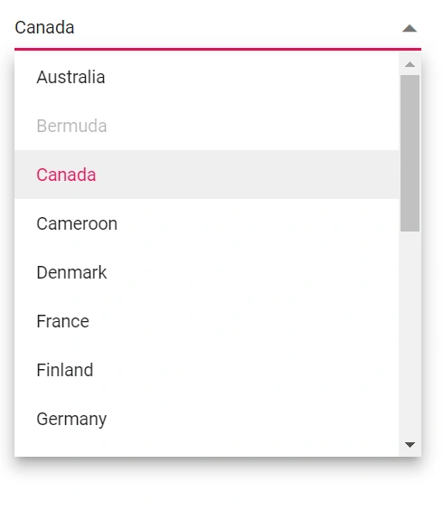
Adding conditional HTML attribute to list item
This is achieved by adding attributes to the li items based on the data source value with the help of the JSInterop. In the Opened event, call the client-side script by passing the required arguments (data source and id) and adding the attributes based on the data source value obtained from the server.
In the following example, the Opened event is used to call the AddAttribute method when the DropDownList is opened. The AddAttribute method gets the data source from the component instance and calls a JavaScript function using the JavaScript Interop. The JavaScript function receives the data source and the ID of the DropDownList as arguments, and adds the attributes to the li elements based on the data source values.
@using Syncfusion.Blazor.DropDowns
@inject IJSRuntime JsRuntime
<div class="game-drop-down-wrapper">
    <SfDropDownList TValue="string"
                    TItem="GameField"
                    ID="dropdown"
                    PopupHeight="400px"
                    Width="300px"
                    Placeholder="Supervisor"
                    @bind-Value="@DropVal"
                    DataSource="@Games"
                    CssClass="game-drop-down">
        <DropDownListEvents TItem="GameField"
                            TValue="string"
                            ValueChange="OnGameChange"
                            Opened="AddAttribute" />
        <DropDownListFieldSettings Value="id" Text="text"></DropDownListFieldSettings>
    </SfDropDownList>
    <div class="game-selection-label">
        <span>@CurrentSelection.id : </span><span>@CurrentSelection.text</span>
    </div>
</div>

<style>
    .game-drop-down-wrapper {
        margin: 40px;
        display: flex;
    }

    .game-drop-down li.e-list-item[isavailable="false"] {
        color: #f00;
    }

    .game-drop-down li.e-list-item {
        color: #00f;
    }

    .game-selection-label {
        margin-left: 20px;
    }
</style>

@code{

    public string DropVal { get; set; }
    public GameField CurrentSelection { get; set; }

    public class GameField
    {
        public string id { get; set; }
        public string text { get; set; }
        public bool isAvailable { get; set; }
    }

    List<GameField> Games = new List<GameField>() {
        new GameField(){ id= "Game1", text= "American Football", isAvailable = true },
        new GameField(){ id= "Game2", text= "Badminton", isAvailable = false },
        new GameField(){ id= "Game3", text= "Basketball", isAvailable = false  },
        new GameField(){ id= "Game4", text= "Cricket", isAvailable = true  },
        new GameField(){ id= "Game5", text= "Football", isAvailable = true  },
        new GameField(){ id= "Game6", text= "Golf", isAvailable = false  },
        new GameField(){ id= "Game7", text= "Hockey", isAvailable = true  },
        new GameField(){ id= "Game8", text= "Rugby", isAvailable = true },
        new GameField(){ id= "Game9", text= "Snooker", isAvailable = false },
        new GameField(){ id= "Game10", text= "Tennis", isAvailable = false }
        };

    protected override void OnInitialized()
    {
        CurrentSelection = Games.Find(x => x.id == "Game4");
    }

    private void OnGameChange(ChangeEventArgs<string, GameField> args)
    {
        CurrentSelection = args.ItemData;
        StateHasChanged();
    }
    private void AddAttribute(PopupEventArgs args)
    {

        this.JsRuntime.InvokeVoidAsync("AddAttribute", Games, "dropdown");
    }
}
<script>
function AddAttribute(datasource, id) {
setTimeout(() => {
//Here, the popup element is uniquely identified with an id
//Classes added via CssClass property will be added to the popup element also.
//You can also uniquely identify the popup element with the help of the added classes.
console.log(document.getElementById(id + "_popup"));
var listItems = document.getElementById(id + "_popup").querySelectorAll('li');
for (var i = 0; i < listItems.length; i++) {
listItems[i].setAttribute(Object.keys(datasource[i])[2], datasource[i].isAvailable)
}
}, 100)
}
</script>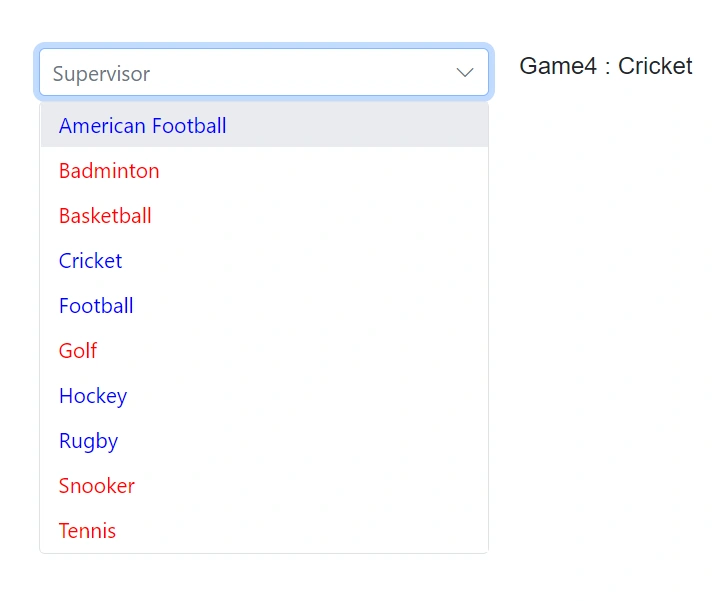
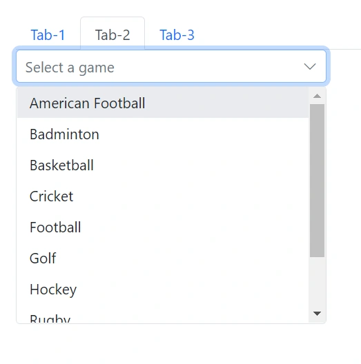
Displaying DropDownList in Tab
The DropDownList component can be used within a tab view to enable users to select an option from a list. This can be achieved by placing the DropDownList within the SfTab component. Each tab includes a DropDownList that allows the user to choose from a list of options.
In the following example, the SfTab component is used to display a tab view with three tab items. Each tab item contains a DropDownList component with a different data source. When the user selects a different tab, the corresponding DropDownList is displayed.
@using Syncfusion.Blazor.Navigations
@using Syncfusion.Blazor.DropDowns
@using Syncfusion.Blazor.Inputs

<div class="col-lg-12 control-section">
    <div class="e-sample-resize-container">
        <SfTab CssClass="default-tab">
            <TabItems>
                <TabItem>
                    <ChildContent>
                        <TabHeader Text="Tab-1" ></TabHeader>
                    </ChildContent>
                    <ContentTemplate>
                        <SfDropDownList ID="drop" EnablePersistence="true" TItem="GameFields" @bind-Value="@dropVal" TValue="string" PopupHeight="230px" Placeholder="Select a game" DataSource="@Games">
                            <DropDownListEvents TItem="GameFields" TValue="string"></DropDownListEvents>
                            <DropDownListFieldSettings Text="Text" Value="ID"></DropDownListFieldSettings>
                        </SfDropDownList>
                    </ContentTemplate>
                </TabItem>
                <TabItem>
                    <ChildContent>
                        <TabHeader Text="Tab-2" ></TabHeader>
                    </ChildContent>
                    <ContentTemplate>
                        <SfDropDownList ID="drop1" EnablePersistence="true" TItem="GameFields" @bind-Value="@dropVal1" TValue="string" PopupHeight="230px" Placeholder="Select a game" DataSource="@Games">
                            <DropDownListEvents TItem="GameFields"  TValue="string"></DropDownListEvents>
                            <DropDownListFieldSettings Text="Text" Value="ID"></DropDownListFieldSettings>
                        </SfDropDownList>
                    </ContentTemplate>
                </TabItem>
                <TabItem>
                    <ChildContent>
                        <TabHeader Text="Tab-3" ></TabHeader>
                    </ChildContent>
                    <ContentTemplate>
                        <SfDropDownList ID="drop2" EnablePersistence="true" TItem="GameFields" @bind-Value="@dropVal2" TValue="string" PopupHeight="230px" Placeholder="Select a game" DataSource="@Games">
                            <DropDownListEvents TItem="GameFields" TValue="string"></DropDownListEvents>
                            <DropDownListFieldSettings Text="Text" Value="ID"></DropDownListFieldSettings>
                        </SfDropDownList>
                    </ContentTemplate>
                </TabItem>
            </TabItems>
        </SfTab>
    </div>
</div>
@code{
    private bool enablePersistence { get; set; } = true;

    private string textValue { get; set; }

    private string dropVal { get; set; }

    private string dropVal1 { get; set; }

    private string dropVal2 { get; set; }

    public class GameFields
    {
        public string ID { get; set; }
        public string Text { get; set; }
    }
    private List<GameFields> Games = new List<GameFields>() {
        new GameFields(){ ID= "Game1", Text= "American Football" },
        new GameFields(){ ID= "Game2", Text= "Badminton" },
        new GameFields(){ ID= "Game3", Text= "Basketball" },
        new GameFields(){ ID= "Game4", Text= "Cricket" },
        new GameFields(){ ID= "Game5", Text= "Football" },
        new GameFields(){ ID= "Game6", Text= "Golf" },
        new GameFields(){ ID= "Game7", Text= "Hockey" },
        new GameFields(){ ID= "Game8", Text= "Rugby"},
        new GameFields(){ ID= "Game9", Text= "Snooker" },
        new GameFields(){ ID= "Game10", Text= "Tennis"},
     };
}
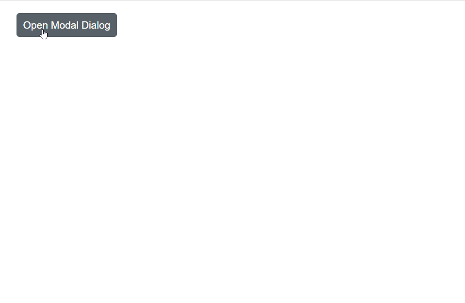
DropDownList inside Dialog
A modal dialog box that contains a dropdown list can be created to allow users to select an option from the list. This can be achieved by placing the dropdown list within an SfDialog component. The dialog box is opened when the user clicks the “Open Modal Dialog” button, and the dropdown list is present inside the dialog box. The dialog box is closed when the user clicks outside of the dialog box.
In the following example, the SfDialog component is used to display a dialog popup with a DropDownList component inside the dialog content. When the user clicks the Open Dialog button, the dialog is displayed.
@using Syncfusion.Blazor.Popups
@using Syncfusion.Blazor.Buttons
@using Syncfusion.Blazor.DropDowns

<SfButton @onclick="@OpenDialog">Open Modal Dialog</SfButton>

<SfDialog Width="250px" IsModal="true" @bind-Visible="@IsVisible">
    <DialogEvents OnOverlayModalClick="@OnOverlayclick">
    </DialogEvents>
    <DialogTemplates>
        <Content>
            <SfDropDownList TValue="string" TItem="Countries" ShowClearButton="true" @bind-Value="@CertificationType" DataSource="@Country">
                <DropDownListFieldSettings Value="Code" Text="Name"></DropDownListFieldSettings>
            </SfDropDownList>
        </Content>
    </DialogTemplates>
</SfDialog>

@code {
    private bool IsVisible { get; set; } = true;
    public string CertificationType;
    private void OpenDialog()
    {
        this.IsVisible = true;
    }

    private void OnOverlayclick(OverlayModalClickEventArgs arg)
    {
        this.IsVisible = false;
    }
    public class Countries
    {
        public string Name { get; set; }

        public string Code { get; set; }
    }

    List<Countries> Country = new List<Countries>
{
        new Countries() { Name = "Australia", Code = "AU" },
        new Countries() { Name = "Bermuda", Code = "BM" },
        new Countries() { Name = "Canada", Code = "CA" },
        new Countries() { Name = "Cameroon", Code = "CM" },
    };
}
Programmatically show and hide spinner
Call ShowSpinnerAsync() and HideSpinnerAsync() on the DropDownList instance (for example, from button clicks) to display or hide the built-in loading spinner.
@using Syncfusion.Blazor.DropDowns;

<button @onclick="Show">Show</button>

<button @onclick="Hide">Hide</button>

<SfDropDownList  @ref="DDLObj" TValue="string" TItem="Games" Placeholder="Select a game" DataSource="@LocalData" @bind-Value="@GameValue" >
  <DropDownListFieldSettings Value="ID" Text="Text"></DropDownListFieldSettings>
</SfDropDownList>

@code {
    SfDropDownList<string, Games> DDLObj;

    public string GameValue { get; set; } = "Game3";

    public class Games
    {
        public string ID { get; set; }
        public string Text { get; set; }
    }

    List<Games> LocalData = new List<Games> {
    new Games() { ID= "Game1", Text= "American Football" },
    new Games() { ID= "Game2", Text= "Badminton" },
    new Games() { ID= "Game3", Text= "Basketball" },
    new Games() { ID= "Game4", Text= "Cricket" },
    new Games() { ID= "Game5", Text= "Football" },
    new Games() { ID= "Game6", Text= "Golf" },
    new Games() { ID= "Game7", Text= "Hockey" },
    new Games() { ID= "Game8", Text= "Rugby"},
    new Games() { ID= "Game9", Text= "Snooker" },
    new Games() { ID= "Game10", Text= "Tennis"},
    };

    public void Show ()
    {
        this.DDLObj.ShowSpinnerAsync();
    }

    public void Hide ()
    {
        this.DDLObj.HideSpinnerAsync();
    }

}