How can I help you?
Style and Appearance in Dropdown Tree
27 Apr 202624 minutes to read
The following content provides the exact CSS structure that can be used to modify the component’s appearance based on the user preference.
Disabled state
Specify the boolean value to the Disabled property that indicates whether the component is Disabled or not.
@using Syncfusion.Blazor.Navigations

<SfDropDownTree TItem="EmployeeData" TValue="string" Placeholder="Select an employee" Width="500px" Disabled="true">
    <DropDownTreeField TItem="EmployeeData" DataSource="Data" ID="Id" Text="Name" HasChildren="HasChild" ParentID="PId"></DropDownTreeField>
</SfDropDownTree>

@code {
    List<EmployeeData> Data = new List<EmployeeData>
    {
        new EmployeeData() { Id = "1", Name = "Steven Buchanan", Job = "General Manager", HasChild = true, Expanded = true },
        new EmployeeData() { Id = "2", PId = "1", Name = "Laura Callahan", Job = "Product Manager", HasChild = true },
        new EmployeeData() { Id = "3", PId = "2", Name = "Andrew Fuller", Job = "Team Lead", HasChild = true },
        new EmployeeData() { Id = "4", PId = "3", Name = "Anne Dodsworth", Job = "Developer" },
        new EmployeeData() { Id = "10", PId = "3", Name = "Lilly", Job = "Developer" },
        new EmployeeData() { Id = "5", PId = "1", Name = "Nancy Davolio", Job = "Product Manager", HasChild = true },
        new EmployeeData() { Id = "6", PId = "5", Name = "Michael Suyama", Job = "Team Lead", HasChild = true },
        new EmployeeData() { Id = "7", PId = "6", Name = "Robert King", Job = "Developer" },
        new EmployeeData() { Id = "11", PId = "6", Name = "Mary", Job = "Developer" },
        new EmployeeData() { Id = "9", PId = "1", Name = "Janet Leverling", Job = "HR"}
    };

    class EmployeeData
    {
        public string? Id { get; set; }
        public string? Name { get; set; }
        public string? Job { get; set; }
        public bool HasChild { get; set; }
        public bool Expanded { get; set; }
        public string? PId { get; set; }
    }
}
CssClass
Specifies the CSS class name that can be appended with the root element of the Dropdown Tree. One or more custom CSS classes can be added to a Dropdown Tree.
Some of the predefined values are
-
e-success, which denotes the component in success state that is added green color to the Dropdown Tree’s input field. -
e-warning, which denotes the component in warning state that is added orange color to the Dropdown Tree’s input field. -
e-error, which denotes the component in error state that is added red color to the Dropdown Tree’s input field. -
e-outline, which supports only in material theme.
@using Syncfusion.Blazor.Navigations

<SfDropDownTree TItem="EmployeeData" TValue="string" Placeholder="Select an employee" Width="500px" CssClass="@CssClass">
    <DropDownTreeField TItem="EmployeeData" DataSource="Data" ID="Id" Text="Name" HasChildren="HasChild" ParentID="PId"></DropDownTreeField>
</SfDropDownTree>

@code {
    string CssClass = "e-success";
    List<EmployeeData> Data = new List<EmployeeData>
    {
        new EmployeeData() { Id = "1", Name = "Steven Buchanan", Job = "General Manager", HasChild = true, Expanded = true },
        new EmployeeData() { Id = "2", PId = "1", Name = "Laura Callahan", Job = "Product Manager", HasChild = true },
        new EmployeeData() { Id = "3", PId = "2", Name = "Andrew Fuller", Job = "Team Lead", HasChild = true },
        new EmployeeData() { Id = "4", PId = "3", Name = "Anne Dodsworth", Job = "Developer" },
        new EmployeeData() { Id = "10", PId = "3", Name = "Lilly", Job = "Developer" },
        new EmployeeData() { Id = "5", PId = "1", Name = "Nancy Davolio", Job = "Product Manager", HasChild = true },
        new EmployeeData() { Id = "6", PId = "5", Name = "Michael Suyama", Job = "Team Lead", HasChild = true },
        new EmployeeData() { Id = "7", PId = "6", Name = "Robert King", Job = "Developer" },
        new EmployeeData() { Id = "11", PId = "6", Name = "Mary", Job = "Developer" },
        new EmployeeData() { Id = "9", PId = "1", Name = "Janet Leverling", Job = "HR"}
    };

    class EmployeeData
    {
        public string? Id { get; set; }
        public string? Name { get; set; }
        public string? Job { get; set; }
        public bool HasChild { get; set; }
        public bool Expanded { get; set; }
        public string? PId { get; set; }
    }
}
Show the custom icon in dropdown icon
You can customize the dropdown icon by targeting its CSS class .e-ddt-icon::before, which indicates the icon element displayed within the Dropdown Tree component, and set the desired icon to the content property.
.e-ddt.e-input-group.e-control-wrapper .e-ddt-icon::before {
    content: '\e665';
}
You can customize the dropdown icon for the particular component using the CssClass property and add style to the custom class which is mapped to CssClass.
@using Syncfusion.Blazor.Navigations

<SfDropDownTree TItem="EmployeeData" TValue="string" Placeholder="Select an employee" Width="500px" CssClass="e-custom">
    <DropDownTreeField TItem="EmployeeData" DataSource="Data" ID="Id" Text="Name" HasChildren="HasChild" ParentID="PId"></DropDownTreeField>
</SfDropDownTree>

@code {
    List<EmployeeData> Data = new List<EmployeeData>
    {
        new EmployeeData() { Id = "1", Name = "Steven Buchanan", Job = "General Manager", HasChild = true, Expanded = true },
        new EmployeeData() { Id = "2", PId = "1", Name = "Laura Callahan", Job = "Product Manager", HasChild = true },
        new EmployeeData() { Id = "3", PId = "2", Name = "Andrew Fuller", Job = "Team Lead", HasChild = true },
        new EmployeeData() { Id = "4", PId = "3", Name = "Anne Dodsworth", Job = "Developer" },
        new EmployeeData() { Id = "10", PId = "3", Name = "Lilly", Job = "Developer" },
        new EmployeeData() { Id = "5", PId = "1", Name = "Nancy Davolio", Job = "Product Manager", HasChild = true },
        new EmployeeData() { Id = "6", PId = "5", Name = "Michael Suyama", Job = "Team Lead", HasChild = true },
        new EmployeeData() { Id = "7", PId = "6", Name = "Robert King", Job = "Developer" },
        new EmployeeData() { Id = "11", PId = "6", Name = "Mary", Job = "Developer" },
        new EmployeeData() { Id = "9", PId = "1", Name = "Janet Leverling", Job = "HR"}
    };

    class EmployeeData
    {
        public string? Id { get; set; }
        public string? Name { get; set; }
        public string? Job { get; set; }
        public bool HasChild { get; set; }
        public bool Expanded { get; set; }
        public string? PId { get; set; }
    }
}

<style>
    .e-custom.e-ddt.e-input-group.e-control-wrapper .e-ddt-icon::before {
        content: '\e665';
    }
</style>
Customizing the dropdown icon’s color
You can customize the dropdown icon by targeting its CSS class .e-ddl-icon.e-icons, which indicates the icon element displayed within the Dropdown Tree component, and setting the desired color to the color property.
.e-ddt .e-input-group-icon.e-ddt-icon.e-icons,
.e-ddt .e-input-group-icon.e-ddt-icon.e-icons:hover {
    color: #3566c5;
    font-size: 13px;
}
Replace the dropdown icon with svg
To replace the default dropdown icon in the Dropdown Tree component with an SVG, use the CssClass property and apply custom styles to the .e-custom .e-ddt-icon class. This allows for a personalized SVG design instead of the default icon.
@using Syncfusion.Blazor.Navigations
<SfDropDownTree TItem="EmployeeData" TValue="string" Placeholder="Select an employee" Width="500px" CssClass="e-custom">
    <DropDownTreeField TItem="EmployeeData" DataSource="Data" ID="Id" Text="Name" HasChildren="HasChild" ParentID="PId"></DropDownTreeField>
</SfDropDownTree>
@code {
    List<EmployeeData> Data = new List<EmployeeData>
    {
        new EmployeeData() { Id = "1", Name = "Steven Buchanan", Job = "General Manager", HasChild = true, Expanded = true },
        new EmployeeData() { Id = "2", PId = "1", Name = "Laura Callahan", Job = "Product Manager", HasChild = true },
        new EmployeeData() { Id = "3", PId = "2", Name = "Andrew Fuller", Job = "Team Lead", HasChild = true },
        new EmployeeData() { Id = "4", PId = "3", Name = "Anne Dodsworth", Job = "Developer" },
        new EmployeeData() { Id = "10", PId = "3", Name = "Lilly", Job = "Developer" },
        new EmployeeData() { Id = "5", PId = "1", Name = "Nancy Davolio", Job = "Product Manager", HasChild = true },
        new EmployeeData() { Id = "6", PId = "5", Name = "Michael Suyama", Job = "Team Lead", HasChild = true },
        new EmployeeData() { Id = "7", PId = "6", Name = "Robert King", Job = "Developer" },
        new EmployeeData() { Id = "11", PId = "6", Name = "Mary", Job = "Developer" },
        new EmployeeData() { Id = "9", PId = "1", Name = "Janet Leverling", Job = "HR"}
    };

    class EmployeeData
    {
        public string? Id { get; set; }
        public string? Name { get; set; }
        public string? Job { get; set; }
        public bool HasChild { get; set; }
        public bool Expanded { get; set; }
        public string? PId { get; set; }
    }
}
<style>
.e-custom .e-ddt-icon::before {
    content: url("/icons/chevron_down.svg");
}
</style>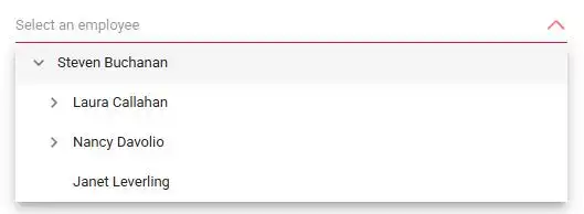
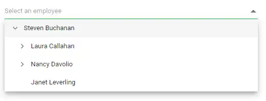
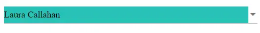
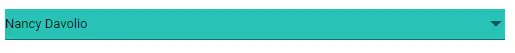
Customizing the appearance of container element
You can customize the appearance of the container element within the Dropdown Tree component by targeting its CSS class .e-input, which indicates the parent element of the input, and allows you to apply any desired styles to the component.
.e-ddt.e-input-group.e-control-wrapper .e-input {
    font-size: 18px;
    font-family: emoji;
    color: #000000;
    background: #29c2b8;
}
Customizing the focus color
You can customize the component color when it is focused by targeting its CSS class .e-input-focus::after, which indicates the input element when it is focused, and set the desired color to the background property.
.e-ddt.e-input-group.e-control-wrapper.e-input-focus::before, .e-ddt.e-input-group.e-control-wrapper.e-input-focus::after {
    background: #0cb3d9;
}
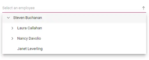
Customizing the outline theme’s focus color
You can customize the color of the Dropdown Tree component when it is in a focused state and rendered with an outline theme, by targeting its CSS class e-outline which indicates the input element when it is focused, and allows you to set the desired color to the color property.
@using Syncfusion.Blazor.Navigations

<SfDropDownTree TItem="EmployeeData" TValue="string" Placeholder="Select an employee" Width="500px" CssClass="e-outline">
    <DropDownTreeField TItem="EmployeeData" DataSource="Data" ID="Id" Text="Name" HasChildren="HasChild" ParentID="PId"></DropDownTreeField>
</SfDropDownTree>

@code {
    List<EmployeeData> Data = new List<EmployeeData>
    {
        new EmployeeData() { Id = "1", Name = "Steven Buchanan", Job = "General Manager", HasChild = true, Expanded = true },
        new EmployeeData() { Id = "2", PId = "1", Name = "Laura Callahan", Job = "Product Manager", HasChild = true },
        new EmployeeData() { Id = "3", PId = "2", Name = "Andrew Fuller", Job = "Team Lead", HasChild = true },
        new EmployeeData() { Id = "4", PId = "3", Name = "Anne Dodsworth", Job = "Developer" },
        new EmployeeData() { Id = "10", PId = "3", Name = "Lilly", Job = "Developer" },
        new EmployeeData() { Id = "5", PId = "1", Name = "Nancy Davolio", Job = "Product Manager", HasChild = true },
        new EmployeeData() { Id = "6", PId = "5", Name = "Michael Suyama", Job = "Team Lead", HasChild = true },
        new EmployeeData() { Id = "7", PId = "6", Name = "Robert King", Job = "Developer" },
        new EmployeeData() { Id = "11", PId = "6", Name = "Mary", Job = "Developer" },
        new EmployeeData() { Id = "9", PId = "1", Name = "Janet Leverling", Job = "HR"}
    };

    class EmployeeData
    {
        public string? Id { get; set; }
        public string? Name { get; set; }
        public string? Job { get; set; }
        public bool HasChild { get; set; }
        public bool Expanded { get; set; }
        public string? PId { get; set; }
    }
}

<style>
    .e-outline.e-input-group.e-input-focus:hover:not(.e-success):not(.e-warning):not(.e-error):not(.e-disabled):not(.e-float-icon-left),
    .e-outline.e-input-group.e-input-focus.e-control-wrapper:hover:not(.e-success):not(.e-warning):not(.e-error):not(.e-disabled):not(.e-float-icon-left),
    .e-outline.e-input-group.e-input-focus:not(.e-success):not(.e-warning):not(.e-error):not(.e-disabled),
    .e-outline.e-input-group.e-control-wrapper.e-input-focus:not(.e-success):not(.e-warning):not(.e-error):not(.e-disabled) {
        border-color: #b1bd15;
        box-shadow: inset 1px 1px #b1bd15, inset -1px 0 #b1bd15, inset 0 -1px #b1bd15;
    }
</style>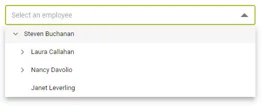
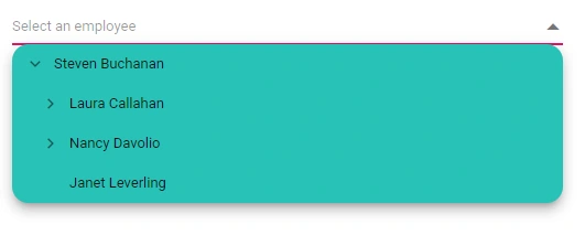
Customizing the background color of focus, hover, and active items
You can customize the background color and text color of list items within the Dropdown Tree component when they are in a focused, active, or hovered state by targeting the CSS classes .e-ddt .e-treeview .e-list-item.e-active > .e-fullrow, .e-ddt .e-treeview .e-list-item.e-hover > .e-fullrow, and .e-ddt .e-treeview .e-list-item.e-node-focus > .e-fullrow, and set the desired color to the background-color and color properties.
.e-ddt .e-treeview .e-list-item.e-active > .e-fullrow,
.e-ddt .e-treeview .e-list-item.e-hover > .e-fullrow,
.e-ddt .e-treeview .e-list-item.e-node-focus > .e-fullrow {
    background: #29c2b8;
}
Customizing the appearance of pop-up element
You can customize the appearance of the popup element within the Dropdown Tree component by targeting the CSS class .e-ddt.e-popup.
 .e-ddt.e-popup {
     background-color: #29c2b8;
     border-radius: 15px;
 }
Change the HTML attributes
Add the additional html attributes such as styles, class, and more to the root element using the HtmlAttributes property and accepts n number of attributes in a key-value pair format.
@using Syncfusion.Blazor.Navigations

<SfDropDownTree TItem="EmployeeData" TValue="string" Placeholder="Select an employee" Width="500px" HtmlAttributes="@htmlAttribute">
    <DropDownTreeField TItem="EmployeeData" DataSource="Data" ID="Id" Text="Name" HasChildren="HasChild" ParentID="PId"></DropDownTreeField>
</SfDropDownTree>

@code {
    List<EmployeeData> Data = new List<EmployeeData>
    {
        new EmployeeData() { Id = "1", Name = "Steven Buchanan", Job = "General Manager", HasChild = true, Expanded = true },
        new EmployeeData() { Id = "2", PId = "1", Name = "Laura Callahan", Job = "Product Manager", HasChild = true },
        new EmployeeData() { Id = "3", PId = "2", Name = "Andrew Fuller", Job = "Team Lead", HasChild = true },
        new EmployeeData() { Id = "4", PId = "3", Name = "Anne Dodsworth", Job = "Developer" },
        new EmployeeData() { Id = "10", PId = "3", Name = "Lilly", Job = "Developer" },
        new EmployeeData() { Id = "5", PId = "1", Name = "Nancy Davolio", Job = "Product Manager", HasChild = true },
        new EmployeeData() { Id = "6", PId = "5", Name = "Michael Suyama", Job = "Team Lead", HasChild = true },
        new EmployeeData() { Id = "7", PId = "6", Name = "Robert King", Job = "Developer" },
        new EmployeeData() { Id = "11", PId = "6", Name = "Mary", Job = "Developer" },
        new EmployeeData() { Id = "9", PId = "1", Name = "Janet Leverling", Job = "HR"}
    };
     Dictionary<string, object> htmlAttribute = new Dictionary<string, object>()
    {
        {"class", "e-employee" },
        {"style", "background-color: #0bebd6; text-align: right" },
        {"title", "Syncfusion DropDownTree" }
    };

    class EmployeeData
    {
        public string? Id { get; set; }
        public string? Name { get; set; }
        public string? Job { get; set; }
        public bool HasChild { get; set; }
        public bool Expanded { get; set; }
        public string? PId { get; set; }
    }
}
Set the various font family for Dropdown Tree elements
The font-family of the Dropdown tree can be changed by overriding using the following selector. The overridden can be applied to specific component by adding a class name through the CssClass property.
In the following sample, the font family of the Dropdown Tree, ListItem text in Dropdown Tree and filterInput text are changed.
@using Syncfusion.Blazor.Navigations

<SfDropDownTree TItem="EmployeeData" TValue="string" Placeholder="Select an employee" Width="500px"  AllowFiltering CssClass="e-custom">
    <DropDownTreeField TItem="EmployeeData" DataSource="Data" ID="Id" Text="Name" HasChildren="HasChild" ParentID="PId"></DropDownTreeField>
</SfDropDownTree>

@code {
    List<EmployeeData> Data = new List<EmployeeData>
    {
        new EmployeeData() { Id = "1", Name = "Steven Buchanan", Job = "General Manager", HasChild = true, Expanded = true },
        new EmployeeData() { Id = "2", PId = "1", Name = "Laura Callahan", Job = "Product Manager", HasChild = true },
        new EmployeeData() { Id = "3", PId = "2", Name = "Andrew Fuller", Job = "Team Lead", HasChild = true },
        new EmployeeData() { Id = "4", PId = "3", Name = "Anne Dodsworth", Job = "Developer" },
        new EmployeeData() { Id = "10", PId = "3", Name = "Lilly", Job = "Developer" },
        new EmployeeData() { Id = "5", PId = "1", Name = "Nancy Davolio", Job = "Product Manager", HasChild = true },
        new EmployeeData() { Id = "6", PId = "5", Name = "Michael Suyama", Job = "Team Lead", HasChild = true },
        new EmployeeData() { Id = "7", PId = "6", Name = "Robert King", Job = "Developer" },
        new EmployeeData() { Id = "11", PId = "6", Name = "Mary", Job = "Developer" },
        new EmployeeData() { Id = "9", PId = "1", Name = "Janet Leverling", Job = "HR"}
    };

    class EmployeeData
    {
        public string? Id { get; set; }
        public string? Name { get; set; }
        public string? Job { get; set; }
        public bool HasChild { get; set; }
        public bool Expanded { get; set; }
        public string? PId { get; set; }
    }
}

<style>
    /* Text in DropDownTree */
    .e-custom.e-input-group input.e-dropdowntree {
        font-family: cursive;
    }

    /* Item Text in DropDownTree */
    .e-custom.e-popup,
    .e-custom .e-treeview {
        font-family: cursive;
    }

    /* Dropdown Tree filterInput font-family */
    .e-custom span.e-input-group.e-control-container.e-control-wrapper {
        font-family: cursive;
    }
</style>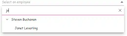
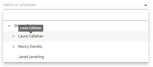
Show tooltip on list item
You can achieve this behavior by integrating the tooltip component. When the mouse hovers over the Dropdown Tree list items, a tooltip appears with information about the hovered list item.
The following code demonstrates how to display a tooltip when hovering over the Dropdown Tree option.
@using Syncfusion.Blazor.Navigations
@using Syncfusion.Blazor.Popups
@using Syncfusion.Blazor.DropDowns

<SfTooltip @ref="TooltipObj" ID="Tooltip" Target=".e-list-item .name[title]">
</SfTooltip>

<SfDropDownTree TItem="EmployeeData" TValue="string" Placeholder="Select an employee" Width="500px"  AllowFiltering CssClass="e-custom" OnPopupOpen="OnOpen" OnPopupClose="OnClose">
    <ChildContent>
        <DropDownTreeField TItem="EmployeeData" DataSource="Data" ID="Id" Text="Name" HasChildren="HasChild" ParentID="PId"></DropDownTreeField>
    </ChildContent>
    <ItemTemplate>
        <span class="name" title="@((context as EmployeeData).Name)">@((context as EmployeeData).Name) </span>
    </ItemTemplate>
</SfDropDownTree>

@code {
    SfTooltip? TooltipObj;
    public bool isOpen { get; set; } = false;
    List<EmployeeData> Data = new List<EmployeeData>
    {
        new EmployeeData() { Id = "1", Name = "Steven Buchanan", Job = "General Manager", HasChild = true, Expanded = true },
        new EmployeeData() { Id = "2", PId = "1", Name = "Laura Callahan", Job = "Product Manager", HasChild = true },
        new EmployeeData() { Id = "3", PId = "2", Name = "Andrew Fuller", Job = "Team Lead", HasChild = true },
        new EmployeeData() { Id = "4", PId = "3", Name = "Anne Dodsworth", Job = "Developer" },
        new EmployeeData() { Id = "10", PId = "3", Name = "Lilly", Job = "Developer" },
        new EmployeeData() { Id = "5", PId = "1", Name = "Nancy Davolio", Job = "Product Manager", HasChild = true },
        new EmployeeData() { Id = "6", PId = "5", Name = "Michael Suyama", Job = "Team Lead", HasChild = true },
        new EmployeeData() { Id = "7", PId = "6", Name = "Robert King", Job = "Developer" },
        new EmployeeData() { Id = "11", PId = "6", Name = "Mary", Job = "Developer" },
        new EmployeeData() { Id = "9", PId = "1", Name = "Janet Leverling", Job = "HR"}
    };

    public void OnOpen(PopupEventArgs args)
    {
        isOpen = true;
    }

    public void OnClose(PopupEventArgs args)
    {
        if (TooltipObj != null)
        {
            TooltipObj.CloseAsync();
        }
    }

    protected override async Task OnAfterRenderAsync(bool firstRender)
    {
        if (firstRender && isOpen && TooltipObj != null)
        {
            await TooltipObj.RefreshAsync();
        }
    }

    class EmployeeData
    {
        public string? Id { get; set; }
        public string? Name { get; set; }
        public string? Job { get; set; }
        public bool HasChild { get; set; }
        public bool Expanded { get; set; }
        public string? PId { get; set; }
    }
}
Tooltip using HTMLAttribute in Dropdown Tree component
To display the tooltip in the Dropdown Tree component, add the Title attribute through the HTMLAttributes property.
In the following example, the HtmlAttributes property is used to add the title attribute to the root input element of the Dropdown Tree with the value Dropdown Tree Component. This will display a tooltip with the text Dropdown Tree Component when the user hovers over the input element.
@using Syncfusion.Blazor.Navigations

<SfDropDownTree TItem="EmployeeData" TValue="string" Placeholder="Select an employee" Width="500px"  HtmlAttributes="htmlAttribute">
    <DropDownTreeField TItem="EmployeeData" DataSource="Data" ID="Id" Text="Name" HasChildren="HasChild" ParentID="PId"></DropDownTreeField>
</SfDropDownTree>

@code {
    private Dictionary<string, object> htmlAttribute = new Dictionary<string, object>()
    {
        {"title", "Dropdown Tree Component" }
    };

    List<EmployeeData> Data = new List<EmployeeData>
    {
        new EmployeeData() { Id = "1", Name = "Steven Buchanan", Job = "General Manager", HasChild = true, Expanded = true },
        new EmployeeData() { Id = "2", PId = "1", Name = "Laura Callahan", Job = "Product Manager", HasChild = true },
        new EmployeeData() { Id = "3", PId = "2", Name = "Andrew Fuller", Job = "Team Lead", HasChild = true },
        new EmployeeData() { Id = "4", PId = "3", Name = "Anne Dodsworth", Job = "Developer" },
        new EmployeeData() { Id = "10", PId = "3", Name = "Lilly", Job = "Developer" },
        new EmployeeData() { Id = "5", PId = "1", Name = "Nancy Davolio", Job = "Product Manager", HasChild = true },
        new EmployeeData() { Id = "6", PId = "5", Name = "Michael Suyama", Job = "Team Lead", HasChild = true },
        new EmployeeData() { Id = "7", PId = "6", Name = "Robert King", Job = "Developer" },
        new EmployeeData() { Id = "11", PId = "6", Name = "Mary", Job = "Developer" },
        new EmployeeData() { Id = "9", PId = "1", Name = "Janet Leverling", Job = "HR"}
    };

    class EmployeeData
    {
        public string? Id { get; set; }
        public string? Name { get; set; }
        public string? Job { get; set; }
        public bool HasChild { get; set; }
        public bool Expanded { get; set; }
        public string? PId { get; set; }
    }
}
Customizing the Width of the component
You can customize the width of the component using Width property. The default value is 100%.
@using Syncfusion.Blazor.Navigations
<SfDropDownTree TItem="EmployeeData" TValue="string" Placeholder="Select an employee" Width="600px">
<DropDownTreeField TItem="EmployeeData" DataSource="Data" ID="Id" Text="Name" HasChildren="HasChild" ParentID="PId"></DropDownTreeField>
</SfDropDownTree>
@code {
List<EmployeeData> Data = new List<EmployeeData>
{
new EmployeeData() { Id = "1", Name = "Steven Buchanan", Job = "General Manager", HasChild = true, Expanded = true },
new EmployeeData() { Id = "2", PId = "1", Name = "Laura Callahan", Job = "Product Manager", HasChild = true },
new EmployeeData() { Id = "3", PId = "2", Name = "Andrew Fuller", Job = "Team Lead", HasChild = true },
new EmployeeData() { Id = "4", PId = "3", Name = "Anne Dodsworth", Job = "Developer" },
new EmployeeData() { Id = "10", PId = "3", Name = "Lilly", Job = "Developer" },
new EmployeeData() { Id = "5", PId = "1", Name = "Nancy Davolio", Job = "Product Manager", HasChild = true },
new EmployeeData() { Id = "6", PId = "5", Name = "Michael Suyama", Job = "Team Lead", HasChild = true },
new EmployeeData() { Id = "7", PId = "6", Name = "Robert King", Job = "Developer" },
new EmployeeData() { Id = "11", PId = "6", Name = "Mary", Job = "Developer" },
new EmployeeData() { Id = "9", PId = "1", Name = "Janet Leverling", Job = "HR"}
};
class EmployeeData
{
public string? Id { get; set; }
public string? Name { get; set; }
public string? Job { get; set; }
public bool HasChild { get; set; }
public bool Expanded { get; set; }
public string? PId { get; set; }
}
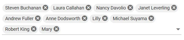
}Wrapping the selected item as text
Specify the boolean value to the TextWrap property that indicates whether to wrap the selected items into multiple lines when the selected item’s text content exceeded the input width limit or not.
In the following example, by enabling the TextWrap the selected items will appear on multiple lines within the input.
@using Syncfusion.Blazor.Navigations

<SfDropDownTree TItem="EmployeeData" TValue="string" Placeholder="Select an employee" Width="500px" ShowCheckBox="true" TextWrap="true">
    <DropDownTreeField TItem="EmployeeData" DataSource="Data" ID="Id" Text="Name" HasChildren="HasChild" ParentID="PId" Selected="Selected" IsChecked="IsChecked"></DropDownTreeField>

</SfDropDownTree>

@code {
    List<EmployeeData> Data = new List<EmployeeData>
    {
        new EmployeeData() { Id = "1", Name = "Steven Buchanan", Job = "General Manager", HasChild = true, Expanded = true},
        new EmployeeData() { Id = "2", PId = "1", Name = "Laura Callahan", Job = "Product Manager", HasChild = true },
        new EmployeeData() { Id = "3", PId = "2", Name = "Andrew Fuller", Job = "Team Lead", HasChild = true },
        new EmployeeData() { Id = "4", PId = "3", Name = "Anne Dodsworth", Job = "Developer" },
        new EmployeeData() { Id = "10", PId = "3", Name = "Lilly", Job = "Developer" },
        new EmployeeData() { Id = "5", PId = "1", Name = "Nancy Davolio", Job = "Product Manager", HasChild = true },
        new EmployeeData() { Id = "6", PId = "5", Name = "Michael Suyama", Job = "Team Lead", HasChild = true },
        new EmployeeData() { Id = "7", PId = "6", Name = "Robert King", Job = "Developer" },
        new EmployeeData() { Id = "11", PId = "6", Name = "Mary", Job = "Developer" },
        new EmployeeData() { Id = "9", PId = "1", Name = "Janet Leverling", Job = "HR"}
    };

    class EmployeeData
    {
        public string? Id { get; set; }
        public string? Name { get; set; }
        public string? Job { get; set; }
        public bool HasChild { get; set; }
        public bool Expanded { get; set; }
        public bool Selected { get; set; }
        public bool IsChecked { get; set; }
        public string? PId { get; set; }
    }
}