Adding Custom Item to Toolbar in Blazor File Manager Component
23 Jun 20265 minutes to read
To enhance the customization of toolbar items, the FileManagerToolbarSettings tag and FileManagerCustomToolbarItem property can be utilized. These features allow for easy addition, appearance, modification of custom toolbar items.
Case 1: To introduce the Custom item to the toolbar using the list of items and customize using icon and tooltip attributes, you can refer to the below code example.
@using Syncfusion.Blazor.FileManager

    <SfFileManager TValue="FileManagerDirectoryContent">
        <FileManagerAjaxSettings Url="/api/SampleData/FileOperations"
                                 UploadUrl="/api/SampleData/Upload"
                                 DownloadUrl="/api/SampleData/Download"
                                 GetImageUrl="/api/SampleData/GetImage">
        </FileManagerAjaxSettings>
        <FileManagerToolbarSettings ToolbarItems="@Items"></FileManagerToolbarSettings>
    </SfFileManager>

@code {
    public List<ToolBarItemModel> Items = new List<ToolBarItemModel>(){
        new ToolBarItemModel() { Name = "NewFolder" },
        new ToolBarItemModel() { Name = "Cut" },
        new ToolBarItemModel() { Name = "Copy" },
        new ToolBarItemModel() { Name = "Paste" },
        new ToolBarItemModel() { Name = "Delete" },
        new ToolBarItemModel() { Name = "Download" },
        new ToolBarItemModel() { Name = "Rename" },
        new ToolBarItemModel() { Name = "SortBy" },
        new ToolBarItemModel() { Name = "Refresh" },
        new ToolBarItemModel() { Name = "Custom", Text="Custom", TooltipText="Test Tooltip", PrefixIcon="e-icons e-check" },
        new ToolBarItemModel() { Name = "Selection" },
        new ToolBarItemModel() { Name = "View" },
        new ToolBarItemModel() { Name = "Details" },
    };
}
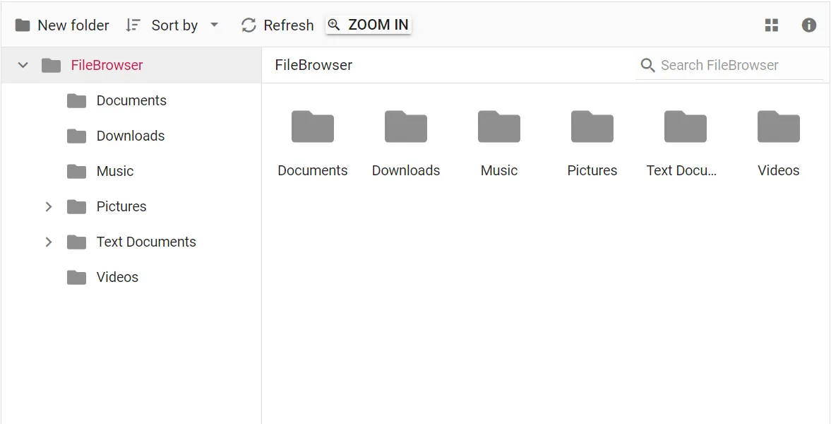
Case 2: To include Blazor components in the File Manager toolbar, you can use the template tag. This enables you to seamlessly render additional components within the toolbar. By assigning the same Name property in the toolbar items list, you can determine the desired position of the template item within the toolbar.
@using Syncfusion.Blazor.FileManager
@using Syncfusion.Blazor.Buttons

    <SfFileManager TValue="FileManagerDirectoryContent">
        <FileManagerAjaxSettings Url="/api/SampleData/FileOperations"
                                 UploadUrl="/api/SampleData/Upload"
                                 DownloadUrl="/api/SampleData/Download"
                                 GetImageUrl="/api/SampleData/GetImage">
        </FileManagerAjaxSettings>
        <FileManagerToolbarSettings ToolbarItems="@Items">
            <FileManagerCustomToolbarItems>
                <FileManagerCustomToolbarItem Name="Zoomin">
                    <Template>
                        <SfButton CssClass="e-tbar-btn-text e-tbar-ddb-text " Content="Zoom In" IconCss="e-icons e-zoom-in"></SfButton>
                    </Template>
                </FileManagerCustomToolbarItem>
            </FileManagerCustomToolbarItems>
        </FileManagerToolbarSettings>
    </SfFileManager>

@code {
    public List<ToolBarItemModel> Items = new List<ToolBarItemModel>(){
        new ToolBarItemModel() { Name = "NewFolder" },
        new ToolBarItemModel() { Name = "Cut" },
        new ToolBarItemModel() { Name = "Copy" },
        new ToolBarItemModel() { Name = "Paste" },
        new ToolBarItemModel() { Name = "Delete" },
        new ToolBarItemModel() { Name = "Download" },
        new ToolBarItemModel() { Name = "Rename" },
        new ToolBarItemModel() { Name = "SortBy" },
        new ToolBarItemModel() { Name = "Refresh" },
        new ToolBarItemModel() { Name = "Zoomin" , TooltipText ="Click to zoom in" },
        new ToolBarItemModel() { Name = "Selection" },
        new ToolBarItemModel() { Name = "View" },
        new ToolBarItemModel() { Name = "Details" },
    };
}