How can I help you?
Styles and Appearance in Blazor File Manager Component
13 Jun 20256 minutes to read
The following content provides the exact CSS structure that can be used to modify the control’s appearance based on the user preference.
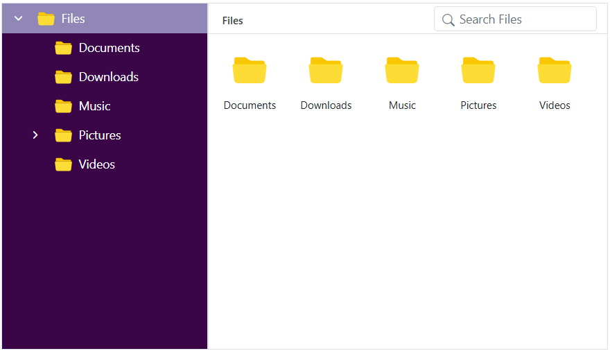
Customizing the File Manager navigation pane
To customize the File Manager navigation pane, use the .e-navigation selector and apply styles.
/* Set background color for the File Manager navigation pane */
.e-filemanager .e-navigation {
    background: #3a0647;
}

/* Highlight the active item in the TreeView inside the navigation pane */
.e-filemanager .e-treeview .e-list-item.e-active > .e-fullrow {
    background: #c3d3f9a1;
}

/* Set text color for TreeView items in the navigation pane */
.e-filemanager .e-treeview .e-list-text {
    color: #fff;
}

/* Set icon color for collapsible and expandable TreeView nodes */
.e-treeview .e-icon-collapsible,
.e-treeview .e-icon-expandable {
    color: #fff;
}
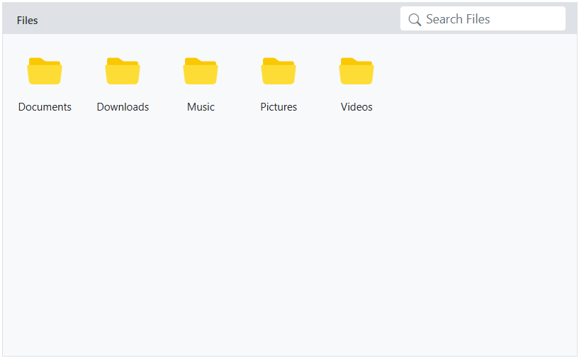
Customizing the File Manager thumbnail
To customize the thumbnails in the File Manager, you can apply background-image styles to specific CSS selectors that represent different file types, as listed in the table below.
| File Type | CSS Selector |
|---|---|
| Image | .e-fe-image |
| Music | .e-fe-music |
| Excel | .e-fe-xlsx |
| Video | .e-fe-video |
| PowerPoint | .e-fe-pptx |
| RAR | .e-fe-rar |
| ZIP | .e-fe-zip |
| Text | .e-fe-txt |
| JavaScript | .e-fe-js |
| CSS | .e-fe-css |
| HTML | .e-fe-html |
| Unknown | .e-fe-unknown |
| Executable | .e-fe-exe |
| MSI | .e-fe-msi |
| PHP | .e-fe-php |
| Word | .e-fe-doc |
| Word(docx) | .e-fe-docx |
| XML | .e-fe-xml |
| Folder | .e-fe-folder |
The following example demonstrates how to customize the File Manager’s thumbnail icon for folders:
/* Applies to both Large Icons view and Details view in the File Manager */

.e-filemanager .e-large-icons .e-fe-folder, .e-filemanager .e-grid .e-fe-folder {
    background-image: url("data:image/svg+xml;base64,PD94bWwgdmVyc2lvbj0iMS4wIiBlbmNvZGluZz0idXRmLTgiPz48c3ZnIHZlcnNpb249IjEuMSIgaWQ9IkxheWVyXzEiIHhtbG5zPSJodHRwOi8vd3d3LnczLm9yZy8yMDAwL3N2ZyIgeG1sbnM6eGxpbms9Imh0dHA6Ly93d3cudzMub3JnLzE5OTkveGxpbmsiIHg9IjBweCIgeT0iMHB4IiB2aWV3Qm94PSIwIDAgMzIgMzIiIHN0eWxlPSJlbmFibGUtYmFja2dyb3VuZDpuZXcgMCAwIDMyIDMyOyIgeG1sOnNwYWNlPSJwcmVzZXJ2ZSI+PHN0eWxlIHR5cGU9InRleHQvY3NzIj4uc3Qwe2ZpbGw6I0ZGOTI5Mjt9LnN0MXtmaWxsOiNFODdFN0U7fS5zdDJ7ZmlsbDojRkZDM0MzO30uc3Qze2ZpbGw6IzkxRDRGRTt9LnN0NHtmaWxsOiM2M0E3RDM7fS5zdDV7ZmlsbDojQzFFN0ZGO30uc3Q2e2ZpbGw6I0ZGRkZGRjt9LnN0N3tmaWxsOiM4M0Q2Qjk7fS5zdDh7ZmlsbDojNDZDNjhDO30uc3Q5e2ZpbGw6I0JCRThEODt9LnN0MTB7ZmlsbDojRkVCMTdEO30uc3QxMXtmaWxsOiNERDk2NjY7fS5zdDEye2ZpbGw6I0ZFRDRCNzt9LnN0MTN7ZmlsbDojRjJBMkEyO30uc3QxNHtmaWxsOiNGMUM1QzU7fS5zdDE1e2ZpbGw6I0RCQjY2Mzt9LnN0MTZ7ZmlsbDojQ0VBMTUxO30uc3QxN3tmaWxsOiNFQkQ3QTk7fS5zdDE4e2ZpbGw6I0NFQ0VDRTt9LnN0MTl7ZmlsbDojQjdCN0I3O30uc3QyMHtmaWxsOiNFNEU0RTQ7fS5zdDIxe2ZpbGw6IzY1QUFEMTt9LnN0MjJ7ZmlsbDojRTU3QTdBO30uc3QyM3tmaWxsOiNFNkE2RTg7fS5zdDI0e2ZpbGw6I0Q2OEFENjt9LnN0MjV7ZmlsbDojRkZDQ0ZFO30uc3QyNntmaWxsOiM5OENFNUY7fS5zdDI3e2ZpbGw6IzhDQUYyQzt9LnN0Mjh7ZmlsbDojQzZFM0E3O30uc3QyOXtmaWxsOiNGRkI1Nzg7fS5zdDMwe2ZpbGw6I0VEOUY2NDt9LnN0MzF7ZmlsbDojRkZENkI1O30uc3QzMntmaWxsOiNGNEExRUY7fS5zdDMze2ZpbGw6I0REODdERDt9LnN0MzR7ZmlsbDojRjlDQkY2O30uc3QzNXtmaWxsOiNBOEEyRjQ7fS5zdDM2e2ZpbGw6Izg4ODVFODt9LnN0Mzd7ZmlsbDojQ0ZDQ0Y4O30uc3QzOHtmaWxsOiNCQ0JDQkM7fS5zdDM5e2ZpbGw6I0E4QThBODt9LnN0NDB7ZmlsbDojREFEQURBO30uc3Q0MXtmaWxsOiM3N0NDREI7fS5zdDQye2ZpbGw6IzREQkNDMTt9LnN0NDN7ZmlsbDojQjRFM0VCO30uc3Q0NHtmaWxsOiNGRkI3QTQ7fS5zdDQ1e2ZpbGw6I0Y2OUE3Qjt9LnN0NDZ7ZmlsbDojRkZEN0NEO30uc3Q0N3tmaWxsOiM3MUM4RjQ7fS5zdDQ4e2ZpbGw6IzhEQzk3Nzt9LnN0NDl7ZmlsbDojN0NBODUxO30uc3Q1MHtvcGFjaXR5OjAuNDU7ZmlsbDojRkZGRkZGO308L3N0eWxlPjxnPjxwYXRoIGNsYXNzPSJzdDMiIGQ9Ik0yOS41LDI3LjVoLTI3Yy0xLjEsMC0yLTAuOS0yLTJ2LTE5YzAtMS4xLDAuOS0yLDItMmgxMC40bDMuNSwzLjFoMTMuMmMxLjEsMCwyLDAuOSwyLDJ2MTUuOUMzMS41LDI2LjYsMzAuNiwyNy41LDI5LjUsMjcuNXoiLz48cGF0aCBjbGFzcz0ic3Q0IiBkPSJNMjkuNSwyOGgtMjdDMS4xLDI4LDAsMjYuOSwwLDI1LjV2LTE5QzAsNS4xLDEuMSw0LDIuNSw0aDEwLjZsMy41LDMuMWgxM2MxLjQsMCwyLjUsMS4xLDIuNSwyLjV2MTUuOUMzMiwyNi45LDMwLjksMjgsMjkuNSwyOHogTTIuNSw1QzEuNyw1LDEsNS43LDEsNi41djE5QzEsMjYuMywxLjcsMjcsMi41LDI3aDI3YzAuOCwwLDEuNS0wLjcsMS41LTEuNVY5LjZjMC0wLjgtMC43LTEuNS0xLjUtMS41SDE2LjJMMTIuNyw1SDIuNXoiLz48L2c+PC9zdmc+");
}
Customizing the File Manager layout
To customize the File Manager layout, use the .e-layout-content selector and apply styles.
/* Style for breadcrumb (address bar) */
.e-filemanager .e-layout-content .e-address {
    background: #dee2e6;
}

/* Customize the background for the Large Icons view */
.e-filemanager .e-layout-content .e-large-icons {
    background: #f8f9fa;
}

/* Customize the background for the Details view table and content area */
.e-filemanager .e-layout-content .e-grid .e-table,
.e-filemanager .e-grid .e-gridcontent .e-content {
    background: #f8f9fa;
}
Customizing the File Manager Toolbar
To customize the File Manager toolbar items, use the .e-toolbar selector and apply styles.
/* Style for individual toolbar buttons */
.e-filemanager .e-toolbar .e-tbar-btn {
        background: #0d9cf6;
    border: 1px solid #000000;
}

/* Style for toolbar icons */
.e-filemanager .e-toolbar .e-tbar-btn .e-icons {
    color: #ffffff;
}

/* Style for toolbar button text */
.e-filemanager .e-toolbar .e-toolbar-item .e-tbar-btn .e-tbar-btn-text {
    color: #ffffff;
}
Customizing the File Manager selected files/folders
To customize the File Manager selected files/folders, use the below selectors and apply styles.
/* Highlight for active and hover item in Large Icons view */
.e-filemanager li.e-list-item.e-large-icon.e-active,
.e-filemanager li.e-list-item.e-large-icon.e-active:hover {
    background: #dee2e6;
    border: 2px solid #000000;
    border-radius: 10%;
}

/* Color for text */
.e-filemanager .e-large-icons .e-active {
    color: #212529;
}

/* Highlight for active row in Details view */
.e-filemanager .e-grid td.e-active {
    background: #dee2e6;
}
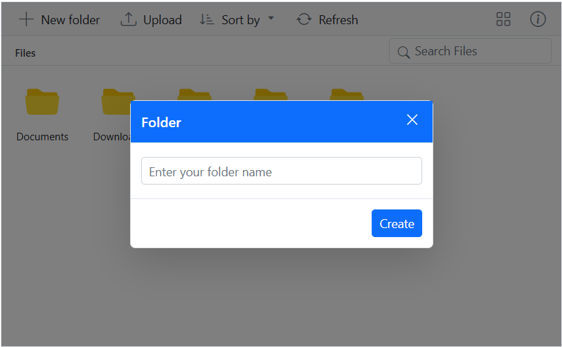
Customizing the File Manager Dialog
To customize the dialog popup in the File Manager, you can apply styles to specific CSS selectors, as listed in the table below.
| Element | CSS Selector |
|---|---|
| Header | .e-dlg-header-content |
| Content | .e-dlg-content |
| Overlay | .e-dlg-overlay |
| Footer | .e-footer-content |
In this example, we have applied styles to the header content.
/* For File Manager Dialog header */
.e-filemanager .e-dialog .e-dlg-header-content {
    background-color: #0d6efd;
}
/* For File Manager Dialog header close icon and text*/
.e-filemanager .e-dialog .e-icon-dlg-close,
.e-filemanager .e-dialog .e-dlg-header {
    color: #fff;
}