File Uploader Customization in Blazor
10 Jul 20264 minutes to read
The visual appearance of the Blazor File Upload component can be extensively customized using CSS to align with your application’s theme and style. This document provides a detailed guide to the component’s CSS structure, enabling you to tailor its look and feel. By targeting specific CSS classes, you can modify elements such as the container, buttons, drop area, file list, and progress bar. For best results, it is recommended to use the CssClass property to apply a custom class, which helps scope your styles and prevent them from affecting other components.
CssClass Property
The File Upload component allows you to add a custom CSS class to its wrapper element using the CssClass property. This approach helps scope customizations and prevents unintended global style changes.
@using Syncfusion.Blazor.Inputs

<SfUploader CssClass="e-custom-uploader">
    <UploaderEvents ValueChange="OnChange"></UploaderEvents>
</SfUploader>

@code{
    private void OnChange(UploadChangeEventArgs args)
    {
        // here you can get uploaded file data
    }
}

<style>
    .e-custom-uploader {
        border: 3px dotted #554444;
    }
</style>
By using the e-custom-uploader class, you can target specific elements within the File Upload component.
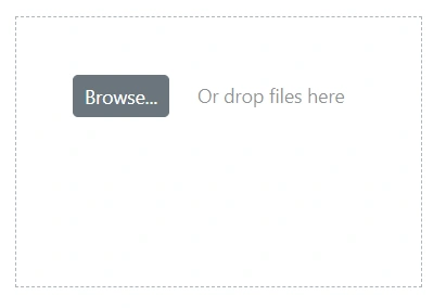
Customizing the Container
Customize the main container of the File Upload component to control its overall dimensions and spacing. To scope your changes, target the custom class assigned via the CssClass property followed by the component’s default class selectors.
/* To specify a custom height, width and padding */
.e-upload.e-control-wrapper {
    height: 200px;
    width: 300px;
    padding: 30px;
}
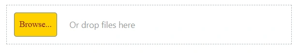
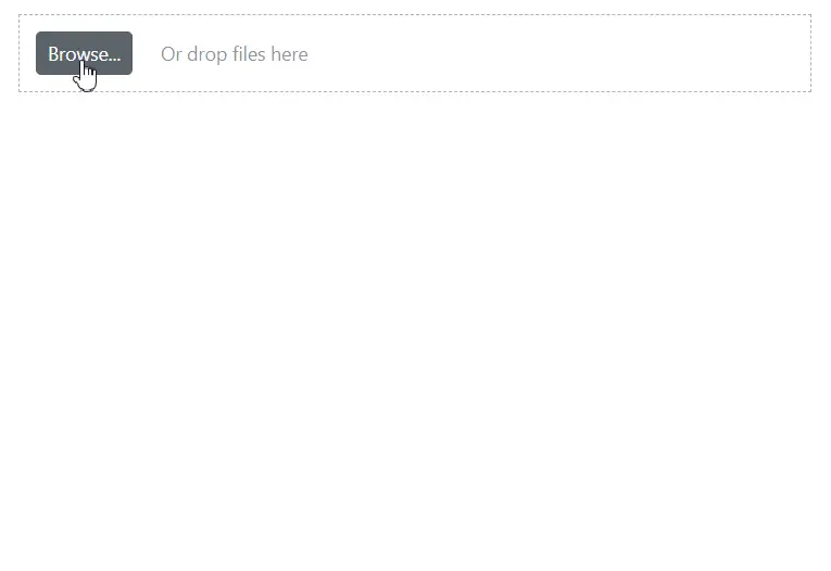
Customizing the Browse Button
Alter the Browse button’s appearance by targeting the .e-file-select-wrap .e-btn selector within your custom class. This allows you to style properties like background-color, color, and font-family to match your application’s design.
/* To specify font styles, background, and color */
.e-upload .e-file-select-wrap .e-btn {
    font-family: 'cursive';
    height: 40px;
    background-color: #ead228;
    color: #ca3d09;
}
Customizing the Content Area
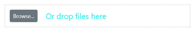
Style the drop zone where users drag and drop files to provide better visual feedback. Use the .e-file-drop selector scoped with your custom class to adjust properties like font-size and color.
/* To specify font size and color */
.e-upload .e-file-select-wrap .e-file-drop {
    font-size: 20px;
    color: aqua;
}
Customizing the File List
Customize the appearance of the file list that displays selected files. Target the .e-upload-file-list selector within your custom class to apply styles like background-color to the list container.
/* To specify a background color */
.e-upload .e-upload-files .e-upload-file-list {
    background-color: beige;
}
Customizing the Progress Bar
Provide a consistent look during file uploads by customizing the progress bar and its text. Use the .e-upload-progress-bar and .e-progress-bar-text selectors, scoped with your custom class, to control properties like background-color and font-weight.
/* To specify the background color of the progress bar */
.e-upload .e-upload-files .e-upload-progress-wrap .e-upload-progress-bar {
    background: green;
}

/* To specify the color of the progress bar text */
.e-upload .e-upload-files .e-upload-progress-wrap .e-progress-bar-text {
    color: #288928;
    font-weight: bold;
}