Transform in the Blazor Image Editor Component
12 Jun 20268 minutes to read
The Blazor Image Editor component provides rotation, flipping, straightening, zooming, and panning for images and annotations. These transformations enable precise adjustments and help enhance visual presentation.
Rotate an image
The RotateAsync method rotates the image and annotations by a specified number of degrees clockwise or counterclockwise. This method accepts one parameter: the rotation angle in degrees. A positive value rotates clockwise; a negative value rotates counterclockwise.
Note: Use multiples of 90° (for example, 90, 180, -90) for proper alignment.
@using Syncfusion.Blazor.ImageEditor
@using Syncfusion.Blazor.Buttons

<div style="padding-bottom: 15px">
    <SfButton OnClick="RotateAsync">Rotate</SfButton>
</div>

<SfImageEditor @ref="ImageEditor" Toolbar="customToolbarItem" Height="400">
    <ImageEditorEvents Created="OpenAsync"></ImageEditorEvents>
</SfImageEditor>

@code {
    SfImageEditor ImageEditor;
    private List<ImageEditorToolbarItemModel> customToolbarItem = new List<ImageEditorToolbarItemModel>() { };

    private async void OpenAsync()
    {
        await ImageEditor.OpenAsync("https://ej2.syncfusion.com/react/demos/src/image-editor/images/bridge.png");
    }

    private async void RotateAsync()
    {
        await ImageEditor.RotateAsync(90);
    }
}
Flip an image
The FlipAsync method flips the image and annotations horizontally or vertically. It accepts a single parameter of type ImageEditorDirection, which specifies the flip direction.
The ImageEditorDirection parameter supports two values: Horizontal and Vertical. Horizontal flips along the horizontal axis (mirror effect). Vertical flips along the vertical axis (flipping the image upside down).
Here is an example of flipping an image on button click.
@using Syncfusion.Blazor.ImageEditor
@using Syncfusion.Blazor.Buttons

<div style="padding-bottom: 15px">
    <SfButton OnClick="FlipAsync">Flip</SfButton>
</div>

<SfImageEditor @ref="ImageEditor" Toolbar="customToolbarItem" Height="400">
    <ImageEditorEvents Created="OpenAsync"></ImageEditorEvents>
</SfImageEditor>

@code {
    SfImageEditor ImageEditor;
    private List<ImageEditorToolbarItemModel> customToolbarItem = new List<ImageEditorToolbarItemModel>() { };

    private async void OpenAsync()
    {
        await ImageEditor.OpenAsync("https://ej2.syncfusion.com/react/demos/src/image-editor/images/bridge.png");
    }

    private async void FlipAsync()
    {
        await ImageEditor.FlipAsync(ImageEditorDirection.Horizontal);
    }
}
Straighten an image
Straightening rotates an image clockwise or counterclockwise within a range of -45 to +45 degrees. Positive values indicate clockwise rotation; negative values indicate counterclockwise rotation. The StraightenImageAsync method adjusts the degree of rotation with one parameter:
- degree - Amount of rotation used to straighten the image.
Here is an example of straightening an image.
@using Syncfusion.Blazor.ImageEditor
@using Syncfusion.Blazor.Buttons

<div style="padding-bottom: 15px">
    <SfButton OnClick="Straighten">Straighten</SfButton>
</div>

<SfImageEditor @ref="ImageEditor" Height="400">
    <ImageEditorEvents Created="OpenAsync"></ImageEditorEvents>
</SfImageEditor>

@code {
    SfImageEditor ImageEditor;
    private async void OpenAsync()
    {
        await ImageEditor.OpenAsync("https://ej2.syncfusion.com/react/demos/src/image-editor/images/bridge.png");
    }

    private async void Straighten()
    {
        await ImageEditor.StraightenImageAsync(45);
    }
}
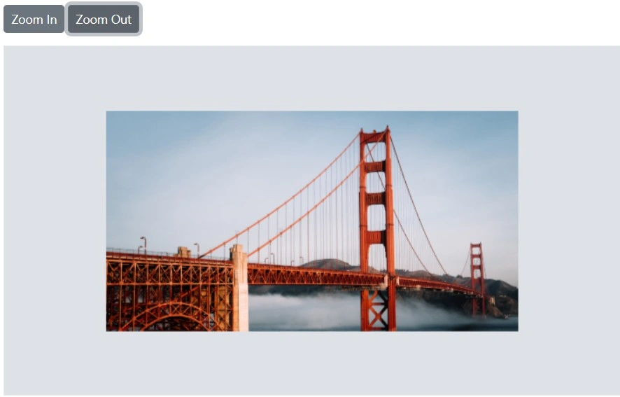
Zoom in or out an image
The ZoomAsync method magnifies or reduces the image and reveals details in hidden areas. It accepts two parameters:
-
zoomFactor - Controls the magnification level.
-
zoomPoint - Specifies the
ImageEditorPoint(x, y) used as the focal point for zooming.
Minimum and maximum zoom level
The MinZoomFactor property defines the minimum zoom level. The default value is 0.1, allowing zoom out up to 10 times from the original size.
The MaxZoomFactor property defines the maximum zoom level. The default value is 10, allowing zoom in up to 10 times the original size.
Here is an example of configuring MinZoomFactor and MaxZoomFactor in ImageEditorZoomSettings.
@using Syncfusion.Blazor.ImageEditor
@using Syncfusion.Blazor.Buttons

<div style="padding-bottom: 15px">
    <SfButton OnClick="ZoomInAsync">Zoom In </SfButton>
    <SfButton OnClick="ZoomOutAsync">Zoom Out </SfButton>
</div>

<SfImageEditor @ref="ImageEditor" Toolbar="customToolbarItem" Height="400">
    <ImageEditorZoomSettings MaxZoomFactor="MaxZoomFactor" MinZoomFactor="MinZoomFactor"></ImageEditorZoomSettings>
    <ImageEditorEvents Created="OpenAsync"></ImageEditorEvents>
</SfImageEditor>

@code {
    SfImageEditor ImageEditor;
    double ZoomLevel = 1;
    double MinZoomFactor = 0.1;
    double MaxZoomFactor = 30;
    private List<ImageEditorToolbarItemModel> customToolbarItem = new List<ImageEditorToolbarItemModel>() { };

    private async void OpenAsync()
    {
        await ImageEditor.OpenAsync("https://ej2.syncfusion.com/react/demos/src/image-editor/images/bridge.png");
    }

    private async void ZoomInAsync()
    {
        if (ZoomLevel < 1)
        {
            ZoomLevel += 0.1;
        }
        else
        {
            ZoomLevel += 1;
        }
        if (ZoomLevel > MaxZoomFactor)
        {
            ZoomLevel = MaxZoomFactor;
        }
        await ImageEditor.ZoomAsync(ZoomLevel);
    }

    private async void ZoomOutAsync()
    {
        if (ZoomLevel <= 1)
        {
            ZoomLevel -= 0.1;
        }
        else
        {
            ZoomLevel -= 1;
        }
        if (ZoomLevel < MinZoomFactor)
        {
            ZoomLevel = MinZoomFactor;
        }
        await ImageEditor.ZoomAsync(ZoomLevel);
    }
}
Enable the specific types of zooming
Using the ZoomTrigger property of ImageEditorZoomSettings, enable one or more zoom actions such as pinch, mouse wheel, commands, and toolbar options.
@using Syncfusion.Blazor.ImageEditor

<SfImageEditor @ref="ImageEditor" Height="450">
    <ImageEditorEvents Created="Created"></ImageEditorEvents>
    <ImageEditorZoomSettings MinZoomFactor="0.1" MaxZoomFactor="50" ZoomTrigger="ZoomTrigger.Pinch | ZoomTrigger.MouseWheel"></ImageEditorZoomSettings>
</SfImageEditor>

@code {
    SfImageEditor ImageEditor;
    private async void Created()
    {
        await ImageEditor.OpenAsync("https://ej2.syncfusion.com/react/demos/src/image-editor/images/bridge.png");
    }
}
Panning an image
Panning is available when the image exceeds the canvas or the selection area. After zooming or applying a selection for cropping, the image may extend beyond the canvas or selection. Click and drag on the canvas to move the image and view the desired area.
OnPanStart and OnPanEnd event
The OnPanStart event fires when dragging begins within the canvas, and the OnPanEnd event fires when the panning action completes. These events can update state in response to the gesture and use PanEventArgs.
Parameters for OnPanStart and OnPanEnd:
-
PanEventArgs.StartPoint– TheImageEditorPoint(x, y) representing the start point. -
PanEventArgs.Endpoint– TheImageEditorPoint(x, y) representing the end point. -
PanEventArgs.Cancel– Boolean value to cancel the panning action.
Zooming event
The Zooming event triggers during zoom operations and can be used to react to image position or scale changes. It uses ZoomEventArgs.
Parameter for Zooming:
-
ZoomEventArgs.ZoomPoint– TheImageEditorPoint(x, y) used for zooming. -
ZoomEventArgs.PreviousZoomFactor– The previous zoom factor. -
ZoomEventArgs.CurrentZoomFactor– The current zoom factor. -
ZoomEventArgs.Cancel– Boolean value to cancel the zoom action. -
ZoomEventArgs.ZoomTrigger– The type of zoom interaction performed.
Rotating event
The Rotating event triggers during rotate or straighten operations and provides rotation details. It uses RotateEventArgs.
Parameters for Rotating:
-
RotateEventArgs.PreviousDegree– The degree of rotation before the recent action in the Image Editor. -
RotateEventArgs.CurrentDegree– The degree of rotation after the action in the Image Editor. -
RotateEventArgs.Cancel– Boolean value to cancel the rotation action.
Flipping event
The Flipping event triggers during flip operations and provides details about the flip. It uses FlipEventArgs.
Parameters for Flipping:
-
FlipEventArgs.Direction– TheImageEditorDirectionto apply. -
FlipEventArgs.PreviousDirection– The previousImageEditorDirection. -
FlipEventArgs.Cancel– Boolean value to cancel the flip action.