Configuration in Blazor In-place Editor Component
12 Jun 202614 minutes to read
Rendering modes
This section explains the supported rendering modes of the In-place Editor. Supported rendering modes:
- Popup
- Inline
NOTE
Inline mode is the default when the editor opens.
- Popup mode displays the editable container like a tooltip or popover above the target element.
- Inline mode replaces the element with the editable container. To open the editor in Inline mode, set Mode to Inline.
In the following example, the In-place Editor renders in Inline mode. The rendering mode can be switched dynamically by changing the drop-down value.
@using Syncfusion.Blazor.InPlaceEditor
@using Syncfusion.Blazor.DropDowns
@using Syncfusion.Blazor.Inputs

<table class="table-section">
    <tr>
        <td> Mode: </td>
        <td>
            <SfDropDownList Width="90%" TItem="InplaceModes" TValue="string" DataSource="@ModeData" @bind-Value="@DropdownValue">
                <DropDownListEvents TValue="string" TItem="InplaceModes" ValueChange="@OnChange"></DropDownListEvents>
                <DropDownListFieldSettings Text="text" Value="value"></DropDownListFieldSettings>
            </SfDropDownList>

        </td>
    </tr>
    <tr>
        <td class="sample-td">Enter your name: </td>
        <td class="sample-td">
            <SfInPlaceEditor @bind-Value="@TextValue" Mode="@InplaceMode" TValue="string">
                <EditorComponent>
                    <SfTextBox @bind-Value="@TextValue" Placeholder="Enter some text"></SfTextBox>
                </EditorComponent>
            </SfInPlaceEditor>
        </td>
    </tr>
</table>

<style>
    .table-section {
        margin: 0 auto;
    }

    tr td:first-child {
        text-align: right;
        padding-right: 20px;
    }

    .sample-td {
        padding-top: 10px;
        min-width: 230px;
        height: 100px;
    }
</style>

@code {
    public RenderMode InplaceMode = RenderMode.Inline;
    public string TextValue = "Andrew";
    public string DropdownValue = "Inline";

    public class InplaceModes
    {
        public string value { get; set; }
        public string text { get; set; }
    }
    List<InplaceModes> ModeData = new List<InplaceModes>()
    {
        new InplaceModes(){ value= "Inline", text= "Inline" },
        new InplaceModes(){ value= "Popup", text= "Popup" }
    };


    private void OnChange(Syncfusion.Blazor.DropDowns.ChangeEventArgs<string, InplaceModes> args)
    {
        this.InplaceMode = (args.Value.ToString() == "Popup" ? RenderMode.Popup : RenderMode.Inline);
        this.StateHasChanged();
    }
}
Popup customization
Popup mode can be customized by using the InPlaceEditorPopupSettings tag.
Popup mode is rendered using the Blazor Tooltip component, so tooltip properties and events can be used to customize popup behavior through InPlaceEditorPopupSettings by configuring tooltip properties
NOTE
For more details, refer to the tooltip documentation section.
Event actions for editing
The event action of the editor will be enabled in the edit mode based on the EditableOn property. By default, Click is enabled.
The following options are also supported:
- Click: Opens the editor on a single click.
- DoubleClick: Opens the editor on a double click. This option does not apply to the edit icon.
- EditIconClick: Disables input-triggered editing and allows editing only through the edit icon.
NOTE
The In-place Editor receives focus by pressing the Tab key from the previous focusable element. Press
Enterto open the editor.
In the following code block, when switching the drop-down item, the selected value is assigned to the EditableOn property. The editor will be opened when you double click on the input.
@using Syncfusion.Blazor.InPlaceEditor
@using Syncfusion.Blazor.DropDowns
@using Syncfusion.Blazor.Inputs

<table class="table-section">
    <tr>
        <td>Choose Editable Type: </td>
        <td>
            <SfDropDownList Width="90%" TValue="string" TItem="InplaceEditableModes" DataSource="@EditableData" @bind-Value="@DropDownValue">
                <DropDownListEvents TValue="string" TItem="InplaceEditableModes" ValueChange="@OnChange"></DropDownListEvents>
                <DropDownListFieldSettings Text="text" Value="value"></DropDownListFieldSettings>
            </SfDropDownList>
        </td>
    </tr>
    <tr>
        <td class="sample-td">Enter your name: </td>
        <td class="sample-td">
            <SfInPlaceEditor @bind-Value="@TextValue" EditableOn="EditableOn" SubmitOnEnter="true" TValue="string">
                <EditorComponent>
                    <SfTextBox @bind-Value="@TextValue" Placeholder="Enter some text"></SfTextBox>
                </EditorComponent>
            </SfInPlaceEditor>
        </td>
    </tr>
</table>

<style>
    .table-section {
        margin: 0 auto;
    }

    tr td:first-child {
        text-align: right;
        padding-right: 20px;
    }

    .sample-td {
        padding-top: 10px;
        min-width: 230px;
        height: 100px;
    }
</style>

@code {
    public string TextValue = "Andrew";
    public string DropDownValue = "Click";
    public EditableType EditableOn = EditableType.Click;

    public class InplaceEditableModes
    {
        public string value { get; set; }
        public string text { get; set; }
    }

    private List<InplaceEditableModes> EditableData = new List<InplaceEditableModes>()
    {
        new InplaceEditableModes(){ value= "Click", text= "Click" },
        new InplaceEditableModes(){ value= "Double Click", text= "Double Click" },
        new InplaceEditableModes(){ value= "Edit Icon Click", text= "Edit Icon Click" }
    };


    private void OnChange(Syncfusion.Blazor.DropDowns.ChangeEventArgs<string, InplaceEditableModes> args)
    {
        if (args.Value != null)
        {
            if (args.Value.ToString() == "Click")
            {
                this.EditableOn = EditableType.Click;
            }
            else if (args.Value.ToString() == "Double Click")
            {
                this.EditableOn = EditableType.DoubleClick;
            }
            else
            {
                this.EditableOn = EditableType.EditIconClick;
            }
            this.StateHasChanged();
        }
    }

}
Action on focus out
An action can be performed when clicking outside the editor container. This is controlled by the ActionOnBlur property. By default, Submit is enabled. The following options are supported:
- Cancel: Cancels editing and restores the previous content.
- Submit: Saves the edited content.
- Ignore: Performs no action.
In the following example, the selected drop-down value is assigned to ActionOnBlur.
@using Syncfusion.Blazor.InPlaceEditor
@using Syncfusion.Blazor.DropDowns
@using Syncfusion.Blazor.Inputs
<table class="table-section">
<tr>
<td> ActionOnBlur: </td>
<td>
<SfDropDownList Width="90%" TItem="DropDownFields" TValue="string" DataSource="@Modes" @bind-Value="@DropdownValue">
<DropDownListEvents TValue="string" TItem="DropDownFields" ValueChange="@OnChange"></DropDownListEvents>
<DropDownListFieldSettings Text="Text" Value="Text"></DropDownListFieldSettings>
</SfDropDownList>
</td>
</tr>
<tr>
<td class="sample-td">Enter your name: </td>
<td class="sample-td">
<SfInPlaceEditor @bind-Value="@TextValue" ActionOnBlur="OnBlur" SubmitOnEnter="true" TValue="string">
<EditorComponent>
<SfTextBox @bind-Value="@TextValue" Placeholder="Enter some text"></SfTextBox>
</EditorComponent>
</SfInPlaceEditor>
</td>
</tr>
</table>
<style>
.table-section {
margin: 0 auto;
}
tr td:first-child {
text-align: right;
padding-right: 20px;
}
.sample-td {
padding-top: 10px;
min-width: 230px;
height: 100px;
}
</style>
@code {
public string TextValue = "Andrew";
public string DropdownValue = "Submit";
public ActionBlur OnBlur = ActionBlur.Ignore;
public class DropDownFields
{
public string Text { get; set; }
}
public List<DropDownFields> Modes = new List<DropDownFields>
{
new DropDownFields() { Text= "Submit" },
new DropDownFields() { Text= "Cancel" },
new DropDownFields() { Text= "Ignore" }
};
private void OnChange(Syncfusion.Blazor.DropDowns.ChangeEventArgs<string, DropDownFields> args)
{
if (args.Value.ToString() == "Submit")
{
this.OnBlur = ActionBlur.Submit;
}
else if (args.Value.ToString() == "Cancel")
{
this.OnBlur = ActionBlur.Cancel;
}
else
{
this.OnBlur = ActionBlur.Ignore;
}
this.StateHasChanged();
}
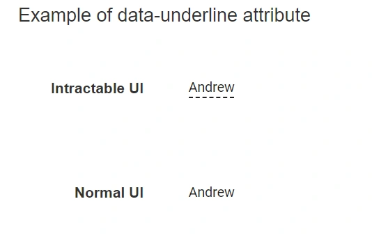
}Display modes
By default, the In-place Editor input element is highlighted with a dotted underline. To remove dotted underline from input element, add {"data-underline", "false" } attribute at In-place Editor root element.
The following example shows interactive and normal display modes.
@using Syncfusion.Blazor.InPlaceEditor
@using Syncfusion.Blazor.Inputs

<h4>Example of data-underline attribute</h4>
<table class="table-section">
    <tr>
        <td class="col-lg-6 col-md-6 col-sm-6 col-xs-6 control-title"> Intractable UI </td>
        <td class="col-lg-6 col-md-6 col-sm-6 col-xs-6">
            <SfInPlaceEditor @bind-Value="@TextValue" TValue="string" SubmitOnEnter="true">
                <EditorComponent>
                    <SfTextBox @bind-Value="@TextValue" Placeholder="Enter some text"></SfTextBox>
                </EditorComponent>
            </SfInPlaceEditor>
        </td>
    </tr>
    <tr>
        <td class="col-lg-6 col-md-6 col-sm-6 col-xs-6 control-title"> Normal UI </td>
        <td class="col-lg-6 col-md-6 col-sm-6 col-xs-6">
            <SfInPlaceEditor @bind-Value="@TextValue" TValue="string" SubmitOnEnter="true" @attributes="htmlAttribute">
                <EditorComponent>
                    <SfTextBox @bind-Value="@TextValue" Placeholder="Enter some text"></SfTextBox>
                </EditorComponent>
            </SfInPlaceEditor>
        </td>
    </tr>
</table>

<style>
    .table-section {
        margin: 0 auto;
    }

    td {
        padding: 20px 0;
        min-width: 230px;
        height: 100px;
    }

    .control-title {
        font-weight: 600;
        padding-right: 20px;
        text-align: right;
        width: 50%;
    }

    h4 {
        text-align: center;
    }
</style>

@code {
    public string TextValue = "Andrew";

    Dictionary<string, object> htmlAttribute = new Dictionary<string, object>() {
        {"data-underline", "false" }
    };
}