How can I help you?
Customize the UI Appearance of the Blazor Input Mask Component
4 Nov 20251 minute to read
The appearance of the MaskedTextBox can be customized by assigning a custom CssClass to the component and defining CSS rules for that class. The CssClass is applied to the component wrapper, allowing targeted styling of the wrapper, floating label, and input elements. For reference, see CssClass, Mask, Placeholder, and FloatLabelType properties in the API.
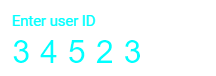
The following example demonstrates how to change the appearance of the MaskedTextBox.
@using Syncfusion.Blazor.Inputs

<SfMaskedTextBox Mask="00000" Value="34523" CssClass="e-style" Placeholder="Enter user ID" FloatLabelType="@FloatLabelType.Always"> </SfMaskedTextBox>

<style>
    .e-mask.e-style .e-control.e-maskedtextbox {
        color: #00ffff;
        letter-spacing: 10px;
        font-size: xx-large;
        border: 1px;
        border-color: #ffffff;
    }

    .e-control-wrapper.e-mask.e-float-input.e-style .e-float-line::before {
        background: #ffffff;
    }

    .e-control-wrapper.e-mask.e-float-input.e-style .e-float-line::after {
        background: #ffffff;
    }

    .e-control-wrapper.e-mask.e-float-input.e-style .e-float-text.e-label-top {
        color: #00ffff;
        font-size: medium;
    }
</style>