Mask Configuration in Blazor Input Mask Component
15 Jun 20267 minutes to read
The Mask is a set of standard and custom elements that validate user input based on defined rules.
NOTE
When the Mask property is not set or is empty, the MaskedTextBox behaves as a text input element.
Standard mask elements
The following table lists the mask elements and their behavior based on theMSDN standard.
The mask can be formed by combining any one or more of these mask elements.
| Mask Element | Description |
|---|---|
| 0 | Digit required. This element accepts any single digit from 0 to 9. |
| 9 | Digit or space, optional. |
| # | Digit or space, optional. Plus (+) and minus (-) signs are allowed. |
| L | Letter required. Accepts letters a-z and A-Z. |
| ? | Letter or space, optional. |
| & | Requires a character. |
| C | Character or space, optional. |
| A | Alphanumeric (A-Za-z0-9) required. |
| a | Alphanumeric (A-Za-z0-9) or space, optional. |
| < | Shift down. Converts all characters to lowercase. |
| > | Shift up. Converts all characters to uppercase. |
| | | Disables a previous shift up or shift down. |
| \\ | Escapes a mask character, turning it into a literal. |
| All other characters | Literals. All non-mask elements (literals) appear as themselves within the MaskedTextBox. |
The following example demonstrates the usage of standard mask elements.
@using Syncfusion.Blazor.Inputs

<SfMaskedTextBox Mask="#####" Placeholder="Mask ##### (ex: 012+-)" FloatLabelType="@FloatLabelType.Always"></SfMaskedTextBox>
<SfMaskedTextBox Mask="LLLLLL" Placeholder="Mask LLLLLL (ex: Sample)" FloatLabelType="@FloatLabelType.Always"></SfMaskedTextBox>
<SfMaskedTextBox Mask="&&&&&" Placeholder="Mask &&&&& (ex: A12#)" FloatLabelType="@FloatLabelType.Always"></SfMaskedTextBox>
<SfMaskedTextBox Mask=">LLL<LLL" Placeholder="Mask >LLL<LL (ex: SAMple)" FloatLabelType="@FloatLabelType.Always"></SfMaskedTextBox>
<SfMaskedTextBox Mask="\\A999" Placeholder="Mask \\A999 (ex: A321)" FloatLabelType="@FloatLabelType.Always"></SfMaskedTextBox>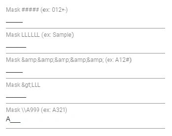
Custom mask elements
Beyond the standard mask elements, the mask can be configured with custom characters or regular expressions to define specific behavior.
Custom characters
Define any non-mask character as a mask element and specify its behavior by using the CustomCharacters property.
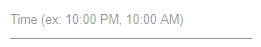
In the following example, the non-mask element P accepts P, A, p, a, and M accepts M, m, as defined in the custom characters collection.
@using Syncfusion.Blazor.Inputs

<SfMaskedTextBox Mask="00:00 >PM" Placeholder="Time (ex: 10:00 PM, 10:00 AM)" CustomCharacters="@CustomMask"></SfMaskedTextBox>

@code {
    public Dictionary<string, string> CustomMask = new Dictionary<string, string>()
    {
        {"P" , "P,p,A,a" },
        {"M" , "m,M" }
    };
}
Regular expression
Instead of predefined mask elements, use a regular expression to validate the input at a particular position. Enclose each position’s regular expression in square brackets (for example, [Regex]).
In the following example, a regular expression is set for each input position.
@using Syncfusion.Blazor.Inputs

<SfMaskedTextBox Placeholder="Enter value" Mask="[0-2][0-9][0-9].[0-2][0-9][0-9].[0-2][0-9][0-9].[0-2][0-9][0-9]" FloatLabelType="@FloatLabelType.Auto"></SfMaskedTextBox>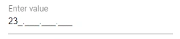
Prompt character
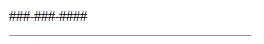
The prompt character is the symbol used to indicate input positions defined by the mask. Customize the prompt character by using the PromptChar property.
The following example demonstrates the MaskedTextBox with a customized prompt character #.
@using Syncfusion.Blazor.Inputs

<SfMaskedTextBox Mask="999-999-9999" PromptChar="@PromptCharacter"></SfMaskedTextBox>

@code{
    public char PromptCharacter { get; set; } = '#';
}
Include literals in the value
By default, the component’s Value returns the raw value (without literals). To include mask literals in the returned value, enable the EnableLiterals property.
The following example demonstrates how to obtain the value with mask literals.
@using Syncfusion.Blazor.Inputs
@using Syncfusion.Blazor.Buttons

<div class="example-content">
<label class="example-label">Mobile Number</label>
<SfMaskedTextBox Mask="(000)-000-0000" EnableLiterals="@IncludeLiterals" @bind-Value="@Value"></SfMaskedTextBox>
<SfCheckBox Label="Included Literals" @bind-Checked="@IncludeLiterals"></SfCheckBox>
<label class="example-label">Value : "@Value"</label>
</div>
@code
{
    public bool IncludeLiterals { get; set; } = true;
    public string Value { get; set; } = "9867433221";
}
<style>

    .example-content{
        margin : 10px;
        width :200px;
    }
    .example-label{
        margin : 5px;
        padding-top : 3px;
    }

</style>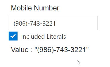
Prompt placeholder
By default, non-filling blank spaces in the mask are replaced with empty string in the Value property. You can change that prompt placeholder by using PromptPlaceholder property.
Set the Null value to the PromptPlaceholder property when you don’t want to use this character in the Value property.
NOTE
An empty PromptPlaceholder will apply to the Value property when you have enabled the EnableLiterals property.
@using Syncfusion.Blazor.Inputs
@using Syncfusion.Blazor.DropDowns;

<div class="example-content">
<label class="example-label">Mobile Number</label>
<SfMaskedTextBox Mask="000-000-0000" @bind-Value="@Value" EnableLiterals=true PromptPlaceholder="@PromptPlaceHolder" ></SfMaskedTextBox>
<label  class="example-label">Value : "@Value"</label>
<label class="example-label">Prompt Placeholder Character</label>
<SfDropDownList TValue="string" TItem="PromptPlaceHolders" DataSource="@PlaceholderList"  @bind-Index="@PlaceholderCharater">
<DropDownListEvents TItem="PromptPlaceHolders" TValue="string" ValueChange="@OnPromptPlaceChange"></DropDownListEvents>
<DropDownListFieldSettings Text="Character" Value="ID"></DropDownListFieldSettings>
</SfDropDownList>
</div>


@code
{
    public string Value { get; set; } = "9876543";
    public char PromptPlaceHolder { get; set; } = '#';
    public class PromptPlaceHolders
    {
        public char ID { get; set; }
        public char Character { get; set; }
    }
    private int? PlaceholderCharater { get; set; } = 0;
    private List<PromptPlaceHolders> PlaceholderList = new List<PromptPlaceHolders>()
    {
        new PromptPlaceHolders(){ ID= '1', Character = '#' },
        new PromptPlaceHolders(){ ID= '2', Character = '_' },
        new PromptPlaceHolders(){ ID= '3', Character = '*' }
    };

    private void OnPromptPlaceChange(Syncfusion.Blazor.DropDowns.ChangeEventArgs<string, PromptPlaceHolders> args)
    {
        this.PromptPlaceHolder = args.ItemData.Character;
    }
}
<style>
    .example-content{
        padding : 5px;
        width :300px;
    }
    .example-label{
        margin : 3px;
    }
</style>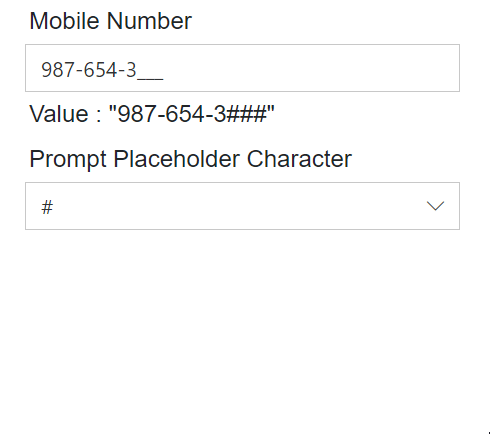
NOTE
Don’t use the PromptPlaceholder character as valid for the user input in the mask. For example, if you have a mask “00/00/0000” and PromptPlaceholder as “5” then you type 2 in the input, Value will become “25/55/5555”. Its lead to return wrong value as Value of the component.