Responsive Layout in Blazor Kanban Component
12 Jun 20261 minute to read
The Blazor Kanban Board component supports responsive behavior, automatically adapting its layout based on the width and height of the client’s browser.
Available layouts
The Kanban component provides the following responsive layouts:
- Default Layout
- Swimlane Layout
Default Layout
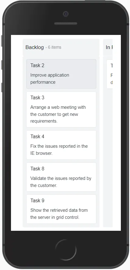
In responsive mode, the Kanban user interface is optimized for smaller screens. The layout is adjusted so that:
- The first column occupies 80% of the screen width.
- The second column occupies 20% of the screen width.
- Users can tap and hold a Kanban card to initiate drag-and-drop.
- Swipe left or right to navigate between columns.
Swimlane Layout
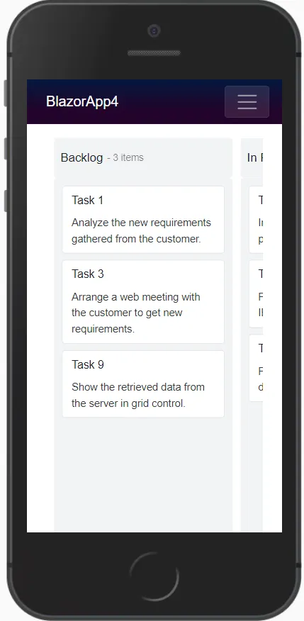
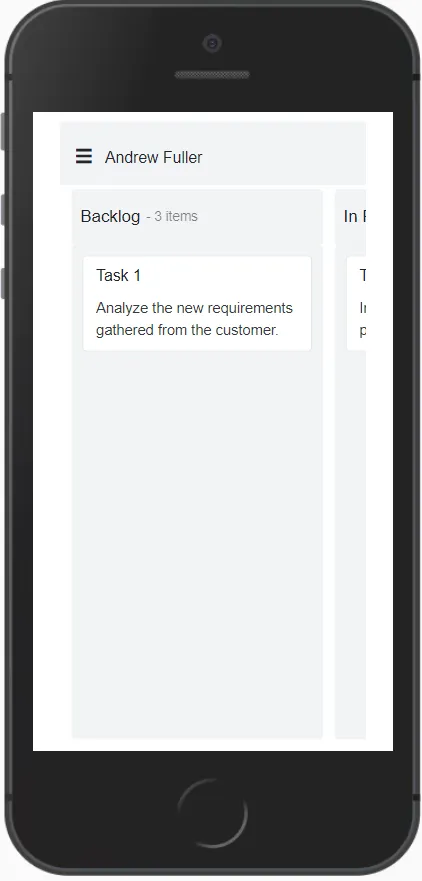
In responsive mode, the swimlane header is displayed with a menu icon at the top of the Kanban board. When the icon is clicked:
- A popup displays all available swimlane group headers.
- Selecting a swimlane group updates the Kanban board to show the corresponding cards.
- By default, the first swimlane group is selected and displayed.
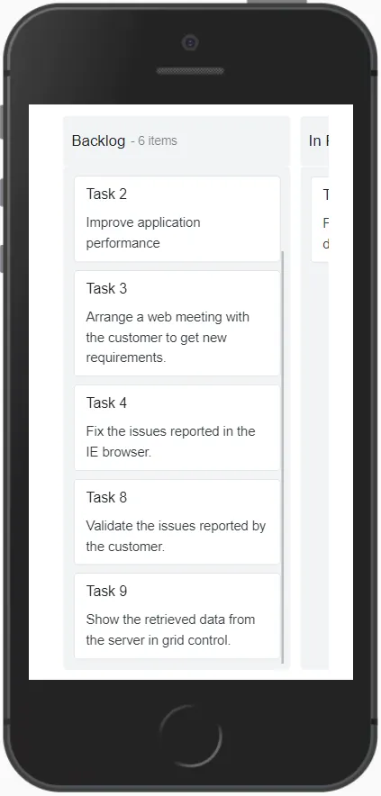
Scrolling
Column scrolling will be shown when exceeding the screen size in the columns.
Selection
Select particular cards in the Kanban board by tapping the card.
Single Selection
Single card will be selected when you tap the card once and the selection will be removed when you select another card.