Axes in Blazor Linear Gauge Component
23 Jun 202612 minutes to read
Axis is used to indicate the numeric values in the linear scale. The Linear Gauge component can have any number of axes. The sub-elements of an axis are line, ticks, labels, ranges, and pointers.
Setting the start value and end value of the axis
The start value and end value for the Linear Gauge can be set using the Minimum and Maximum properties in the LinearGaugeAxis class respectively. By default, the start value of the axis is 0 and the end value of the axis is 100.
@using Syncfusion.Blazor.LinearGauge

<SfLinearGauge>
    <LinearGaugeAxes>
        <LinearGaugeAxis Minimum="20" Maximum="200">
        </LinearGaugeAxis>
    </LinearGaugeAxes>
</SfLinearGauge>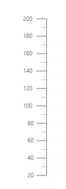
Line Customization
The following properties in the LinearGaugeLine class can be used to customize the axis line in the Linear Gauge.
- Height - To set the length of the axis line.
- Width - To set the thickness of the axis line.
- Color - To set the color of the axis line.
- Offset - To render the axis line with the specified distance from the Linear Gauge.
@using Syncfusion.Blazor.LinearGauge

<SfLinearGauge>
    <LinearGaugeAxes>
        <LinearGaugeAxis>
            <LinearGaugeLine Height="150" Width="2" Color="#4286f4" Offset="2">
            </LinearGaugeLine>
        </LinearGaugeAxis>
    </LinearGaugeAxes>
</SfLinearGauge>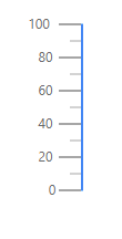
Ticks Customization
Ticks are used to specify the interval in the axis. Ticks are of two types, major ticks and minor ticks. The following properties in the LinearGaugeMajorTicks and LinearGaugeMinorTicks classes can be used to customize the major ticks and minor ticks respectively.
- Height - To set the length of the major and minor ticks in pixel values.
- Color - To set the color of the major and minor ticks of the Linear Gauge.
- Width - To set the thickness of the major and minor ticks in pixel values.
- Interval - To set the interval for the major ticks and minor ticks in the Linear Gauge.
@using Syncfusion.Blazor.LinearGauge

<SfLinearGauge>
    <LinearGaugeAxes>
        <LinearGaugeAxis Minimum=20 Maximum=140>
            <LinearGaugeMajorTicks Color="red" Interval="20" Height="20" Width="3">
            </LinearGaugeMajorTicks>
            <LinearGaugeMinorTicks Color="Orange" Interval="5" Height="10">
            </LinearGaugeMinorTicks>
            <LinearGaugePointers>
                <LinearGaugePointer></LinearGaugePointer>
            </LinearGaugePointers>
        </LinearGaugeAxis>
    </LinearGaugeAxes>
</SfLinearGauge>
Positioning the ticks
The minor and major ticks can be positioned by using the Offset and Position properties. The Offset is used to render the ticks with the specified distance from the axis. By default, the offset value is 0. The possible values of the Position property are “Inside”, “Outside”, “Cross”, and “Auto”. By default, the ticks will be placed inside the axis.
@using Syncfusion.Blazor.LinearGauge

<SfLinearGauge>
    <LinearGaugeAxes>
        <LinearGaugeAxis Minimum="0" Maximum="160">
           <LinearGaugeMajorTicks Interval="10" Color="red" Height="10" Width="3"
                                  Position="Position.Outside">
           </LinearGaugeMajorTicks>
            <LinearGaugeMinorTicks Interval="5" Color="green" Height="5" Width="2"
                                   Position="Position.Cross">
            </LinearGaugeMinorTicks>
            <LinearGaugePointers>
                <LinearGaugePointer></LinearGaugePointer>
            </LinearGaugePointers>
        </LinearGaugeAxis>
    </LinearGaugeAxes>
</SfLinearGauge>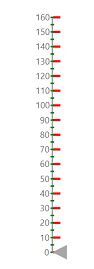
Labels Customization
The style of the labels can be customized using the following properties in LinearGaugeAxisLabelFont class in the LinearGaugeAxisLabelStyle.
- Color - To set the color of the axis label.
- FontFamily - To set the font family of the axis label.
- FontStyle - To set the font style of the axis label.
- FontWeight - To set the font weight of the axis label.
- Opacity - To set the opacity of the axis label.
- Size - To set the size of the axis label.
@using Syncfusion.Blazor.LinearGauge

<SfLinearGauge>
    <LinearGaugeAxes>
        <LinearGaugeAxis>
            <LinearGaugeAxisLabelStyle>
                <LinearGaugeAxisLabelFont Color="red"></LinearGaugeAxisLabelFont>
            </LinearGaugeAxisLabelStyle>
        </LinearGaugeAxis>
    </LinearGaugeAxes>
</SfLinearGauge>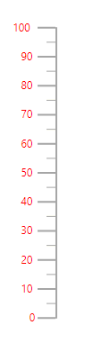
Positioning the axis label
Labels can be positioned by using Offset and Position properties in the LinearGaugeAxisLabelStyle. The Offset defines the distance between the labels and ticks. By default, the offset value is 0. The possible values of the Position property are “Inside”, “Outside”, “Cross”, and “Auto”. By default, the labels will be placed inside the axis.
@using Syncfusion.Blazor.LinearGauge

<SfLinearGauge>
    <LinearGaugeAxes>
        <LinearGaugeAxis>
            <LinearGaugeAxisLabelStyle Offset="55" Position="Position.Cross">
            </LinearGaugeAxisLabelStyle>
            <LinearGaugePointers>
                <LinearGaugePointer></LinearGaugePointer>
            </LinearGaugePointers>
        </LinearGaugeAxis>
    </LinearGaugeAxes>
</SfLinearGauge>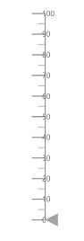
Customizing the display of the last label
If the last label is not in the visible range, it will be hidden by default. The last label can be made visible by setting the ShowLastLabel property as true in the LinearGaugeAxis class.
@using Syncfusion.Blazor.LinearGauge

<SfLinearGauge>
    <LinearGaugeAxes>
        <LinearGaugeAxis Minimum="0" Maximum="170" ShowLastLabel="true">
            <LinearGaugePointers>
                <LinearGaugePointer></LinearGaugePointer>
            </LinearGaugePointers>
        </LinearGaugeAxis>
    </LinearGaugeAxes>
</SfLinearGauge>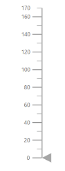
Label Format
Axis labels in the Linear Gauge control can be formatted using the Format property in the LinearGaugeAxisLabelStyle class. It is used to render the axis labels in a certain format or to add a user-defined unit in the label. It works with the help of placeholder like {value}°C, where value represents the axis value. For example, 20°C.
@using Syncfusion.Blazor.LinearGauge

<SfLinearGauge>
    <LinearGaugeAxes>
        <LinearGaugeAxis Minimum =20 Maximum =140>
            <LinearGaugeAxisLabelStyle Format= "{value}°C">
            </LinearGaugeAxisLabelStyle>
            <LinearGaugePointers>
                <LinearGaugePointer></LinearGaugePointer>
            </LinearGaugePointers>
        </LinearGaugeAxis>
    </LinearGaugeAxes>
</SfLinearGauge>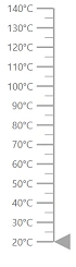
Displaying numeric format in labels
The numeric formats such as currency, percentage, and so on can be displayed in the labels of the Linear Gauge using the Format property in the SfLinearGauge class. The following table describes the result of applying some commonly used label formats on numeric values.
| Label Value | Label Format property value | Result | Description |
| 1000 | n1 | 1000.0 | The number is rounded to 1 decimal place. |
| 1000 | n2 | 1000.00 | The number is rounded to 2 decimal places. |
| 1000 | n3 | 1000.000 | The number is rounded to 3 decimal places. |
| 0.01 | p1 | 1.0% | The number is converted to percentage with 1 decimal place. |
| 0.01 | p2 | 1.00% | The number is converted to percentage with 2 decimal places. |
| 0.01 | p3 | 1.000% | The number is converted to percentage with 3 decimal places. |
| 1000 | c1 | $1,000.0 | The currency symbol is appended to number and number is rounded to 1 decimal place. |
| 1000 | c2 | $1,000.00 | The currency symbol is appended to number and number is rounded to 2 decimal places. |
@using Syncfusion.Blazor.LinearGauge

<SfLinearGauge Format="c">
    <LinearGaugeAxes>
        <LinearGaugeAxis>
        </LinearGaugeAxis>
    </LinearGaugeAxes>
</SfLinearGauge>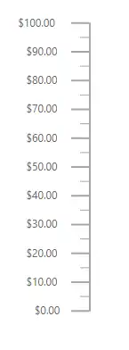
Orientation
By default, the Linear Gauge is rendered vertically. To change its orientation, the Orientation property must be set to Horizontal.
@using Syncfusion.Blazor.LinearGauge

<SfLinearGauge Orientation="Orientation.Horizontal">
    <LinearGaugeAxes>
        <LinearGaugeAxis Minimum="20" Maximum="140">
            <LinearGaugeMajorTicks Interval="10"></LinearGaugeMajorTicks>
        </LinearGaugeAxis>
    </LinearGaugeAxes>
</SfLinearGauge>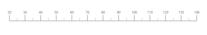
Inverted Axis
The axis of the Linear Gauge component can be inversed by setting the IsInversed property to true in the LinearGaugeAxis.
@using Syncfusion.Blazor.LinearGauge

<SfLinearGauge>
    <LinearGaugeAxes>
        <LinearGaugeAxis IsInversed="true">
            <LinearGaugePointers>
                <LinearGaugePointer></LinearGaugePointer>
            </LinearGaugePointers>
        </LinearGaugeAxis>
    </LinearGaugeAxes>
</SfLinearGauge>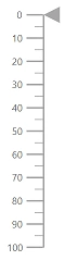
Opposed Axis
To place an axis opposite from its original position, OpposedPosition property in the LinearGaugeAxis class must be set as true.
@using Syncfusion.Blazor.LinearGauge

<SfLinearGauge>
    <LinearGaugeAxes>
        <LinearGaugeAxis OpposedPosition="true">
            <LinearGaugePointers>
                <LinearGaugePointer></LinearGaugePointer>
            </LinearGaugePointers>
        </LinearGaugeAxis>
    </LinearGaugeAxes>
</SfLinearGauge>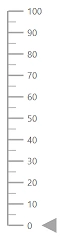
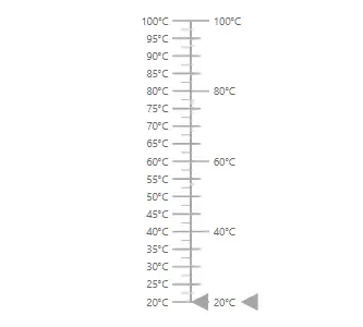
Multiple Axes
Multiple axes can be added to the Linear Gauge by adding multiple LinearGaugeAxis classes in the LinearGaugeAxes class and customization can be done with the LinearGaugeAxis class. Each axis can be customized separately.
@using Syncfusion.Blazor.LinearGauge

<SfLinearGauge>
    <LinearGaugeAxes>
        <LinearGaugeAxis Minimum=20 Maximum=100>
            <LinearGaugeAxisLabelStyle Format="{value}°C">
            </LinearGaugeAxisLabelStyle>
            <LinearGaugePointers>
                <LinearGaugePointer PointerValue=20></LinearGaugePointer>
            </LinearGaugePointers>
        </LinearGaugeAxis>
        <LinearGaugeAxis Minimum=20 Maximum=100 OpposedPosition=true>
            <LinearGaugeMajorTicks Interval="20" Height="20">
            </LinearGaugeMajorTicks>
            <LinearGaugeMinorTicks Interval="5" Height="10">
            </LinearGaugeMinorTicks>
            <LinearGaugeAxisLabelStyle Format="{value}°C">
            </LinearGaugeAxisLabelStyle>
            <LinearGaugePointers>
                <LinearGaugePointer PointerValue=20></LinearGaugePointer>
            </LinearGaugePointers>
        </LinearGaugeAxis>
    </LinearGaugeAxes>
</SfLinearGauge>