How can I help you?
Appearance in Blazor Linear Gauge Component
15 Dec 20226 minutes to read
Customizing the Linear Gauge area
The following property and components are available in the SfLinearGauge to customize the Linear Gauge area.
- Background - Applies the background color for the Linear gauge.
- LinearGaugeBorder - To customize the color and width of the border in Linear Gauge.
- LinearGaugeMargin - To customize the margins of the Linear Gauge.
@using Syncfusion.Blazor.LinearGauge

<SfLinearGauge Width="200px" Height="400px" Background="skyblue">
    <LinearGaugeBorder Color="#FF0000" Width="2"></LinearGaugeBorder>
    <LinearGaugeMargin Left="20" Right="20" Top="20" Bottom="20"></LinearGaugeMargin>
    <LinearGaugeAxes>
        <LinearGaugeAxis>
        </LinearGaugeAxis>
    </LinearGaugeAxes>
</SfLinearGauge>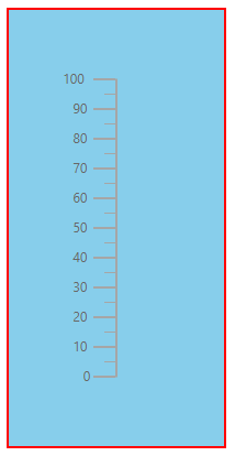
Setting up the Linear Gauge title
The title for the Linear Gauge can be set using Title property in SfLinearGauge. Its appearance can be customized using the LinearGaugeTitleStyle with the below properties.
- Color - Specifies the text color of the title.
- FontStyle - Specifies the font style of the title.
- FontWeight - Specifies the font weight of the title.
- Size - Specifies the font size of the title.
- Opacity - Specifies the opacity of the title.
- FontFamily - Specifies the font family of the title.
@using Syncfusion.Blazor.LinearGauge

<SfLinearGauge Title="Linear Gauge">
    <LinearGaugeTitleStyle FontFamily="Arial" FontWeight="regular" FontStyle="italic" Color="#E27F2D" Size="23px">
    </LinearGaugeTitleStyle>
    <LinearGaugeAxes>
        <LinearGaugeAxis>
        </LinearGaugeAxis>
    </LinearGaugeAxes>
</SfLinearGauge>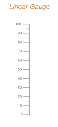
Customizing the Linear Gauge container
The area used to render the ranges and pointers at the center position of the gauge is called container. The following types of container to be applicable for Linear Gauge.
- Normal
- Rounded Rectangle
- Thermometer
The type of the container can be modified by using the Type property in LinearGaugeContainer. The container can be customized by using the following properties and component in LinearGaugeContainer,
- Offset - To place the container with the specified distance from the axis of the Linear Gauge.
- Width - To set the thickness of the container.
- Height - To set the length of the container.
- BackgroundColor - To set the background color of the container.
- LinearGaugeContainerBorder - To set the color and width for the border of the container.
Normal
The Normal type will render the container as a rectangle and this is the default container type.
@using Syncfusion.Blazor.LinearGauge

<SfLinearGauge>
    <LinearGaugeContainer Width="30">
        <LinearGaugeAxes>
            <LinearGaugeAxis>
                <LinearGaugePointers>
                    <LinearGaugePointer PointerValue="50" Width="15" Type="Point.Bar"
                                        Color="#a6a6a6">
                    </LinearGaugePointer>
                </LinearGaugePointers>
            </LinearGaugeAxis>
        </LinearGaugeAxes>
    </LinearGaugeContainer>
</SfLinearGauge>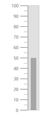
Rounded Rectangle
The RoundedRectangle type will render the container as a rectangle with rounded corner radius. The rounded corner radius of the container can be customized using the RoundedCornerRadius property in LinearGaugeContainer.
@using Syncfusion.Blazor.LinearGauge

<SfLinearGauge>
    <LinearGaugeContainer Width="30" Type="ContainerType.RoundedRectangle">
        <LinearGaugeAxes>
            <LinearGaugeAxis>
                <LinearGaugePointers>
                    <LinearGaugePointer PointerValue="50" Width="15" Type="Point.Bar"
                                        Color="#a6a6a6">
                    </LinearGaugePointer>
                </LinearGaugePointers>
            </LinearGaugeAxis>
        </LinearGaugeAxes>
    </LinearGaugeContainer>
</SfLinearGauge>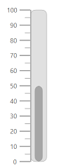
Thermometer
The Thermometer type will render the container similar to the appearance of thermometer.
@using Syncfusion.Blazor.LinearGauge

<SfLinearGauge>
    <LinearGaugeContainer Width="30" Type="ContainerType.Thermometer">
        <LinearGaugeAxes>
            <LinearGaugeAxis>
                <LinearGaugePointers>
                    <LinearGaugePointer PointerValue="80" Width="15" Type="Point.Bar"
                                        Color="#a6a6a6">
                    </LinearGaugePointer>
                </LinearGaugePointers>
            </LinearGaugeAxis>
        </LinearGaugeAxes>
    </LinearGaugeContainer>
</SfLinearGauge>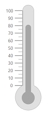
Fitting the Linear Gauge to the control
The Linear Gauge component is rendered with margin by default. To remove the margin around the Linear Gauge, the AllowMargin property in SfLinearGauge is set as false.
@using Syncfusion.Blazor.LinearGauge

<SfLinearGauge AllowMargin="false" Width="100%" Height="100%"
               Orientation="Orientation.Horizontal" Background="#04fbfb">
    <LinearGaugeBorder Color="#FF0000" Width="2"></LinearGaugeBorder>
    <LinearGaugeMargin Left="0" Right="0" Top="0" Bottom="0"></LinearGaugeMargin>
    <LinearGaugeAxes>
        <LinearGaugeAxis>
        </LinearGaugeAxis>
    </LinearGaugeAxes>
</SfLinearGauge>
NOTE
To use this feature, set the AllowMargin property to false, the Width property to 100% and the properties of LinearGaugeMargin to 0.