Ranges in Blazor Linear Gauge Component
23 Jun 202615 minutes to read
Range is the set of values in the axis. The range can be defined using the Start and End properties in the LinearGaugeRange. Any number of ranges can be added to the Linear Gauge using the LinearGaugeRanges.
@using Syncfusion.Blazor.LinearGauge

<SfLinearGauge>
    <LinearGaugeAxes>
        <LinearGaugeAxis Minimum="0" Maximum="100">
            <LinearGaugeRanges>
                <LinearGaugeRange Start="50" End="80" StartWidth="20" EndWidth="20">
                </LinearGaugeRange>
            </LinearGaugeRanges>
            <LinearGaugePointers>
                <LinearGaugePointer></LinearGaugePointer>
            </LinearGaugePointers>
        </LinearGaugeAxis>
    </LinearGaugeAxes>
</SfLinearGauge>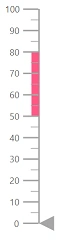
Customizing the range
Ranges can be customized using the following properties in LinearGaugeRange.
- StartWidth - Customize the range thickness at the start axis value.
- EndWidth - Customize the range thickness at the end axis value.
- Color - Customize the range color.
- Position - To place the range. By default, the range is placed outside of the axis. To change the position, this property can be set as “Inside”, “Outside”, “Cross”, or “Auto”.
- Offset - To place the range with specified distance from the axis.
- LinearGaugeRangeBorder - Customize color and width of range border.
@using Syncfusion.Blazor.LinearGauge

<SfLinearGauge>
    <LinearGaugeAxes>
        <LinearGaugeAxis Minimum="0" Maximum="100">
            <LinearGaugeRanges>
                <LinearGaugeRange Start="50" End="80" StartWidth="2" EndWidth="15"
                                  Color="orange" Position="Position.Inside"
                                  Offset="4">
                    <LinearGaugeRangeBorder Color="red" Width="2">
                    </LinearGaugeRangeBorder>
                </LinearGaugeRange>
            </LinearGaugeRanges>
            <LinearGaugePointers>
                <LinearGaugePointer></LinearGaugePointer>
            </LinearGaugePointers>
        </LinearGaugeAxis>
    </LinearGaugeAxes>
</SfLinearGauge>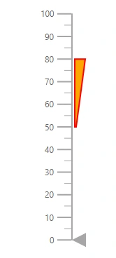
Setting the range color for the labels
To set the color of the labels like the range color, set the UseRangeColor property as true in the LinearGaugeAxisLabelStyle.
@using Syncfusion.Blazor.LinearGauge

<SfLinearGauge>
    <LinearGaugeAxes>
        <LinearGaugeAxis>
           <LinearGaugeAxisLabelStyle UseRangeColor="true">
           </LinearGaugeAxisLabelStyle>
            <LinearGaugeRanges>
                <LinearGaugeRange Start="20" End="60" Color="red">
                </LinearGaugeRange>
            </LinearGaugeRanges>
        </LinearGaugeAxis>
    </LinearGaugeAxes>
</SfLinearGauge>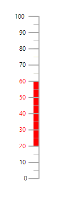
Multiple ranges
Multiple ranges can be added to the Linear Gauge by adding collections of LinearGaugeRange in the LinearGaugeRanges and customization of ranges can be done with LinearGaugeRange.
@using Syncfusion.Blazor.LinearGauge

<SfLinearGauge>
    <LinearGaugeAxes>
        <LinearGaugeAxis>
            <LinearGaugeRanges>
                <LinearGaugeRange Start="1" End="30" StartWidth="10" EndWidth="10"
                                  Color="#41f47f">
                </LinearGaugeRange>
                <LinearGaugeRange Start="30" End="50" StartWidth="10" EndWidth="10"
                                  Color="#f49441">
                </LinearGaugeRange>
                <LinearGaugeRange Start="50" End="80" StartWidth="10" EndWidth="10"
                                  Color="#cd41f4">
                </LinearGaugeRange>
            </LinearGaugeRanges>
            <LinearGaugePointers>
                <LinearGaugePointer></LinearGaugePointer>
            </LinearGaugePointers>
        </LinearGaugeAxis>
    </LinearGaugeAxes>
</SfLinearGauge>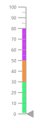
Gradient Color
Gradient support allows the addition of multiple colors in the range. The following gradient types are supported in the Linear Gauge.
- Linear Gradient
- Radial Gradient
Linear Gradient
Using linear-gradient, colors will be applied in a linear progression. The start value of the linear gradient can be set using the StartValue property. The end value of the linear gradient will be set using the EndValue property. The color stop values such as Color, Opacity, and Offset to be defined in ColorStop.
@using Syncfusion.Blazor.LinearGauge

<SfLinearGauge Orientation="Orientation.Horizontal">
    <LinearGaugeContainer Width="30" Offset="30">
        <LinearGaugeContainerBorder Width="0" />
        <LinearGaugeAxes>
            <LinearGaugeAxis>
                <LinearGaugeAxisLabelStyle Offset="55">
                    <LinearGaugeAxisLabelFont Color="#424242" />
                </LinearGaugeAxisLabelStyle>
                <LinearGaugeLine Width="0" />
                <LinearGaugeMajorTicks Height="0" Interval="25" />
                <LinearGaugeMinorTicks Height="0" />
                <LinearGaugePointers>
                    <LinearGaugePointer PointerValue="80" Height="25" Width="35"
                                Color="#f54ea2" Offset="-40" MarkerType="MarkerType.Triangle"
                                Placement="Syncfusion.Blazor.LinearGauge.Placement.Near">
                    </LinearGaugePointer>
                </LinearGaugePointers>
                <LinearGaugeRanges>
                    <LinearGaugeRange Color="#f54ea2" Start="0" End="80"
                                      StartWidth="30" EndWidth="30" Offset="30">
                        <LinearGradient StartValue="1%" EndValue="99%">
                            <ColorStops>
                                <ColorStop Opacity="1" Offset="0%" Color="#fef3f9">
                                </ColorStop>
                                <ColorStop Opacity="1" Offset="100%" Color="#f54ea2">
                                </ColorStop>
                            </ColorStops>
                        </LinearGradient>
                    </LinearGaugeRange>
                </LinearGaugeRanges>
            </LinearGaugeAxis>
        </LinearGaugeAxes>
    </LinearGaugeContainer>
</SfLinearGauge>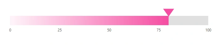
Radial Gradient
Using radial gradient, colors will be applied in circular progression. The inner-circle position of the radial gradient will be set using the InnerPosition class. The outer circle position of the radial gradient can be set using the OuterPosition class. The color stop values such as Color, Opacity, and Offset to be defined in ColorStop.
@using Syncfusion.Blazor.LinearGauge

<SfLinearGauge Orientation="Orientation.Horizontal">
    <LinearGaugeContainer Width="30" Offset="30">
        <LinearGaugeContainerBorder Width="0" />
        <LinearGaugeAxes>
            <LinearGaugeAxis>
                <LinearGaugeAxisLabelStyle Offset="55">
                    <LinearGaugeAxisLabelFont Color="#424242" />
                </LinearGaugeAxisLabelStyle>
                <LinearGaugeLine Width="0" />
                <LinearGaugeMajorTicks Height="0" Interval="25" />
                <LinearGaugeMinorTicks Height="0" />
                <LinearGaugePointers>
                    <LinearGaugePointer PointerValue="80" Height="25" Width="35"
                                Color="#f54ea2" Offset="-40" MarkerType="MarkerType.Triangle"
                                Placement="Syncfusion.Blazor.LinearGauge.Placement.Near">
                    </LinearGaugePointer>
                </LinearGaugePointers>
                <LinearGaugeRanges>
                    <LinearGaugeRange Color="#f54ea2" Start="0" End="80"
                                      StartWidth="30" EndWidth="30" Offset="30">
                        <RadialGradient Radius="65%">
                             <InnerPosition X="50%" Y="70%"></InnerPosition>
                             <OuterPosition X="60%" Y="60%"></OuterPosition>
                            <ColorStops>
                                <ColorStop Opacity="0.9" Color= "#fff5f5" Offset="5%">
                                </ColorStop>
                                <ColorStop Opacity="1" Color="#f54ea2" Offset="99%">
                                </ColorStop>
                            </ColorStops>
                        </RadialGradient>
                    </LinearGaugeRange>
                </LinearGaugeRanges>
            </LinearGaugeAxis>
        </LinearGaugeAxes>
    </LinearGaugeContainer>
</SfLinearGauge>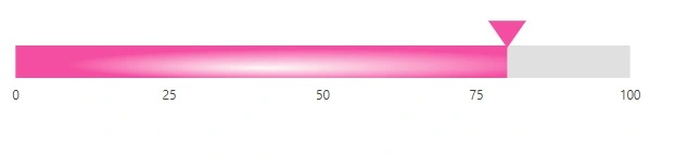
NOTE
If we set both gradients for the range, only the linear gradient gets rendered. If we set the StartValue and EndValue of the LinearGradient as empty strings, then the radial gradient gets rendered in the range of the Linear Gauge.