Template in Blazor Message
24 Jun 20261 minute to read
The message supports templates that allows the user to customize the content with a custom structure. The content can be a string, paragraph, or any other HTML element. The template can be added directly to the SfMessage tags.
In the following sample, the Message component content is customized with HTML elements and Blazor Buttons, which are directly added to the SfMessage tag.
@using Syncfusion.Blazor.Notifications
@using Syncfusion.Blazor.Buttons
<div class="msg-template-section">
<div class="content-section">
<SfButton Content='Show pull request' CssClass="@showBtnClass" OnClick="@showClick"></SfButton>
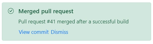
<SfMessage Severity="MessageSeverity.Success" Visible="@visible">
<h1>Merged pull request</h1>
<p>Pull request #41 merged after a successful build</p>
<SfButton CssClass='e-link' Content='View commit'></SfButton>
<SfButton CssClass='e-link' Content='Dismiss' OnClick="@dismissClick"></SfButton>
</SfMessage>
</div>
</div>
@code {
public string showBtnClass = "e-outline e-primary e-success msg-hidden";
public bool visible = true;
public void showClick()
{
this.visible = true;
this.showBtnClass = "e-outline e-primary e-success msg-hidden";
}
public void dismissClick()
{
this.visible = false;
this.showBtnClass = "e-outline e-primary e-success";
}
}
<style>
.msg-template-section .content-section {
margin: 0 auto;
max-width: 450px;
padding-top: 20px;
}
.msg-template-section .e-btn.msg-hidden {
display: none;
}
.msg-template-section .e-message h1 {
margin: 0;
font-size: 16px;
font-weight: 600;
line-height: 1.25;
}
.msg-template-section .e-message .e-msg-icon {
padding: 0 4px;
margin-top: 3px;
}
.msg-template-section .e-message p {
margin: 8px 0 4px;
}
.msg-template-section .e-message .e-btn {
padding: 0;
}
</style>