How can I help you?
Placeholder and Float Label in MultiColumn ComboBox
1 Dec 20257 minutes to read
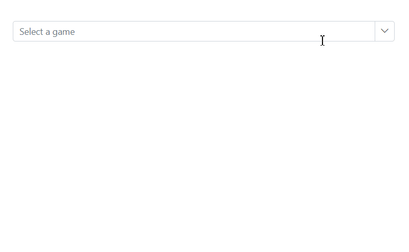
Placeholder
Use the Placeholder property to display a short hint about the expected value when no selection has been made. In the following example, setting Select a game guides the user until an item is chosen.
@using Syncfusion.Blazor.MultiColumnComboBox
@using Syncfusion.Blazor.Data

<SfMultiColumnComboBox TItem="Games" TValue="string" DataSource="LocalData" AllowFiltering=true ValueField="Game" Placeholder="Select a game" TextField="Game" PopupWidth="600px">
</SfMultiColumnComboBox>

@code {

    public class Games
    {
        public string ID { get; set; }
        public string Game { get; set; }
        public string Category { get; set; } // New field
    }
    List<Games> LocalData = new List<Games> {
    new Games() { ID= "Game1", Game= "American Football", Category= "Outdoor" },
    new Games() { ID= "Game2", Game= "Badminton", Category= "Indoor" },
    new Games() { ID= "Game3", Game= "Basketball", Category= "Outdoor" },
    new Games() { ID= "Game4", Game= "Cricket", Category= "Outdoor" },
    new Games() { ID= "Game5", Game= "Football", Category= "Outdoor" },
    new Games() { ID= "Game6", Game= "Golf", Category= "Outdoor" },
    new Games() { ID= "Game7", Game= "Hockey", Category= "Outdoor" },
    new Games() { ID= "Game8", Game= "Rugby", Category= "Outdoor" },
    new Games() { ID= "Game9", Game= "Snooker", Category= "Indoor" }
};

}
Add mandatory indicator using placeholder
A visual mandatory indicator (*) can be appended to the floating placeholder label by targeting the .e-float-text::after CSS selector and setting the content style.
For accessibility, pair this visual cue with semantic validation (for example, apply [Required] to the bound model property or set aria-required="true") so assistive technologies convey the required state.
@using Syncfusion.Blazor.MultiColumnComboBox
@using Syncfusion.Blazor.Inputs

<SfMultiColumnComboBox TItem="Games" TValue="string" DataSource="LocalData" FloatLabelType="Syncfusion.Blazor.Inputs.FloatLabelType.Auto" AllowFiltering=true ValueField="Game" Placeholder="Select a game" TextField="Game" PopupWidth="600px">
</SfMultiColumnComboBox>

@code {

    public class Games
    {
        public string ID { get; set; }
        public string Game { get; set; }
        public string Category { get; set; } // New field
    }
    List<Games> LocalData = new List<Games> {
    new Games() { ID= "Game1", Game= "American Football", Category= "Outdoor" },
    new Games() { ID= "Game2", Game= "Badminton", Category= "Indoor" },
    new Games() { ID= "Game3", Game= "Basketball", Category= "Outdoor" },
    new Games() { ID= "Game4", Game= "Cricket", Category= "Outdoor" },
    new Games() { ID= "Game5", Game= "Football", Category= "Outdoor" },
    new Games() { ID= "Game6", Game= "Golf", Category= "Outdoor" },
    new Games() { ID= "Game7", Game= "Hockey", Category= "Outdoor" },
    new Games() { ID= "Game8", Game= "Rugby", Category= "Outdoor" },
    new Games() { ID= "Game9", Game= "Snooker", Category= "Indoor" }
};

}
<style>
    .e-input-group.e-control-wrapper.e-control-container.e-float-input .e-float-text::after {
        content: "*";
        color: red;
        padding: 4px;
    }
</style>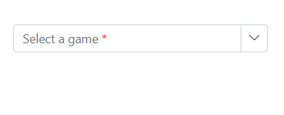
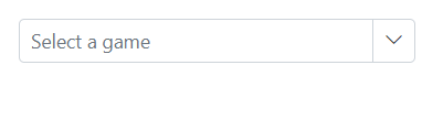
Floating label
Use the FloatLabelType property to control how the placeholder text floats as a label above the input. Floating labels work when a Placeholder is provided. The default is Never.
The floating label supports the following options.
| Type | Description |
|---|---|
| Auto | Floats the label on focus or after a value is entered. |
| Always | Always keeps the label floated above the input. |
| Never | Never floats the label when a placeholder is available (default). |
The FloatLabelType set to Auto is demonstrated in the following example.
@using Syncfusion.Blazor.MultiColumnComboBox
@using Syncfusion.Blazor.Inputs

<SfMultiColumnComboBox TItem="Games" TValue="string" DataSource="LocalData" FloatLabelType="Syncfusion.Blazor.Inputs.FloatLabelType.Auto" AllowFiltering=true ValueField="Game" Placeholder="Select a game" TextField="Game" PopupWidth="600px">
</SfMultiColumnComboBox>

@code {

    public class Games
    {
        public string ID { get; set; }
        public string Game { get; set; }
        public string Category { get; set; } // New field
    }
    List<Games> LocalData = new List<Games> {
    new Games() { ID= "Game1", Game= "American Football", Category= "Outdoor" },
    new Games() { ID= "Game2", Game= "Badminton", Category= "Indoor" },
    new Games() { ID= "Game3", Game= "Basketball", Category= "Outdoor" },
    new Games() { ID= "Game4", Game= "Cricket", Category= "Outdoor" },
    new Games() { ID= "Game5", Game= "Football", Category= "Outdoor" },
    new Games() { ID= "Game6", Game= "Golf", Category= "Outdoor" },
    new Games() { ID= "Game7", Game= "Hockey", Category= "Outdoor" },
    new Games() { ID= "Game8", Game= "Rugby", Category= "Outdoor" },
    new Games() { ID= "Game9", Game= "Snooker", Category= "Indoor" }
};

}