How can I help you?
Value Binding in MultiColumn ComboBox
1 Dec 202516 minutes to read
Value binding synchronizes the selected value between the Blazor MultiColumn ComboBox and the parent component. The control supports two binding approaches:
-
@bind-Valueto bind the selected value -
@bind-Indexto bind by the zero-based item index
Value binding
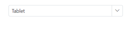
Bind the selected value using the @bind-Value attribute. Supported value types include primitives (such as string, int, bool, enum) and complex types. Ensure the bound value type aligns with the configured ValueField and TextField mapping.
-
TValue: Specifies the selected value type. -
TItem: Specifies the data model type of each item.
When the component value changes, all places bound with the same variable are updated.
@using Syncfusion.Blazor.MultiColumnComboBox

<SfMultiColumnComboBox @bind-Value="@Value" DataSource="@Products" PopupWidth="600px" ValueField="Name" TextField="Name" Placeholder="Select any product"></SfMultiColumnComboBox>

@code {

     public class Product
    {
        public string Name { get; set; }
        public decimal Price { get; set; }
        public string Availability { get; set; }
        public string Category { get; set; }
        public double Rating { get; set; }
    }
    private List<Product> Products = new List<Product>();
    private string Value { get; set; } = "Smartphone";
    protected override Task OnInitializedAsync()
    {
        Products = new List<Product>
        {
            new Product { Name = "Laptop", Price = 999.99m, Availability = "In Stock", Category = "Electronics", Rating = 4.5 },
            new Product { Name = "Smartphone", Price = 599.99m, Availability = "Out of Stock", Category = "Electronics", Rating = 4.3 },
            new Product { Name = "Tablet", Price = 299.99m, Availability = "In Stock", Category = "Electronics", Rating = 4.2 },
            new Product { Name = "Headphones", Price = 49.99m, Availability = "In Stock", Category = "Accessories", Rating = 4.0 },
            new Product { Name = "Smartwatch", Price = 199.99m, Availability = "Limited Stock", Category = "Wearables", Rating = 4.4 },
            new Product { Name = "Monitor", Price = 129.99m, Availability = "In Stock", Category = "Electronics", Rating = 4.6 },
            new Product { Name = "Keyboard", Price = 39.99m, Availability = "In Stock", Category = "Accessories", Rating = 4.1 },
            new Product { Name = "Mouse", Price = 19.99m, Availability = "Out of Stock", Category = "Accessories", Rating = 4.3 },
            new Product { Name = "Printer", Price = 89.99m, Availability = "In Stock", Category = "Office Supplies", Rating = 4.2 },
            new Product { Name = "Camera", Price = 499.99m, Availability = "In Stock", Category = "Electronics", Rating = 4.7 },
            new Product { Name = "Speakers", Price = 149.99m, Availability = "In Stock", Category = "Accessories", Rating = 4.5 },
            new Product { Name = "Router", Price = 79.99m, Availability = "Out of Stock", Category = "Electronics", Rating = 4.4 },
            new Product { Name = "External Hard Drive", Price = 59.99m, Availability = "In Stock", Category = "Storage", Rating = 4.6 },
            new Product { Name = "USB Flash Drive", Price = 9.99m, Availability = "In Stock", Category = "Storage", Rating = 4.2 },
            new Product { Name = "Webcam", Price = 29.99m, Availability = "Limited Stock", Category = "Accessories", Rating = 4.1 },
            new Product { Name = "Smart TV", Price = 799.99m, Availability = "In Stock", Category = "Electronics", Rating = 4.8 },
            new Product { Name = "Projector", Price = 299.99m, Availability = "Out of Stock", Category = "Electronics", Rating = 4.5 },
            new Product { Name = "VR Headset", Price = 349.99m, Availability = "In Stock", Category = "Electronics", Rating = 4.7 },
            new Product { Name = "Drone", Price = 599.99m, Availability = "In Stock", Category = "Electronics", Rating = 4.6 },
            new Product { Name = "Fitness Tracker", Price = 99.99m, Availability = "In Stock", Category = "Wearables", Rating = 4.3 }
        };
        return base.OnInitializedAsync();
    }
}
Index value binding
The Index value binding is accomplished through the @bind-Index attribute, which supports both integer and nullable integer types. This attribute allows you to bind values according to their corresponding index.
@using Syncfusion.Blazor.MultiColumnComboBox

<SfMultiColumnComboBox TItem="Product" TValue="string" @bind-Index="@ComboIndex" DataSource="@Products" PopupWidth="600px" ValueField="Name" TextField="Name" Placeholder="Select any product"></SfMultiColumnComboBox>

@code {

     public class Product
    {
        public string Name { get; set; }
        public decimal Price { get; set; }
        public string Availability { get; set; }
        public string Category { get; set; }
        public double Rating { get; set; }
    }
    private List<Product> Products = new List<Product>();
    private int? ComboIndex { get; set; } = 2;
    protected override Task OnInitializedAsync()
    {
        Products = new List<Product>
        {
            new Product { Name = "Laptop", Price = 999.99m, Availability = "In Stock", Category = "Electronics", Rating = 4.5 },
            new Product { Name = "Smartphone", Price = 599.99m, Availability = "Out of Stock", Category = "Electronics", Rating = 4.3 },
            new Product { Name = "Tablet", Price = 299.99m, Availability = "In Stock", Category = "Electronics", Rating = 4.2 },
            new Product { Name = "Headphones", Price = 49.99m, Availability = "In Stock", Category = "Accessories", Rating = 4.0 },
            new Product { Name = "Smartwatch", Price = 199.99m, Availability = "Limited Stock", Category = "Wearables", Rating = 4.4 },
            new Product { Name = "Monitor", Price = 129.99m, Availability = "In Stock", Category = "Electronics", Rating = 4.6 },
            new Product { Name = "Keyboard", Price = 39.99m, Availability = "In Stock", Category = "Accessories", Rating = 4.1 },
            new Product { Name = "Mouse", Price = 19.99m, Availability = "Out of Stock", Category = "Accessories", Rating = 4.3 },
        };
        return base.OnInitializedAsync();
    }
}
Show or hide clear button
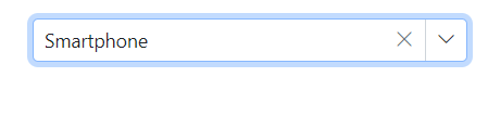
Control the clear button visibility using the ShowClearButton property. When the clear button is clicked, the Value, Text, and Index properties reset to null.
NOTE
If the TValue is a non-nullable type, pressing the clear button will reset it to the default value for that data type. Conversely, if TValue is a nullable type, pressing the clear button will set it to null. For instance, if TValue is defined as
int, clearing it will assign a value of 0 to the component, whereas if TValue is defined asint?, it will assign a value of null.
The following example uses string as the TValue, so clearing sets the value to null.
@using Syncfusion.Blazor.MultiColumnComboBox

<SfMultiColumnComboBox TValue="string" TItem="Product" @bind-Value="@Value" ShowClearButton=true DataSource="@Products" PopupWidth="600px" ValueField="Name" TextField="Name" Placeholder="Select any product"></SfMultiColumnComboBox>

@code {

    public class Product
    {
        public string Name { get; set; }
        public decimal Price { get; set; }
        public string Availability { get; set; }
        public string Category { get; set; }
        public double Rating { get; set; }
    }
    private List<Product> Products = new List<Product>();
    private string Value { get; set; } = "Smartphone";
    protected override Task OnInitializedAsync()
    {
        Products = new List<Product>
        {
            new Product { Name = "Laptop", Price = 999.99m, Availability = "In Stock", Category = "Electronics", Rating = 4.5 },
            new Product { Name = "Smartphone", Price = 599.99m, Availability = "Out of Stock", Category = "Electronics", Rating = 4.3 },
            new Product { Name = "Tablet", Price = 299.99m, Availability = "In Stock", Category = "Electronics", Rating = 4.2 },
            new Product { Name = "Headphones", Price = 49.99m, Availability = "In Stock", Category = "Accessories", Rating = 4.0 },
            new Product { Name = "Smartwatch", Price = 199.99m, Availability = "Limited Stock", Category = "Wearables", Rating = 4.4 },
            new Product { Name = "Monitor", Price = 129.99m, Availability = "In Stock", Category = "Electronics", Rating = 4.6 },

        };
        return base.OnInitializedAsync();
    }
}
Dynamically change TItem
TItem can be changed dynamically by wrapping the MultiColumn ComboBox in a generic component that declares @typeparam parameters for TValue and TItem, and exposes parameters for the data source and bound value. The following sample demonstrates using a generic component to switch data types.
Creating a generic MultiColumn ComboBox component
Create a MultiColumnComboBox.razor file that defines @typeparam for TValue and TItem, and exposes parameters for customData and ComboBoxValue.
@using Syncfusion.Blazor.MultiColumnComboBox

@typeparam TValue;
@typeparam TItem;

<SfMultiColumnComboBox TValue="TValue" Width="300px" TItem="TItem" @bind-Value="@ComboBoxValue" Placeholder="Please select a value" DataSource="@customData" ValueField="ID" TextField="Text">
</SfMultiColumnComboBox>

@code {
    [Parameter]
    public List<TItem> customData { get; set; }
    [Parameter]
    public TValue ComboBoxValue { get; set; }

    [Parameter]
    public EventCallback<TValue> ComboBoxValueChanged { get; set; }
}
Use the generic component with different types
Render the generic component with the required TValue and TItem in the corresponding Razor page.
Example: Use int? for TValue and a Games model for TItem in Index.razor.
[Index.razor]
<MultiColumnComboBox TValue="int?" TItem="Games" @bind-ComboBoxValue="@value" customData="@LocalData" >
</MultiColumnComboBox>


@code{
    public int? value { get; set; } = 3;
    public class Games
    {
        public int? ID { get; set; }
        public string Text { get; set; }
    }
    List<Games> LocalData = new List<Games> {
        new Games() { ID= 1, Text= "American Football" },
        new Games() { ID= 2, Text= "Badminton" },
        new Games() { ID= 3, Text= "Basketball" },
        new Games() { ID= 4, Text= "Cricket" },
        new Games() { ID= 5, Text= "Football" },
        new Games() { ID= 6, Text= "Golf" },
        new Games() { ID= 7, Text= "Hockey" },
        new Games() { ID= 8, Text= "Rugby"},
        new Games() { ID= 9, Text= "Snooker" },
        new Games() { ID= 10, Text= "Tennis"},
    };
}