Multiple Selection Display Modes
24 Jun 202613 minutes to read
Basic modes
The MultiSelect component provides multiple display modes to visualize selected items:
-
Default: Selected items are displayed as chip type when the component is in focus. Otherwise, selected items are displayed with a delimiter character. -
Box: The selected items are displayed as a chip (box) type in the MultiSelect input box. -
Delimiter: The selected items are displayed with a delimiter character in the MultiSelect input box.
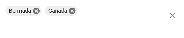
Box mode
In Box mode, selected values are displayed as chips (boxes) within the MultiSelect input field, even after the component loses focus.
@using Syncfusion.Blazor.DropDowns

<SfMultiSelect TItem="Country" TValue="string[]" Placeholder="e.g. Australia" Mode="VisualMode.Box" DataSource="@Countries">
    <MultiSelectFieldSettings Value="Code" Text="Name"></MultiSelectFieldSettings>
</SfMultiSelect>

@code {

public class Country
{
public string Name { get; set; }

public string Code { get; set; }
}

List<Country>Countries = new List<Country>
{
new Country() { Name = "Australia", Code = "AU" },
new Country() { Name = "Bermuda", Code = "BM" },
new Country() { Name = "Canada", Code = "CA" },
new Country() { Name = "Cameroon", Code = "CM" },
new Country() { Name = "Denmark", Code = "DK" },
new Country() { Name = "France", Code = "FR" },
new Country() { Name = "Finland", Code = "FI" },
new Country() { Name = "Germany", Code = "DE" },
new Country() { Name = "Greenland", Code = "GL" },
new Country() { Name = "Hong Kong", Code = "HK" },
new Country() { Name = "India", Code = "IN" },
new Country() { Name = "Italy", Code = "IT" },
new Country() { Name = "Japan", Code = "JP" },
new Country() { Name = "Mexico", Code = "MX" },
new Country() { Name = "Norway", Code = "NO" },
new Country() { Name = "Poland", Code = "PL" },
new Country() { Name = "Switzerland", Code = "CH" },
new Country() { Name = "United Kingdom", Code = "GB" },
new Country() { Name = "United States", Code = "US" },
};
}
Show the chip remove icon based on conditions
The chip cancel (remove) icon can be shown or hidden conditionally by using the OnChipTag event. The TaggingEventArgs argument provides the SetClass property to assign a custom CSS class to selected chips. Apply a CSS rule for that class to hide the cancel icon for specific items.
In the example below, the cancel icon is hidden for the “Badminton” and “Cricket” items.
@using Syncfusion.Blazor.DropDowns

<SfMultiSelect TItem="GameFields" TValue="string[]" AllowFiltering="true" DataSource="@Games">
    <MultiSelectEvents TItem="GameFields" TValue="string[]"  OnChipTag="TaggingHanlder"></MultiSelectEvents>
    <MultiSelectFieldSettings Text="Text"Value="ID"></MultiSelectFieldSettings>
</SfMultiSelect>

@code{
    public class GameFields
    {
        public string ID{get;set;}
        public string Text{get;set;}
    }

    private List<GameFields> Games = new List<GameFields>(){
        new GameFields(){ID="Game1",Text="AmericanFootball"},
        new GameFields(){ID="Game2",Text="Badminton"},
        new GameFields(){ID="Game3",Text="Basketball"},
        new GameFields(){ID="Game4",Text="Cricket"},
    };

    private void TaggingHanlder(TaggingEventArgs<GameFields>args)
    {
        if(args.ItemData.Text=="Cricket" || args.ItemData.Text=="Badminton"  )
        {
            args.SetClass="e-hide-close";
        }

    }

}
<style>
    .e-multi-select-wrapper .e-hide-close .e-chips-close{
        display:none;
    }
</style>
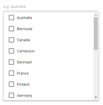
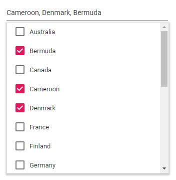
CheckBox mode
To get started quickly with CheckBox mode in the Blazor MultiSelect Dropdown component, watch the following video:
The MultiSelect has built-in support to select multiple values through checkbox, when the Mode property is set to CheckBox.
To use checkbox, inject the CheckBoxSelection module in the MultiSelect.
@using Syncfusion.Blazor.DropDowns

<SfMultiSelect TItem="Country" TValue="string[]" Placeholder="e.g. Australia" Mode="VisualMode.CheckBox" DataSource="@Countries">
    <MultiSelectFieldSettings Value="Code" Text="Name"></MultiSelectFieldSettings>
</SfMultiSelect>

@code {

    public class Country
    {
        public string Name { get; set; }

        public string Code { get; set; }
    }

    List<Country>Countries = new List<Country>
    {
        new Country() { Name = "Australia", Code = "AU" },
        new Country() { Name = "Bermuda", Code = "BM" },
        new Country() { Name = "Canada", Code = "CA" },
        new Country() { Name = "Cameroon", Code = "CM" },
        new Country() { Name = "Denmark", Code = "DK" },
        new Country() { Name = "France", Code = "FR" },
        new Country() { Name = "Finland", Code = "FI" },
        new Country() { Name = "Germany", Code = "DE" },
        new Country() { Name = "Greenland", Code = "GL" },
        new Country() { Name = "Hong Kong", Code = "HK" },
        new Country() { Name = "India", Code = "IN" },
        new Country() { Name = "Italy", Code = "IT" },
        new Country() { Name = "Japan", Code = "JP" },
        new Country() { Name = "Mexico", Code = "MX" },
        new Country() { Name = "Norway", Code = "NO" },
        new Country() { Name = "Poland", Code = "PL" },
        new Country() { Name = "Switzerland", Code = "CH" },
        new Country() { Name = "United Kingdom", Code = "GB" },
        new Country() { Name = "United States", Code = "US" },
    };
}
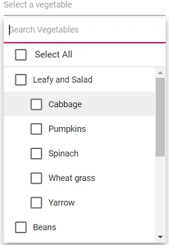
Grouping checkbox
Arrange the data source items by grouping them with checkbox mode in MultiSelect. Clicking the checkbox in group will select all the items grouped under it. Click the MultiSelect element and then type the character in the search box. It will display the filtered list items based on the typed characters and then select the multiple values through the checkbox.
@using Syncfusion.Blazor.DropDowns

<SfMultiSelect TValue="string[]" AllowFiltering="true" TItem="Vegetables" Mode="@VisualMode.CheckBox" Width="250px" Placeholder="Select a vegetable" DataSource="@VegetablesList" ShowSelectAll="@ShowSelectAllCheckBox"
               EnableSelectionOrder="@EnableSelectionOrders" FilterBarPlaceholder="Search Vegetables" EnableGroupCheckBox="@EnableCheckBox" PopupHeight="350px">
    <MultiSelectFieldSettings GroupBy="Category" Value="Vegetable"></MultiSelectFieldSettings>
</SfMultiSelect>

@code{
    public bool ShowSelectAllCheckBox { get; set; } = true;
    public bool EnableSelectionOrders { get; set; } = false;
    public bool EnableCheckBox { get; set; } = true;
    public class Vegetables
    {
        public string Vegetable { get; set; }
        public string Category { get; set; }
        public string ID { get; set; }
    }
    List<Vegetables> VegetablesList = new List<Vegetables>()
    {
        new Vegetables() { Vegetable = "Cabbage", Category = "Leafy and Salad", ID = "item1" },
        new Vegetables() { Vegetable = "Chickpea", Category = "Beans", ID = "item2" },
        new Vegetables() { Vegetable = "Garlic", Category = "Bulb and Stem", ID = "item3" },
        new Vegetables() { Vegetable = "Green bean", Category = "Beans", ID = "item4" },
        new Vegetables() { Vegetable = "Horse gram", Category = "Beans", ID = "item5" },
        new Vegetables() { Vegetable = "Nopal", Category = "Bulb and Stem", ID = "item6" },
        new Vegetables() { Vegetable = "Onion", Category = "Bulb and Stem", ID = "item7" },
        new Vegetables() { Vegetable = "Pumpkins", Category = "Leafy and Salad", ID = "item8" },
        new Vegetables() { Vegetable = "Spinach", Category = "Leafy and Salad", ID = "item9" },
        new Vegetables() { Vegetable = "Wheat grass", Category = "Leafy and Salad", ID = "item10" },
        new Vegetables() { Vegetable = "Yarrow", Category = "Leafy and Salad", ID = "item11" },
    };
}
Selection Reordering
Use EnableSelectionOrder to control how selected items are ordered while the popup is open. When enabled, the order of the selected items follows the sequence in which items were selected.
<SfMultiSelect TItem="Country" TValue="string[]" Placeholder="e.g. Australia" EnableSelectionOrder=false  Mode="VisualMode.CheckBox" DataSource="@Countries">
    <MultiSelectFieldSettings Text="Name" Value="Code"></MultiSelectFieldSettings>
</SfMultiSelect>

@code {

    public class Country
    {
        public string Name { get; set; }

        public string Code { get; set; }
    }

    List<Country>Countries = new List<Country>
    {
        new Country() { Name = "Australia", Code = "AU" },
        new Country() { Name = "Bermuda", Code = "BM" },
        new Country() { Name = "Canada", Code = "CA" },
        new Country() { Name = "Cameroon", Code = "CM" },
        new Country() { Name = "Denmark", Code = "DK" },
        new Country() { Name = "France", Code = "FR" },
        new Country() { Name = "Finland", Code = "FI" },
        new Country() { Name = "Germany", Code = "DE" },
        new Country() { Name = "Greenland", Code = "GL" },
        new Country() { Name = "Hong Kong", Code = "HK" },
        new Country() { Name = "India", Code = "IN" },
        new Country() { Name = "Italy", Code = "IT" },
        new Country() { Name = "Japan", Code = "JP" },
        new Country() { Name = "Mexico", Code = "MX" },
        new Country() { Name = "Norway", Code = "NO" },
        new Country() { Name = "Poland", Code = "PL" },
        new Country() { Name = "Switzerland", Code = "CH" },
        new Country() { Name = "United Kingdom", Code = "GB" },
        new Country() { Name = "United States", Code = "US" },
    };
}
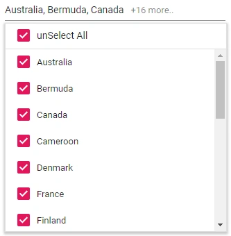
Select all
The MultiSelect component has in-built support to select all the list items using Select All options in the header. When the ShowSelectAll property is set to true, by default Select All text will show. You can customize the name attribute of the Select All option by using SelectAllText.
For the unSelect All option, by default unSelect All text will show. You can customize the name attribute of the unSelect All option by using UnSelectAllText.
@using Syncfusion.Blazor.DropDowns

<SfMultiSelect TItem="Country" TValue="string[]" Placeholder="e.g. Australia" ShowSelectAll=true SelectAllText="Select All" UnSelectAllText="unSelect All" Mode="VisualMode.CheckBox" DataSource="@Countries">
    <MultiSelectFieldSettings Text="Name" Value="Code"></MultiSelectFieldSettings>
</SfMultiSelect>

@code {

    public class Country
    {
        public string Name { get; set; }

        public string Code { get; set; }
    }

    List<Country>Countries = new List<Country>
    {
        new Country() { Name = "Australia", Code = "AU" },
        new Country() { Name = "Bermuda", Code = "BM" },
        new Country() { Name = "Canada", Code = "CA" },
        new Country() { Name = "Cameroon", Code = "CM" },
        new Country() { Name = "Denmark", Code = "DK" },
        new Country() { Name = "France", Code = "FR" },
        new Country() { Name = "Finland", Code = "FI" },
        new Country() { Name = "Germany", Code = "DE" },
        new Country() { Name = "Greenland", Code = "GL" },
        new Country() { Name = "Hong Kong", Code = "HK" },
        new Country() { Name = "India", Code = "IN" },
        new Country() { Name = "Italy", Code = "IT" },
        new Country() { Name = "Japan", Code = "JP" },
        new Country() { Name = "Mexico", Code = "MX" },
        new Country() { Name = "Norway", Code = "NO" },
        new Country() { Name = "Poland", Code = "PL" },
        new Country() { Name = "Switzerland", Code = "CH" },
        new Country() { Name = "United Kingdom", Code = "GB" },
        new Country() { Name = "United States", Code = "US" },
    };
}