How can I help you?
Placeholder and Float Label in MultiSelect
26 Jun 20266 minutes to read
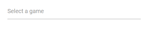
Placeholder
Use the Placeholder property to display brief helper text that describes the expected input. In the following example, the placeholder is set to “Select a game,” which renders as the input element’s placeholder attribute.
@using Syncfusion.Blazor.DropDowns

<SfMultiSelect TValue="string[]" TItem="string" Placeholder="Select a game" DataSource="@data" Width="300px">
</SfMultiSelect>

@code {
    List<string> data = new List<string> { "Cricket", "Badminton", "Football" };
}
Color of the placeholder text
Change the color of the placeholder by targeting its CSS class input.e-multiselect::placeholder, which indicates the placeholder text, and set the desired color using the color property.
@using Syncfusion.Blazor.DropDowns;

<SfMultiSelect TValue="string[]" TItem="Games" Placeholder="Favorite Sports" DataSource="@LocalData" Width="300px">
    <MultiSelectFieldSettings Text="Text" Value="ID"></MultiSelectFieldSettings>
</SfMultiSelect>

@code {
    public class Games
    {
        public string ID { get; set; }
        public string Text { get; set; }
    }
    List<Games> LocalData = new List<Games> {
    new Games() { ID= "Game1", Text= "American Football" },
    new Games() { ID= "Game2", Text= "Badminton" },
    new Games() { ID= "Game3", Text= "Basketball" },
    new Games() { ID= "Game4", Text= "Cricket" },
    new Games() { ID= "Game5", Text= "Football" },
    new Games() { ID= "Game6", Text= "Golf" },
    new Games() { ID= "Game7", Text= "Hockey" },
    new Games() { ID= "Game8", Text= "Rugby"},
    new Games() { ID= "Game9", Text= "Snooker" },
    new Games() { ID= "Game10", Text= "Tennis"},
    };
}

<style>
.e-multiselect input.e-multiselect::placeholder {
    color: red;
}
</style>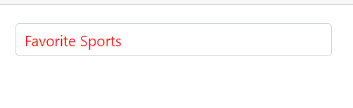
Add mandatory indicator using placeholder
Add a mandatory indicator “*” to the floating label by targeting the .e-float-text::after selector and setting the content style.
@using Syncfusion.Blazor.DropDowns;
@using Syncfusion.Blazor.Inputs;

<SfMultiSelect TValue="string[]" TItem="Games" Placeholder="Favorite Sports" DataSource="@LocalData" Width="300px" FloatLabelType="FloatLabelType.Auto">
    <MultiSelectFieldSettings Text="Text" Value="ID"></MultiSelectFieldSettings>
</SfMultiSelect>

@code {
    public class Games
    {
        public string ID { get; set; }
        public string Text { get; set; }
    }
    List<Games> LocalData = new List<Games> {
    new Games() { ID= "Game1", Text= "American Football" },
    new Games() { ID= "Game2", Text= "Badminton" },
    new Games() { ID= "Game3", Text= "Basketball" },
    new Games() { ID= "Game4", Text= "Cricket" },
    new Games() { ID= "Game5", Text= "Football" },
    new Games() { ID= "Game6", Text= "Golf" },
    new Games() { ID= "Game7", Text= "Hockey" },
    new Games() { ID= "Game8", Text= "Rugby"},
    new Games() { ID= "Game9", Text= "Snooker" },
    new Games() { ID= "Game10", Text= "Tennis"},
    };
}

<style>
.e-input-group.e-control-wrapper.e-control-container.e-float-input .e-float-text::after {
    content: "*";
    color: red;
}
</style>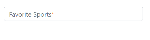
FloatLabel
Use the FloatLabelType property to control the floating label behavior of the MultiSelect. When enabled, the placeholder text moves above the input according to the specified mode. FloatLabelType applies only when a Placeholder is defined. The default value is Never.
The floating label supports the types of actions as follow.
| Type | Description |
|---|---|
| Auto | The label floats above the input on focus or when a value is entered. |
| Always | The label always floats above the input. |
| Never | The label never floats when a placeholder is present. |
The following example demonstrates FloatLabelType="Auto":
@using Syncfusion.Blazor.DropDowns;
@using Syncfusion.Blazor.Inputs;

<SfMultiSelect TValue="string[]" TItem="Games" Placeholder="Favorite Sports" DataSource="@LocalData" FloatLabelType="@FloatLabelType">
    <MultiSelectFieldSettings Text="Text" Value="ID"></MultiSelectFieldSettings>
</SfMultiSelect>

@code {

    public class Games
    {
        public string ID { get; set; }
        public string Text { get; set; }
    }
    List<Games> LocalData = new List<Games> {
    new Games() { ID= "Game1", Text= "American Football" },
    new Games() { ID= "Game2", Text= "Badminton" },
    new Games() { ID= "Game3", Text= "Basketball" },
    new Games() { ID= "Game4", Text= "Cricket" },
    new Games() { ID= "Game5", Text= "Football" },
    new Games() { ID= "Game6", Text= "Golf" },
    new Games() { ID= "Game7", Text= "Hockey" },
    new Games() { ID= "Game8", Text= "Rugby"},
    new Games() { ID= "Game9", Text= "Snooker" },
    new Games() { ID= "Game10", Text= "Tennis"},
    };

    public FloatLabelType FloatLabelType { get; set; } = FloatLabelType.Auto;

}
Customizing the float label element’s focusing color
Customize the component color when it is focused by targeting its CSS class .e-input-focus::after, which indicates the input element when it is focused, and set the desired color to the background property.
@using Syncfusion.Blazor.DropDowns;

<SfMultiSelect TValue="string[]" TItem="Games" Placeholder="Favorite Sports" DataSource="@LocalData" Width="300px" ShowDropDownIcon=true>
    <MultiSelectFieldSettings Text="Text" Value="ID"></MultiSelectFieldSettings>
</SfMultiSelect>

@code {

    public class Games
    {
        public string ID { get; set; }
        public string Text { get; set; }
    }
    List<Games> LocalData = new List<Games> {
    new Games() { ID= "Game1", Text= "American Football" },
    new Games() { ID= "Game2", Text= "Badminton" },
    new Games() { ID= "Game3", Text= "Basketball" },
    new Games() { ID= "Game4", Text= "Cricket" },
    new Games() { ID= "Game5", Text= "Football" },
    new Games() { ID= "Game6", Text= "Golf" },
    new Games() { ID= "Game7", Text= "Hockey" },
    new Games() { ID= "Game8", Text= "Rugby"},
    new Games() { ID= "Game9", Text= "Snooker" },
    new Games() { ID= "Game10", Text= "Tennis"},
    };
}

<style>
.e-multiselect.e-input-group.e-control-wrapper.e-input-focus::before, .e-multiselect.e-input-group.e-control-wrapper.e-input-focus::after {
    background: #c000ff;
}
</style>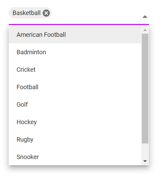
NOTE
The above example works correctly with the Material3 theme. If you use a different theme, you may need to adjust the CSS classes accordingly.