Style and appearance in Blazor MultiSelect Dropdown Component
24 Jun 202624 minutes to read
The following content outlines the CSS structure and properties that can be used to customize the component’s appearance.
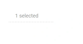
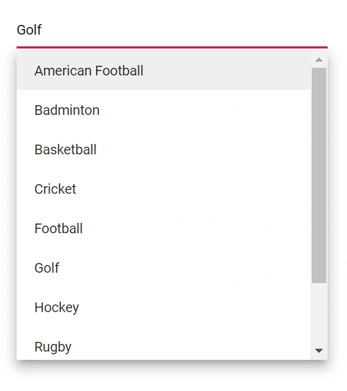
Read-only mode
Use the Readonly property to specify whether users can change the value.
@using Syncfusion.Blazor.DropDowns;

<SfMultiSelect TValue="string[]" TItem="Games" Placeholder="Favorite Sports" DataSource="@LocalData" Readonly="Readonly">
    <MultiSelectFieldSettings Text="Text" Value="ID"></MultiSelectFieldSettings>
</SfMultiSelect>

@code {

    public class Games
    {
        public string ID { get; set; }
        public string Text { get; set; }
    }
    List<Games> LocalData = new List<Games> {
    new Games() { ID= "Game1", Text= "American Football" },
    new Games() { ID= "Game2", Text= "Badminton" },
    new Games() { ID= "Game3", Text= "Basketball" },
    new Games() { ID= "Game4", Text= "Cricket" },
    new Games() { ID= "Game5", Text= "Football" },
    new Games() { ID= "Game6", Text= "Golf" },
    new Games() { ID= "Game7", Text= "Hockey" },
    new Games() { ID= "Game8", Text= "Rugby"},
    new Games() { ID= "Game9", Text= "Snooker" },
    new Games() { ID= "Game10", Text= "Tennis"},
    };

    public bool Readonly { get; set; } = true;

}
Disabled state
Control interactivity with the Enabled property. Setting it to false disables the component. In contrast, setting Readonly to true keeps the component interactive for focus and scrolling but prevents changes to the value.
@using Syncfusion.Blazor.DropDowns;


<div class=content>
    <SfMultiSelect @ref="MultiSelectObj" TValue="string[]" TItem="Games"  Enabled="false" Placeholder="Favorite Sports" DataSource="@LocalData" @bind-Value="@GameValue">
        <MultiSelectFieldSettings Text="Text" Value="ID"></MultiSelectFieldSettings>
    </SfMultiSelect>
</div>

@code {
    SfMultiSelect<string[],Games> MultiSelectObj;
    public class Games
    {
        public string ID { get; set; }
        public string Text { get; set; }
    }
    List<Games> LocalData = new List<Games> {
        new Games() { ID= "Game1", Text= "American Football" },
        new Games() { ID= "Game2", Text= "Badminton" },
        new Games() { ID= "Game3", Text= "Basketball" },
        new Games() { ID= "Game4", Text= "Cricket" },
        new Games() { ID= "Game5", Text= "Football" },
        new Games() { ID= "Game6", Text= "Golf" },
        new Games() { ID= "Game7", Text= "Hockey" },
        new Games() { ID= "Game8", Text= "Rugby"},
        new Games() { ID= "Game9", Text= "Snooker" },
        new Games() { ID= "Game10", Text= "Tennis"},
    };

    public string[] GameValue { get; set; } = new string[]{ "Game5"};

}
Customizing the disabled component’s text color
Customize the text color of a disabled component by targeting .e-multiselect.e-disabled and setting the -webkit-text-fill-color property.
@using Syncfusion.Blazor.DropDowns;

<SfMultiSelect TValue="string[]" TItem="Games" Placeholder="Favorite Sports" DataSource="@LocalData" Width="300px" Enabled="false" @bind-Value="@GameValue">
    <MultiSelectFieldSettings Text="Text" Value="ID"></MultiSelectFieldSettings>
</SfMultiSelect>

@code {
    public string[] GameValue { get; set; } = { "Game3", "Game4" };

    public class Games
    {
        public string ID { get; set; }
        public string Text { get; set; }
    }
    List<Games> LocalData = new List<Games> {
    new Games() { ID= "Game1", Text= "American Football" },
    new Games() { ID= "Game2", Text= "Badminton" },
    new Games() { ID= "Game3", Text= "Basketball" },
    new Games() { ID= "Game4", Text= "Cricket" },
    new Games() { ID= "Game5", Text= "Football" },
    new Games() { ID= "Game6", Text= "Golf" },
    new Games() { ID= "Game7", Text= "Hockey" },
    new Games() { ID= "Game8", Text= "Rugby"},
    new Games() { ID= "Game9", Text= "Snooker" },
    new Games() { ID= "Game10", Text= "Tennis"},
    };
}

<style>
.e-multiselect.e-disabled .e-multi-select-wrapper .e-delim-values {
    -webkit-text-fill-color: red;
}
</style>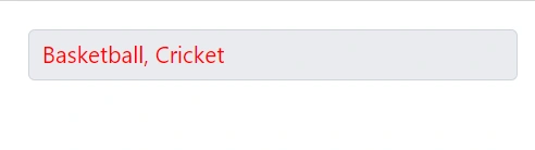
Change remove icon color in chip
To change the remove icon color in a chip within the Blazor MultiSelect component, you can use the following CSS style to customize it.
@using Syncfusion.Blazor.DropDowns;

<div class=content>
    <SfMultiSelect @ref="MultiSelectObj" TValue="string[]" Mode="VisualMode.Box" TItem="Games" Placeholder="Favorite Sports" DataSource="@LocalData">
        <MultiSelectFieldSettings Text="Text" Value="ID"></MultiSelectFieldSettings>
    </SfMultiSelect>
</div>

@code {
    SfMultiSelect<string[],Games> MultiSelectObj;
    public class Games
    {
        public string ID { get; set; }
        public string Text { get; set; }
    }

    List<Games> LocalData = new List<Games>
    {
        new Games() { ID = "Game1", Text = "American Football" },
        new Games() { ID = "Game2", Text = "Badminton" },
        new Games() { ID = "Game3", Text = "Basketball" },
        new Games() { ID = "Game4", Text = "Cricket" },
        new Games() { ID = "Game5", Text = "Football" },
        new Games() { ID = "Game6", Text = "Golf" },
        new Games() { ID = "Game7", Text = "Hockey" },
        new Games() { ID = "Game8", Text = "Rugby" },
        new Games() { ID = "Game9", Text = "Snooker" },
        new Games() { ID = "Game10", Text = "Tennis" },
    };

}

<style>
    .e-multi-select-wrapper .e-chips .e-chips-close::before {
        -webkit-text-fill-color: red;
    }
</style>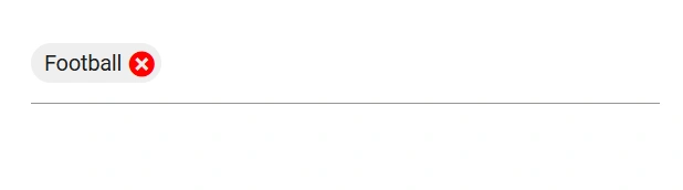
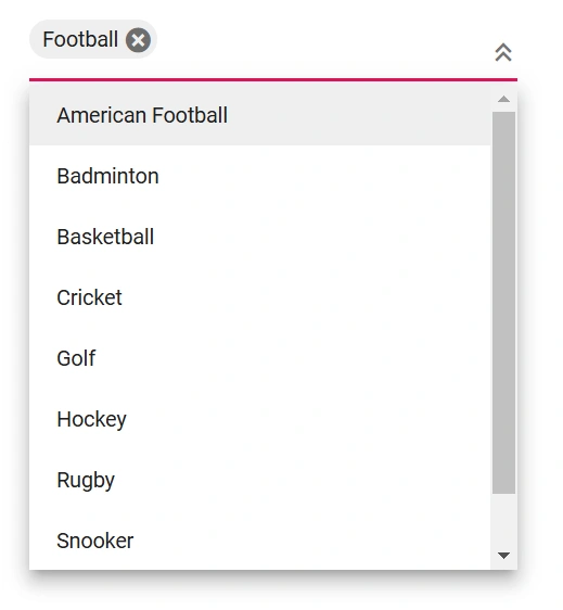
Show the custom icon in dropdown icon
Customize the dropdown icon by targeting its CSS class .e-ddl-icon::before, which indicates the icon element displayed within the dropdown list component, and set the desired icon to the content property.
To style only a specific instance, set a custom class via CssClass and scope the CSS to that class.
@using Syncfusion.Blazor.DropDowns;

<SfMultiSelect TValue="string[]" TItem="Games"  CssClass="e-custom" Placeholder="Select a game" Width="300px" ShowDropDownIcon="true" DataSource="@LocalData" @bind-Value="GameValue">
    <MultiSelectFieldSettings Value="ID" Text="Text"></MultiSelectFieldSettings>
</SfMultiSelect>


@code {
public string[] GameValue { get; set; } = new string[]{ "Game5"};

public class Games
{
public string ID { get; set; }
public string Text { get; set; }
}

List<Games> LocalData = new List<Games> {
new Games() { ID= "Game1", Text= "American Football" },
new Games() { ID= "Game2", Text= "Badminton" },
new Games() { ID= "Game3", Text= "Basketball" },
new Games() { ID= "Game4", Text= "Cricket" },
new Games() { ID= "Game5", Text= "Football" },
new Games() { ID= "Game6", Text= "Golf" },
new Games() { ID= "Game7", Text= "Hockey" },
new Games() { ID= "Game8", Text= "Rugby"},
new Games() { ID= "Game9", Text= "Snooker" },
new Games() { ID= "Game10", Text= "Tennis"},
};

}

<style>
    .e-custom.e-multiselect.e-input-group .e-ddl-icon::before{
        content: '\e304';
    }
</style>Adding icons in popup items
Display icons in list items by mapping a field to IconCss.
@using Syncfusion.Blazor.DropDowns;


<label class="example-label">Icons</label>
<SfMultiSelect TValue="string[]" TItem="SocialMedia" Placeholder="Select a social media" DataSource="@IconData">
    <MultiSelectFieldSettings Text="SocialMediaName" IconCss="Class" Value="Id"/>
</SfMultiSelect>

@code {
    public class SocialMedia
    {
        public string Class { get; set; }
        public string SocialMediaName { get; set; }
        public string Id { get; set; }
    }
    List<SocialMedia> IconData = new List<SocialMedia>()
    {
        new SocialMedia() { Class= "facebook", SocialMediaName= "Facebook", Id= "media1" },
        new SocialMedia() { Class= "google-plus", SocialMediaName= "Google Plus", Id= "media2" },
        new SocialMedia() { Class= "instagram", SocialMediaName= "Instagram", Id= "media3" },
        new SocialMedia() { Class= "linkedin", SocialMediaName= "LinkedIn", Id= "media4" },
        new SocialMedia() { Class= "skype", SocialMediaName= "Skype", Id= "media5" },
        new SocialMedia() { Class= "tumblr", SocialMediaName= "Tumblr", Id= "media6" },
        new SocialMedia() { Class= "twitter", SocialMediaName= "Twitter", Id= "media7" },
        new SocialMedia() { Class= "vimeo", SocialMediaName= "Vimeo", Id= "media8" },
        new SocialMedia() { Class= "whatsapp", SocialMediaName= "WhatsApp", Id= "media9" },
        new SocialMedia() { Class = "youtube", SocialMediaName= "YouTube", Id = "media10" }
    };
}

<style>

    @@font-face {
        font-family: 'Socialicons';
        src: url(data:application/x-font-ttf;charset=utf-8;base64,AAEAAAAKAIAAAwAgT1MvMv1tCfsAAAEoAAAAVmNtYXCnKKeOAAABrAAAAEhnbHlml19XagAAAgwAABhQaGVhZA8dCeEAAADQAAAANmhoZWEIUQQMAAAArAAAACRobXR4LAAAAAAAAYAAAAAsbG9jYR3AIwwAAAH0AAAAGG1heHABIAIAAAABCAAAACBuYW1l0X1q/wAAGlwAAAJVcG9zdGX5D00AABy0AAAAkwABAAAEAAAAAFwEAAAAAAAD9AABAAAAAAAAAAAAAAAAAAAACwABAAAAAQAA+iTiP18PPPUACwQAAAAAANYFYngAAAAA1gVieAAAAAAD9AP0AAAACAACAAAAAAAAAAEAAAALAfQACwAAAAAAAgAAAAoACgAAAP8AAAAAAAAAAQQAAZAABQAAAokCzAAAAI8CiQLMAAAB6wAyAQgAAAIABQMAAAAAAAAAAAAAAAAAAAAAAAAAAAAAUGZFZABApwCnCQQAAAAAXAQAAAAAAAABAAAAAAAABAAAAAQAAAAEAAAABAAAAAQAAAAEAAAABAAAAAQAAAAEAAAABAAAAAQAAAAAAAACAAAAAwAAABQAAwABAAAAFAAEADQAAAAEAAQAAQAApwn//wAApwD//wAAAAEABAAAAAEAAgADAAQABQAGAAcACAAJAAoAAAAAAiQCzgOMBU4F/gZYB9QIcAo+DCgABAAAAAAD0gPzAFUA4gF3AfMAAAEzHwYHFQ8EFR8IPwUfBRUPCCMvFj0BPwoXNw8fHQEfDhUPAT8CHwkzPyA9Ai8iDwIFHwcPIysBLwYjDwI/AS8PNT8oHx4BDxAdAR8PHQEHPwE7AR8EMz8dNS8kIw8FAYkFEgQDAyQDAQECAyIBAQMSEgkUCw4vBQQFChsGBQdqAgIBAwMDCAoMDA0NBgYPEA8PFxYVFBQTEhITEREPDgwKCQQEBQICBAQFChMJBQUFBTURDxAPDw8ODg4NDQwMDAsLCgkJCQgHBwcFBQUEAwICAQEDAgQEBgYHBwkJCgsOAgEmiwMEBAQUFRQVFRQVFRQVFRUVFBUVDw4ODg0NDAwLCwoKCQkICAcGBgUEBAQCAgICAgMEBAYGBgcICQkJCgsLCwwNDQ0ODg4PDw8QEBAQEBEREREQEQHcBgUEBAICAQEBAQEDAwQFBQYHCAgICgoLCwwNDQ4ODxAREhISEhMTExMUExQUFRQVGxsaGgcIBwfXNgEBAQ8KCgoIBwcGBQUDAwIBAQECAwMDBQUFBgcHCAgICgkKCwsMDAwNDg0ODw8PEBAQEhISEhISEhIREREREREQERAQDw8PDw8ODQ0NDQwLDAoKCgkJCAcH/aAQEB0cGhgWFBIRDgwLCAcEAwICAwMFBQYHBwgJCgoLAgE9+AYFBSMeHx4fIB8fFhQUFBQSExIRERAQEA8ODhAQDQ0LCQgHBgQCAgICBAQEBgYGCAgJCQoLCwwMDQ4ODg8PEBAREBESEhISExITGBcZGRgZGBgXAu4CAgMEXAkFBAQFBCQCAwMGGhcKFQkMIwIBAwoYAwIBKQECBSgFBgULCgkHBgMBAQEDAwcICgwMDg8PEhITFBUWGBgSEyYJCAgIBwcHDBEGAgEBAagEBAQGBgYHCAgJCgkLCwsMDAwNDQ4ODg8PDw8QEBAQERITEhESEREREBEPEA8QDhMEBASFNgEBAQEJCAcGBQMCAQEDAwUGCAgHCAgJCQoKCwsMDA0NDQ4ODg8ODxAPEA8QEBAREBAQEBIQERAQDw8ODg0NDQwMCwoKCQkICAcGBgUFAwMDAQEBAQEC6RISExISExISEhMSEhESERERERAQEA8QDg8NDg0MDAwLCwoJCQcHBgUEAwICAgIEBggJAwECVNcFBAQVEBEREhESEhITExMTFBMUEhEREBEQEBAPDw8PDg4ODQ0MDAwLCwoKCgkICAcHBwUGBQQDAgIBAQEBAgIDBAQFBQcGCAgICQoKCgsMDA0NDQ4PDw8QEBEBBwgIEhMUFhcYGRscHR8fIiIjFBMTEhMSEhIREhEREBEQEAMEAwT1YQINCAYEAgIEBAUGBggICQoKDAwNDg8PERUVFhcWGBcYGBkZGRkaGxoTEhISEhEREBAQDw8ODg4MDQwLCgoKCQgHBwYFBQMDAwEBAgMFBQgIAAAAAAEAAAAAAzoD9ACWAAATDwYVERUfHTsBPw49AS8OIy8PNSEzPw4vDyE9AS8ODwblCAYFBAQCAgECAwMEBQUGBwgICQoKCwwMDA0NDQ0ODg4PDw8QEBDQCgsKCQkJCAgHBwUEBAICAgIEBAUHBwgICQkJCgsK0QoKCgoJCAgIBwcFBAMDAQEBKQoJCggJCAgHBwUFBAQCAQEBAQIEBAUFBwgHCAkJCQkK/tcCAgMFBQYHCAkICQoJCwoLCwoJCQkIA9AJCgsKDAwMDf4LExMTEhESEREQEBAPDw4PDQ4MDAoKCQgIBgYEBAMCAgEBAwQFBwcJCQoKCwsMDA0NDAsMCwoKCQkHBwUEAwEBAQEDBAUGCAgJCgoLCwwMDVgCAwMFBgcICQkJCgsLCwwLDAsKCgoJCAgHBgUEAgIBtQ0MDAsLCgoJCQcHBQQDAQEBAQMEBQYIAAABAAAAAAP0A90AqAAAAT8DMx8MHQEPDSsBLxoPCBc/Ah8LEx8PMz8dLw8jDw4CSAoTEhIRCAcGBwUFBQQDAwICAgEDBQoPExYWFAsLCgQFBAUFBAUFBQUJCQkJCyQEBQUGBwcICAkKCgsLDQwODQ8RERQfI5IvNRMGBwYGBwYGBgYGDAsMWAcICAgICQkJCQkKCgoLCgsJExITFBQVFRYWFiMkJTEWFRQREQ8NDAsJBwYFAwEBAQEDBAUHBwkJCwwNDhAQEgsYGBYWFBQSEhAQDg4MCwsC2wQGBQIBAgICAwQEBQUHBgcICBMSDxEdIiUoIxsOCgcCAQIEBAYICBUbHyU37xQTERAPDQwKCQgGBQMCAQEDBggLDhofkUInCwIBAgQEBwcJCwscISf+pBYUExIQDg4LCwkIBgUDAgEDBAcJDA0REhQXJysxRiEhIB4eHRwbGhkZFxcVFRoXFhQTERAODQwKCAcGBAMBAQMFBwkMDQ8RExUXGhsdAAUAAAAAA/ED9ABCAKoA6wESAYQAAAEdAQ8NKwEvDjU/EB8OJR0BHw8hPw8TLwMhHwUVDxEvEzU/CSchDwMFFR8PPw8vDw8OAR8HFQ8JIy8GPQI/BjMlHQEPBC8DNS8DDwMVDwIjLwM9Ai8BIw8EFQ8DIy8CNw8KFxUfASUzPwgzHwkhPwI1LxAlDwICkAMDBQcHCQkKDAwMDQ4ODwwMCwsLCgoJDwsJCAYFAgECAwQGBgcICQkKCwsMDA0LCw8ODg4MDAsKCQkHBgQEAv1/AQMFBgkJDAwODwgRERITEwJpExMSEhEQDw4MDAUJBwYEAgEBAgEF/uYOCwkGBAICBAYHCQsMDg8QERETExQTFRQVFBQUFBMTEhAPDg0LCQgGBAMCAgEBAwMEBQYHCAkC/uoFAgEBASwBAwUGCQoLDQ0PERESEhQUFBQTEhEQEA4MDAkJBgUDAQEDBQcICgsNDg8QERISFBQUFBMSERAQDgwMCggHBAMCPAYGBgQEAwEBAQEBAwMEBAQFBmgHBgYEBAMCAwMEBQUFBjX90AECBAUUBQEBAQEBAgIRAgIBAQIFEAkDAwECBAQEBQQDAwICAwUWAwIBAQQQDwwLCQgFAwEBAQEEATEEBBYUFRYWFxcYFxcXFxYVFBgFBQYBJwYCAgICBAYHCQoLDA4ODxAIERIR/d8FAQIB9wcHDg0NDAwLCgkIBwYFBAICAgQEBQYGDQwODg8REBINDQwMCwsKCgkIBwcGBAQCAQEBAgQFBggICgoLDQ0NDg9929sUExISERAPDgwMBQkHBgQCAQMFBgkJDAwODwgQERITEwHBBgMBARYXFxcXFxcWFhUUFBMREQ8ODAsJCAYEAwIBAgQFBwkKDA0PDxERExQPEA8PDw8PDw8ODw4ODg4OAQEBAQKPCgoUEhIREBANDQsKCAcFAwEBAwUHCAoLDQ4PEBESExQUFBMTEhEQDw4NCwoIBwUDAQEDBQcICgsNDg8QEhITEwGSAQICBAUFBgdsBQQFBAQDAgIBAQECAgQFBQYHawcHBgUDAgEBR2h1CAMCAQEBAgIF5wMCAQEBAQED6gUCAQEDAwbbBQICAQIDAwMG0ggEAQICAgTKAQ0OEBASEhQVEiRdAgIBAQITDg0JCAYDAQQFBwoMDhQCAQEBAQNuJBIRERAPDg4NCwoJCAMFBAEBAQIEAAAAAAMAAAAAA/QD3QADAFcAlwAANzMRIwUVIzc1IxEzET8OHw8RMxEvGw8MAR8PPw41Lw8PDhnW1gIjAQHW1gIDBQgKCwcHBwgJCQoKCw4NDAsKCAgHBwUEBAICAQHWAQICAgQDBQUFBgYHBwcJCAkJCgoKCwsLDBgZGhQUEREPDg0MCwoJCQ79xAEBAwMFBgYHCAkKCwsMDA4PDQwLCwoJCQcGBgUDAwIBAQMEBAYGCAgJCgoLDQwODQ0MDAoKCQkHBwYEBAMBIgKFWwICW/17AXcUDA0ODgwGBQUEBAMCAQEBAgMFBQcICgoLDA0NDw8Q/qcBhBIREBAPDw4NDQwMCwoKCQkICAcGBgUFBAMGAwEBAgMEBgYHCAgICQkSARIMCwsKCgkICAgGBQUEAwEBAQEDBAUFBggICAkKCgsLDAsLCwsJCggIBwYGBAQDAQEBAQMEBAYGBwgICgkLCwsAAAABAAAAAAPuA/QARgAAExEVHwYhESM1MzU/DzMVIw8GFTMVIxEhPwYRLwYhDwYSAgQFBwgKCgHPb24BAwMGBggJCgsMDQ0ODwgPlUcLCwkIBgQDe3sBBQoKCAcFBAICBAUHCAoK/IUKCgkHBwQDA7v8igYLCgkIBgQDAZuFUBAQDw4ODQwLCgkIBwUEAgGFAwQHCAkKDDOF/mUDBAYICQoLA4ILCgkIBgQDAQQFBwgKCwAAAAAGAAAAAAP0A/QAOABEAIABBQEqAUwAAAEPCR0BHw07AT8NPQEvCCMPASUVMxUjFSM1IzUzNSUPBRUfDTsBPww1Lw4jDwU3ByMfCA8PHw4dAQ8OLw8/DS8FPwIHIy8NPQE/DwEVHw8hPw8RITchLw8hDw4BCgMTCwsFBAQEAgICAwQGBgcICgoLDAwODg8NDQwLCgkICAYGBQQDAwEBAQIDBAgMDiYRNw0B9nR0TXNz/kAFAwMDAQIBAgMDBAQGBgcICQkKDAsIBwcHBwYFBQYFAwMBAQECAwMEBQYGBwgJCQoLDAcIBwcHBwX+MTAQDggIAwICAQEBAQEDAwMICgsMDAsGAgEBAQECAwYiGQoFCQcDAgIBAwQFCAgLDA0PERITFRYYFRISEA8NDAsKCAcGBAMCAQEBAwUHCQsOERMUFB0xCAcDAwEBAQIFGQ4ODQ0LCgoICAcFBQQCAgMDBgcICgwICBESEhESEBD+pwEDBQYJCgsNDg8IEBISExQCahQTExIREA8ODQsGCQcGBAL8GAED5gIDBgcICgsNDg4QCBIRExP9lhMTExEREA4ODQsKCAcGAwFKAQkHCAYGBggICQkKCgkICAgHBgYFBQMDAgIBAgMDBAUFBgYHBwcICQgHBwYGBgYLCwwcBQPYck9yck5zZwYGBwcHDxELCgwLCwsKCgkJBwUFAwECAwMDBAUHBwcIBw0QCwwLDAsMCgoKCAcGBAMBAgIDAwQFLRkQDwwPCAgJCgoLCQkICAgNDAsKCQwJBQYGBQYEBAcbFQsGDA4HCAgJCQ4NDQwNCwwKCggIBgYDAwEBAgMDBQYGBwgJCAoJCgsKCwUMDAwMDAsKCQYFBQUKDAYHCAgJBw0BAgQEBQcHCAkJCgoKCwsLDQ4NDQ0MDAsGBgkIBQQCAQH+EAoKExMSERAQDQ0LBgkHBgQCAQMFBgkKCw0NEAgQEhITFAJHKxQSEhIQDw8NDAsJBQcFBAIBAwQHCAkLDA0PDxASEhIAAAAAAgAAAAAD7gP0AEAAhAAAARUzFSMRHws/BxUPAy8OESM1Pw8lER8OMyEzPw4RLw4jISMPDQIbysoDBgUICgYHCAgJCgsLDQ4PEBESE0QtICIiEREQDw8ODQwKCgcHBANuGBkVDw4ODgYFBgUEBAMCAv5fAQECAwQEBQUGBwcHCAgJCAM0CAkICAcHBwYFBQQEAwIBAQEBAgMEBAUFBgcHBwgICQj8zAgJCAgHBwcGBQUEBAMCAQON0H/+9BIMCAkHBAMDAgEBAQEBAgMDBQYHeA4GAwEBAgIDBAUFBwgJCwsNDxABVGwKDxANDxEUCwwMDQ0ODxAQEvzCCQgICAcHBwYGBAUDAwICAgIDAwUEBgYHBwcICAgJAz4JCAgIBwcHBgYEBQMDAgICAgMDBQQGBgcHBwgICAAAAgAAAAAD7APzAPgBqAAAAR8LFQ8MIy8QKwEPDh8bHQEPFi8WPQE/DTMfEjM/Di8ePQE/Fh8CBR8HDwMfHjsBPwIfBzM/HTUvBz8CPQEvHiMPAi8HIw8dAnALFhMSDw4LCQgFBAIBAgIDAwgFBgUGBgcGCAwLCQgHChQLCwsHBwkJCgsNDQwMCwsJCggIBwYFBAMDAQEBAgMEBQcHCRMTdxojFhQTEA8OCwUFAwQCAwEBAgIEBQUHCAgKCgwMDg4PEBEREhMTFBUZGBYWFRMSEgsLCwoJCQgIBwYFBQMCAgECAgMDBAUFBQYGBgYHCAsLCgkIBwcMBwcHBwoKDAcPERMZDQ0MDAsKCQgHBgUEAwEBAQICAgMEBAsMDQ8bTSIfGxkMCwsKCQgIBwYFBQMCAgICBAQGBggICQoLDA0NDw8PERERExIUHxwb/bsBAgMEBQcHCQUDAQEBAQMFBQYICAkLCwwNDg8QEBESEhMUFBUWFRcWGBcYGBYWFRUPDxAQEBEREQ4ODg0NDQ0MDAwMCwoLCgkJCQgHBwcGBgQFAwMDAgEBAQIDBAUGBgQEAgIDBAUHBwkJCgwMDQ4PDxERERMTFBQVFRYWFxcYGBgUFRQTEBESEhITFBMODg4NDQ0NDA0LDAsKCwoJCQkIBwcHBgYEBQMDAwIBAzcECAoLDAwNDQ4NDg0NBgYGBQYKBQQDAwICAQECBAUHDSEODQoEBAMCAgIBAQICAwMEBQUFBQYGBgYGCAcHBgYFBQUIBx0GDAgJCgsNDg8JCAkKCgsLCwwPDg0ODQwMDAsLCgoICAgHBgUEBAMCAQEBAgIEBQYICAYIBwkJCQoKCwsLCgsLCgoHBgYGBQUFBQQEAwMCAQEBAgUGCAkLGg0LCgkICAYDBAMCAQIDBAQFBgYGBwcIBwkIDQcFBgUEBQgIBgYHEgkJCgoHBgcICAkJCgoLDAwMDg0NDQ0MDAsLCgoKCQgIBwYGBQQEAwMBAQEBAwRbEhMSEREREBAXFxgYGBgYFxcWFhUVFBQTExEREQ8PDg0MDAoKCAcHBQQDAgICAwcGBgUDAwEBAQIDAwMFBAYGBwcHCAkJCQoLCgsMDAwMDQ0NDQ4ODhAQEA8PDw4OGBoZGhgYFxgWFxUWFRQUExISERAQDw4NDAsLCQkHBgUFAwEBAgIDCggHBgUDAgEBAgMDAwUEBgYGCAcICQkJCgoLCwwLDQwNDQ0NDg4AAAAACwAAAAAD8wOYABEAMwBbAKYAywDTARcBOQFjAZgBoQAAAQ8DMzcvBisBDwEnDwIdAh8FOwE/BjUvBisBDwEnFwcfBDM/Bic1MxUnNw8GIy8HNyclHwsVIxUfBjsBPwY1MxcVDw0vCzU/CycVPwMfCR0CDwgjLwQPAREjFSMVIzUjNTcPCxUfDyE/DzUvDiMhIw8BJR8DFQ8GKwEvBjU/Bx8DFR8KPwUHMzUjFQ8GKwEvBjUjDwcdAR8LOwE/CTUvDg8DFTM1NyMHJyMDIgQDAgJCAgECAwQFBQYGCgUG2QQDAgIDBAUFBQYGBQYEBQICAQECAgUEBgUGBgUF6wEBAwUCAwMEBwgEAgEBAQFFOQEDBAYMDhAQDwgGBgYFAgIEAQECHQoLCgkJCAcFBAMCAXcBAQMDBQQFBhAGBQQEAgIBMwMBAQMCBAQMBwcICAgIDxAPDg8HBgYEAwMBAQECAgQGBggJCQkJC+UQDg4NDQUGBwcFBAQCAgIDAwUGBgcICQoLBQwNFAQ50VJFRyAPDQ0LCwkJBwMFAwIBAgQGBwkJCwsNDQ8PDxARAqAQEQ8PDw0NCwsKCAcDBQMCAQIEBgcICgsLDQ0PDxAQEP1gERAPAYoEAgIBAQICBAUGBQYGBgUFBAICAQECAwQFBQUGBgUGdgEEAgQEBQQGBwgIBwcGBgoKAUw7AQEDAwQEBQUFBQQEAwIBAUC+CggGBgMCAgICBAMECgYHCQsLCwwMCwoSBwcHCAUEAgEBAgIEAwQHBwgJCgsMDg8NDMpKVlAuLVEBbAMEBB8bBQMEAwICAQECCAMDAwOAAwMDAgICAQECAgIDAwOAAwMDAwICAQECF4kgBQUCAQECBAQEAQIDCJrYARsEBAMHBQQCAQICAwQEBRoPmw0BAQIDAwQFBgYMDBgvMgYEAwIDAQEBAQMCAwQEGREGBgUFBQQECQQEAwICAQEBAwYHBQYGBwgJCgpDDwwLCggHBgYDAwMBQFQHBQQBAQICAwUFBQYHBwhwCgkJCAgGBQQDAQEBBAULEgEBIib+/yVJBQUGBwcICQkFCgsK9gsLCgoJCQgHBwYFBQMDAQEBAQMDBQUGBwcICQkFCgoL9woLCgoJCQgHBwYFBQMDAgID9wQEBAV3BAUDBAMCAQECAwQEBAR3BQQEBAMCAQEBAQJ3GAwRBAUEAwMDAQEBAQEBAwcKEuCvAwMDAgMBAQEBAwIDAwOvAgUHCAoKDA0OQxgOBwcGCgQEAgMCAQICBQQFBwsKDxZTCgkHBgYGBQYFBQMDAgEBAQIEPayslG9vAAAAABIA3gABAAAAAAAAAAEAAAABAAAAAAABAAsAAQABAAAAAAACAAcADAABAAAAAAADAAsAEwABAAAAAAAEAAsAHgABAAAAAAAFAAsAKQABAAAAAAAGAAsANAABAAAAAAAKACwAPwABAAAAAAALABIAawADAAEECQAAAAIAfQADAAEECQABABYAfwADAAEECQACAA4AlQADAAEECQADABYAowADAAEECQAEABYAuQADAAEECQAFABYAzwADAAEECQAGABYA5QADAAEECQAKAFgA+wADAAEECQALACQBUyBTb2NpYWxpY29uc1JlZ3VsYXJTb2NpYWxpY29uc1NvY2lhbGljb25zVmVyc2lvbiAxLjBTb2NpYWxpY29uc0ZvbnQgZ2VuZXJhdGVkIHVzaW5nIFN5bmNmdXNpb24gTWV0cm8gU3R1ZGlvd3d3LnN5bmNmdXNpb24uY29tACAAUwBvAGMAaQBhAGwAaQBjAG8AbgBzAFIAZQBnAHUAbABhAHIAUwBvAGMAaQBhAGwAaQBjAG8AbgBzAFMAbwBjAGkAYQBsAGkAYwBvAG4AcwBWAGUAcgBzAGkAbwBuACAAMQAuADAAUwBvAGMAaQBhAGwAaQBjAG8AbgBzAEYAbwBuAHQAIABnAGUAbgBlAHIAYQB0AGUAZAAgAHUAcwBpAG4AZwAgAFMAeQBuAGMAZgB1AHMAaQBvAG4AIABNAGUAdAByAG8AIABTAHQAdQBkAGkAbwB3AHcAdwAuAHMAeQBuAGMAZgB1AHMAaQBvAG4ALgBjAG8AbQAAAAACAAAAAAAAAAoAAAAAAAAAAAAAAAAAAAAAAAAAAAAAAAsBAgEDAQQBBQEGAQcBCAEJAQoBCwEMAAh3aGF0c2FwcAd0d2l0dGVyBXZpbWVvCWluc3RhZ3JhbQhsaW5rZWRpbghmYWNlYm9vawtnb29nbGUtcGx1cwZ0dW1ibHIIc2t5cGUtMDEIeW91dHViZTEAAAA=) format('truetype');
        font-weight: normal;
        font-style: normal;
    }
    .e-list-icon {
        font-family: 'Socialicons' !important;
        color: rgba(0, 0, 0, .57);
    }

    .twitter:before {
        content: "\a701";
    }

    .vimeo:before {
        content: "\a702";
    }

    .youtube:before {
        content: "\a709";
    }

    .whatsapp:before {
        content: "\a700";
    }

    .skype:before {
        content: "\a708";
    }

    .instagram:before {
        content: "\a703";
    }

    .google-plus:before {
        content: "\a706";
    }

    .facebook:before {
        content: "\a705";
    }

    .tumblr:before {
        content: "\a707";
    }

    .linkedin:before {
        content: "\a704";
    }
</style>
Customizing the background color of the container
Customize the appearance of the container element within the multiselect component by targeting its CSS class .e-multi-select-wrapper, which indicates the parent element of the input, and allows you to apply any desired styles to the component.
@using Syncfusion.Blazor.DropDowns;

<SfMultiSelect TValue="string[]" TItem="Games" Placeholder="Favorite Sports" DataSource="@LocalData" Width="300px">
    <MultiSelectFieldSettings Text="Text" Value="ID"></MultiSelectFieldSettings>
</SfMultiSelect>

@code {

    public class Games
    {
        public string ID { get; set; }
        public string Text { get; set; }
    }
    List<Games> LocalData = new List<Games> {
    new Games() { ID= "Game1", Text= "American Football" },
    new Games() { ID= "Game2", Text= "Badminton" },
    new Games() { ID= "Game3", Text= "Basketball" },
    new Games() { ID= "Game4", Text= "Cricket" },
    new Games() { ID= "Game5", Text= "Football" },
    new Games() { ID= "Game6", Text= "Golf" },
    new Games() { ID= "Game7", Text= "Hockey" },
    new Games() { ID= "Game8", Text= "Rugby"},
    new Games() { ID= "Game9", Text= "Snooker" },
    new Games() { ID= "Game10", Text= "Tennis"},
    };
}

<style>
.e-multiselect.e-input-group .e-multi-select-wrapper {
    background: #32a5ab;
}
</style>
Customizing the dropdown icon’s color
Customize the dropdown icon by targeting its CSS class .e-ddl-icon.e-icons, which indicates the icon element displayed within the multiselect component, and setting the desired color to the color property.
@using Syncfusion.Blazor.DropDowns;

<SfMultiSelect TValue="string[]" TItem="Games" Placeholder="Favorite Sports" ShowDropDownIcon="true" DataSource="@LocalData" Width="300px">
    <MultiSelectFieldSettings Text="Text" Value="ID"></MultiSelectFieldSettings>
</SfMultiSelect>

@code {
    public class Games
    {
        public string ID { get; set; }
        public string Text { get; set; }
    }
    List<Games> LocalData = new List<Games> {
    new Games() { ID= "Game1", Text= "American Football" },
    new Games() { ID= "Game2", Text= "Badminton" },
    new Games() { ID= "Game3", Text= "Basketball" },
    new Games() { ID= "Game4", Text= "Cricket" },
    new Games() { ID= "Game5", Text= "Football" },
    new Games() { ID= "Game6", Text= "Golf" },
    new Games() { ID= "Game7", Text= "Hockey" },
    new Games() { ID= "Game8", Text= "Rugby"},
    new Games() { ID= "Game9", Text= "Snooker" },
    new Games() { ID= "Game10", Text= "Tennis"},
    };
}

<style>
.e-multiselect .e-input-group-icon.e-ddl-icon.e-icons, .e-multiselect .e-input-group-icon.e-ddl-icon.e-icons:hover {
    color: red;
    font-size: 13px;
}
</style>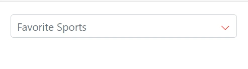
CssClass
Specifies the CssClass name that can be appended with the root element of the MultiSelect. One or more custom CSS classes can be added to a MultiSelect.
Some of the possible values are
-
e-success, which denotes the component in success state that is added green color to the multiselect’s input field. -
e-warning, which denotes the component in warning state that is added orange color to the multiselect’s input field. -
e-error, which denotes the component in error state that is added red color to the multiselect’s input field. -
e-outline, which supports only in material theme.
@using Syncfusion.Blazor.DropDowns;

<SfMultiSelect TValue="string[]" TItem="Games" Placeholder="Favorite Sports" DataSource="@LocalData" FloatLabelType="Syncfusion.Blazor.Inputs.FloatLabelType.Auto" CssClass="@CssClass">
    <MultiSelectFieldSettings Text="Text" Value="ID"></MultiSelectFieldSettings>
</SfMultiSelect>

@code {

    public class Games
    {
        public string ID { get; set; }
        public string Text { get; set; }
    }
    List<Games> LocalData = new List<Games> {
    new Games() { ID= "Game1", Text= "American Football" },
    new Games() { ID= "Game2", Text= "Badminton" },
    new Games() { ID= "Game3", Text= "Basketball" },
    new Games() { ID= "Game4", Text= "Cricket" },
    new Games() { ID= "Game5", Text= "Football" },
    new Games() { ID= "Game6", Text= "Golf" },
    new Games() { ID= "Game7", Text= "Hockey" },
    new Games() { ID= "Game8", Text= "Rugby"},
    new Games() { ID= "Game9", Text= "Snooker" },
    new Games() { ID= "Game10", Text= "Tennis"},
    };
    public string CssClass { get; set; } = "e-success";
}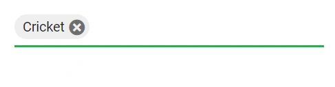
Customizing the appearance of the delimiter container
Customize the appearance of the delimiter container element within the multiselect component by targeting its CSS class .e-delim-values, which indicates the selected values separated by the delimiter character of the multiselect component, and allows you to apply any desired styles to the component.
@using Syncfusion.Blazor.DropDowns;

<SfMultiSelect TValue="string[]" TItem="Games" Placeholder="Favorite Sports" DataSource="@LocalData" Width="300px">
    <MultiSelectFieldSettings Text="Text" Value="ID"></MultiSelectFieldSettings>
</SfMultiSelect>

@code {

    public class Games
    {
        public string ID { get; set; }
        public string Text { get; set; }
    }
    List<Games> LocalData = new List<Games> {
    new Games() { ID= "Game1", Text= "American Football" },
    new Games() { ID= "Game2", Text= "Badminton" },
    new Games() { ID= "Game3", Text= "Basketball" },
    new Games() { ID= "Game4", Text= "Cricket" },
    new Games() { ID= "Game5", Text= "Football" },
    new Games() { ID= "Game6", Text= "Golf" },
    new Games() { ID= "Game7", Text= "Hockey" },
    new Games() { ID= "Game8", Text= "Rugby"},
    new Games() { ID= "Game9", Text= "Snooker" },
    new Games() { ID= "Game10", Text= "Tennis"},
    };
}

<style>
.e-multiselect .e-delim-values {
    -webkit-text-fill-color: blue;
    font-size: 16px;
    font-family: cursive;
}
</style>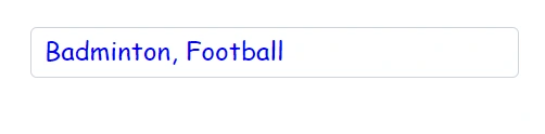
Customizing the appearance of chips
Customize the appearance of the chips within the multiselect component by targeting its CSS classes .e-chips and .e-chipcontent, which represent the chips of the multiselect component, and apply any desired styles to the component.
@using Syncfusion.Blazor.DropDowns;

<SfMultiSelect TValue="string[]" TItem="Games" Placeholder="Favorite Sports" DataSource="@LocalData" Width="300px">
    <MultiSelectFieldSettings Text="Text" Value="ID"></MultiSelectFieldSettings>
</SfMultiSelect>

@code {

    public class Games
    {
        public string ID { get; set; }
        public string Text { get; set; }
    }
    List<Games> LocalData = new List<Games> {
    new Games() { ID= "Game1", Text= "American Football" },
    new Games() { ID= "Game2", Text= "Badminton" },
    new Games() { ID= "Game3", Text= "Basketball" },
    new Games() { ID= "Game4", Text= "Cricket" },
    new Games() { ID= "Game5", Text= "Football" },
    new Games() { ID= "Game6", Text= "Golf" },
    new Games() { ID= "Game7", Text= "Hockey" },
    new Games() { ID= "Game8", Text= "Rugby"},
    new Games() { ID= "Game9", Text= "Snooker" },
    new Games() { ID= "Game10", Text= "Tennis"},
    };
}

<style>
.e-multiselect .e-multi-select-wrapper .e-chips .e-chipcontent {
    font-family: cursive;
    font-size: 20px;
    -webkit-text-fill-color: blue;
}

.e-multi-select-wrapper .e-chips {
    background-color: aqua;
    height: 26px;
}
</style>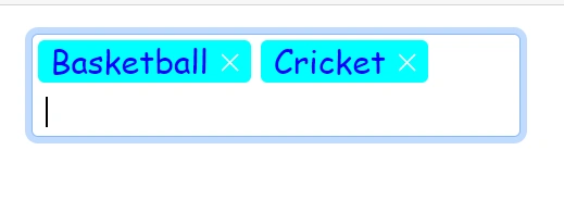
Customizing the outline theme focus color
Customize the color of the multiselect component when it is in a focused state and rendered with an outline theme, by targeting its CSS class e-outline which indicates the input element when it is focused, and allows you to set the desired color to the color property.
@using Syncfusion.Blazor.DropDowns;

<SfMultiSelect TValue="string[]" TItem="Games" Placeholder="Favorite Sports" DataSource="@LocalData" Width="300px" CssClass="e-outline">
    <MultiSelectFieldSettings Text="Text" Value="ID"></MultiSelectFieldSettings>
</SfMultiSelect>

@code {
    public class Games
    {
        public string ID { get; set; }
        public string Text { get; set; }
    }
    List<Games> LocalData = new List<Games> {
    new Games() { ID= "Game1", Text= "American Football" },
    new Games() { ID= "Game2", Text= "Badminton" },
    new Games() { ID= "Game3", Text= "Basketball" },
    new Games() { ID= "Game4", Text= "Cricket" },
    new Games() { ID= "Game5", Text= "Football" },
    new Games() { ID= "Game6", Text= "Golf" },
    new Games() { ID= "Game7", Text= "Hockey" },
    new Games() { ID= "Game8", Text= "Rugby"},
    new Games() { ID= "Game9", Text= "Snooker" },
    new Games() { ID= "Game10", Text= "Tennis"},
    };
}

<style>
.e-outline.e-input-group.e-input-focus:hover:not(.e-success):not(.e-warning):not(.e-error):not(.e-disabled):not(.e-float-icon-left),.e-outline.e-input-group.e-input-focus.e-control-wrapper:hover:not(.e-success):not(.e-warning):not(.e-error):not(.e-disabled):not(.e-float-icon-left),.e-outline.e-input-group.e-input-focus:not(.e-success):not(.e-warning):not(.e-error):not(.e-disabled),.e-outline.e-input-group.e-control-wrapper.e-input-focus:not(.e-success):not(.e-warning):not(.e-error):not(.e-disabled) {
    border-color: #b1bd15;
    box-shadow: inset 1px 1px #b1bd15, inset -1px 0 #b1bd15, inset 0 -1px #b1bd15;
}
</style>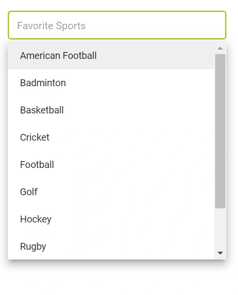
Customizing focus, hover, and active item styles
Customize the background color and text color of list items within the multiselect component when they are in a focused, active, or hovered state by targeting the CSS classes .e-list-item.e-item-focus, .e-list-item.e-active, and .e-list-item.e-hover, and set the desired color to the background-color and color properties.
@using Syncfusion.Blazor.DropDowns;

<SfMultiSelect TValue="string[]" TItem="Games" Placeholder="Favorite Sports" DataSource="@LocalData" Width="300px">
    <MultiSelectFieldSettings Text="Text" Value="ID"></MultiSelectFieldSettings>
</SfMultiSelect>

@code {
    public class Games
    {
        public string ID { get; set; }
        public string Text { get; set; }
    }
    List<Games> LocalData = new List<Games> {
    new Games() { ID= "Game1", Text= "American Football" },
    new Games() { ID= "Game2", Text= "Badminton" },
    new Games() { ID= "Game3", Text= "Basketball" },
    new Games() { ID= "Game4", Text= "Cricket" },
    new Games() { ID= "Game5", Text= "Football" },
    new Games() { ID= "Game6", Text= "Golf" },
    new Games() { ID= "Game7", Text= "Hockey" },
    new Games() { ID= "Game8", Text= "Rugby"},
    new Games() { ID= "Game9", Text= "Snooker" },
    new Games() { ID= "Game10", Text= "Tennis"},
    };
}

<style>
.e-dropdownbase .e-list-item.e-item-focus, .e-dropdownbase .e-list-item.e-active, .e-dropdownbase .e-list-item.e-active.e-hover, .e-dropdownbase .e-list-item.e-hover {
    background-color: #1f9c99;
    color: #2319b8;
}
</style>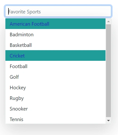
Customizing the appearance of the popup element
Use the following CSS to customize the appearance of popup element.
Customize the appearance of the popup element within the multiselect component by targeting the CSS class .e-list-item.e-item-focus, which indicates the list item element when it is focused, and and allows you to apply any desired styles to the component.
@using Syncfusion.Blazor.DropDowns;

<SfMultiSelect TValue="string[]" TItem="Games" Placeholder="Favorite Sports" DataSource="@LocalData" Width="300px">
    <MultiSelectFieldSettings Text="Text" Value="ID"></MultiSelectFieldSettings>
</SfMultiSelect>

@code {
    public class Games
    {
        public string ID { get; set; }
        public string Text { get; set; }
    }
    List<Games> LocalData = new List<Games> {
    new Games() { ID= "Game1", Text= "American Football" },
    new Games() { ID= "Game2", Text= "Badminton" },
    new Games() { ID= "Game3", Text= "Basketball" },
    new Games() { ID= "Game4", Text= "Cricket" },
    new Games() { ID= "Game5", Text= "Football" },
    new Games() { ID= "Game6", Text= "Golf" },
    new Games() { ID= "Game7", Text= "Hockey" },
    new Games() { ID= "Game8", Text= "Rugby"},
    new Games() { ID= "Game9", Text= "Snooker" },
    new Games() { ID= "Game10", Text= "Tennis"},
    };
}

<style>
.e-dropdownbase .e-list-item, .e-popup.e-multi-select-list-wrapper .e-dropdownbase .e-list-item.e-item-focus {
    background: #29c2b8;
    color: #207cd9;
    font-family: emoji;
    min-height: 29px
}
</style>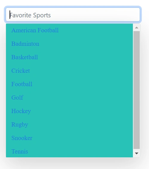
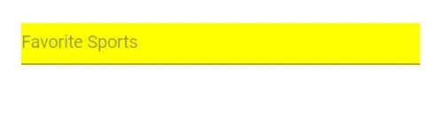
Change HTML attributes
Add additional input attributes such as disabled, value, and more to the root element.
If you configured both the property and equivalent input attribute, then the component considers the property value.
@using Syncfusion.Blazor.DropDowns;

<SfMultiSelect TValue="string[]" TItem="Games" Placeholder="Favorite Sports" DataSource="@LocalData" HtmlAttributes="@htmlAttribute">
    <MultiSelectFieldSettings Text="Text" Value="ID"></MultiSelectFieldSettings>
</SfMultiSelect>

@code {

    public class Games
    {
        public string ID { get; set; }
        public string Text { get; set; }
    }
    List<Games> LocalData = new List<Games> {
    new Games() { ID= "Game1", Text= "American Football" },
    new Games() { ID= "Game2", Text= "Badminton" },
    new Games() { ID= "Game3", Text= "Basketball" },
    new Games() { ID= "Game4", Text= "Cricket" },
    new Games() { ID= "Game5", Text= "Football" },
    new Games() { ID= "Game6", Text= "Golf" },
    new Games() { ID= "Game7", Text= "Hockey" },
    new Games() { ID= "Game8", Text= "Rugby"},
    new Games() { ID= "Game9", Text= "Snooker" },
    new Games() { ID= "Game10", Text= "Tennis"},
    };

    Dictionary<string, object> htmlAttribute = new Dictionary<string, object>()
    {
        {"class", "e-games" },
        {"name", "games" },
        {"style", "background-color: yellow; text-align: right" },
        {"title", "Syncfusion DropDownList" }
    };

}
Set various font families for dropdown elements
The font-family of the multiselect dropdown list can be changed by overriding using the following selector. The overridden can be applied to specific component by adding a class name through the CssClass property.
In the following sample, the font family of the MultiSelect, ListItem text in DropDownList and filterInput text are changed.
@using Syncfusion.Blazor.DropDowns;

<SfMultiSelect TValue="string[]" TItem="Games" Placeholder="Select a game" Width="300px" DataSource="@LocalData" CssClass="e-custom" AllowFiltering=true FilterBarPlaceholder="Search here">
    <MultiSelectFieldSettings Value="ID" Text="Text"></MultiSelectFieldSettings>
</SfMultiSelect>


@code {

    public class Games
    {
        public string ID { get; set; }
        public string Text { get; set; }
    }

    List<Games> LocalData = new List<Games> {
        new Games() { ID= "Game1", Text= "American Football" },
        new Games() { ID= "Game2", Text= "Badminton" },
        new Games() { ID= "Game3", Text= "Basketball" },
        new Games() { ID= "Game4", Text= "Cricket" },
        new Games() { ID= "Game5", Text= "Football" },
        new Games() { ID= "Game6", Text= "Golf" },
        new Games() { ID= "Game7", Text= "Hockey" },
        new Games() { ID= "Game8", Text= "Rugby"},
        new Games() { ID= "Game9", Text= "Snooker" },
        new Games() { ID= "Game10", Text= "Tennis"},
    };
}

<style>
.e-custom.e-popup-open .e-dropdownbase .e-list-item {
    font-family: cursive;
}
.e-custom.e-input-group.e-control-container.e-control-wrapper input {
    font-family: cursive;
}

</style>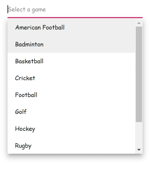
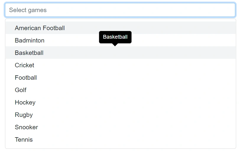
Show a tooltip on list items
You can achieve this behavior by integrating the tooltip component. When the mouse hovers over the DropDownList option, a tooltip appears with information about the hovered list item.
The following code demonstrates how to display a tooltip when hovering over the DropDownList option.
@using Syncfusion.Blazor.DropDowns;
@using Syncfusion.Blazor.Popups;

<SfTooltip @ref="TooltipObj" ID="Tooltip" Target=".e-list-item .name[title]">
</SfTooltip>
<SfMultiSelect TItem="GameFields" TValue="string[]" Placeholder="Select games" DataSource="@Games" HideSelectedItem="false">
    <MultiSelectFieldSettings Text="Text" Value="ID"></MultiSelectFieldSettings>
    <MultiSelectTemplates TItem="GameFields">
        <ItemTemplate>
            <div class="name" title="@((context as GameFields).Text)"> @((context as GameFields).Text) </div>
        </ItemTemplate>
    </MultiSelectTemplates>
    <MultiSelectEvents TValue="string[]" TItem="GameFields" Opened="OnOpen" OnClose="OnClose"></MultiSelectEvents>
</SfMultiSelect>

@code {
    SfTooltip TooltipObj;
    public Boolean isOpen { get; set; } = false;
    public class GameFields
    {
        public string ID { get; set; }
        public string Text { get; set; }
    }
    private List<GameFields> Games = new List<GameFields>() {
        new GameFields(){ ID= "Game1", Text= "American Football" },
        new GameFields(){ ID= "Game2", Text= "Badminton" },
        new GameFields(){ ID= "Game3", Text= "Basketball" },
        new GameFields(){ ID= "Game4", Text= "Cricket" },
        new GameFields(){ ID= "Game5", Text= "Football" },
        new GameFields(){ ID= "Game6", Text= "Golf" },
        new GameFields(){ ID= "Game7", Text= "Hockey" },
        new GameFields(){ ID= "Game8", Text= "Rugby"},
        new GameFields(){ ID= "Game9", Text= "Snooker" },
        new GameFields(){ ID= "Game10", Text= "Tennis"},
    };
    public void OnOpen(PopupEventArgs args)
    {
        isOpen = true;
    }
    public void OnClose(PopupEventArgs args)
    {
        TooltipObj.CloseAsync();
    }
    protected override async Task OnAfterRenderAsync(bool firstRender)
    {
        if (isOpen)
        {
            await TooltipObj.RefreshAsync();
        }
    }
}
Change the width
Set the component width using the Width property. The default is 100% (inherits parent width).
@using Syncfusion.Blazor.DropDowns;

<SfMultiSelect TValue="string[]" TItem="Games" Placeholder="Favorite Sports" DataSource="@LocalData" Width="@Width">
    <MultiSelectFieldSettings Text="Text" Value="ID"></MultiSelectFieldSettings>
</SfMultiSelect>

@code {

    public class Games
    {
        public string ID { get; set; }
        public string Text { get; set; }
    }
    List<Games> LocalData = new List<Games> {
    new Games() { ID= "Game1", Text= "American Football" },
    new Games() { ID= "Game2", Text= "Badminton" },
    new Games() { ID= "Game3", Text= "Basketball" },
    new Games() { ID= "Game4", Text= "Cricket" },
    new Games() { ID= "Game5", Text= "Football" },
    new Games() { ID= "Game6", Text= "Golf" },
    new Games() { ID= "Game7", Text= "Hockey" },
    new Games() { ID= "Game8", Text= "Rugby"},
    new Games() { ID= "Game9", Text= "Snooker" },
    new Games() { ID= "Game10", Text= "Tennis"},
    };

    public string Width { get; set; } = "600px";

}
Disable specific items in the dropdown list
The MultiSelect provides options for individual items to be either in an enabled or disabled state for specific scenarios. The category of each list item can be mapped through the Disabled field in the data table. Once an item is disabled, it cannot be selected as a value for the component. To configure the disabled item columns, use the MultiSelectFieldSettings.Disabled property.
In the following sample, State are grouped according on its category using Disabled field.
@using Syncfusion.Blazor.DropDowns

<SfMultiSelect TValue="string" TItem="TagData" Placeholder="Select Status" DataSource="@LocalData">
    <MultiSelectFieldSettings Value="Text" Disabled="State" ></MultiSelectFieldSettings>
</SfMultiSelect>

@code {

    public IEnumerable<TagData> LocalData { get; set; } = new TagData().TagDataList();

    public class TagData
    {
        public string Text { get; set; }
        public bool State { get; set; }

        public List<TagData> TagDataList()
        {
            List<TagData> tag = new List<TagData>();
            tag.Add(new TagData { Text = "Add to KB", State = false });
            tag.Add(new TagData { Text = "Crisis", State = false });
            tag.Add(new TagData { Text = "Enhancement", State = true });
            tag.Add(new TagData { Text = "Presale", State = false });
            tag.Add(new TagData { Text = "Needs Approval", State = false });
            tag.Add(new TagData { Text = "Approved", State = true });
            tag.Add(new TagData { Text = "Internal Issue", State = true });
            tag.Add(new TagData { Text = "Breaking Issue", State = false });
            tag.Add(new TagData { Text = "New Feature", State = true });
            tag.Add(new TagData { Text = "New Component", State = false });
            tag.Add(new TagData { Text = "Mobile Issue", State = false });
            return tag;

        }
    }
}Disable item method
The disableItem method can be used to handle dynamic changing in disable state of a specific item. Only one item can be disabled in this method. To disable multiple items, this method can be iterated with the items list or array. The disabled field state will to be updated in the DataSource, when the item is disabled using this method. If the selected item is disabled dynamically, then the selection will be cleared.
| Parameter | Type | Description |
|---|---|---|
| itemValue |
string | number | boolean | object
|
Identifies the item to update by its value. |
| itemIndex | number |
Identifies the item to update by its index. |
Customizing the color of the checkbox
Change the color of the checkbox by targeting the CSS classes .e-checkbox-wrapper and .e-frame.e-check which indicates the checkbox of the list item element. Set the desired color using the background-color and color properties.
@using Syncfusion.Blazor.DropDowns;

<SfMultiSelect TValue="string[]" TItem="Country" Placeholder="e.g. Australia" ShowSelectAll=true SelectAllText="Select All" UnSelectAllText="unSelect All" Mode="VisualMode.CheckBox" DataSource="@Countries" Width="300px">
    <MultiSelectFieldSettings Text="Name" Value="Code"></MultiSelectFieldSettings>
</SfMultiSelect>

@code {

    public class Country
    {
        public string Name { get; set; }

        public string Code { get; set; }
    }

    List<Country>Countries = new List<Country>
    {
        new Country() { Name = "Australia", Code = "AU" },
        new Country() { Name = "Bermuda", Code = "BM" },
        new Country() { Name = "Canada", Code = "CA" },
        new Country() { Name = "Cameroon", Code = "CM" },
        new Country() { Name = "Denmark", Code = "DK" },
        new Country() { Name = "France", Code = "FR" },
        new Country() { Name = "Finland", Code = "FI" },
        new Country() { Name = "Germany", Code = "DE" },
        new Country() { Name = "Greenland", Code = "GL" },
        new Country() { Name = "Hong Kong", Code = "HK" },
        new Country() { Name = "India", Code = "IN" },
        new Country() { Name = "Italy", Code = "IT" },
        new Country() { Name = "Japan", Code = "JP" },
        new Country() { Name = "Mexico", Code = "MX" },
        new Country() { Name = "Norway", Code = "NO" },
        new Country() { Name = "Poland", Code = "PL" },
        new Country() { Name = "Switzerland", Code = "CH" },
        new Country() { Name = "United Kingdom", Code = "GB" },
        new Country() { Name = "United States", Code = "US" },
    };
}

<style>
.e-popup .e-checkbox-wrapper .e-frame.e-check, .e-popup .e-checkbox-wrapper:hover .e-frame.e-check {
    background-color: green;
    color: white;
}
</style>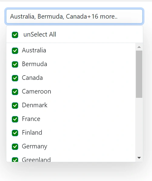
InputAttributes
Add extra input attributes to the root element via InputAttributes. If both a property and an equivalent input attribute are set, the property value takes precedence.
@using Syncfusion.Blazor.DropDowns;

<SfMultiSelect TValue="string[]" TItem="Games" Placeholder="Favorite Sports" DataSource="@LocalData"InputAttributes="@inputAttribute">
    <MultiSelectFieldSettings Text="Text" Value="ID"></MultiSelectFieldSettings>
</SfMultiSelect>

@code {

    public class Games
    {
        public string ID { get; set; }
        public string Text { get; set; }
    }
    List<Games> LocalData = new List<Games> {
    new Games() { ID= "Game1", Text= "American Football" },
    new Games() { ID= "Game2", Text= "Badminton" },
    new Games() { ID= "Game3", Text= "Basketball" },
    new Games() { ID= "Game4", Text= "Cricket" },
    new Games() { ID= "Game5", Text= "Football" },
    new Games() { ID= "Game6", Text= "Golf" },
    new Games() { ID= "Game7", Text= "Hockey" },
    new Games() { ID= "Game8", Text= "Rugby"},
    new Games() { ID= "Game9", Text= "Snooker" },
    new Games() { ID= "Game10", Text= "Tennis"},
    };

     Dictionary<string, object> inputAttribute = new Dictionary<string, object>()
    {
        {"readonly", true },
        {"value","Golf"}
    };

}
Customization of hiding selected item
By default, selected items are hidden from the list. Set HideSelectedItem to false to show selected items in the list. The default value is true.
@using Syncfusion.Blazor.DropDowns;

<SfMultiSelect TValue="string[]" TItem="Games" Placeholder="Favorite Sports" DataSource="@LocalData" HideSelectedItem="@HideSelectedItem">
    <MultiSelectFieldSettings Text="Text" Value="ID"></MultiSelectFieldSettings>
</SfMultiSelect>

@code {

    public class Games
    {
        public string ID { get; set; }
        public string Text { get; set; }
    }
    List<Games> LocalData = new List<Games> {
    new Games() { ID= "Game1", Text= "American Football" },
    new Games() { ID= "Game2", Text= "Badminton" },
    new Games() { ID= "Game3", Text= "Basketball" },
    new Games() { ID= "Game4", Text= "Cricket" },
    new Games() { ID= "Game5", Text= "Football" },
    new Games() { ID= "Game6", Text= "Golf" },
    new Games() { ID= "Game7", Text= "Hockey" },
    new Games() { ID= "Game8", Text= "Rugby"},
    new Games() { ID= "Game9", Text= "Snooker" },
    new Games() { ID= "Game10", Text= "Tennis"},
    };

    public bool HideSelectedItem { get; set; } = false;

}
Show or hide the popup after selection
Use EnableCloseOnSelect to control whether the popup closes automatically after a selection. The default is true.
@using Syncfusion.Blazor.DropDowns;

<SfMultiSelect TValue="string[]" TItem="Games" Placeholder="Favorite Sports" DataSource="@LocalData" EnableCloseOnSelect="@EnableCloseOnSelect">
    <MultiSelectFieldSettings Text="Text" Value="ID"></MultiSelectFieldSettings>
</SfMultiSelect>

@code {

    public class Games
    {
        public string ID { get; set; }
        public string Text { get; set; }
    }
    List<Games> LocalData = new List<Games> {
    new Games() { ID= "Game1", Text= "American Football" },
    new Games() { ID= "Game2", Text= "Badminton" },
    new Games() { ID= "Game3", Text= "Basketball" },
    new Games() { ID= "Game4", Text= "Cricket" },
    new Games() { ID= "Game5", Text= "Football" },
    new Games() { ID= "Game6", Text= "Golf" },
    new Games() { ID= "Game7", Text= "Hockey" },
    new Games() { ID= "Game8", Text= "Rugby"},
    new Games() { ID= "Game9", Text= "Snooker" },
    new Games() { ID= "Game10", Text= "Tennis"},
    };

    public bool EnableCloseOnSelect { get; set; } = false;

}
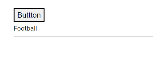
Programmatically clearing value
Clear the value programmatically by calling ClearAsync() on the component instance (for example, from a button click handler).
@using Syncfusion.Blazor.DropDowns;

<div>
    <button  @onclick="ClearAll">Buttton</button>
</div>
<div>
<SfMultiSelect @ref="MultiSelectObj" TValue="string[]" TItem="Games" Placeholder="Favorite Sports" DataSource="@LocalData" @bind-Value="@GameValue">
    <MultiSelectFieldSettings Text="Text" Value="ID"></MultiSelectFieldSettings>
</SfMultiSelect>
</div>

@code {
    SfMultiSelect<string[],Games> MultiSelectObj;
    public class Games
    {
        public string ID { get; set; }
        public string Text { get; set; }
    }
    List<Games> LocalData = new List<Games> {
    new Games() { ID= "Game1", Text= "American Football" },
    new Games() { ID= "Game2", Text= "Badminton" },
    new Games() { ID= "Game3", Text= "Basketball" },
    new Games() { ID= "Game4", Text= "Cricket" },
    new Games() { ID= "Game5", Text= "Football" },
    new Games() { ID= "Game6", Text= "Golf" },
    new Games() { ID= "Game7", Text= "Hockey" },
    new Games() { ID= "Game8", Text= "Rugby"},
    new Games() { ID= "Game9", Text= "Snooker" },
    new Games() { ID= "Game10", Text= "Tennis"},
    };

    public string[] GameValue { get; set; } = { "Game5"};

     public async void ClearAll()
    {
        await this.MultiSelectObj.ClearAsync();
        StateHasChanged();
    }

}
Programmatically show and hide spinner
Show or hide the built-in spinner by calling ShowSpinnerAsync() and HideSpinnerAsync() on the component instance.
@using Syncfusion.Blazor.DropDowns;

<div class=button>
    <button  @onclick="Show">Show</button>
</div>
<div class=button>
    <button  @onclick="Hide">Hide</button>
</div>
<div class=content>
<SfMultiSelect @ref="MultiSelectObj" TValue="string[]" TItem="Games" Placeholder="Favorite Sports" DataSource="@LocalData" ShowDropDownIcon="true" @bind-Value="@GameValue">
    <MultiSelectFieldSettings Text="Text" Value="ID"></MultiSelectFieldSettings>
</SfMultiSelect>
</div>

@code {
    SfMultiSelect<string[],Games> MultiSelectObj;
    public class Games
    {
        public string ID { get; set; }
        public string Text { get; set; }
    }
    List<Games> LocalData = new List<Games> {
    new Games() { ID= "Game1", Text= "American Football" },
    new Games() { ID= "Game2", Text= "Badminton" },
    new Games() { ID= "Game3", Text= "Basketball" },
    new Games() { ID= "Game4", Text= "Cricket" },
    new Games() { ID= "Game5", Text= "Football" },
    new Games() { ID= "Game6", Text= "Golf" },
    new Games() { ID= "Game7", Text= "Hockey" },
    new Games() { ID= "Game8", Text= "Rugby"},
    new Games() { ID= "Game9", Text= "Snooker" },
    new Games() { ID= "Game10", Text= "Tennis"},
    };

    public string[] GameValue { get; set; } = { "Game5"};

    public void Show()
    {
        this.MultiSelectObj.ShowSpinnerAsync();
    }

    public void Hide()
    {
        this.MultiSelectObj.HideSpinnerAsync();
    }

}
<style>
    .button{
        margin-top: 5px;
    }
</style>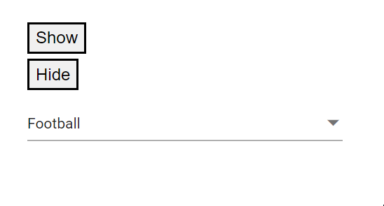
Programmatically focus in and focus out
Move focus in and out programmatically by calling FocusAsync() and FocusOutAsync() on the component instance.
@using Syncfusion.Blazor.DropDowns;

<div class=button>
    <button  @onclick="Focus">FocusIn</button>
</div>
<div class=button>
    <button  @onclick="FocusOut">FocusOut</button>
</div>
<div class=content>
<SfMultiSelect @ref="MultiSelectObj" TValue="string[]" TItem="Games" Placeholder="Favorite Sports" DataSource="@LocalData" @bind-Value="@GameValue">
    <MultiSelectFieldSettings Text="Text" Value="ID"></MultiSelectFieldSettings>
</SfMultiSelect>
</div>

@code {
    SfMultiSelect<string[],Games> MultiSelectObj;
    public class Games
    {
        public string ID { get; set; }
        public string Text { get; set; }
    }
    List<Games> LocalData = new List<Games> {
    new Games() { ID= "Game1", Text= "American Football" },
    new Games() { ID= "Game2", Text= "Badminton" },
    new Games() { ID= "Game3", Text= "Basketball" },
    new Games() { ID= "Game4", Text= "Cricket" },
    new Games() { ID= "Game5", Text= "Football" },
    new Games() { ID= "Game6", Text= "Golf" },
    new Games() { ID= "Game7", Text= "Hockey" },
    new Games() { ID= "Game8", Text= "Rugby"},
    new Games() { ID= "Game9", Text= "Snooker" },
    new Games() { ID= "Game10", Text= "Tennis"},
    };

    public string[] GameValue { get; set; } = { "Game5"};

    public void Focus()
    {
        this.MultiSelectObj.FocusAsync();
    }

    public void FocusOut()
    {
        this.MultiSelectObj.FocusOutAsync();
    }

}
<style>
    .button{
        margin-top: 5px;
    }
</style>Popup opening on click
Use the OpenOnClick property to control whether clicking the component opens the popup automatically. The default value is true.
@using Syncfusion.Blazor.DropDowns;

<SfMultiSelect TValue="string[]" TItem="Games" Placeholder="Favorite Sports" DataSource="@LocalData" OpenOnClick="OpenOnClick">
    <MultiSelectFieldSettings Text="Text" Value="ID"></MultiSelectFieldSettings>
</SfMultiSelect>

@code {

    public class Games
    {
        public string ID { get; set; }
        public string Text { get; set; }
    }
    List<Games> LocalData = new List<Games> {
    new Games() { ID= "Game1", Text= "American Football" },
    new Games() { ID= "Game2", Text= "Badminton" },
    new Games() { ID= "Game3", Text= "Basketball" },
    new Games() { ID= "Game4", Text= "Cricket" },
    new Games() { ID= "Game5", Text= "Football" },
    new Games() { ID= "Game6", Text= "Golf" },
    new Games() { ID= "Game7", Text= "Hockey" },
    new Games() { ID= "Game8", Text= "Rugby"},
    new Games() { ID= "Game9", Text= "Snooker" },
    new Games() { ID= "Game10", Text= "Tennis"},
    };

    public bool OpenOnClick{ get; set; } = false;

}