Templates in Blazor MultiSelect Dropdown Component
24 Jun 20269 minutes to read
The MultiSelect provides template options to customize the selected value, list items, group headers, header, and footer elements.
To get started quickly with templates in the Blazor MultiSelect Dropdown component, watch the following video:
Value template
Customize how the currently selected value is displayed in the input by using the ValueTemplate property.
In the following sample, the selected value displays combined text from FirstName and Designation, separated by a hyphen.
@using Syncfusion.Blazor.Data
@using Syncfusion.Blazor.DropDowns
@using Syncfusion.Blazor
<SfMultiSelect TValue="string[]" TItem="EmployeeData" Placeholder="Select a employee" Query="@Query">
    <MultiSelectTemplates TItem="EmployeeData">
        <ItemTemplate>
            <span><span class='name'>@((context as EmployeeData).FirstName)</span><span class='destination'>@((context as EmployeeData).Designation)</span></span>
        </ItemTemplate>
        <ValueTemplate>
            <span>@((context as EmployeeData).FirstName) - @((context as EmployeeData).Designation)</span>
        </ValueTemplate>
    </MultiSelectTemplates>
    <SfDataManager Url="https://ej2services.syncfusion.com/production/web-services/api/Employees" Adaptor="Adaptors.WebApiAdaptor" CrossDomain=true></SfDataManager>
    <MultiSelectFieldSettings Text="FirstName" Value="Designation"></MultiSelectFieldSettings>
</SfMultiSelect>

@code {
    public class EmployeeData
    {
        public string FirstName { get; set; }
        public string Designation { get; set; }
    }
    public Query Query = new Query();
}
<style>
    .destination {
        right: 15px;
        position: absolute;
    }
</style>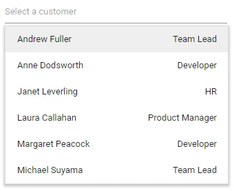
Item template
Customize the content of each list item by using the ItemTemplate property.
In the following sample, each list item is split into two columns to display related data.
@using Syncfusion.Blazor.Data
@using Syncfusion.Blazor.DropDowns
@using Syncfusion.Blazor

<SfMultiSelect Placeholder="Select a employee" TValue="string[]" TItem="EmployeeData" Query="@Query">
    <MultiSelectTemplates TItem="EmployeeData">
        <ItemTemplate>
            <span><span class='name'>@((context as EmployeeData).FirstName)</span><span class='country'>@((context as EmployeeData).Country)</span></span>
        </ItemTemplate>
    </MultiSelectTemplates>
    <SfDataManager Url="https://ej2services.syncfusion.com/production/web-services/api/Employees" Adaptor="Adaptors.WebApiAdaptor" CrossDomain=true></SfDataManager>
    <MultiSelectFieldSettings Text="FirstName" Value="Country"></MultiSelectFieldSettings>
</SfMultiSelect>

@code {
    public class EmployeeData
    {
        public string FirstName { get; set; }
        public string Country { get; set; }
    }
    public Query Query = new Query();
}

<style>
    .country {
        right: 15px;
        position: absolute;
    }
</style>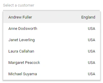
Group template
Customize the group header title (used for both inline and floating headers) by using the GroupTemplate property.
In the following sample, employees are grouped by city.
@using Syncfusion.Blazor.Data
@using Syncfusion.Blazor.DropDowns

<SfMultiSelect TValue="string[]" TItem="EmployeeData" Placeholder="Select a customer" Query="@Query">
    <MultiSelectTemplates TItem="EmployeeData">
        <GroupTemplate>
            <span class="group">@(context.Text)</span>
        </GroupTemplate>
    </MultiSelectTemplates>
    <SfDataManager Url="https://blazor.syncfusion.com/services/production/api/Employees" Adaptor="Syncfusion.Blazor.Adaptors.WebApiAdaptor" CrossDomain=true></SfDataManager>
    <MultiSelectFieldSettings Value="FirstName" GroupBy="Country"></MultiSelectFieldSettings>
</SfMultiSelect>

@code {

public class EmployeeData
{
public string FirstName { get; set; }
public string Country { get; set; }
}

public Query Query = new Query();
}

<style>
    .group {
        color: slategrey;
    }
</style>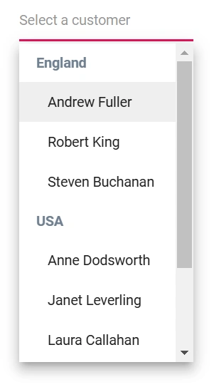
Header template
Render a custom header at the top of the popup by using the HeaderTemplate property.
In the following sample, the header and list items are presented in two columns similar to a grid layout.
@using Syncfusion.Blazor.Data
@using Syncfusion.Blazor.DropDowns
@using Syncfusion.Blazor

<SfMultiSelect TValue="string[]" TItem="EmployeeData" Placeholder="Select a employe" Query="@Query">
    <MultiSelectTemplates TItem="EmployeeData">
        <ItemTemplate>
            <span class='item'><span class='name'>@((context as EmployeeData).FirstName)</span><span class='city'>@((context as EmployeeData).Country)</span></span>
        </ItemTemplate>
        <HeaderTemplate>
            <span class='head'><span class='name'>Name</span><span class='city'>Country</span></span>
        </HeaderTemplate>
    </MultiSelectTemplates>
    <SfDataManager Url="https://ej2services.syncfusion.com/production/web-services/api/Employees" Adaptor="Adaptors.WebApiAdaptor" CrossDomain=true></SfDataManager>
    <MultiSelectFieldSettings Value="Country" Text="FirstName"></MultiSelectFieldSettings>
</SfMultiSelect>

@code {
    public class EmployeeData
    {
        public string FirstName { get; set; }
        public string Country { get; set; }
    }
    public Query Query = new Query();
}

<style>
    .head, .item {
        display: table;
        width: 100%;
        margin: auto;
    }

    .head {
        height: 40px;
        font-size: 15px;
        font-weight: 600;
    }

    .name, .city {
        display: table-cell;
        vertical-align: middle;
        width: 50%;
    }

    .head .name {
        text-indent: 16px;
    }

    .head .city {
        text-indent: 10px;
    }
</style>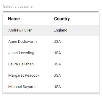
Footer template
Render a custom footer at the bottom of the popup list by using the FooterTemplate property.
In the following sample, the footer displays the total number of list items.
@using Syncfusion.Blazor.Data
@using Syncfusion.Blazor.DropDowns
@using Syncfusion.Blazor

<SfMultiSelect TValue="string[]" TItem="EmployeeData" Query="@Query" Placeholder="Select a customer">
    <MultiSelectTemplates TItem="EmployeeData">
        <FooterTemplate>
            <span class='footer'>Total list Item: 6 </span>
        </FooterTemplate>
    </MultiSelectTemplates>
    <SfDataManager Url="https://ej2services.syncfusion.com/production/web-services/api/Employees" Adaptor="Adaptors.WebApiAdaptor" CrossDomain=true></SfDataManager>
    <MultiSelectFieldSettings Value="Country" Text="FirstName"></MultiSelectFieldSettings>
</SfMultiSelect>

@code {

    public class EmployeeData
    {
        public string FirstName { get; set; }
    }
    public Query Query = new Query();
}

<style>
    .footer {
        text-indent: 1.2em;
        display: block;
        font-size: 15px;
        line-height: 40px;
        border-top: 1px solid #e0e0e0;
    }
</style>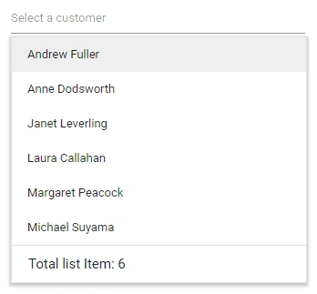
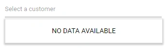
No records template
Customize the popup content when no items are available or when search yields no matches by using the NoRecordsTemplate property.
In the following sample, the popup displays a “no data available” message.
@using Syncfusion.Blazor.DropDowns

<SfMultiSelect TValue="string[]" TItem="EmployeeData" Placeholder="Select a employee" CssClass="e-custom" DataSource="@employee">
    <MultiSelectTemplates TItem="EmployeeData">
        <NoRecordsTemplate>
            <span class='norecord'> NO DATA AVAILABLE</span>
        </NoRecordsTemplate>
    </MultiSelectTemplates>
</SfMultiSelect>

@code {

    public class EmployeeData { }

    List<EmployeeData> employee = new List<EmployeeData> { };
}
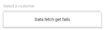
Action failure template
Customize the popup content displayed when a remote data request fails by using the ActionFailureTemplate property.
In the following sample, the component shows a notification when data retrieval fails.
@using Syncfusion.Blazor.Data
@using Syncfusion.Blazor.DropDowns
@using Syncfusion.Blazor

<SfMultiSelect  TValue="string[]" TItem="EmployeeData" Placeholder="Select a customer" Query="@Query">
    <MultiSelectTemplates TItem="EmployeeData">
        <ActionFailureTemplate>
            <span class='norecord'>Data fetch get fails </span>
        </ActionFailureTemplate>
    </MultiSelectTemplates>
    <SfDataManager Url="https://services.odata.org/V4/Northwind/Northwind.svcs/Employees" Adaptor="Adaptors.ODataV4Adaptor" CrossDomain=true></SfDataManager>
    <MultiSelectFieldSettings Value="Country" Text="FirstName"></MultiSelectFieldSettings>
</SfMultiSelect>

@code {
    public class EmployeeData
    {
        public string FirstName { get; set; }
    }
    public Query Query = new Query();
}