Accessibility in Blazor Numeric TextBox Component
25 Jun 20264 minutes to read
The Blazor NumericTextBox component follows accessibility guidelines and standards, including ADA, Section 508, WCAG 2.2 standards, and WCAG roles that are commonly used to evaluate accessibility.
The accessibility compliance for the Blazor Numeric TextBox component is outlined below.
| Accessibility Criteria | Compatibility |
|---|---|
| WCAG 2.2 Support | AA |
| Section 508 Support |  |
| Screen Reader Support | |
| Right-To-Left Support | |
| Color Contrast | |
| Mobile Device Support | |
| Keyboard Navigation Support | |
| Axe-core Accessibility Validation | |
- All features of the component meet the requirement. - Some features of the component do not meet the requirement.
 - The component does not meet the requirement.
WAI-ARIA attributes
The Blazor Numeric TextBox provides comprehensive WAI-ARIA support to improve accessibility for screen readers and other assistive technologies. It is designed with reference to the WAI ARAI Accessibility practices.
The Numeric TextBox uses the role=”spin button” and the following ARIA properties to convey state to assistive technologies.
| Property | Functionality |
|---|---|
| aria-live | Indicates the priority of updates to a live region |
| aria-valuemin | Specifies the minimum allowable range of the NumericTextBox. |
| aria-valuemax | Specifies the maximum allowable range of the NumericTextBox. |
| aria-disabled | Indicates disabled state of the NumericTextBox. |
| aria-readonly | Indicates the read-only state of the NumericTextBox. |
| aria-valuenow | Specifies the current value of the NumericTextBox. |
| aria-invalid | Indicates that the user input is incorrect or not within acceptable ranges. |
| aria-label | Indicates a string value that labels the NumericTextBox. |
Keyboard interaction
Keyboard interaction of the Blazor Numeric TextBox component is designed based on the WAI-ARIA Practices for spinbutton behavior. The input must have focus for the shortcuts to apply.
The following table shows shortcut keys and their corresponding actions.
| Windows | Mac | Actions |
|---|---|---|
| ↓ | ↓ | Decrements the value. |
| ↑ | ↑ | Increments the value. |
@using Syncfusion.Blazor.Inputs

<SfNumericTextBox TValue="int?" Value=10></SfNumericTextBox>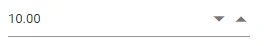
Ensuring accessibility
The Blazor Numeric TextBox component’s accessibility levels are validated through an axe-core software tool during automated testing.
The accessibility compliance of the Numeric TextBox component is shown in the following sample. Open the sample in a new window to evaluate the accessibility of the Numeric TextBox component with accessibility tools.