Appearance in Blazor OTP Input component
1 Jul 202624 minutes to read
Customize the appearance of the OTP input component, including input length, disabled state, and visual styles.
Setting input length
Specify the length of the OTP by using the Length property. The default value is 4. This value determines the number of input fields rendered for the OTP.
@using Syncfusion.Blazor.Inputs

<SfOtpInput Length=5></SfOtpInput>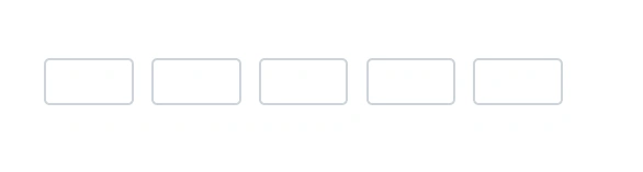
Disable inputs
Disable the OTP Input component by using the Disabled property. By default, the value is false. When disabled, the input fields are non-interactive and display the disabled visual style.
@using Syncfusion.Blazor.Inputs

<SfOtpInput Disabled="true"></SfOtpInput>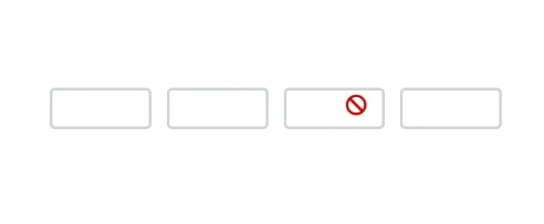
CssClass
Customize the appearance of the OTP Input component by changing colors, fonts, sizes, and other visual aspects by using the CssClass property.
The OTP input component supports the following predefined styles that can be applied using the CssClass property. Replace the CssClass value with one of the following class names to apply the corresponding style.
| cssClass | Description |
|---|---|
e-success |
Used to represent a positive action. |
e-warning |
Used to represent an action with caution. |
e-error |
Used to represent a negative action. |
@using Syncfusion.Blazor.Inputs

<SfOtpInput Value="1234" CssClass="e-success"></SfOtpInput>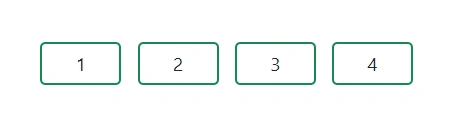
Style Customization
Customize the OTP Input component with various visual styles by using the CssClass property. Below are examples of different style variations and hover effects.
Default (Outline) Style
Displays standard outlined input boxes with the default Syncfusion appearance. Clean borders with subtle shadow on focus for visual feedback.
@using Syncfusion.Blazor.Inputs

<SfOtpInput Value="1234" CssClass="otp-default" />.e-otpinput.otp-default .e-otp-input-field {
font-size: 18px;
font-weight: 600;
color: #333;
}
.e-otpinput.otp-default .e-otp-input-field:focus,
.e-otpinput.otp-default .e-otp-input-field.e-otp-input-focus {
border-color: #333 !important;
box-shadow: 0 0 0 3px rgba(51, 51, 51, 0.15) !important;
outline: none !important;
}Filled Background Style
Each cell has a solid background with no visible border. Provides a modern, filled appearance with color-coded background on focus.
@using Syncfusion.Blazor.Inputs

<SfOtpInput Value="5678" CssClass="otp-filled" />.e-otpinput.otp-filled .e-otp-input-field {
background: #e8f4fd !important;
border: none !important;
border-radius: 8px !important;
color: #0a6ebd;
font-weight: 700;
font-size: 18px;
}
.e-otpinput.otp-filled .e-otp-input-field:focus,
.e-otpinput.otp-filled .e-otp-input-field.e-otp-input-focus {
background: #bde0f9 !important;
border: none !important;
border-radius: 8px !important;
color: #0a6ebd !important;
outline: none !important;
box-shadow: none !important;
}Underline (Bottom Border Only) Style
Minimalist style with only a bottom border visible. Clean and elegant, perfect for forms with a modern aesthetic.
@using Syncfusion.Blazor.Inputs

<SfOtpInput Value="9012" CssClass="otp-underline" />.e-otpinput.otp-underline .e-otp-input-field {
background: transparent;
border: none !important;
border-bottom: 2px solid #888 !important;
border-radius: 0 !important;
color: #333;
font-size: 20px;
font-weight: 600;
text-align: center;
}
.e-otpinput.otp-underline .e-otp-input-field:focus,
.e-otpinput.otp-underline .e-otp-input-field.e-otp-input-focus {
background: transparent !important;
border: none !important;
border-bottom: 2px solid #6200ea !important;
border-radius: 0 !important;
color: #6200ea !important;
outline: none !important;
box-shadow: none !important;
}Rounded / Pill Style
Circular input cells with a colored border. Creates a modern, rounded appearance ideal for mobile-friendly interfaces.
@using Syncfusion.Blazor.Inputs

<SfOtpInput Value="3456" CssClass="otp-rounded" />.e-otpinput.otp-rounded .e-otp-input-field {
border-radius: 50% !important;
border: 2px solid #6200ea !important;
color: #6200ea !important;
font-weight: 700 !important;
font-size: 18px !important;
width: 52px !important;
height: 52px !important;
}
.e-otpinput.otp-rounded .e-otp-input-field:focus,
.e-otpinput.otp-rounded .e-otp-input-field.e-otp-input-focus {
border-radius: 50% !important;
border: 2px solid #6200ea !important;
color: #6200ea !important;
background: #ede7f6 !important;
width: 52px !important;
height: 52px !important;
outline: none !important;
box-shadow: 0 0 0 3px rgba(98, 0, 234, 0.15) !important;
}Success (Green) Theme
Communicates a verified or successful OTP state using green color scheme. Ideal for completed or validated input states.
@using Syncfusion.Blazor.Inputs

<SfOtpInput Value="7890" CssClass="otp-success" />.e-otpinput.otp-success .e-otp-input-field {
border: 2px solid #28a745 !important;
color: #155724 !important;
background: #d4edda !important;
border-radius: 8px !important;
font-weight: 700 !important;
font-size: 18px !important;
}
.e-otpinput.otp-success .e-otp-input-field:focus,
.e-otpinput.otp-success .e-otp-input-field.e-otp-input-focus {
border: 2px solid #28a745 !important;
color: #155724 !important;
background: #b8dfc4 !important;
border-radius: 8px !important;
box-shadow: 0 0 0 3px rgba(40, 167, 69, 0.25) !important;
outline: none !important;
}Error (Red) Theme
Highlights an invalid OTP entry using red color scheme. Perfect for error states and validation feedback.
@using Syncfusion.Blazor.Inputs

<SfOtpInput Value="0000" CssClass="otp-error" />.e-otpinput.otp-error .e-otp-input-field {
border: 2px solid #dc3545 !important;
color: #721c24 !important;
background: #f8d7da !important;
border-radius: 8px !important;
font-weight: 700 !important;
font-size: 18px !important;
}
.e-otpinput.otp-error .e-otp-input-field:focus,
.e-otpinput.otp-error .e-otp-input-field.e-otp-input-focus {
border: 2px solid #dc3545 !important;
color: #721c24 !important;
background: #f1b0b7 !important;
border-radius: 8px !important;
box-shadow: 0 0 0 3px rgba(220, 53, 69, 0.25) !important;
outline: none !important;
}Warning (Amber) Theme
Draws attention without indicating failure using amber/yellow color scheme. Useful for caution states and warnings.
@using Syncfusion.Blazor.Inputs

<SfOtpInput Value="1111" CssClass="otp-warning" />.e-otpinput.otp-warning .e-otp-input-field {
border: 2px solid #ffc107 !important;
color: #856404 !important;
background: #fff3cd !important;
border-radius: 8px !important;
font-weight: 700 !important;
font-size: 18px !important;
}
.e-otpinput.otp-warning .e-otp-input-field:focus,
.e-otpinput.otp-warning .e-otp-input-field.e-otp-input-focus {
border: 2px solid #ffc107 !important;
color: #856404 !important;
background: #ffe699 !important;
border-radius: 8px !important;
box-shadow: 0 0 0 3px rgba(255, 193, 7, 0.30) !important;
outline: none !important;
}Dark / Night Mode Style
Dark background with light-colored cells for better visibility in low-light environments. Perfect for dark mode interfaces.
@using Syncfusion.Blazor.Inputs

<SfOtpInput Value="2222" CssClass="otp-dark" />.e-otpinput.otp-dark .e-otp-input-field {
background: #2d2d3f !important;
border: 1.5px solid #555 !important;
border-radius: 8px !important;
color: #e0e0e0 !important;
font-weight: 700 !important;
font-size: 18px !important;
}
.e-otpinput.otp-dark .e-otp-input-field:focus,
.e-otpinput.otp-dark .e-otp-input-field.e-otp-input-focus {
border: 1.5px solid #bb86fc !important;
background: #3a3a52 !important;
color: #ffffff !important;
border-radius: 8px !important;
box-shadow: 0 0 0 3px rgba(187, 134, 252, 0.25) !important;
outline: none !important;
}Large Size Style
Bigger cells with larger font — ideal for accessibility and touch-friendly interfaces. Enhances usability for users with visual impairments.
@using Syncfusion.Blazor.Inputs

<SfOtpInput Value="3333" CssClass="otp-large" />.e-otpinput.otp-large .e-otp-input-field {
width: 64px !important;
height: 64px !important;
font-size: 26px !important;
font-weight: 700 !important;
border: 2px solid #0d6efd !important;
border-radius: 10px !important;
color: #0d6efd !important;
background: #e7f0ff !important;
}
.e-otpinput.otp-large .e-otp-input-field:focus,
.e-otpinput.otp-large .e-otp-input-field.e-otp-input-focus {
width: 64px !important;
height: 64px !important;
border: 2px solid #0d6efd !important;
border-radius: 10px !important;
color: #0d6efd !important;
background: #ccdeff !important;
box-shadow: 0 0 0 4px rgba(13, 110, 253, 0.2) !important;
outline: none !important;
}Gradient / Shadow Highlight Style
Eye-catching cells with a box-shadow glow effect on focus. Creates a premium, polished appearance.
@using Syncfusion.Blazor.Inputs

<SfOtpInput Value="4444" CssClass="otp-glow" />.e-otpinput.otp-glow .e-otp-input-field {
border: 2px solid #ff6b6b !important;
border-radius: 10px !important;
color: #c0392b !important;
background: #fff5f5 !important;
font-weight: 700 !important;
font-size: 18px !important;
transition: box-shadow 0.2s ease, transform 0.15s ease !important;
}
.e-otpinput.otp-glow .e-otp-input-field:focus,
.e-otpinput.otp-glow .e-otp-input-field.e-otp-input-focus {
border: 2px solid #ff6b6b !important;
border-radius: 10px !important;
color: #c0392b !important;
background: #ffd5d5 !important;
box-shadow: 0 0 12px 3px rgba(255, 107, 107, 0.5) !important;
transform: scale(1.08);
outline: none !important;
}Hover Effects
Enhance user experience with interactive hover states that provide visual feedback.
Lift / Elevation on Hover
Cell rises with a shadow on hover — gives a tactile feel and improves interactivity feedback.
@using Syncfusion.Blazor.Inputs

<SfOtpInput Value="1234" CssClass="otp-hover-lift" />.e-otpinput.otp-hover-lift .e-otp-input-field {
border: 2px solid #adb5bd !important;
border-radius: 8px !important;
font-size: 18px !important;
font-weight: 600 !important;
color: #333 !important;
background: #fff !important;
transition: transform 0.18s ease, box-shadow 0.18s ease, border-color 0.18s ease !important;
}
.e-otpinput.otp-hover-lift .e-otp-input-field:hover {
transform: translateY(-4px) !important;
box-shadow: 0 8px 18px rgba(0, 0, 0, 0.15) !important;
border-color: #6c757d !important;
}
.e-otpinput.otp-hover-lift .e-otp-input-field:focus,
.e-otpinput.otp-hover-lift .e-otp-input-field.e-otp-input-focus {
border-color: #495057 !important;
box-shadow: 0 0 0 3px rgba(73, 80, 87, 0.2) !important;
outline: none !important;
}Border Color Change on Hover
Border transitions to a vibrant color when hovered — simple yet effective visual feedback.
@using Syncfusion.Blazor.Inputs

<SfOtpInput Value="5678" CssClass="otp-hover-border" />.e-otpinput.otp-hover-border .e-otp-input-field {
border: 2px solid #dee2e6 !important;
border-radius: 8px !important;
font-size: 18px !important;
font-weight: 600 !important;
color: #333 !important;
background: #fff !important;
transition: border-color 0.2s ease, color 0.2s ease !important;
}
.e-otpinput.otp-hover-border .e-otp-input-field:hover {
border-color: #e91e8c !important;
color: #e91e8c !important;
}
.e-otpinput.otp-hover-border .e-otp-input-field:focus,
.e-otpinput.otp-hover-border .e-otp-input-field.e-otp-input-focus {
border-color: #e91e8c !important;
color: #e91e8c !important;
box-shadow: 0 0 0 3px rgba(233, 30, 140, 0.2) !important;
outline: none !important;
}Background Fill on Hover
Cell background fills with color smoothly on hover — creates an interactive, engaging experience.
@using Syncfusion.Blazor.Inputs

<SfOtpInput Value="9012" CssClass="otp-hover-fill" />.e-otpinput.otp-hover-fill .e-otp-input-field {
border: 2px solid #20c997 !important;
border-radius: 8px !important;
font-size: 18px !important;
font-weight: 600 !important;
color: #20c997 !important;
background: #fff !important;
transition: background 0.2s ease, color 0.2s ease !important;
}
.e-otpinput.otp-hover-fill .e-otp-input-field:hover {
background: #20c997 !important;
color: #fff !important;
}
.e-otpinput.otp-hover-fill .e-otp-input-field:focus,
.e-otpinput.otp-hover-fill .e-otp-input-field.e-otp-input-focus {
background: #12a07a !important;
color: #fff !important;
border-color: #12a07a !important;
box-shadow: 0 0 0 3px rgba(32, 201, 151, 0.25) !important;
outline: none !important;
}Scale / Zoom on Hover
Cell slightly scales up when the pointer is over it — adds dynamism and playfulness to the interface.
@using Syncfusion.Blazor.Inputs

<SfOtpInput Value="3456" CssClass="otp-hover-scale" />.e-otpinput.otp-hover-scale .e-otp-input-field {
border: 2px solid #fd7e14 !important;
border-radius: 8px !important;
font-size: 18px !important;
font-weight: 600 !important;
color: #fd7e14 !important;
background: #fff8f3 !important;
transition: transform 0.15s ease, box-shadow 0.15s ease !important;
}
.e-otpinput.otp-hover-scale .e-otp-input-field:hover {
transform: scale(1.12) !important;
box-shadow: 0 4px 14px rgba(253, 126, 20, 0.3) !important;
}
.e-otpinput.otp-hover-scale .e-otp-input-field:focus,
.e-otpinput.otp-hover-scale .e-otp-input-field.e-otp-input-focus {
border-color: #fd7e14 !important;
background: #ffe5cc !important;
box-shadow: 0 0 0 3px rgba(253, 126, 20, 0.25) !important;
outline: none !important;
}Glow Ring on Hover
A colored ring glows around the cell on hover — creates a premium, polished appearance.
@using Syncfusion.Blazor.Inputs

<SfOtpInput Value="7890" CssClass="otp-hover-glow" />.e-otpinput.otp-hover-glow .e-otp-input-field {
border: 2px solid #6f42c1 !important;
border-radius: 8px !important;
font-size: 18px !important;
font-weight: 600 !important;
color: #6f42c1 !important;
background: #f8f4ff !important;
transition: box-shadow 0.2s ease !important;
}
.e-otpinput.otp-hover-glow .e-otp-input-field:hover {
box-shadow: 0 0 0 5px rgba(111, 66, 193, 0.2), 0 0 14px rgba(111, 66, 193, 0.25) !important;
}
.e-otpinput.otp-hover-glow .e-otp-input-field:focus,
.e-otpinput.otp-hover-glow .e-otp-input-field.e-otp-input-focus {
border-color: #6f42c1 !important;
background: #ede0ff !important;
box-shadow: 0 0 0 5px rgba(111, 66, 193, 0.3) !important;
outline: none !important;
}Underline Slide-In on Hover
Bottom border slides in from center on hover — creates an elegant, modern animation effect.
@using Syncfusion.Blazor.Inputs

<SfOtpInput Value="2468" CssClass="otp-hover-underline" />.e-otpinput.otp-hover-underline .e-otp-input-field {
border: none !important;
border-radius: 0 !important;
border-bottom: 2px solid transparent !important;
font-size: 18px !important;
font-weight: 600 !important;
color: #333 !important;
background: #f0f0f0 !important;
transition: border-bottom-color 0.25s ease, background 0.2s ease !important;
}
.e-otpinput.otp-hover-underline .e-otp-input-field:hover {
border-bottom-color: #0dcaf0 !important;
background: #e6f9fc !important;
}
.e-otpinput.otp-hover-underline .e-otp-input-field:focus,
.e-otpinput.otp-hover-underline .e-otp-input-field.e-otp-input-focus {
border: none !important;
border-bottom: 2px solid #0dcaf0 !important;
border-radius: 0 !important;
background: #ccf4fb !important;
box-shadow: none !important;
outline: none !important;
}Invert / Contrast on Hover
Background and text color swap on hover for a bold contrast effect — creates strong visual feedback.
@using Syncfusion.Blazor.Inputs

<SfOtpInput Value="1357" CssClass="otp-hover-invert" />.e-otpinput.otp-hover-invert .e-otp-input-field {
border: 2px solid #343a40 !important;
border-radius: 8px !important;
font-size: 18px !important;
font-weight: 700 !important;
color: #343a40 !important;
background: #fff !important;
transition: background 0.2s ease, color 0.2s ease, border-color 0.2s ease !important;
}
.e-otpinput.otp-hover-invert .e-otp-input-field:hover {
background: #343a40 !important;
color: #fff !important;
border-color: #343a40 !important;
}
.e-otpinput.otp-hover-invert .e-otp-input-field:focus,
.e-otpinput.otp-hover-invert .e-otp-input-field.e-otp-input-focus {
background: #495057 !important;
color: #fff !important;
border-color: #495057 !important;
box-shadow: 0 0 0 3px rgba(52, 58, 64, 0.25) !important;
outline: none !important;
}Shake / Wiggle on Hover
Cell performs a subtle wiggle animation when hovered — adds playful feedback to user interactions.
@using Syncfusion.Blazor.Inputs

<SfOtpInput Value="9999" CssClass="otp-hover-shake" />@@keyframes otp-wiggle {
0% { transform: rotate(0deg); }
20% { transform: rotate(-4deg); }
40% { transform: rotate(4deg); }
60% { transform: rotate(-3deg); }
80% { transform: rotate(3deg); }
100% { transform: rotate(0deg); }
}
.e-otpinput.otp-hover-shake .e-otp-input-field {
border: 2px solid #dc3545 !important;
border-radius: 8px !important;
font-size: 18px !important;
font-weight: 600 !important;
color: #dc3545 !important;
background: #fff5f5 !important;
}
.e-otpinput.otp-hover-shake .e-otp-input-field:hover {
animation: otp-wiggle 0.4s ease !important;
border-color: #a71d2a !important;
background: #fde8ea !important;
}
.e-otpinput.otp-hover-shake .e-otp-input-field:focus,
.e-otpinput.otp-hover-shake .e-otp-input-field.e-otp-input-focus {
border-color: #a71d2a !important;
background: #f5c6cb !important;
box-shadow: 0 0 0 3px rgba(167, 29, 42, 0.2) !important;
outline: none !important;
}