How can I help you?
Input Types in Blazor OTP Input component
24 Jun 20261 minute to read
Types
This section explains the available types of the OTP (one-time password) input component, their default behaviors, and appropriate use cases.
Number type
Set the Type property to Number to accept only numeric characters. This is ideal for OTP scenarios with digit-only codes. The default Type is Number.
@using Syncfusion.Blazor.Inputs

<SfOtpInput Value="1234" Type="OtpInputType.Number"></SfOtpInput>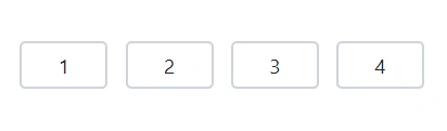
Text type
Set the Type property to Text to allow alphanumeric input. Use this when the OTP may include both letters and numbers.
@using Syncfusion.Blazor.Inputs

<SfOtpInput Value="e3c7" Type="OtpInputType.Text"></SfOtpInput>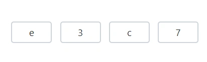
Password type
Set the Type property to Password to mask entered characters for privacy while typing. The underlying value remains the same; only the display is obscured.
@using Syncfusion.Blazor.Inputs

<SfOtpInput Value="e3c7" Type="OtpInputType.Password"></SfOtpInput>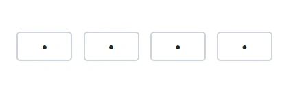
Value
Specify the initial OTP value by using the Value property.
@using Syncfusion.Blazor.Inputs

<SfOtpInput Value="1234"></SfOtpInput>