Placeholder in Blazor OTP Input component
24 Jun 20261 minute to read
The placeholder in OTP Input specifies the text that is shown as a hint or placeholder until the user enters a value in the input field. It acts as a guidance for the users regarding the expected input format or purpose of the input field.
Set the placeholder text by using the Placeholder property. When a single character is provided, all input fields display the same character.
@using Syncfusion.Blazor.Inputs

<SfOtpInput Placeholder="x"></SfOtpInput>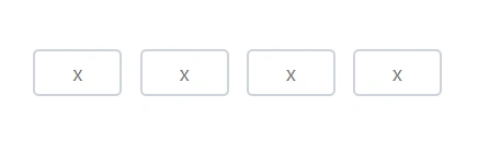
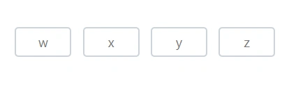
When a placeholder string with multiple characters is provided, characters are assigned to input fields from left to right up to the configured OTP length. If the placeholder string contains more characters than the OTP length, extra characters are ignored; if it contains fewer, only those positions display placeholder characters.
@using Syncfusion.Blazor.Inputs

<SfOtpInput Placeholder="wxyz"></SfOtpInput>