Styling Modes in Blazor OTP Input component
24 Jun 20261 minute to read
Styling modes specify the visual variants for the input fields in the OTP input component. These modes allow customization of the inputs’ appearance to match application design.
Outline mode
Use the outline style by setting the StylingMode property to Outlined. The default styling mode is Outlined.
@using Syncfusion.Blazor.Inputs

<SfOtpInput StylingMode="OtpInputStyle.Outlined"></SfOtpInput>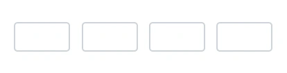
Filled mode
Use the filled style by setting the StylingMode property to Filled.
@using Syncfusion.Blazor.Inputs

<SfOtpInput StylingMode="OtpInputStyle.Filled"></SfOtpInput>
Underline mode
Use the underline style by setting the StylingMode property to Underlined.
@using Syncfusion.Blazor.Inputs

<SfOtpInput StylingMode="OtpInputStyle.Underlined"></SfOtpInput>