How can I help you?
Style and appearance in Syncfusion Blazor Pager
14 Apr 202611 minutes to read
The Syncfusion® Blazor Pager supports visual customization using CSS and theme-based styling. Styles can be applied to various elements to match the application’s design. Styling options are available for:
- Pager root element: Defines the overall appearance of the pager container.
- Numeric items: Controls the appearance of page number buttons and currently selected page indicator.
- Navigation buttons: Customizes the first, previous, next, and last page buttons.
- Page size dropdown: Customizes the dropdown list for selecting items per page.
- Focused and disabled states: Manages appearance of focused elements and disabled elements.
Override Default Styles:
Default styles such as colors, typography, spacing, and borders can be customized using CSS. Use browser developer tools to inspect the rendered HTML and identify relevant selectors. Where possible, use CSS variables or theme tokens to maintain consistency across components.
.e-pager .e-numericitem {
    background-color: #f0f0f0; /* Override numeric item background */
    color: #333;
}
Properties like background-color, color, font-family, and padding can be changed to match the pager layout design and improve visual consistency.
Customize the Pager root element
The .e-pager class styles the root container of the Blazor Pager. Apply CSS to modify its appearance:
.e-pager {
    font-family: 'Segoe UI', sans-serif;
    padding: 12px;
    border-radius: 4px;
    border: 1px solid #e0e0e0;
}
.e-pager, .e-pager .e-pagercontainer{
    background-color: #f9f9f9;
}
Properties such as font-family, background-color, padding, and border-radius can be adjusted to align with the pager design. Additional styling can be applied to individual elements within the pager for a cohesive visual experience.
@using Syncfusion.Blazor.Navigations

<SfPager TotalItemsCount="25" PageSize="5" NumericItemsCount="4">
</SfPager>

<style>
    .e-pager {
        font-family: 'Segoe UI', sans-serif;
        padding: 12px;
        border-radius: 4px;
        border: 1px solid #e0e0e0;
    }
    .e-pager, .e-pager .e-pagercontainer{
        background-color: #f9f9f9;
    }
</style>
Customize numeric items
The .e-numericitem class styles the page number buttons in the Pager. Apply CSS to modify their appearance:
.e-pager .e-numericitem {
    background-color: #ffffff;
    color: #333;
    border: 1px solid #ddd;
    margin: 0 4px;
    padding: 6px 10px;
    border-radius: 3px;
}
Properties such as background-color, border, padding, and border-radius can be adjusted. The .e-currentitem class further defines the styling of the active page button.
@using Syncfusion.Blazor.Navigations

<SfPager TotalItemsCount="50" PageSize="5" NumericItemsCount="5">
</SfPager>

<style>
    .e-pager .e-numericitem {
        background-color: #ffffff;
        color: #333;
        border: 1px solid #ddd;
        margin: 0 4px;
        padding: 6px 10px;
        border-radius: 3px;
        font-weight: 500;
    }

    .e-pager .e-numericitem:hover {
        background-color: #e8f4f8;
        border-color: #2bbbad;
    }

    .e-pager .e-currentitem.e-numericitem {
        background-color: #2bbbad;
        color: #fff;
        border-color: #2bbbad;
    }

    .e-pager .e-currentitem.e-numericitem.e-focused {
        outline: 2px solid #005a9e;
        outline-offset: -2px;
        color: #2bbbad;
    }
</style>
Customize navigation buttons
The .e-numericitem.e-navigation class and related selectors style the navigation buttons (first, previous, next, last). Apply CSS to customize their appearance:
.e-pager .e-numericitem.e-navigation {
    background-color: #ffffff;
    color: #333;
    border: 1px solid #ddd;
    padding: 6px 12px;
    margin: 0 2px;
}
Adjust properties such as background-color, padding, and border to match the desired design. Navigation buttons can be further customized for disabled states using the .e-disable class.
@using Syncfusion.Blazor.Navigations

<SfPager TotalItemsCount="100" PageSize="10" NumericItemsCount="3">
</SfPager>

<style>
    .e-pager .e-icons {
        background-color: #ffffff;
        color: #333;
        border: 1px solid #ddd;
        padding: 6px 12px;
        margin: 0 2px;
        border-radius: 3px;
        font-weight: 500;
    }
    .e-pager .e-icons:hover {
        background-color: #e8f4f8;
        border-color: #2bbbad;
        color: #2bbbad;
    }

    .e-pager .e-icons.e-disable {
        background-color: #f5f5f5;
        color: #999;
        border-color: #ddd;
        cursor: not-allowed;
        opacity: 0.6;
    }
    .e-pager .e-disable {
        pointer-events: none;
        cursor: not-allowed;
    }
</style>
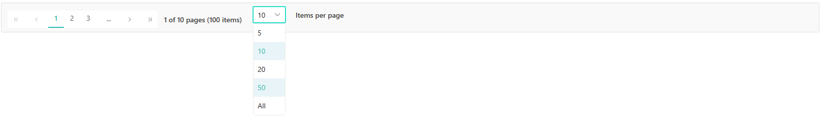
Customize page size dropdown
When the PageSizes property is configured, a dropdown list appears for selecting items per page. The dropdown renders as a separate component outside the pager container, so dropdown input styling and dropdown list item styling use different CSS class selectors:
/* Dropdown input field styling */
.e-pager .e-input-focus {
    border-color: #25decc !important;
        box-shadow: 0 0 0 1px #25decc !important;
}

.e-pager .e-currentitem {
    border-bottom: 2px solid #2bbbad;
}

/* Dropdown list items styling */
.e-dropdownbase .e-list-item.e-item-focus,
.e-dropdownbase .e-list-item.e-active,
.e-dropdownbase .e-list-item.e-active.e-hover,
.e-dropdownbase .e-list-item.e-hover {
    background-color: #e8f4f8;
    color: #2bbbad;
}
The dropdown component renders outside the .e-pager container, therefore dropdown list items use the .e-dropdownbase class selector instead of .e-pager for styling.
@using Syncfusion.Blazor.Navigations

<SfPager TotalItemsCount="100" PageSize="10" PageSizes="@pageSizes" NumericItemsCount="3" ShowAllInPageSizes="true">
</SfPager>

<style>
    .e-pager {
        display: flex;
        align-items: center;
        gap: 12px;
        padding: 12px;
        background-color: #f9f9f9;
        border: 1px solid #e0e0e0;
        border-radius: 4px;
    }

    .e-pager .e-input-focus {
        border-color: #25decc !important;
        box-shadow: 0 0 0 1px #25decc !important;
    }

    .e-pager .e-currentitem {
        border-bottom: 2px solid #2bbbad;
        color: #2bbbad;
    }

    .e-dropdownbase .e-list-item.e-item-focus,
    .e-dropdownbase .e-list-item.e-active,
    .e-dropdownbase .e-list-item.e-active.e-hover,
    .e-dropdownbase .e-list-item.e-hover {
        background-color: #e8f4f8;
        color: #2bbbad;
    }

    .e-pager .e-pagercontainer {
        display: flex;
        align-items: center;
        gap: 8px;
    }
</style>

@code {
    public List<int> pageSizes = new List<int> { 5, 10, 20, 50 };
}
Customize focus and disabled states
The .e-focused and .e-disable classes manage the appearance during keyboard navigation and when buttons are inactive. Customize these for improved accessibility:
.e-pager .e-numericitem.e-focused {
    outline: 2px solid #005a9e;
    outline-offset: -2px;
}

.e-pager .e-disable {
    background-color: #f5f5f5;
    color: #999;
    border-color: #ddd;
    opacity: 0.6;
    cursor: not-allowed;
}
Properties such as outline, outline-offset, opacity, and cursor can be adjusted to indicate focus and disabled states clearly.
@using Syncfusion.Blazor.Navigations

<SfPager TotalItemsCount="100" PageSize="10" NumericItemsCount="4">
</SfPager>

<style>
    .e-pager {
        padding: 12px;
        background-color: #f9f9f9;
        border: 1px solid #e0e0e0;
        border-radius: 4px;
    }

    .e-pager .e-numericitem {
        background-color: #ffffff;
        color: #333;
        border: 1px solid #ddd;
        margin: 0 3px;
        padding: 6px 10px;
        border-radius: 3px;
        transition: all 0.2s ease;
    }

    .e-pager .e-icons.e-focused {
        outline: 2px solid #005a9e;
        outline-offset: -2px;
        box-shadow: inset 0 0 0 1px #005a9e;
    }

    .e-pager .e-icons:hover:not(.e-disable) {
        background-color: #e8f4f8;
        border-color: #2bbbad;
    }

    .e-pager .e-icons.e-disable {
        background-color: #f5f5f5;
        color: #999;
        border-color: #ddd;
        opacity: 0.6;
        cursor: not-allowed;
    }

    .e-pager .e-currentitem.e-numericitem {
        background-color: #2bbbad;
        color: #ffffff;
        border-color: #2bbbad;
        font-weight: bold;
    }

    .e-pager .e-currentitem.e-numericitem.e-focused {
        outline: 2px solid #005a9e;
        outline-offset: 2px;
        color: #2bbbad;
    }
</style>
Apply custom CSS class
The CssClass property enables the application of custom CSS classes to the Pager component. Assign a class name to this property and define the required styles in the CSS file:
@using Syncfusion.Blazor.Navigations

<SfPager TotalItemsCount="50" PageSize="5" NumericItemsCount="3" CssClass="custom-pager">
</SfPager>

<style>
    .e-pager.custom-pager {
        background: linear-gradient(135deg, #667eea 0%, #764ba2 100%);
        padding: 15px;
        border-radius: 8px;
        box-shadow: 0 4px 6px rgba(0, 0, 0, 0.1);
    }

    .e-pager.custom-pager .e-numericitem {
        background-color: rgba(255, 255, 255, 0.9);
        color: #333;
        border: none;
        margin: 0 5px;
        border-radius: 4px;
    }

    .e-pager.custom-pager .e-currentitem.e-numericitem {
        background-color: #ffffff;
        color: #667eea;
        font-weight: bold;
    }
</style>
This approach allows creating multiple pager variants with different visual themes within the same application, maintaining design consistency while providing flexibility for specific use cases.
