Tooltip in Blazor Pivot Table
24 Aug 20269 minutes to read
The tooltip displays contextual information when users hover over value cells in the pivot table. It can be enabled or disabled by setting the ShowTooltip property in SfPivotView class to true or false. By default, the tooltip is enabled in the pivot table and shows the cell value with its row and column headers.
@using Syncfusion.Blazor.PivotView

<SfPivotView TValue="ProductDetails" ShowTooltip="true">
    <PivotViewDataSourceSettings DataSource="@data">
        <PivotViewColumns>
            <PivotViewColumn Name="Year"></PivotViewColumn>
            <PivotViewColumn Name="Quarter"></PivotViewColumn>
        </PivotViewColumns>
        <PivotViewRows>
            <PivotViewRow Name="Country"></PivotViewRow>
            <PivotViewRow Name="Products"></PivotViewRow>
        </PivotViewRows>
        <PivotViewValues>
            <PivotViewValue Name="Sold" Caption="Units Sold"></PivotViewValue>
            <PivotViewValue Name="Amount" Caption="Sold Amount"></PivotViewValue>
        </PivotViewValues>
    </PivotViewDataSourceSettings>
</SfPivotView>

@code{
    public List<ProductDetails> data { get; set; }
    protected override void OnInitialized()
    {
        this.data = ProductDetails.GetProductData().ToList();
        //Bind the data source collection here. Refer "Assigning sample data to the pivot table" section in getting started for more details.
    }
}
Tooltip template
Users can customize the tooltip in the Pivot Table component by setting the TooltipTemplate property within the PivotViewTemplates class. This allows you to design a custom HTML layout for the tooltip with styling and formatting that matches your application’s design.
Tooltip Template Context
When you create a custom tooltip template, you gain access to the PivotTooltipTemplateContext object, which contains the following properties that you can use to display dynamic information within your custom tooltip:
-
RowHeaders: Displays the row headers for the selected value cell. -
ColumnHeaders: Displays the column headers for the selected value cell. -
RowFields: Displays the row fields of the selected value cell. -
ColumnFields: Displays the column fields of the selected value cell. -
ValueField: Displays the value field name of the selected cell. -
AggregateType: Specifies the aggregate type of the selected value cell. -
Value: Displays the formatted value of the selected value cell.
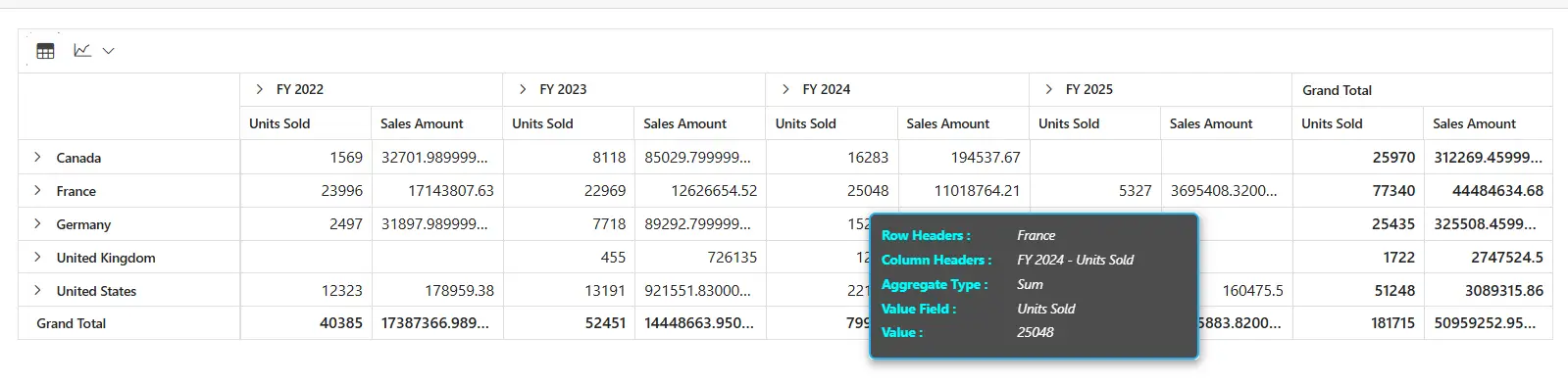
You can apply tooltip customization to both the Pivot Table and Pivot Chart together, or to either one individually. To customize the Pivot Table tooltip, using the TooltipTemplate property. The following example demonstrates how to create a professional-looking custom tooltip that displays all relevant information in a well-organized format:
@using Syncfusion.Blazor.PivotView

<SfPivotView TValue="PivotProductDetails" Height="600px" ShowTooltip="true" ShowToolbar="true" Toolbar=@toolbarItems>
    <PivotViewTemplates>
        <TooltipTemplate Context="tooltipContext">
            @{
                var data = tooltipContext;
            }
            <div class="tooltip-wrapper">
                <div class="tooltip-row">
                    <span class="tooltip-header">Row Headers :</span>
                    <span class="tooltip-value">@data.RowHeaders</span>
                </div>
                <div class="tooltip-row">
                    <span class="tooltip-header">Column Headers :</span>
                    <span class="tooltip-value">@data.ColumnHeaders</span>
                </div>
                <div class="tooltip-row">
                    <span class="tooltip-header">Aggregate Type :</span>
                    <span class="tooltip-value">@data.AggregateType</span>
                </div>
                <div class="tooltip-row">
                    <span class="tooltip-header">Value Field :</span>
                    <span class="tooltip-value">@data.ValueField</span>
                </div>
                <div class="tooltip-row">
                    <span class="tooltip-header">Value :</span>
                    <span class="tooltip-value">@data.Value</span>
                </div>
            </div>
        </TooltipTemplate>
    </PivotViewTemplates>
    <PivotViewDataSourceSettings DataSource="@Data">
        <PivotViewRows>
            <PivotViewRow Name="Country"></PivotViewRow>
            <PivotViewRow Name="Products"></PivotViewRow>
        </PivotViewRows>
        <PivotViewColumns>
            <PivotViewColumn Name="Year"></PivotViewColumn>
            <PivotViewColumn Name="Quarter"></PivotViewColumn>
        </PivotViewColumns>
        <PivotViewValues>
            <PivotViewValue Name="Sold" Caption="Units Sold"></PivotViewValue>
            <PivotViewValue Name="Amount" Caption="Sales Amount"></PivotViewValue>
        </PivotViewValues>
    </PivotViewDataSourceSettings>
    <PivotViewDisplayOption Primary="Primary.Table" View="View.Both"></PivotViewDisplayOption>
    <PivotChartSettings Title="Sales Analysis">
        <PivotChartSeries Type="ChartSeriesType.Column">
        </PivotChartSeries>
        <PivotChartTooltipSettings Enable=true>
        </PivotChartTooltipSettings>
    </PivotChartSettings>
</SfPivotView>
<style>
    .e-pivotview {
        min-height: 600px;
    }
    .tooltip-wrapper {
        background-color: #4d4d4d;
        color: #ffffff;
        border: 2px solid #27b1f0;
        border-radius: 6px;
        padding: 10px;
        min-width: 300px;
        font-size: 12px;
    }
    .tooltip-row {
        margin-bottom: 6px;
    }
    .tooltip-header {
        color: aqua;
        font-weight: bold;
        display: inline-block;
        min-width: 120px;
    }
    .tooltip-value {
        font-style: italic;
        word-break: break-word;
    }
</style>
@code {
    private List<PivotProductDetails> Data = new();
    protected override void OnInitialized()
    {
        Data = PivotProductDetails.GetProductData().ToList();
    }
    private List<ToolbarItems> toolbarItems = new List<ToolbarItems>()
    {
        ToolbarItems.Grid,
        ToolbarItems.Chart
    };
}
Understanding the Custom Tooltip Example
The <TooltipTemplate> component inside <PivotViewTemplates> defines the custom HTML structure displayed when hovering over value cells. The Context="tooltipContext" attribute exposes the PivotTooltipTemplateContext object as the tooltipContext variable, providing access to cell properties such as RowHeaders, ColumnHeaders, Value, and AggregateType.
The template uses a div with class tooltip-wrapper as the main container, with nested tooltip-row divs to organize related information in a flex-based layout. The accompanying CSS styles define appearance (colors, borders, shadows) and layout properties. Custom styles are applied directly; no Syncfusion tooltip defaults are inherited, giving you complete design control.
The RowHeaders and ColumnHeaders properties return concatenated header values separated by “ - “ (e.g., “USA - Q1” or “Product A - Year 2023”).
You can extend the template by adding conditional rendering, additional HTML elements, or interactive content based on context properties. For example, use @if blocks to show/hide information dynamically. Keep in mind that custom templates are re-evaluated on each hover, so avoid expensive computations in the template markup to prevent render lag.
NOTE
You can refer to the Blazor Pivot Table feature tour page for its groundbreaking feature representations. You can also explore the Blazor Pivot Table example to know how to render and configure the pivot table.