How can I help you?
Dimension in Predefined Dialogs in Blazor
4 Nov 20258 minutes to read
Customize predefined dialog dimensions using the DialogOptions.Height and DialogOptions.Width properties.
By default, the Width and Height properties are set to auto. The dialog size adapts to its content when these values are not specified. Dimensions can be provided in pixels (for example, 300px) or percentages (for example, 50%) to override the default sizing.
Use the following code snippet for alert.razor, confirm.razor, and prompt.razor to customize dialog dimensions.
@using Syncfusion.Blazor.Popups
@using Syncfusion.Blazor.Buttons
@inject SfDialogService DialogService
<div>
<SfButton @onclick="@AlertBtn">Alert</SfButton>
</div>
@code {
private async Task AlertBtn()
{
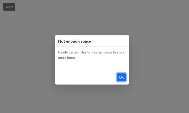
await DialogService.AlertAsync("Delete certain files to free up space to store more items.", "Not enough space", new DialogOptions()
{
Width = "300px",
Height = "200px",
});
}
}@using Syncfusion.Blazor.Popups
@using Syncfusion.Blazor.Buttons
@inject SfDialogService DialogService
<div>
<SfButton @onclick="@ConfirmBtn">Confirm</SfButton>
</div>
@code {
private async Task ConfirmBtn()
{
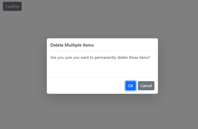
bool isConfirm = await DialogService.ConfirmAsync("Are you sure you want to permanently delete these items?", "Delete Multiple Items", new DialogOptions()
{
Width = "400px",
Height = "200px",
});
}
}@using Syncfusion.Blazor.Popups
@using Syncfusion.Blazor.Buttons
@inject SfDialogService DialogService
<div>
<SfButton @onclick="@PromptBtn">Prompt</SfButton>
</div>
@code {
private async Task PromptBtn()
{
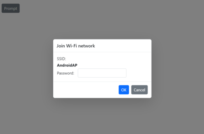
string promptText = await DialogService.PromptAsync(null, "Join Wi-Fi network", new DialogOptions()
{
Width = "350px",
Height = "210px",
ChildContent = @<table class="Table">
<tbody>
<tr>
<td>SSID:</td>
</tr>
<tr>
<td><b>AndroidAP</b></td>
</tr>
<tr>
<td>Password:</td>
<td>
<span class="e-input-group">
<input type="password" id="password" name="Required" class="e-input">
</span>
</td>
</tr>
</tbody>
</table>
});
}
}Results from the code snippet
Alert
Confirm
Prompt
Max-width and max-height
To constrain the dialog’s maximum size, specify max-width and max-height CSS properties for the component’s container using the CssClass property. The component may apply an inline max-height; to override it, use a higher-specificity selector (or !important if necessary).
Use the following code to customize the max-width and max-height for the alert dialog:
@using Syncfusion.Blazor.Buttons
@using Syncfusion.Blazor.Popups
@inject SfDialogService DialogService
    <div>
        <SfButton @onclick="@AlertBtn">Alert</SfButton>
    </div>
    <style>
        .e-dialog.customClass {
            max-width: 350px;
            max-height: 250px !important;
        }
    </style>
@code {
    private async Task AlertBtn()
    {
        await DialogService.AlertAsync(" In the Succinctly series, Syncfusion created a robust, free library of more than 130 technical e-books formatted for PDF, Kindle, and EPUB.Each title in the Succinctly series is written by a carefully chosen expert and provides essential content in about 100 pages. The Succinctly series was born in 2012 out of a desire to provide concise technical e-books for software developers.", "About SYNCFUSION Succinctly Serires", new DialogOptions()
            {
               CssClass ="customClass ",
            });
    }
}
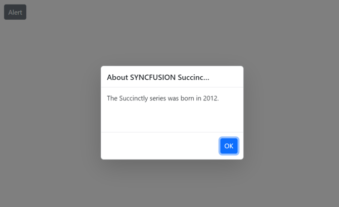
Min-width and min-height
To ensure a minimum dialog size (for example, to keep action buttons visible), specify min-width and min-height CSS properties for the component’s container using the CssClass property.
Use the following code to customize the min-width and min-height for the alert dialog:
@using Syncfusion.Blazor.Buttons
@using Syncfusion.Blazor.Popups
@inject SfDialogService DialogService
    <div>
        <SfButton @onclick="@AlertBtn">Alert</SfButton>
    </div>
    <style>
        .e-dialog.customClass {
            min-width: 300px;
            min-height: 200px;
        }
    </style>
@code {
    private async Task AlertBtn()
    {
        await DialogService.AlertAsync("The Succinctly series was born in 2012.", "About SYNCFUSION Succinctly Serires", new DialogOptions()
            {
               CssClass ="customClass ",
            });
    }
}