Types and Icons in Blazor ProgressButton Component
30 Jun 20261 minute to read
This section describes the available ProgressButton types and how to configure icons for the component.
Types
The types of Blazor Progress Button are as follows:
- Outline Progress Button
- Round Progress Button
- Primary Progress Button
Outline Progress Button
An outline ProgressButton has a border with transparent background. To create an outline Progress Button, set the CssClass property to e-outline.
@using Syncfusion.Blazor.SplitButtons

<SfProgressButton Content="Outline" EnableProgress="true" CssClass="e-outline e-success">
    <ProgressButtonSpinSettings Position="SpinPosition.Center"></ProgressButtonSpinSettings>
</SfProgressButton>
Round Progress Button
A round ProgressButton is circular and typically displays an icon representing its action. To create a round ProgressButton, set the CssClass property to e-round.
@using Syncfusion.Blazor.SplitButtons

<SfProgressButton CssClass="e-round e-small e-success" IconCss="e-icons e-play-icon">
<ProgressButtonSpinSettings Position="SpinPosition.Center"></ProgressButtonSpinSettings>
</SfProgressButton>

<style>
    .e-play-icon::before {
        content: '\e324';
    }
</style>
Primary Progress Button
A primary ProgressButton uses a solid background to emphasize a primary action. To create a primary ProgressButton, set the IsPrimary property to true.
@using Syncfusion.Blazor.SplitButtons

<SfProgressButton Content="Primary" IsPrimary="true"></SfProgressButton>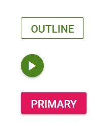
Icons
Progress Button with font icons
The ProgressButton can display an icon to visually represent the action. Assign the IconCss property to e-icons plus the desired icon class. By default, the icon is positioned on the left. Use IconPosition to change the icon placement.
@using Syncfusion.Blazor.SplitButtons
@using Syncfusion.Blazor.Buttons

<SfProgressButton IconCss="e-icons e-play-icon" IconPosition="IconPosition.Left">PLAY
</SfProgressButton>

<style>
    .e-play-icon::before {
        content: '\e324';
    }
</style>