Label and Size in Blazor RadioButton Component
30 Jun 20261 minute to read
This section explains how to configure labels and sizes for the RadioButton component.
Label
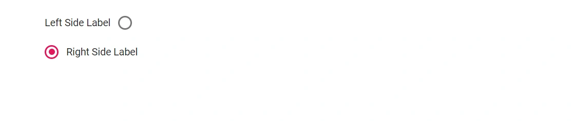
Define the RadioButton caption using the Label property to automatically render an associated label element, improving accessibility and click/tap targets. Control where the label appears with the LabelPosition property (before or after the radio button). When multiple radio buttons share the same Name value, they form a group that allows only one selection.
@using Syncfusion.Blazor.Buttons

<SfRadioButton Label="Left Side Label" Name="position" LabelPosition="LabelPosition.Before" Value="Left"  @bind-Checked="stringChecked"></SfRadioButton><br />
<SfRadioButton Label="Right Side Label" Name="position" LabelPosition="LabelPosition.After" Value="Right" @bind-Checked="stringChecked"></SfRadioButton>

@code {
    private string stringChecked ="Right";
}
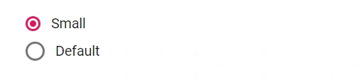
Size
RadioButton supports two sizes: default and small. To render the small size, set the CssClass property toe-small.
@using Syncfusion.Blazor.Buttons

<SfRadioButton Label="Small" Name="size" CssClass="e-small" Value="Small" @bind-Checked="stringChecked"></SfRadioButton><br />
<SfRadioButton Label="Default" Name="size" Value="Default" @bind-Checked="stringChecked"></SfRadioButton>

@code {
    private string stringChecked ="Default";
}