Formatting in Blazor Range Slider Component
30 Jun 20262 minutes to read
The Format feature is used to customize the units and appearance of slider values. Formatted values are also applied to the ARIA attributes of the slider to ensure accessible output. There are two ways to apply formatting in the slider.
- Use the
FormatAPI of the slider, which leverages the built-in internationalization and .NET standard format strings. - Customize formatting using the
TicksRenderingandOnTooltipChangeevents.
@using Syncfusion.Blazor.Inputs

<SfSlider @bind-Value="@CurrencyValue">
    <SliderTooltip IsVisible="true" ShowOn="TooltipShowOn.Always" Format="C2" Placement="TooltipPlacement.Before"></SliderTooltip>
    <SliderTicks Placement="Placement.Before" Format="C2" ShowSmallTicks="true" LargeStep="20" SmallStep="10"></SliderTicks>
</SfSlider>

@code {
    int CurrencyValue = 30;
}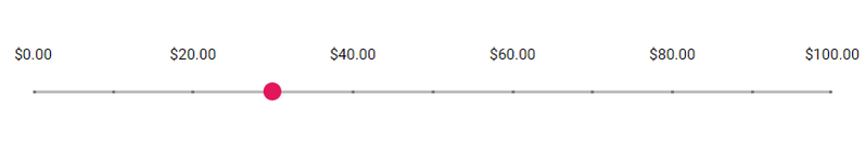
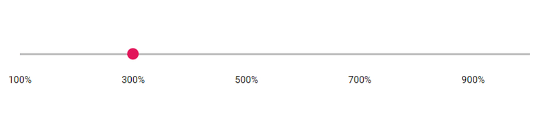
Using format API
Slider provides predefined formatting styles such as Numeric (N), Percentage (P), Currency (C), and custom numeric format strings (for example, #). These formats are culture-aware and use the application’s current culture for symbols and separators.
@using Syncfusion.Blazor.Inputs

<SfSlider Min="1" Max="10" @bind-Value="@PercentageValue">
    <SliderTicks Placement="Placement.After" Format="P0" ShowSmallTicks="true" LargeStep="2" SmallStep="1"></SliderTicks>
    <SliderTooltip IsVisible="true" ShowOn="TooltipShowOn.Always" Format="P0" Placement="TooltipPlacement.Before"></SliderTooltip>
</SfSlider>

@code {
    int PercentageValue = 3;
}
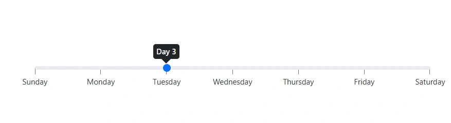
Using Events
For custom scenarios, use event handlers like TicksRendering and OnTooltipChange. The following example formats tick labels as weekday names and tooltips as day numbers.
@using Syncfusion.Blazor.Inputs

<SfSlider id='default' Min="0" Max="6" @bind-Value="@Value">
    <SliderEvents TValue="int" OnTooltipChange="@TooltipChange" TicksRendering="@TickesRendering"></SliderEvents>
    <SliderTicks Placement="Placement.After" LargeStep="1"></SliderTicks>
    <SliderTooltip Placement="TooltipPlacement.Before" IsVisible="true"></SliderTooltip>
</SfSlider>

@code{

    private int Value = 2;

    public void TickesRendering(SliderTickEventArgs args)
    {
        string[] daysArr = { "Sunday", "Monday", "Tuesday", "Wednesday", "Thursday", "Friday", "Saturday" };

        args.Text = daysArr[int.Parse(args.Value.ToString())];
    }

    public void TooltipChange(SliderTooltipEventArgs<int> args)
    {
        args.Text = "Day " + (args.Value + 1).ToString();
    }
}