Customize the limits in Blazor Range Slider Component
30 Jun 20264 minutes to read
The slider’s limits bar can be customized with CSS. By overriding the slider CSS classes, the limits region can be styled to match application design requirements. In this example, the limits bar is given a custom background color. By default, the limits bar uses the e-limits class. Override that class with your preferred color values as shown below.
.e-control-wrapper.e-slider-container.e-horizontal .e-limits {
    background-color: rgba(69, 100, 233, 0.46);
}
Apply the above CSS to the following sliders to visualize the customized limits bar.
@using Syncfusion.Blazor.Inputs;
@using Syncfusion.Blazor.Buttons;
<div class="col-lg-8 control-section sb-property-border">
<div class="content-wrapper">
<div class='sliderwrap'>
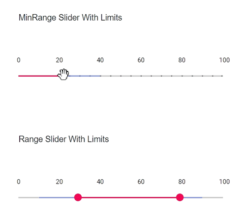
<label class="userselect">MinRange Slider With Limits</label>
<SfSlider @bind-Value="@Default" Min="0" Max="100" Type=SliderType.MinRange>
<SliderTicks Placement="@Placement.Before" LargeStep="20" SmallStep="5" ShowSmallTicks="true"></SliderTicks>
<SliderTooltip IsVisible="true" Placement="@TooltipPlacement.Before" ShowOn="@TooltipShowOn.Focus"></SliderTooltip>
<SliderLimits Enabled="true"
MinStart="10"
MinEnd="40"
StartHandleFixed="false"></SliderLimits>
</SfSlider>
</div>
<div class='sliderwrap'>
<label class="userselect">Range Slider With Limits</label>
<SfSlider @bind-Value="@Range" Min="0" Max="100" Type=SliderType.Range>
<SliderTicks Placement="@Placement.Before" LargeStep="20" SmallStep="5" ShowSmallTicks="true"></SliderTicks>
<SliderTooltip IsVisible="true" Placement="@TooltipPlacement.Before" ShowOn="@TooltipShowOn.Focus"></SliderTooltip>
<SliderLimits Enabled="true"
MinStart="10"
MinEnd="40"
MaxStart="50"
MaxEnd="90"></SliderLimits>
</SfSlider>
</div>
</div>
</div>
@code{
int Default = 25;
int[] Range = { 25, 75 };
}
<style>
.content-wrapper {
width: 52%;
margin: 0 auto;
min-width: 185px;
}
.sliderwrap {
margin-top: 45px;
}
.e-control-wrapper.e-slider-container.e-horizontal .e-limits {
background-color: rgba(69, 100, 233, 0.46);
}
.sliderwrap label {
padding-bottom: 50px;
font-size: 13px;
font-weight: 500;
margin-top: 15px;
}
.userselect {
-webkit-user-select: none;
/* Safari 3.1+ */
-moz-user-select: none;
/* Firefox 2+ */
-ms-user-select: none;
/* IE 10+ */
user-select: none;
/* Standard syntax */
}
.property-custom td {
padding: 5px;
}
</style>