Customize the thumb in Blazor Range Slider Component
30 Jun 20264 minutes to read
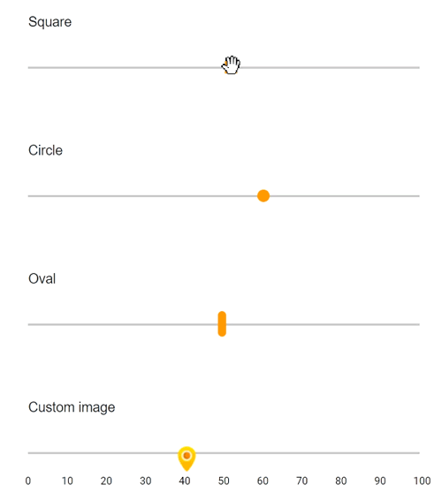
The slider’s appearance can be customized with CSS. By overriding the slider CSS classes, the thumb can be restyled. The slider thumb uses the e-handle class by default. Override this class to create different shapes or apply custom images. In the following example, the slider thumb is customized as square, circle, and oval shapes, and a background image is also applied.
@using Syncfusion.Blazor.Inputs;
@using Syncfusion.Blazor.Buttons;

<div class="col-lg-12 control-section">
    <div class="control-wrapper">
        <div class="slider-content-wrapper">
            <div class="slider_container">
                <div class="labelText slider-userselect">Square</div>
                <SfSlider Value="30" ID="square_slider">
                </SfSlider>
            </div>
            <div class="slider_container">
                <div class="labelText slider-userselect">Circle</div>
                <SfSlider Value="30" ID="circle_slider">
                </SfSlider>
            </div>
            <div class="slider_container">
                <div class="labelText slider-userselect">Oval</div>
                <SfSlider Value="30" ID="oval_slider">
                </SfSlider>
            </div>
            <div class="slider_container">
                <div class="labelText slider-userselect">Custom image</div>
                <SfSlider Value="30" ID="image_slider">
                    <SliderTicks Placement="@Placement.After" LargeStep="10" SmallStep="5" ShowSmallTicks="true"></SliderTicks>
                </SfSlider>
            </div>
        </div>
    </div>
</div>
<style>
    .slider-content-wrapper {
        width: 40%;
        margin: 0 auto;
        min-width: 185px;
    }

    .slider-userselect {
        -webkit-user-select: none;
        /* Safari 3.1+ */
        -moz-user-select: none;
        /* Firefox 2+ */
        -ms-user-select: none;
        /* IE 10+ */
        user-select: none;
        /* Standard syntax */
    }

    .labelText {
        text-align: -webkit-left;
        font-weight: 500;
        font-size: 13px;
        padding-bottom: 10px;
    }

    .slider_container {
        margin-top: 40px;
    }

    #square_slider.e-control.e-slider .e-handle {
        border-radius: 0%;
        background-color: #f9920b;
        border: 0;
    }

    #circle_slider.e-control.e-slider .e-handle {
        background-color: #f9920b;
        border-radius: 50%;
        border: 0;
    }

    #image_slider.e-control.e-slider .e-handle {
        height: 25px;
        width: 24px;
        background-size: 24px;
    }

    #image_slider.e-control.e-slider .e-handle {
        background-image: url(https://ej2.syncfusion.com/demos/src/slider/images/thumb.png);
        background-repeat: no-repeat;
        background-color: transparent;
        border: 0;
    }

    #square_slider .e-tab-handle::after,
    #circle_slider .e-tab-handle::after {
        background-color: #f9920b;
    }

    #image_slider .e-tab-handle::after {
        background-color: transparent;
    }

    #oval_slider.e-control.e-slider .e-handle {
        height: 25px;
        width: 8px;
        top: 3px;
        border-radius: 15px;
        background-color: #f9920b;
    }
</style>