Numeric Range Slider in Blazor Range Slider Component
30 Jun 20264 minutes to read
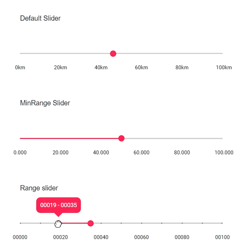
The Blazor Range Slider can display numeric values with custom formatting using the Format property on SliderTicks and SliderTooltip. Formatting options include appending units, controlling decimal precision, and adding leading zeros. The examples below demonstrate three common scenarios.
- Units: Append units such as “km” to tick labels and tooltips
- Decimal places: Control the number of decimal digits displayed
- Leading zeros: Pad values with zeros to a fixed width
The first example formats values with a unit suffix (km).
<SliderTicks ShowSmallTicks="true" Placement="Placement.After" LargeStep="20" SmallStep="10" Format="##.##km"> </SliderTicks>
            <SliderTooltip IsVisible="true" Placement="TooltipPlacement.Before" Format="##.##km"></SliderTooltip>
The second example shows values with a specific decimal format.
<SliderTicks ShowSmallTicks="true" Placement="Placement.After" LargeStep="20" SmallStep="10" Format="##.#00"> </SliderTicks>
                <SliderTooltip IsVisible="true" Placement="TooltipPlacement.Before" Format="##.#00"></SliderTooltip>
The third example pads values with leading zeros to achieve a fixed width.
<SliderTicks ShowSmallTicks="true" Placement="Placement.After" LargeStep="20" SmallStep="10" Format="0000#"> </SliderTicks>
            <SliderTooltip IsVisible="true" Placement="TooltipPlacement.Before" Format="0000#"></SliderTooltip>
The complete code for the numeric formatting examples is shown below.
@using Syncfusion.Blazor.Inputs;

<div class="control-section">
    <div class="content-wrapper">
        <div class="sliderwrap">
            <label class="labeltext userselect">Default Slider</label>
            <SfSlider @bind-Value="@Value1">
                <SliderTicks ShowSmallTicks="true" Placement="Placement.After" LargeStep="20" SmallStep="10" Format="##.##km"> </SliderTicks>
                <SliderTooltip IsVisible="true" Placement="TooltipPlacement.Before" Format="##.##km"></SliderTooltip>
            </SfSlider>
        </div>
        <div class="sliderwrap">
            <label class="labeltext userselect">MinRange Slider</label>
            <SfSlider @bind-Value="@Value2" Type=SliderType.MinRange>
                <SliderTicks ShowSmallTicks="true" Placement="Placement.After" LargeStep="20" SmallStep="10" Format="##.#00"> </SliderTicks>
                    <SliderTooltip IsVisible="true" Placement="TooltipPlacement.Before" Format="##.#00"></SliderTooltip>
            </SfSlider>
        </div>
        <div class="sliderwrap">
            <label class="labeltext userselect">Range Slider</label>
            <SfSlider @bind-Value="@Value" Type=SliderType.Range>
                <SliderTicks ShowSmallTicks="true" Placement="Placement.After" LargeStep="20" SmallStep="10" Format="0000#"> </SliderTicks>
                <SliderTooltip IsVisible="true" Placement="TooltipPlacement.Before" Format="0000#"></SliderTooltip>
            </SfSlider>
        </div>
    </div>
</div>
@code{
    int Value1 = 30;
    int Value2 = 30;
    public int[] Value = { 20, 50 };
}
<style>
    .content-wrapper {
        width: 40%;
        margin: 0 auto;
        min-width: 185px;
    }

    .sliderwrap {
        margin-top: 40px;
    }

    .sliderwrap label {
        padding-bottom: 26px;
        font-size: 13px;
        font-weight: 500;
        margin-top: 15px;
    }

    .userselect {
        -webkit-user-select: none; /* Safari 3.1+ */
        -moz-user-select: none; /* Firefox 2+ */
        -ms-user-select: none; /* IE 10+ */
        user-select: none; /* Standard syntax */
    }
</style>