Ticks in Blazor Range Slider Component
30 Jun 20262 minutes to read
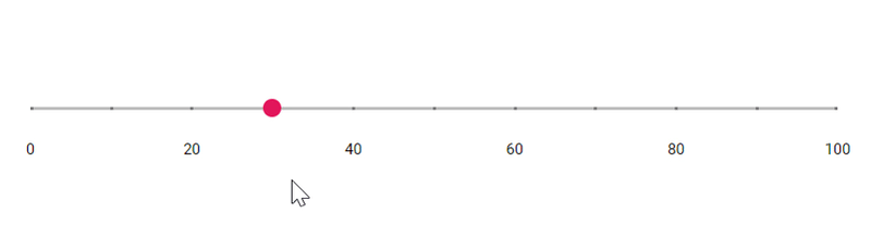
Ticks in the slider help users quickly identify the current value or range. Configure tick intervals using SmallStep and LargeStep. By default, only major (large) tick labels are displayed. Use the ShowSmallTicks property to show or hide minor ticks.
@using Syncfusion.Blazor.Inputs

<SfSlider @bind-Value="@value">
    <SliderTicks Placement="Placement.After" ShowSmallTicks="true" LargeStep="20" SmallStep="10"></SliderTicks>
    <SliderTooltip IsVisible="true" ShowOn="TooltipShowOn.Always" Placement="TooltipPlacement.Before"></SliderTooltip>
</SfSlider>

@code {
    int value = 30;
}
Step
When the slider moves, its value increases or decreases by the step amount. By default, the step is 1. Use the Step property to change the increment.
@using Syncfusion.Blazor.Inputs

<SfSlider Step="10" @bind-Value="@value">
   <SliderTooltip IsVisible="true" ShowOn="TooltipShowOn.Always" Placement="TooltipPlacement.Before"></SliderTooltip>
</SfSlider>

@code {
    int value = 30;
}
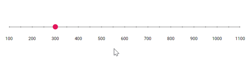
Min and Max
Set the minimum (start) and maximum (end) values using the Min and Max properties. By default, the slider range is 1 to 100. The following example configures a range from 100 to 1100.
@using Syncfusion.Blazor.Inputs

<SfSlider @bind-Value ="@value" Min="100" Max="1100">
     <SliderTicks Placement="Placement.After" ShowSmallTicks="true" LargeStep="100" SmallStep="50"></SliderTicks>
    <SliderTooltip IsVisible="true" ShowOn="TooltipShowOn.Always" Placement="TooltipPlacement.Before"></SliderTooltip>
</SfSlider>

@code {
    int value = 300;
}
ValueChanged
The ValueChanged property of the Blazor Range Slider component allows you to define a callback method that will be invoked whenever the value of the Slider changes. This property enables you to capture the updated value of the Slider and perform custom actions based on the new value. The callback method can be used to handle any logic associated with the Slider value change, such as updating other parts of the application, triggering events, or displaying notifications.
@using Syncfusion.Blazor.Inputs
@inject IJSRuntime JSRuntime

<SfSlider TValue="int" Step="1" Min="1" Max="20" Value="value" ValueChanged="OnValueChanged">
    <SliderTooltip IsVisible="true" ShowOn="TooltipShowOn.Always" Placement="TooltipPlacement.After"></SliderTooltip>
</SfSlider>

@code {
    int value = 5;
    public void OnValueChanged(int newValue)
    {
        // Update the value variable with the new value
        value = newValue;
        // For example, you can display the new value using an alert:
        JSRuntime.InvokeVoidAsync("alert", $"Slider value changed to: {value}");
    }
}