How can I help you?
Types in Blazor Range Slider Component
29 Jun 20261 minute to read
The Type options for the slider are:
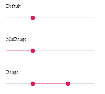
| Types | Usage |
|---|---|
| Default | Selects a single value. |
| MinRange | Selects a single value and displays a filled selection from the start to the current value. |
| Range | Selects a range of values using two handles and displays a filled selection between them. |
NOTE
Default and MinRange both select a single value. MinRange visually fills the track from the start value to the current handle position. Range uses two handles to select a span of values and fills the area between them.
@using Syncfusion.Blazor.Inputs

<label class="labeltext">Default</label>
<SfSlider Value="30"></SfSlider>

<label class="labeltext">MinRange</label>
<SfSlider Value="40" Type="SliderType.MinRange"></SfSlider>

<label class="labeltext">Range</label>
<SfSlider Value=@RangeValue Type="SliderType.Range"></SfSlider>


@code{
    public int[] RangeValue = { 30, 70 };
}