How can I help you?
Labels in Blazor Rating Component
4 Nov 20251 minute to read
Use the ShowLabel property to display a label that shows the current rating value. By default, ShowLabel is false. When set to true, the label is rendered.
@using Syncfusion.Blazor.Inputs

<SfRating Value="3" ShowLabel=true></SfRating>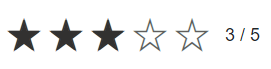
Label position
Control where the label appears using the LabelPosition property. The default position is Right. In right-to-left layouts, left and right positions follow RTL direction.
The following label positions are supported:
- Top: The label appears above the rating.
- Bottom: The label appears below the rating.
- Left: The label appears on the left side of the rating.
- Right: The label appears on the right side of the rating.
@using Syncfusion.Blazor.Inputs

<label>Left Label Position</label><br/>
<SfRating Value=3 ShowLabel=true LabelPosition="LabelPosition.Left"></SfRating><br/>

<label>Right Label Position</label><br />
<SfRating Value=3 ShowLabel=true></SfRating><br/>

<label>Top Label Position </label><br />
<SfRating Value=3 ShowLabel=true LabelPosition="LabelPosition.Top"></SfRating><br/>

<label>Bottom Label Position</label><br />
<SfRating Value=3 ShowLabel=true LabelPosition="LabelPosition.Bottom"></SfRating><br/>
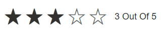
Label template
Use the LabelTemplate tag directive to provide custom content for the label. The current rating value (passed as the context, a double) is available when building the label content. When a template is provided and ShowLabel is true, the template replaces the default label.
@using Syncfusion.Blazor.Inputs

<SfRating Value="3" ShowLabel=true>
    <LabelTemplate>@context Out Of 5</LabelTemplate>
</SfRating>