How can I help you?
Tooltip in Blazor Rating Component
4 Nov 20252 minutes to read
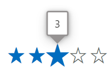
The Blazor Rating component supports tooltips that display additional information for rating items by enabling the ShowTooltip property. When enabled (default is false), a tooltip appears when the user hovers over a rating item.
@using Syncfusion.Blazor.Inputs

<SfRating Value="3" ShowTooltip=true></SfRating>
Tooltip template
Use the TooltipTemplate tag directive to define custom content for the tooltip. The current item’s value is passed to the template as the context (a double), allowing dynamic tooltip content based on the hovered item.
@using Syncfusion.Blazor.Inputs

<SfRating Value=4 ShowTooltip=true>
    <TooltipTemplate>
        <b>@((context == 1)?"Angry":(context == 2)?"Sad":(context == 3)?"Neutral":(context == 4)?"Good":"Happy")</b>
    </TooltipTemplate>
</SfRating>
Tooltip customization
Customize the appearance of tooltips by assigning a custom CSS class using the CssClass property on the Blazor Rating component and writing styles scoped to that class. The class is applied to the component’s root element, which lets you target the nested tooltip elements without affecting other tooltips.
NOTE
For more details on styling options, refer to the tooltip customization documentation. For accessibility, ensure tooltip text is concise, meaningful, and readable. Tooltips should supplement visible information.
@using Syncfusion.Blazor.Inputs

<SfRating Value="3" CssClass="customtooltip" ShowTooltip=true></SfRating>

<style>

    /* To change the radius of the tooltip corners. */
    .customtooltip .e-tooltip-wrap {
        border-radius: 3px;
    }

    /* To change the size of the tooltip content. */
    .customtooltip .e-tooltip-wrap .e-tip-content {
        font-size:14px;
    }

    /* To change the border color and width for tooltip. */
    .customtooltip .e-tooltip-wrap.e-popup {
        border: 2px solid #969393;
    }

    /* To change the color for arrow of the tooltip. */
    .customtooltip .e-tooltip-wrap .e-arrow-tip-inner.e-tip-bottom {
        border: 12px solid #9693
    }

    /* To change the top border color for arrow of the tooltip. */
    .customtooltip .e-tooltip-wrap .e-arrow-tip-outer.e-tip-bottom {
        border-top: 12.5px solid #969393;
    }

</style>