Backstage in Blazor Ribbon component
30 Jun 202624 minutes to read
The Ribbon component supports a backstage view as an enhancement to the traditional file menu. Backstage view can be used to display options like application settings, user details, and more. It can be configured using the RibbonBackstageMenuSettings tag directive.
Backstage menu options are displayed on the left panel, and the corresponding content is shown on the right panel.
Visibility
You can make the backstage view visible by setting the Visible property of the RibbonBackstageMenuSettings tag directive to true. By default, the backstage view is hidden.
Adding backstage items
You can add menu items to the backstage view using the BackstageMenuItems tag directive. Each menu item can be defined with properties such as ID, Text, IconCss, and content templates.
@using Syncfusion.Blazor.Ribbon;
@using Syncfusion.Blazor.SplitButtons;

<div style="width:75%">
    <SfRibbon>
        <RibbonBackstageMenuSettings Text="File" Visible="true">
            <BackstageMenuItems>
                <BackstageMenuItem ID="home" Text="Home" IconCss="e-icons e-home">@GetBackstageContent("home")</BackstageMenuItem>
                <BackstageMenuItem ID="new" Text="New" IconCss="e-icons e-file-new">@GetBackstageContent("new")</BackstageMenuItem>
                <BackstageMenuItem ID="open" Text="Open" IconCss="e-icons e-folder-open">@GetBackstageContent("open")</BackstageMenuItem>
            </BackstageMenuItems>
        </RibbonBackstageMenuSettings>
        <RibbonTabs>
            <RibbonTab HeaderText="Home">
                <RibbonGroups>
                    <RibbonGroup HeaderText="Clipboard">
                        <RibbonCollections>
                            <RibbonCollection>
                                <RibbonItems>
                                    <RibbonItem Type=RibbonItemType.SplitButton>
                                        <RibbonSplitButtonSettings Content="Paste" IconCss="e-icons e-paste" Items="@formatItems"></RibbonSplitButtonSettings>
                                    </RibbonItem>
                                </RibbonItems>
                            </RibbonCollection>
                            <RibbonCollection>
                                <RibbonItems>
                                    <RibbonItem Type=RibbonItemType.Button>
                                        <RibbonButtonSettings Content="Cut" IconCss="e-icons e-cut" ></RibbonButtonSettings>
                                    </RibbonItem>
                                    <RibbonItem Type=RibbonItemType.Button>
                                        <RibbonButtonSettings Content="Copy" IconCss="e-icons e-copy"></RibbonButtonSettings>
                                    </RibbonItem>
                                    <RibbonItem Type=RibbonItemType.Button>
                                        <RibbonButtonSettings Content="Format Painter" IconCss="e-icons e-format-painter"></RibbonButtonSettings>
                                    </RibbonItem>
                                </RibbonItems>
                            </RibbonCollection>
                        </RibbonCollections>
                    </RibbonGroup>
                </RibbonGroups>
            </RibbonTab>
        </RibbonTabs>
    </SfRibbon>
</div>

@code{
    List<DropDownMenuItem> formatItems = new List<DropDownMenuItem>()
    {
        new DropDownMenuItem{ Text = "Keep Source Format" },
        new DropDownMenuItem{ Text = "Merge Format" },
        new DropDownMenuItem{ Text = "Keep Text Only" }
    };

    RenderFragment GetBackstageContent(string item) => item switch
{
    "home" => @<div class="home-wrapper">
    <div class="new-wrapper">
        <div class="section-title">New</div>
        <div class="category_container">
            <div class="doc_category_image"></div>
            <span class="doc_category_text">New document</span>
        </div>
    </div>
    <div class="block-wrapper">
        <div class="section-title">Recent</div>
        @{
    var recentDocuments = new List<(string icon, string name, string description)>
    {
    ("e-notes", "Classic_layout.docx", "EJ2 >> Components >> Navigations >> Ribbon >> layouts"),
    };
        }
        @foreach (var doc in recentDocuments)
    {
        @RenderWrapperContent(doc.icon, doc.name, doc.description)
    }
    </div>
</div>,
    "new" => @<div class="new-wrapper">
    <div class="section-title">New</div>
    <div class="category_container">
        <div class="doc_category_image"></div>
        <span class="doc_category_text">New document</span>
    </div>
</div>,
    "open" => @<div class="block-wrapper">
    <div class="section-title">Recent</div>
    @{
var recentDocuments = new List<(string icon, string name, string description)>
{
("e-notes", "Classic_layout.docx", "EJ2 >> Components >> Navigations >> Ribbon >> layouts"),
("e-notes", "Simplified_layout.docx", "EJ2 >> Components >> Navigations >> Ribbon >> layouts"),
};
    }
    @foreach (var doc in recentDocuments)
{
    @RenderWrapperContent(doc.icon, doc.name, doc.description)
}
</div>
};

RenderFragment RenderWrapperContent(string icon, string name, string description) =>
@<div class="section-content">
    <table>
        <tbody>
            <tr>
                <td><span class="doc_icon e-icons @icon"></span></td>
                <td>
                    <span style="display: block; font-size: 14px">@name</span>
                    <span style="font-size: 12px">@description</span>
                </td>
            </tr>
        </tbody>
    </table>
</div>;
}

<style>
    /* Sample level styles */
    .e-ribbon-backstage-content > div:first-child {
        width: 550px;
        padding: 25px;
        height: 510px;
    }

    #home_content .new-wrapper {
        margin-bottom: 15px;
    }

    .section-title {
        font-size: 22px;
    }

    .new-docs {
        display: flex;
        justify-content: space-around;
        flex-wrap: wrap;
    }

    .category_container {
        width: 150px;
        padding: 15px;
        text-align: center;
        cursor: pointer;
    }

    .doc_category_image {
        width: 80px;
        height: 100px;
        background-color: #fff;
        border: 1px solid rgb(125, 124, 124);
        text-align: center;
        overflow: hidden;
        margin: 0px auto 10px;
    }

    .doc_category_text {
        font-size: 16px;
    }

    .section-content {
        padding: 12px 0px;
        cursor: pointer;
    }

    .doc_icon {
        font-size: 16px;
        padding: 0px 10px;
    }

    /* Hover styles */
    .category_container:hover,
    .section-content:hover {
        background-color: #dfdfdf;
        border-radius: 5px;
        transition: all 0.3s;
    }
</style>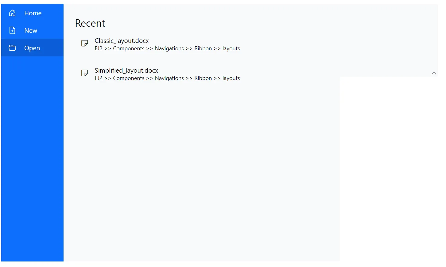
Adding footer items
You can add the footer items in the backstage view by setting the IsFooter property in the BackstageMenuItem tag directive to true. These items are displayed at the bottom of the menu. By default, the value is false.
@using Syncfusion.Blazor.Ribbon;
@using Syncfusion.Blazor.SplitButtons;

<div style="width:75%">
    <SfRibbon>
        <RibbonBackstageMenuSettings Text="File" Visible="true">
            <BackstageMenuItems>
                <BackstageMenuItem ID="home" Text="Home" IconCss="e-icons e-home">@GetBackstageContent("home")</BackstageMenuItem>
                <BackstageMenuItem ID="new" Text="New" IconCss="e-icons e-file-new">@GetBackstageContent("new")</BackstageMenuItem>
                <BackstageMenuItem ID="open" Text="Open" IconCss="e-icons e-folder-open">@GetBackstageContent("open")</BackstageMenuItem>
                <BackstageMenuItem ID="account" Text="Account" IsFooter="true">@GetBackstageContent("account")</BackstageMenuItem>
            </BackstageMenuItems>
        </RibbonBackstageMenuSettings>
        <RibbonTabs>
            <RibbonTab HeaderText="Home">
                <RibbonGroups>
                    <RibbonGroup HeaderText="Clipboard">
                        <RibbonCollections>
                            <RibbonCollection>
                                <RibbonItems>
                                    <RibbonItem Type=RibbonItemType.SplitButton>
                                        <RibbonSplitButtonSettings Content="Paste" IconCss="e-icons e-paste" Items="@formatItems"></RibbonSplitButtonSettings>
                                    </RibbonItem>
                                </RibbonItems>
                            </RibbonCollection>
                            <RibbonCollection>
                                <RibbonItems>
                                    <RibbonItem Type=RibbonItemType.Button>
                                        <RibbonButtonSettings Content="Cut" IconCss="e-icons e-cut" ></RibbonButtonSettings>
                                    </RibbonItem>
                                    <RibbonItem Type=RibbonItemType.Button>
                                        <RibbonButtonSettings Content="Copy" IconCss="e-icons e-copy"></RibbonButtonSettings>
                                    </RibbonItem>
                                    <RibbonItem Type=RibbonItemType.Button>
                                        <RibbonButtonSettings Content="Format Painter" IconCss="e-icons e-format-painter"></RibbonButtonSettings>
                                    </RibbonItem>
                                </RibbonItems>
                            </RibbonCollection>
                        </RibbonCollections>
                    </RibbonGroup>
                </RibbonGroups>
            </RibbonTab>
        </RibbonTabs>
    </SfRibbon>
</div>

@code{
    List<DropDownMenuItem> formatItems = new List<DropDownMenuItem>()
    {
        new DropDownMenuItem{ Text = "Keep Source Format" },
        new DropDownMenuItem{ Text = "Merge Format" },
        new DropDownMenuItem{ Text = "Keep Text Only" }
    };

    RenderFragment GetBackstageContent(string item) => item switch
{
    "home" => @<div class="home-wrapper">
    <div class="new-wrapper">
        <div class="section-title">New</div>
        <div class="category_container">
            <div class="doc_category_image"></div>
            <span class="doc_category_text">New document</span>
        </div>
    </div>
    <div class="block-wrapper">
        <div class="section-title">Recent</div>
        @{
    var recentDocuments = new List<(string icon, string name, string description)>
    {
    ("e-notes", "Classic_layout.docx", "EJ2 >> Components >> Navigations >> Ribbon >> layouts"),
    };
        }
        @foreach (var doc in recentDocuments)
    {
        @RenderWrapperContent(doc.icon, doc.name, doc.description)
    }
    </div>
</div>,
    "new" => @<div class="new-wrapper">
    <div class="section-title">New</div>
    <div class="category_container">
        <div class="doc_category_image"></div>
        <span class="doc_category_text">New document</span>
    </div>
</div>,
    "open" => @<div class="block-wrapper">
    <div class="section-title">Recent</div>
    @{
var recentDocuments = new List<(string icon, string name, string description)>
{
("e-notes", "Classic_layout.docx", "EJ2 >> Components >> Navigations >> Ribbon >> layouts"),
("e-notes", "Simplified_layout.docx", "EJ2 >> Components >> Navigations >> Ribbon >> layouts"),
};
    }
    @foreach (var doc in recentDocuments)
{
    @RenderWrapperContent(doc.icon, doc.name, doc.description)
}
</div>,
    "account" => @<div class="block-wrapper">
    <div class="section-title">Account</div>
    @{
var accountItems = new List<(string icon, string name, string description)>
{
("e-people", "Account type", "Administrator"),
};
    }
    @foreach (var item in accountItems)
{
    @RenderWrapperContent(item.icon, item.name, item.description)
}
</div>,
};

RenderFragment RenderWrapperContent(string icon, string name, string description) =>
@<div class="section-content">
    <table>
        <tbody>
            <tr>
                <td><span class="doc_icon e-icons @icon"></span></td>
                <td>
                    <span style="display: block; font-size: 14px">@name</span>
                    <span style="font-size: 12px">@description</span>
                </td>
            </tr>
        </tbody>
    </table>
</div>;
}

<style>
    /* Sample level styles */
    .e-ribbon-backstage-content > div:first-child {
        width: 550px;
        padding: 25px;
        height: 510px;
    }

    #home_content .new-wrapper {
        margin-bottom: 15px;
    }

    .section-title {
        font-size: 22px;
    }

    .new-docs {
        display: flex;
        justify-content: space-around;
        flex-wrap: wrap;
    }

    .category_container {
        width: 150px;
        padding: 15px;
        text-align: center;
        cursor: pointer;
    }

    .doc_category_image {
        width: 80px;
        height: 100px;
        background-color: #fff;
        border: 1px solid rgb(125, 124, 124);
        text-align: center;
        overflow: hidden;
        margin: 0px auto 10px;
    }

    .doc_category_text {
        font-size: 16px;
    }

    .section-content {
        padding: 12px 0px;
        cursor: pointer;
    }

    .doc_icon {
        font-size: 16px;
        padding: 0px 10px;
    }

    /* Hover styles */
    .category_container:hover,
    .section-content:hover {
        background-color: #dfdfdf;
        border-radius: 5px;
        transition: all 0.3s;
    }
</style>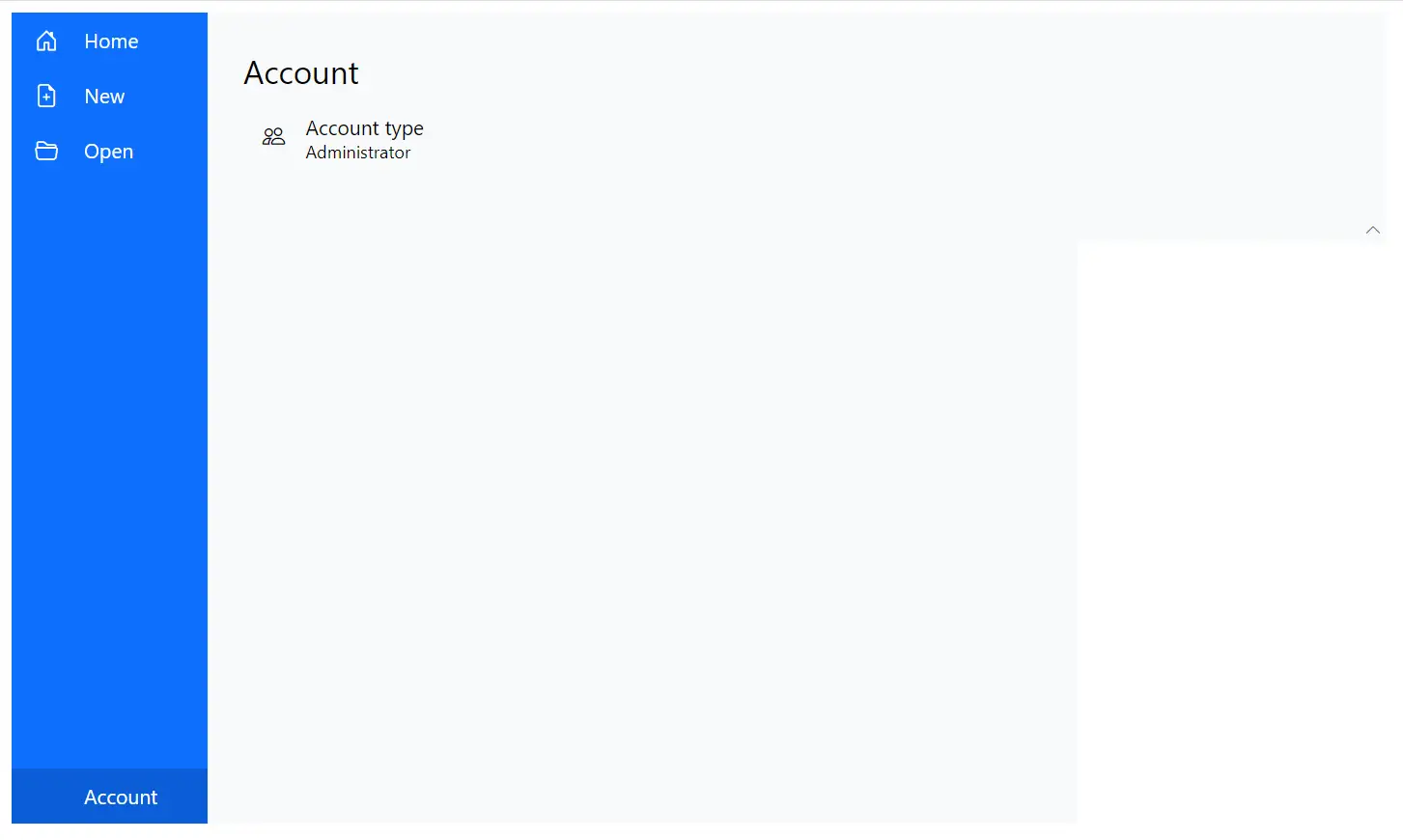
Adding separator
The separators are horizontal lines used to visually divide backstage menu items. You can use the Separator property to split the menu items.
@using Syncfusion.Blazor.Ribbon;
@using Syncfusion.Blazor.SplitButtons;

<div style="width:75%">
    <SfRibbon>
        <RibbonBackstageMenuSettings Text="File" Visible="true">
            <BackstageMenuItems>
                <BackstageMenuItem ID="home" Text="Home" IconCss="e-icons e-home">@GetBackstageContent("home")</BackstageMenuItem>
                <BackstageMenuItem ID="new" Text="New" IconCss="e-icons e-file-new">@GetBackstageContent("new")</BackstageMenuItem>
                <BackstageMenuItem ID="open" Text="Open" IconCss="e-icons e-folder-open">@GetBackstageContent("open")</BackstageMenuItem>
                <BackstageMenuItem Separator="true"></BackstageMenuItem>
                <BackstageMenuItem ID="account" Text="Account">@GetBackstageContent("account")</BackstageMenuItem>
            </BackstageMenuItems>
        </RibbonBackstageMenuSettings>
        <RibbonTabs>
            <RibbonTab HeaderText="Home">
                <RibbonGroups>
                    <RibbonGroup HeaderText="Clipboard">
                        <RibbonCollections>
                            <RibbonCollection>
                                <RibbonItems>
                                    <RibbonItem Type=RibbonItemType.SplitButton>
                                        <RibbonSplitButtonSettings Content="Paste" IconCss="e-icons e-paste" Items="@formatItems"></RibbonSplitButtonSettings>
                                    </RibbonItem>
                                </RibbonItems>
                            </RibbonCollection>
                            <RibbonCollection>
                                <RibbonItems>
                                    <RibbonItem Type=RibbonItemType.Button>
                                        <RibbonButtonSettings Content="Cut" IconCss="e-icons e-cut" ></RibbonButtonSettings>
                                    </RibbonItem>
                                    <RibbonItem Type=RibbonItemType.Button>
                                        <RibbonButtonSettings Content="Copy" IconCss="e-icons e-copy"></RibbonButtonSettings>
                                    </RibbonItem>
                                    <RibbonItem Type=RibbonItemType.Button>
                                        <RibbonButtonSettings Content="Format Painter" IconCss="e-icons e-format-painter"></RibbonButtonSettings>
                                    </RibbonItem>
                                </RibbonItems>
                            </RibbonCollection>
                        </RibbonCollections>
                    </RibbonGroup>
                </RibbonGroups>
            </RibbonTab>
        </RibbonTabs>
    </SfRibbon>
</div>

@code{
    List<DropDownMenuItem> formatItems = new List<DropDownMenuItem>()
    {
        new DropDownMenuItem{ Text = "Keep Source Format" },
        new DropDownMenuItem{ Text = "Merge Format" },
        new DropDownMenuItem{ Text = "Keep Text Only" }
    };

    RenderFragment GetBackstageContent(string item) => item switch
{
    "home" => @<div class="home-wrapper">
    <div class="new-wrapper">
        <div class="section-title">New</div>
        <div class="category_container">
            <div class="doc_category_image"></div>
            <span class="doc_category_text">New document</span>
        </div>
    </div>
    <div class="block-wrapper">
        <div class="section-title">Recent</div>
        @{
    var recentDocuments = new List<(string icon, string name, string description)>
    {
    ("e-notes", "Classic_layout.docx", "EJ2 >> Components >> Navigations >> Ribbon >> layouts"),
    };
        }
        @foreach (var doc in recentDocuments)
    {
        @RenderWrapperContent(doc.icon, doc.name, doc.description)
    }
    </div>
</div>,
    "new" => @<div class="new-wrapper">
    <div class="section-title">New</div>
    <div class="category_container">
        <div class="doc_category_image"></div>
        <span class="doc_category_text">New document</span>
    </div>
</div>,
    "open" => @<div class="block-wrapper">
    <div class="section-title">Recent</div>
    @{
var recentDocuments = new List<(string icon, string name, string description)>
{
("e-notes", "Classic_layout.docx", "EJ2 >> Components >> Navigations >> Ribbon >> layouts"),
("e-notes", "Simplified_layout.docx", "EJ2 >> Components >> Navigations >> Ribbon >> layouts"),
};
    }
    @foreach (var doc in recentDocuments)
{
    @RenderWrapperContent(doc.icon, doc.name, doc.description)
}
</div>,
    "account" => @<div class="block-wrapper">
    <div class="section-title">Account</div>
    @{
var accountItems = new List<(string icon, string name, string description)>
{
("e-people", "Account type", "Administrator"),
};
    }
    @foreach (var item in accountItems)
{
    @RenderWrapperContent(item.icon, item.name, item.description)
}
</div>,
};

RenderFragment RenderWrapperContent(string icon, string name, string description) =>
@<div class="section-content">
    <table>
        <tbody>
            <tr>
                <td><span class="doc_icon e-icons @icon"></span></td>
                <td>
                    <span style="display: block; font-size: 14px">@name</span>
                    <span style="font-size: 12px">@description</span>
                </td>
            </tr>
        </tbody>
    </table>
</div>;
}

<style>
    /* Sample level styles */
    .e-ribbon-backstage-content > div:first-child {
        width: 550px;
        padding: 25px;
        height: 510px;
    }

    #home_content .new-wrapper {
        margin-bottom: 15px;
    }

    .section-title {
        font-size: 22px;
    }

    .new-docs {
        display: flex;
        justify-content: space-around;
        flex-wrap: wrap;
    }

    .category_container {
        width: 150px;
        padding: 15px;
        text-align: center;
        cursor: pointer;
    }

    .doc_category_image {
        width: 80px;
        height: 100px;
        background-color: #fff;
        border: 1px solid rgb(125, 124, 124);
        text-align: center;
        overflow: hidden;
        margin: 0px auto 10px;
    }

    .doc_category_text {
        font-size: 16px;
    }

    .section-content {
        padding: 12px 0px;
        cursor: pointer;
    }

    .doc_icon {
        font-size: 16px;
        padding: 0px 10px;
    }

    /* Hover styles */
    .category_container:hover,
    .section-content:hover {
        background-color: #dfdfdf;
        border-radius: 5px;
        transition: all 0.3s;
    }
</style>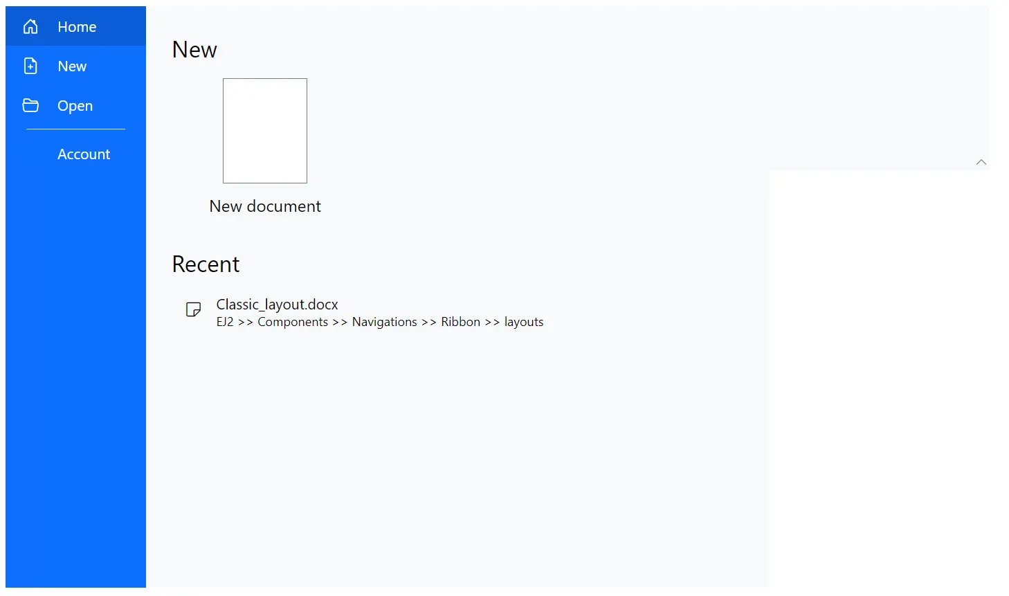
Back button
You can use the BackButtonSettings property in the RibbonBackstageMenuSettings tag directive to customize the text and icon of the close button using the Text and IconCss property. You can show the back button by setting the Visible property to true.
@using Syncfusion.Blazor.Ribbon;
@using Syncfusion.Blazor.SplitButtons;

<div style="width:75%">
    <SfRibbon>
        <RibbonBackstageMenuSettings Text="File" Visible="true" BackButtonSettings="@backStageBackButton">
            <BackstageMenuItems>
                <BackstageMenuItem ID="home" Text="Home" IconCss="e-icons e-home">@GetBackstageContent("home")</BackstageMenuItem>
            </BackstageMenuItems>
        </RibbonBackstageMenuSettings>
        <RibbonTabs>
            <RibbonTab HeaderText="Home">
                <RibbonGroups>
                    <RibbonGroup HeaderText="Clipboard">
                        <RibbonCollections>
                            <RibbonCollection>
                                <RibbonItems>
                                    <RibbonItem Type=RibbonItemType.SplitButton>
                                        <RibbonSplitButtonSettings Content="Paste" IconCss="e-icons e-paste" Items="@formatItems"></RibbonSplitButtonSettings>
                                    </RibbonItem>
                                </RibbonItems>
                            </RibbonCollection>
                            <RibbonCollection>
                                <RibbonItems>
                                    <RibbonItem Type=RibbonItemType.Button>
                                        <RibbonButtonSettings Content="Cut" IconCss="e-icons e-cut" ></RibbonButtonSettings>
                                    </RibbonItem>
                                    <RibbonItem Type=RibbonItemType.Button>
                                        <RibbonButtonSettings Content="Copy" IconCss="e-icons e-copy"></RibbonButtonSettings>
                                    </RibbonItem>
                                    <RibbonItem Type=RibbonItemType.Button>
                                        <RibbonButtonSettings Content="Format Painter" IconCss="e-icons e-format-painter"></RibbonButtonSettings>
                                    </RibbonItem>
                                </RibbonItems>
                            </RibbonCollection>
                        </RibbonCollections>
                    </RibbonGroup>
                </RibbonGroups>
            </RibbonTab>
        </RibbonTabs>
    </SfRibbon>
</div>

@code{

    BackstageBackButtonSettings backStageBackButton = new BackstageBackButtonSettings
    {
        Text = "Close",
        IconCss = "e-icons e-arrow-left",
        Visible = true
    };

    List<DropDownMenuItem> formatItems = new List<DropDownMenuItem>()
    {
        new DropDownMenuItem{ Text = "Keep Source Format" },
        new DropDownMenuItem{ Text = "Merge Format" },
        new DropDownMenuItem{ Text = "Keep Text Only" }
    };

    RenderFragment GetBackstageContent(string item) => item switch
{
    "home" => @<div class="home-wrapper">
    <div class="new-wrapper">
        <div class="section-title">New</div>
        <div class="category_container">
            <div class="doc_category_image"></div>
            <span class="doc_category_text">New document</span>
        </div>
    </div>
</div>
};
}

<style>
    /* Sample level styles */
    .e-ribbon-backstage-content > div:first-child {
        width: 550px;
        padding: 25px;
        height: 510px;
    }

    #home_content .new-wrapper {
        margin-bottom: 15px;
    }

    .section-title {
        font-size: 22px;
    }

    .new-docs {
        display: flex;
        justify-content: space-around;
        flex-wrap: wrap;
    }

    .category_container {
        width: 150px;
        padding: 15px;
        text-align: center;
        cursor: pointer;
    }

    .doc_category_image {
        width: 80px;
        height: 100px;
        background-color: #fff;
        border: 1px solid rgb(125, 124, 124);
        text-align: center;
        overflow: hidden;
        margin: 0px auto 10px;
    }

    .doc_category_text {
        font-size: 16px;
    }

    .section-content {
        padding: 12px 0px;
        cursor: pointer;
    }

    .doc_icon {
        font-size: 16px;
        padding: 0px 10px;
    }

    /* Hover styles */
    .category_container:hover,
    .section-content:hover {
        background-color: #dfdfdf;
        border-radius: 5px;
        transition: all 0.3s;
    }
</style>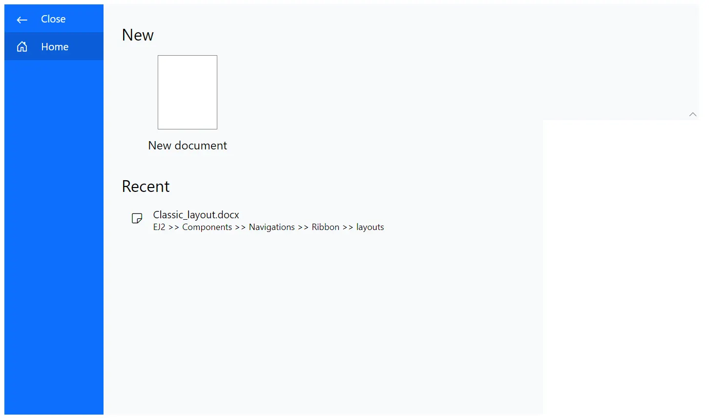
Template
You can customize the backstage menu items and their content using the Template property in the RibbonBackstageMenuSettings tag directive.
@using Syncfusion.Blazor.Ribbon;
@using Syncfusion.Blazor.SplitButtons;

<div style="width:75%">
    <SfRibbon>
        <RibbonBackstageMenuSettings @ref=backstageRef Text="File" Visible="true">
            <Template>
                <div id="temp-content" style="width: 550px; height: 350px; display: flex">
                    <div id="items-wrapper" style="width: 130px; height:100%; background: #779de8;">
                        <ul>
                            <li id="close" @onclick="CloseContent">
                                <span class="e-icons e-close"></span> Close
                            </li>
                            @foreach(var item in backstageMenus)
                            {
                                <li id="@item.Value.name" @onclick="() => ContentClickHandler(item.Key)">
                                    <span class="e-icons @item.Value.icon"></span>
                                    @item.Value.name
                                </li>
                            }
                        </ul>
                    </div>
                    @GetBackstageContent(selectedContent)
                </div>
            </Template>
        </RibbonBackstageMenuSettings>
        <RibbonTabs>
            <RibbonTab HeaderText="Home">
                <RibbonGroups>
                    <RibbonGroup HeaderText="Clipboard">
                        <RibbonCollections>
                            <RibbonCollection>
                                <RibbonItems>
                                    <RibbonItem Type=RibbonItemType.SplitButton>
                                        <RibbonSplitButtonSettings Content="Paste" IconCss="e-icons e-paste" Items="@formatItems"></RibbonSplitButtonSettings>
                                    </RibbonItem>
                                </RibbonItems>
                            </RibbonCollection>
                            <RibbonCollection>
                                <RibbonItems>
                                    <RibbonItem Type=RibbonItemType.Button>
                                        <RibbonButtonSettings Content="Cut" IconCss="e-icons e-cut" ></RibbonButtonSettings>
                                    </RibbonItem>
                                    <RibbonItem Type=RibbonItemType.Button>
                                        <RibbonButtonSettings Content="Copy" IconCss="e-icons e-copy"></RibbonButtonSettings>
                                    </RibbonItem>
                                    <RibbonItem Type=RibbonItemType.Button>
                                        <RibbonButtonSettings Content="Format Painter" IconCss="e-icons e-format-painter"></RibbonButtonSettings>
                                    </RibbonItem>
                                </RibbonItems>
                            </RibbonCollection>
                        </RibbonCollections>
                    </RibbonGroup>
                </RibbonGroups>
            </RibbonTab>
        </RibbonTabs>
    </SfRibbon>
</div>

@code{

    RibbonBackstageMenuSettings backstageRef;

    Dictionary<int, (string name, string icon)> backstageMenus = new Dictionary<int, (string, string)>()
        {
        { 1, ("New", "e-file-new") },
        { 2, ("Open", "e-folder-open") },
        { 3, ("Save", "e-save") }
    };

    private string selectedContent = "new";

    private void CloseContent()
    {
        selectedContent = "new";
        backstageRef.HideBackstageAsync();
    }

    private void ContentClickHandler(int id)
    {
        if (backstageMenus.TryGetValue(id, out var menuItem))
        {
            selectedContent = menuItem.name.ToLowerInvariant();
        }
    }

    List<DropDownMenuItem> formatItems = new List<DropDownMenuItem>()
    {
        new DropDownMenuItem{ Text = "Keep Source Format" },
        new DropDownMenuItem{ Text = "Merge Format" },
        new DropDownMenuItem{ Text = "Keep Text Only" }
    };

     private RenderFragment RenderWrapperContent(string icon, string name, string description) => @<div class="section-content">
        <span class="e-icons @icon doc_icon"></span>
        <span>@name</span>
        <div class="desc" style="font-size:12px;color:#555;margin-left:26px;">@description</div>
    </div>;

        RenderFragment GetBackstageContent(string item) => (item ?? string.Empty).ToLowerInvariant() switch
    {
        "new" => @<div class="new-wrapper" style="padding: 20px;">
        <div class="section-title">New</div>
        <div class="category_container">
            <div class="doc_category_image"></div>
            <span class="doc_category_text">New document</span>
        </div>
    </div>,
        "open" => @<div class="block-wrapper">
        <div class="section-title">Recent</div>
        @{
    var recentDocuments = new List<(string icon, string name, string description)>
    {
    ("e-notes", "Classic_layout.docx", "EJ2 >> Components >> Navigations >> Ribbon >> layouts"),
    ("e-notes", "Simplified_layout.docx", "EJ2 >> Components >> Navigations >> Ribbon >> layouts"),
    };
        }
        @foreach (var doc in recentDocuments)
    {
        @RenderWrapperContent(doc.icon, doc.name, doc.description)
    }
    </div>,
        "save" => @<div class="block-wrapper">
        <div class="section-title">Save</div>
        @{
    var saveItems = new List<(string icon, string name, string description)>
    {
    ("e-save", "Save as", "Save a copy online"),
    };
        }
        @foreach (var item in saveItems)
    {
        @RenderWrapperContent(item.icon, item.name, item.description)
    }
    </div>
    };
}

<style>
    .e-ribbon-backstage-content {
        width: 550px;
        height: 350px;
    }

    .section-title {
        font-size: 22px;
    }

    .new-docs {
        display: flex;
        justify-content: space-around;
        flex-wrap: wrap;
    }

    .category_container {
        width: 150px;
        padding: 15px;
        text-align: center;
        cursor: pointer;
    }

    .doc_category_image {
        width: 80px;
        height: 100px;
        background-color: #fff;
        border: 1px solid rgb(125, 124, 124);
        text-align: center;
        overflow: hidden;
        margin: 0px auto 10px;
    }

    .doc_category_text {
        font-size: 16px;
    }

    .section-content {
        padding: 12px 0px;
        cursor: pointer;
    }

    .doc_icon {
        font-size: 16px;
        padding: 0px 10px;
    }

    .category_container:hover, .section-content:hover {
        background-color: #dfdfdf;
        border-radius: 5px;
        transition: all 0.3s;
    }

    #targetElement {
        width: 500px;
        height: 500px;
    }

    #items-wrapper ul {
        padding: 0;
        margin: 0;
    }

    #items-wrapper li {
        height: 38px;
        font-size: 16px;
        list-style: none;
        cursor: pointer;
        text-align: center;
        padding-top: 10px;
    }

    #items-wrapper li span {
        margin-right: 15px;
        font-size: 14px;
    }

    #items-wrapper ul li:hover {
        background-color: #a5bff4;
    }

    #content-wrapper .content-close {
        display: none;
    }

    #content-wrapper .content-open {
        display: block;
    }

</style>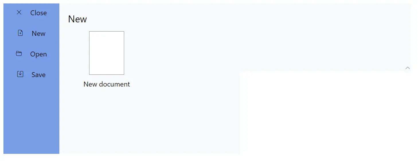
Setting width and height
The height and width of the backstage view can be customized using the Height and Width properties. By default, the dimensions are adjusted to fit the content.
Events
The following event is available in the Ribbon Backstage.
| Name | Args | Description |
|---|---|---|
| BackstageItemClick | BackstageItemClickEventArgs | Triggers when a backstage item is clicked |
@using Syncfusion.Blazor.Ribbon;
@using Syncfusion.Blazor.SplitButtons;

<div style="width:75%">
    <SfRibbon>
        <RibbonBackstageMenuSettings Text="File" Visible="true" BackstageItemClick="BackstageClickHandler">
            <BackstageMenuItems>
                <BackstageMenuItem ID="home" Text="Home" IconCss="e-icons e-home">@GetBackstageContent("home")</BackstageMenuItem>
            </BackstageMenuItems>
        </RibbonBackstageMenuSettings>
        <RibbonTabs>
            <RibbonTab HeaderText="Home">
                <RibbonGroups>
                    <RibbonGroup HeaderText="Clipboard">
                        <RibbonCollections>
                            <RibbonCollection>
                                <RibbonItems>
                                    <RibbonItem Type=RibbonItemType.SplitButton>
                                        <RibbonSplitButtonSettings Content="Paste" IconCss="e-icons e-paste" Items="@formatItems"></RibbonSplitButtonSettings>
                                    </RibbonItem>
                                </RibbonItems>
                            </RibbonCollection>
                            <RibbonCollection>
                                <RibbonItems>
                                    <RibbonItem Type=RibbonItemType.Button>
                                        <RibbonButtonSettings Content="Cut" IconCss="e-icons e-cut" ></RibbonButtonSettings>
                                    </RibbonItem>
                                    <RibbonItem Type=RibbonItemType.Button>
                                        <RibbonButtonSettings Content="Copy" IconCss="e-icons e-copy"></RibbonButtonSettings>
                                    </RibbonItem>
                                    <RibbonItem Type=RibbonItemType.Button>
                                        <RibbonButtonSettings Content="Format Painter" IconCss="e-icons e-format-painter"></RibbonButtonSettings>
                                    </RibbonItem>
                                </RibbonItems>
                            </RibbonCollection>
                        </RibbonCollections>
                    </RibbonGroup>
                </RibbonGroups>
            </RibbonTab>
        </RibbonTabs>
    </SfRibbon>
</div>

@code{

    private void BackstageClickHandler(BackstageItemClickEventArgs args) {
        // Handle required actions here
    }

    List<DropDownMenuItem> formatItems = new List<DropDownMenuItem>()
    {
        new DropDownMenuItem{ Text = "Keep Source Format" },
        new DropDownMenuItem{ Text = "Merge Format" },
        new DropDownMenuItem{ Text = "Keep Text Only" }
    };

    RenderFragment GetBackstageContent(string item) => item switch
    {
        "home" => @<div class="home-wrapper"> Home content </div>
    };
}