How can I help you?
Contextual tabs in Blazor Ribbon component
31 Mar 202624 minutes to read
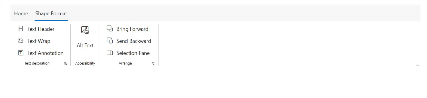
The Ribbon Contextual tabs are similar to the Ribbon tabs that are displayed on demand based on their needs, such as an image or a table tabs. It supports adding all built-in and custom Ribbon items to perform specific actions.
Controlling tab visibility
You can utilize the Visible property to control the visibility of each contextual tab. By default the value is false.
Adding contextual tabs
You can utilize the RibbonContextualTabs tag directive to define contextual tabs within the Ribbon. This allows you to group collection of Ribbon tabs and display them only when required.
@using Syncfusion.Blazor.Ribbon;
@using  Syncfusion.Blazor.Buttons;

<div id="ribbonContainer">
    <SfRibbon ID="ribbon">
        <RibbonTabs>
            <RibbonTab HeaderText="Home">
                <RibbonGroups>
                    <RibbonGroup HeaderText="Clipboard" ID="clipboardGroup" GroupIconCss="e-icons e-paste" ShowLauncherIcon="true">
                        <RibbonCollections>
                            <RibbonCollection>
                                <RibbonItems>
                                    <RibbonItem Type=RibbonItemType.Button>
                                        <RibbonButtonSettings Content="Cut" IconCss="e-icons e-cut"></RibbonButtonSettings>
                                    </RibbonItem>
                                    <RibbonItem Type=RibbonItemType.Button>
                                        <RibbonButtonSettings Content="Copy" IconCss="e-icons e-copy"></RibbonButtonSettings>
                                    </RibbonItem>
                                    <RibbonItem Type=RibbonItemType.Button>
                                        <RibbonButtonSettings Content="Format Painter" IconCss="e-icons e-format-painter"></RibbonButtonSettings>
                                    </RibbonItem>
                                </RibbonItems>
                            </RibbonCollection>
                        </RibbonCollections>
                    </RibbonGroup>
                </RibbonGroups>
            </RibbonTab>
        </RibbonTabs>
        <RibbonContextualTabs>
            <RibbonContextualTab @bind-Visible="@isVisible">
                <RibbonTabs>
                    <RibbonTab ID="ShapeFormat" HeaderText="Shape Format">
                        <RibbonGroups>
                            <RibbonGroup HeaderText="Text decoration" ShowLauncherIcon="true">
                                <RibbonCollections>
                                    <RibbonCollection>
                                        <RibbonItems>
                                            <RibbonItem Type=RibbonItemType.Button>
                                                <RibbonButtonSettings Content="Text Header" IconCss="e-icons e-text-header"></RibbonButtonSettings>
                                            </RibbonItem>
                                            <RibbonItem Type=RibbonItemType.Button>
                                                <RibbonButtonSettings Content="Text Wrap" IconCss="e-icons e-text-wrap"></RibbonButtonSettings>
                                            </RibbonItem>
                                            <RibbonItem Type=RibbonItemType.Button>
                                                <RibbonButtonSettings Content="Text Annotation" IconCss="e-icons e-text-annotation"></RibbonButtonSettings>
                                            </RibbonItem>
                                        </RibbonItems>
                                    </RibbonCollection>
                                </RibbonCollections>
                            </RibbonGroup>
                            <RibbonGroup HeaderText="Accessibility">
                                <RibbonCollections>
                                    <RibbonCollection>
                                        <RibbonItems>
                                            <RibbonItem Type=RibbonItemType.Button AllowedSizes="RibbonItemSize.Large">
                                                <RibbonButtonSettings Content="Alt Text" IconCss="e-icons e-text-alternative"></RibbonButtonSettings>
                                            </RibbonItem>
                                        </RibbonItems>
                                    </RibbonCollection>
                                </RibbonCollections>
                            </RibbonGroup>
                            <RibbonGroup HeaderText="Arrange" ShowLauncherIcon="true">
                                <RibbonCollections>
                                    <RibbonCollection>
                                        <RibbonItems>
                                            <RibbonItem Type=RibbonItemType.Button>
                                                <RibbonButtonSettings Content="Bring Forward" IconCss="e-icons e-bring-forward"></RibbonButtonSettings>
                                            </RibbonItem>
                                            <RibbonItem Type=RibbonItemType.Button>
                                                <RibbonButtonSettings Content="Send Backward" IconCss="e-icons e-send-backward"></RibbonButtonSettings>
                                            </RibbonItem>
                                            <RibbonItem Type=RibbonItemType.Button>
                                                <RibbonButtonSettings Content="Selection Pane" IconCss="e-icons e-show-hide-panel"></RibbonButtonSettings>
                                            </RibbonItem>
                                        </RibbonItems>
                                    </RibbonCollection>
                                </RibbonCollections>
                            </RibbonGroup>
                        </RibbonGroups>
                    </RibbonTab>
                </RibbonTabs>
            </RibbonContextualTab>
        </RibbonContextualTabs>
    </SfRibbon>
</div>

@code {
    bool isVisible = true;
}
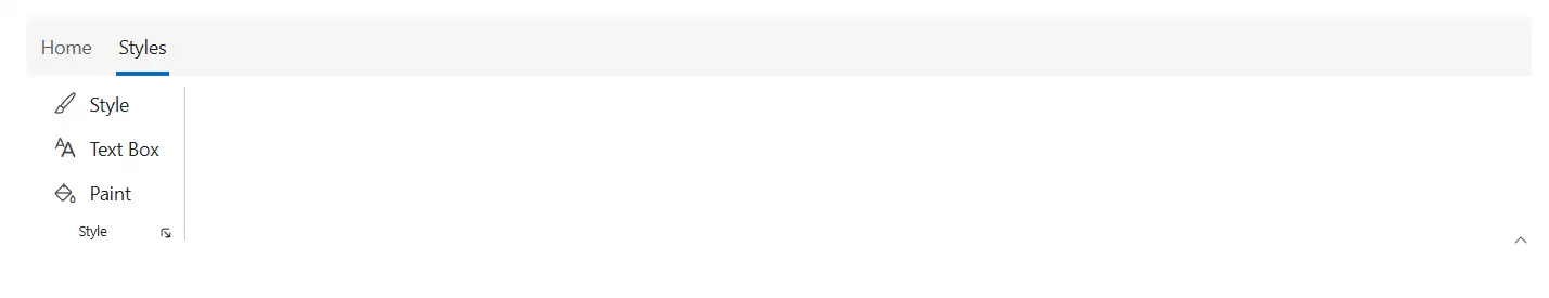
Selected tabs
By using the IsSelected property you can control the selected state of each contextual tab and indicates which tab is currently active when set to true. By default the value is false.
@using Syncfusion.Blazor.Ribbon;
@using  Syncfusion.Blazor.Buttons;

<div id="ribbonContainer">
    <SfRibbon ID="ribbon">
        <RibbonTabs>
            <RibbonTab HeaderText="Home">
                <RibbonGroups>
                    <RibbonGroup HeaderText="Clipboard" ID="clipboardGroup" GroupIconCss="e-icons e-paste" ShowLauncherIcon="true">
                        <RibbonCollections>
                            <RibbonCollection>
                                <RibbonItems>
                                    <RibbonItem Type=RibbonItemType.Button>
                                        <RibbonButtonSettings Content="Cut" IconCss="e-icons e-cut"></RibbonButtonSettings>
                                    </RibbonItem>
                                    <RibbonItem Type=RibbonItemType.Button>
                                        <RibbonButtonSettings Content="Copy" IconCss="e-icons e-copy"></RibbonButtonSettings>
                                    </RibbonItem>
                                    <RibbonItem Type=RibbonItemType.Button>
                                        <RibbonButtonSettings Content="Format Painter" IconCss="e-icons e-format-painter"></RibbonButtonSettings>
                                    </RibbonItem>
                                </RibbonItems>
                            </RibbonCollection>
                        </RibbonCollections>
                    </RibbonGroup>
                </RibbonGroups>
            </RibbonTab>
        </RibbonTabs>
        <RibbonContextualTabs>
            <RibbonContextualTab @bind-Visible=@isVisible @bind-IsSelected=@isSelected>
                <RibbonTabs>
                    <RibbonTab HeaderText="Styles">
                        <RibbonGroups>
                            <RibbonGroup HeaderText="Style" ShowLauncherIcon="true">
                                <RibbonCollections>
                                    <RibbonCollection>
                                        <RibbonItems>
                                            <RibbonItem Type=RibbonItemType.Button>
                                                <RibbonButtonSettings Content="Style" IconCss="e-icons e-style"></RibbonButtonSettings>
                                            </RibbonItem>
                                            <RibbonItem Type=RibbonItemType.Button>
                                                <RibbonButtonSettings Content="Text Box" IconCss="e-icons e-font-name"></RibbonButtonSettings>
                                            </RibbonItem>
                                            <RibbonItem Type=RibbonItemType.Button>
                                                <RibbonButtonSettings Content="Paint" IconCss="e-icons e-paint-bucket"></RibbonButtonSettings>
                                            </RibbonItem>
                                        </RibbonItems>
                                    </RibbonCollection>
                                </RibbonCollections>
                            </RibbonGroup>
                        </RibbonGroups>
                    </RibbonTab>
                </RibbonTabs>
            </RibbonContextualTab>
        </RibbonContextualTabs>
    </SfRibbon>
</div>

@code {
    bool isVisible = true;
    bool isSelected = true;
}
Methods
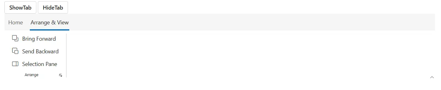
Show tab
You can use the ShowTabAsync method to programmatically display a specific contextual tab in the Ribbon.
Hide tab
You can use the HideTabAsync method allows you to hide the specific contextual tab in the Ribbon.
@using Syncfusion.Blazor.Ribbon;
@using  Syncfusion.Blazor.Buttons;

<div id="ribbonContainer">
    <SfButton @onclick="handleShowTab">ShowTab</SfButton>
    <SfButton @onclick="handleHideTab">HideTab</SfButton>
    <SfRibbon ID="ribbon" @ref="ribbon">
        <RibbonTabs>
            <RibbonTab HeaderText="Home">
                <RibbonGroups>
                    <RibbonGroup HeaderText="Clipboard" ID="clipboardGroup" GroupIconCss="e-icons e-paste" ShowLauncherIcon="true">
                        <RibbonCollections>
                            <RibbonCollection>
                                <RibbonItems>
                                    <RibbonItem Type=RibbonItemType.Button>
                                        <RibbonButtonSettings Content="Cut" IconCss="e-icons e-cut"></RibbonButtonSettings>
                                    </RibbonItem>
                                    <RibbonItem Type=RibbonItemType.Button>
                                        <RibbonButtonSettings Content="Copy" IconCss="e-icons e-copy"></RibbonButtonSettings>
                                    </RibbonItem>
                                    <RibbonItem Type=RibbonItemType.Button>
                                        <RibbonButtonSettings Content="Format Painter" IconCss="e-icons e-format-painter"></RibbonButtonSettings>
                                    </RibbonItem>
                                </RibbonItems>
                            </RibbonCollection>
                        </RibbonCollections>
                    </RibbonGroup>
                </RibbonGroups>
            </RibbonTab>
        </RibbonTabs>
        <RibbonContextualTabs>
            <RibbonContextualTab @bind-Visible=@isVisible @bind-IsSelected=@isSelected>
                <RibbonTabs>
                    <RibbonTab HeaderText="Arrange & View" ID="ArrangeView">
                        <RibbonGroups>
                            <RibbonGroup HeaderText="Arrange" ShowLauncherIcon="true">
                                <RibbonCollections>
                                    <RibbonCollection>
                                        <RibbonItems>
                                            <RibbonItem Type=RibbonItemType.Button>
                                                <RibbonButtonSettings Content="Bring Forward" IconCss="e-icons e-bring-forward"></RibbonButtonSettings>
                                            </RibbonItem>
                                            <RibbonItem Type=RibbonItemType.Button>
                                                <RibbonButtonSettings Content="Send Backward" IconCss="e-icons e-send-backward"></RibbonButtonSettings>
                                            </RibbonItem>
                                            <RibbonItem Type=RibbonItemType.Button>
                                                <RibbonButtonSettings Content="Selection Pane" IconCss="e-icons e-show-hide-panel"></RibbonButtonSettings>
                                            </RibbonItem>
                                        </RibbonItems>
                                    </RibbonCollection>
                                </RibbonCollections>
                            </RibbonGroup>
                        </RibbonGroups>
                    </RibbonTab>
                </RibbonTabs>
            </RibbonContextualTab>
        </RibbonContextualTabs>
    </SfRibbon>
</div>

@code {
    bool isVisible = true;
    bool isSelected = true;

    SfRibbon ribbon;
    private async Task handleShowTab()
    {
        await ribbon.ShowTabAsync("ArrangeView");
    }
    private async Task handleHideTab()
    {
        await ribbon.HideTabAsync("ArrangeView");
    }
}