Gallery Items in Blazor Ribbon component
30 Jun 202624 minutes to read
The Ribbon supports a gallery view, allowing users to interact with a collection of related items such as icons, text, or images. You can render gallery items by setting the Type property of a Ribbon item to RibbonItemType.Gallery and customize it using the RibbonGallerySettings tag directive. The settings provide options like Groups, ItemCount, PopupHeight, PopupWidth, and more.
Groups
You can render groups inside the gallery using the Groups property of the RibbonGallerySettings tag directive. Groups can be customized using GalleryGroup tag directive with properties like Items, CssClass, Header, etc.
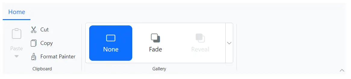
Adding items
Gallery items can be added using GalleryItem tag directive within the Items property of a group. Below example demonstrates how to configure properties such as Content, IconCss, Disabled to the gallery item.
@using Syncfusion.Blazor.Ribbon;
@using Syncfusion.Blazor.SplitButtons;

<div style="width:60%">
    <SfRibbon>
        <RibbonTabs>
            <RibbonTab HeaderText="Home">
                <RibbonGroups>
                    <RibbonGroup HeaderText="Clipboard">
                        <RibbonCollections>
                            <RibbonCollection>
                                <RibbonItems>
                                    <RibbonItem Type=RibbonItemType.SplitButton Disabled=true>
                                        <RibbonSplitButtonSettings Content="Paste" IconCss="e-icons e-paste" Items="@formatItems"></RibbonSplitButtonSettings>
                                    </RibbonItem>
                                </RibbonItems>
                            </RibbonCollection>
                            <RibbonCollection>
                                <RibbonItems>
                                    <RibbonItem Type=RibbonItemType.Button>
                                        <RibbonButtonSettings Content="Cut" IconCss="e-icons e-cut"></RibbonButtonSettings>
                                    </RibbonItem>
                                    <RibbonItem Type=RibbonItemType.Button>
                                        <RibbonButtonSettings Content="Copy" IconCss="e-icons e-copy"></RibbonButtonSettings>
                                    </RibbonItem>
                                    <RibbonItem Type=RibbonItemType.Button>
                                        <RibbonButtonSettings Content="Format Painter" IconCss="e-icons e-format-painter"></RibbonButtonSettings>
                                    </RibbonItem>
                                </RibbonItems>
                            </RibbonCollection>
                        </RibbonCollections>
                    </RibbonGroup>
                    <RibbonGroup HeaderText="Gallery">
                        <RibbonCollections>
                            <RibbonCollection>
                                <RibbonItems>
                                    <RibbonItem Type=RibbonItemType.Gallery>
                                        <RibbonGallerySettings Groups="galleryGroups">
                                        </RibbonGallerySettings>
                                    </RibbonItem>
                                </RibbonItems>
                            </RibbonCollection>
                        </RibbonCollections>
                    </RibbonGroup>
                </RibbonGroups>
            </RibbonTab>
        </RibbonTabs>
    </SfRibbon>
</div>

@code{
    List<DropDownMenuItem> formatItems = new List<DropDownMenuItem>()
    {
        new DropDownMenuItem{ Text = "Keep Source Format" },
        new DropDownMenuItem{ Text = "Merge Format" },
        new DropDownMenuItem{ Text = "Keep Text Only" }
    };

    List<GalleryGroup> galleryGroups = new List<GalleryGroup>
    {
        new GalleryGroup
        {
            Items = new List<GalleryItem>
            {
                new GalleryItem { Content = "None", IconCss = "e-icons e-rectangle" },
                new GalleryItem { Content = "Fade", IconCss = "e-icons e-send-backward" },
                new GalleryItem { Content = "Reveal", IconCss = "e-icons e-bring-forward", Disabled = true },
                new GalleryItem { Content = "Zoom", IconCss = "e-icons e-zoom-to-fit" }
            }
        }
    };
}
CSS class
You can use the CssClass property to customize the gallery item.
@using Syncfusion.Blazor.Ribbon;
@using Syncfusion.Blazor.SplitButtons;

<div style="width:60%">
    <SfRibbon>
        <RibbonTabs>
            <RibbonTab HeaderText="Home">
                <RibbonGroups>
                    <RibbonGroup HeaderText="Clipboard">
                        <RibbonCollections>
                            <RibbonCollection>
                                <RibbonItems>
                                    <RibbonItem Type=RibbonItemType.SplitButton Disabled=true>
                                        <RibbonSplitButtonSettings Content="Paste" IconCss="e-icons e-paste" Items="@formatItems"></RibbonSplitButtonSettings>
                                    </RibbonItem>
                                </RibbonItems>
                            </RibbonCollection>
                            <RibbonCollection>
                                <RibbonItems>
                                    <RibbonItem Type=RibbonItemType.Button>
                                        <RibbonButtonSettings Content="Cut" IconCss="e-icons e-cut"></RibbonButtonSettings>
                                    </RibbonItem>
                                    <RibbonItem Type=RibbonItemType.Button>
                                        <RibbonButtonSettings Content="Copy" IconCss="e-icons e-copy"></RibbonButtonSettings>
                                    </RibbonItem>
                                    <RibbonItem Type=RibbonItemType.Button>
                                        <RibbonButtonSettings Content="Format Painter" IconCss="e-icons e-format-painter"></RibbonButtonSettings>
                                    </RibbonItem>
                                </RibbonItems>
                            </RibbonCollection>
                        </RibbonCollections>
                    </RibbonGroup>
                    <RibbonGroup HeaderText="Gallery">
                        <RibbonCollections>
                            <RibbonCollection>
                                <RibbonItems>
                                    <RibbonItem Type=RibbonItemType.Gallery>
                                        <RibbonGallerySettings Groups="galleryGroups">
                                        </RibbonGallerySettings>
                                    </RibbonItem>
                                </RibbonItems>
                            </RibbonCollection>
                        </RibbonCollections>
                    </RibbonGroup>
                </RibbonGroups>
            </RibbonTab>
        </RibbonTabs>
    </SfRibbon>
</div>

@code{
    List<DropDownMenuItem> formatItems = new List<DropDownMenuItem>()
    {
        new DropDownMenuItem{ Text = "Keep Source Format" },
        new DropDownMenuItem{ Text = "Merge Format" },
        new DropDownMenuItem{ Text = "Keep Text Only" }
    };

    List<GalleryGroup> galleryGroups = new List<GalleryGroup>
    {
       new GalleryGroup
        {
            Items = new List<GalleryItem>
            {
                new GalleryItem { Content = "Normal", CssClass = "normal" },
                new GalleryItem { Content = "Bad", CssClass = "bad" },
                new GalleryItem { Content = "Good", CssClass = "good" },
                new GalleryItem { Content = "Neutral", CssClass = "neutral" }
            }
        },
    };
}

<style>

    .e-ribbon-gallery-item.bad {
        background: #ffb6b6;
    }

    .e-ribbon-gallery-item.good {
        background: #c7ebc9;
    }

    .e-ribbon-gallery-item.neutral {
        background: #eedd9d;
    }
</style>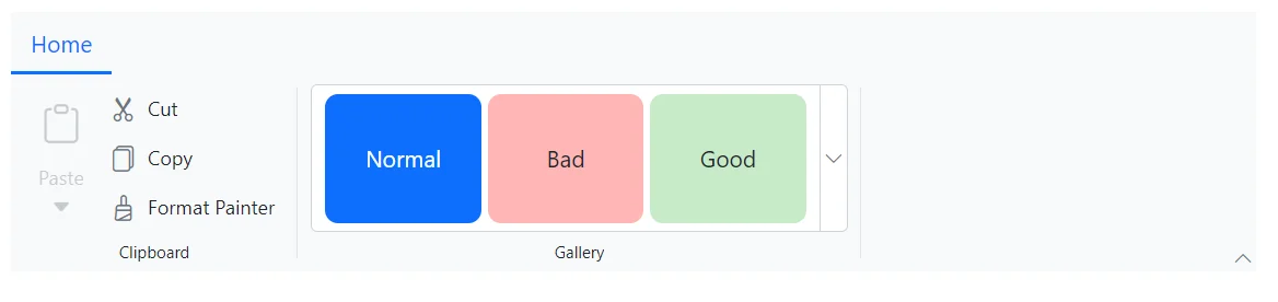
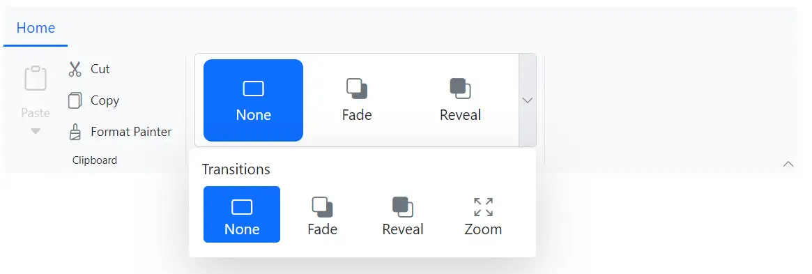
Custom header
You can use the Header property to set header for the groups in the Ribbon gallery popup.
@using Syncfusion.Blazor.Ribbon;
@using Syncfusion.Blazor.SplitButtons;

<div style="width:60%">
    <SfRibbon>
        <RibbonTabs>
            <RibbonTab HeaderText="Home">
                <RibbonGroups>
                    <RibbonGroup HeaderText="Clipboard">
                        <RibbonCollections>
                            <RibbonCollection>
                                <RibbonItems>
                                    <RibbonItem Type=RibbonItemType.SplitButton Disabled=true>
                                        <RibbonSplitButtonSettings Content="Paste" IconCss="e-icons e-paste" Items="@formatItems"></RibbonSplitButtonSettings>
                                    </RibbonItem>
                                </RibbonItems>
                            </RibbonCollection>
                            <RibbonCollection>
                                <RibbonItems>
                                    <RibbonItem Type=RibbonItemType.Button>
                                        <RibbonButtonSettings Content="Cut" IconCss="e-icons e-cut"></RibbonButtonSettings>
                                    </RibbonItem>
                                    <RibbonItem Type=RibbonItemType.Button>
                                        <RibbonButtonSettings Content="Copy" IconCss="e-icons e-copy"></RibbonButtonSettings>
                                    </RibbonItem>
                                    <RibbonItem Type=RibbonItemType.Button>
                                        <RibbonButtonSettings Content="Format Painter" IconCss="e-icons e-format-painter"></RibbonButtonSettings>
                                    </RibbonItem>
                                </RibbonItems>
                            </RibbonCollection>
                        </RibbonCollections>
                    </RibbonGroup>
                    <RibbonGroup HeaderText="Gallery">
                        <RibbonCollections>
                            <RibbonCollection>
                                <RibbonItems>
                                    <RibbonItem Type=RibbonItemType.Gallery>
                                        <RibbonGallerySettings Groups="galleryGroups">
                                        </RibbonGallerySettings>
                                    </RibbonItem>
                                </RibbonItems>
                            </RibbonCollection>
                        </RibbonCollections>
                    </RibbonGroup>
                </RibbonGroups>
            </RibbonTab>
        </RibbonTabs>
    </SfRibbon>
</div>

@code{
    List<DropDownMenuItem> formatItems = new List<DropDownMenuItem>()
    {
        new DropDownMenuItem{ Text = "Keep Source Format" },
        new DropDownMenuItem{ Text = "Merge Format" },
        new DropDownMenuItem{ Text = "Keep Text Only" }
    };

    List<GalleryGroup> galleryGroups = new List<GalleryGroup>
    {
        new GalleryGroup
        {
            Header = "Transitions",
            Items = new List<GalleryItem>
            {
                new GalleryItem { Content = "None", IconCss = "e-icons e-rectangle" },
                new GalleryItem { Content = "Fade", IconCss = "e-icons e-send-backward" },
                new GalleryItem { Content = "Reveal", IconCss = "e-icons e-bring-forward", Disabled = true },
                new GalleryItem { Content = "Zoom", IconCss = "e-icons e-zoom-to-fit" }
            }
        }
    };
}
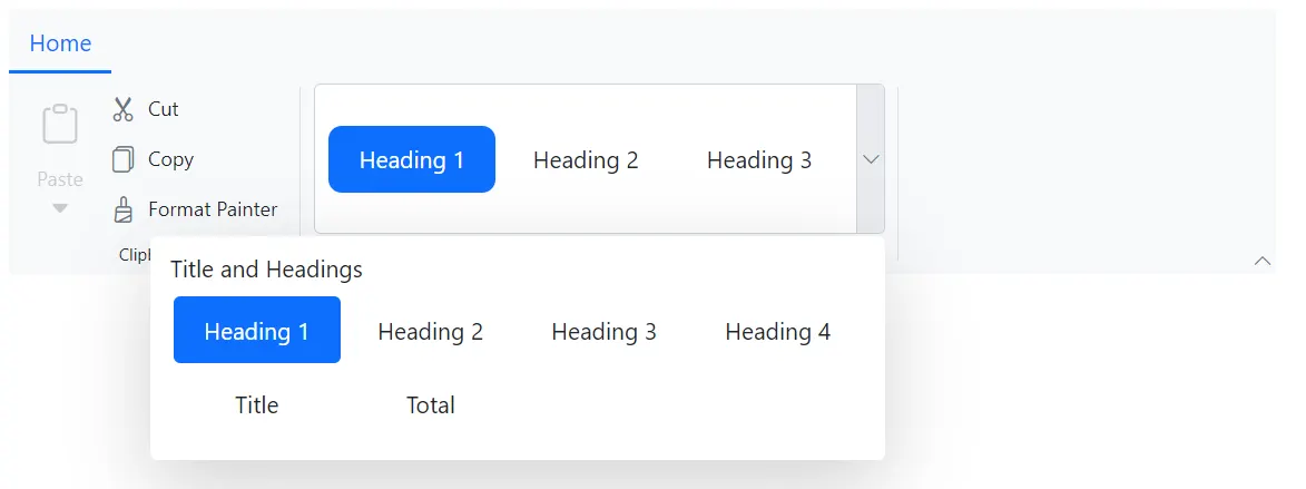
Setting item dimensions
You can specify the width and height of gallery items using the ItemWidth and ItemHeight properties within a GalleryGroup. If the ItemHeight of the gallery item is smaller, then the remaining gallery items are aligned based on the ItemCount specified.
@using Syncfusion.Blazor.Ribbon;
@using Syncfusion.Blazor.SplitButtons;

<div style="width:60%">
    <SfRibbon>
        <RibbonTabs>
            <RibbonTab HeaderText="Home">
                <RibbonGroups>
                    <RibbonGroup HeaderText="Clipboard">
                        <RibbonCollections>
                            <RibbonCollection>
                                <RibbonItems>
                                    <RibbonItem Type=RibbonItemType.SplitButton Disabled=true>
                                        <RibbonSplitButtonSettings Content="Paste" IconCss="e-icons e-paste" Items="@formatItems"></RibbonSplitButtonSettings>
                                    </RibbonItem>
                                </RibbonItems>
                            </RibbonCollection>
                            <RibbonCollection>
                                <RibbonItems>
                                    <RibbonItem Type=RibbonItemType.Button>
                                        <RibbonButtonSettings Content="Cut" IconCss="e-icons e-cut"></RibbonButtonSettings>
                                    </RibbonItem>
                                    <RibbonItem Type=RibbonItemType.Button>
                                        <RibbonButtonSettings Content="Copy" IconCss="e-icons e-copy"></RibbonButtonSettings>
                                    </RibbonItem>
                                    <RibbonItem Type=RibbonItemType.Button>
                                        <RibbonButtonSettings Content="Format Painter" IconCss="e-icons e-format-painter"></RibbonButtonSettings>
                                    </RibbonItem>
                                </RibbonItems>
                            </RibbonCollection>
                        </RibbonCollections>
                    </RibbonGroup>
                    <RibbonGroup HeaderText="Gallery">
                        <RibbonCollections>
                            <RibbonCollection>
                                <RibbonItems>
                                    <RibbonItem Type=RibbonItemType.Gallery>
                                        <RibbonGallerySettings Groups="galleryGroups">
                                        </RibbonGallerySettings>
                                    </RibbonItem>
                                </RibbonItems>
                            </RibbonCollection>
                        </RibbonCollections>
                    </RibbonGroup>
                </RibbonGroups>
            </RibbonTab>
        </RibbonTabs>
    </SfRibbon>
</div>

@code{
    List<DropDownMenuItem> formatItems = new List<DropDownMenuItem>()
    {
        new DropDownMenuItem{ Text = "Keep Source Format" },
        new DropDownMenuItem{ Text = "Merge Format" },
        new DropDownMenuItem{ Text = "Keep Text Only" }
    };

    List<GalleryGroup> galleryGroups = new List<GalleryGroup>
    {
        new GalleryGroup
        {
            Header = "Title and Headings",
            ItemWidth = "100",
            ItemHeight = "40",
            Items = new List<GalleryItem>
            {
                new GalleryItem { Content = "Heading 1" },
                new GalleryItem { Content = "Heading 2" },
                new GalleryItem { Content = "Heading 3" },
                new GalleryItem { Content = "Heading 4" },
                new GalleryItem { Content = "Title" },
                new GalleryItem { Content = "Total" }
            }
        },
    };
}
Group styling
You can use the CssClass property within the GalleryGroup to customize the appearance of gallery groups.
@using Syncfusion.Blazor.Ribbon;
@using Syncfusion.Blazor.SplitButtons;

<div style="width:60%">
    <SfRibbon>
        <RibbonTabs>
            <RibbonTab HeaderText="Home">
                <RibbonGroups>
                    <RibbonGroup HeaderText="Clipboard">
                        <RibbonCollections>
                            <RibbonCollection>
                                <RibbonItems>
                                    <RibbonItem Type=RibbonItemType.SplitButton Disabled=true>
                                        <RibbonSplitButtonSettings Content="Paste" IconCss="e-icons e-paste" Items="@formatItems"></RibbonSplitButtonSettings>
                                    </RibbonItem>
                                </RibbonItems>
                            </RibbonCollection>
                            <RibbonCollection>
                                <RibbonItems>
                                    <RibbonItem Type=RibbonItemType.Button>
                                        <RibbonButtonSettings Content="Cut" IconCss="e-icons e-cut"></RibbonButtonSettings>
                                    </RibbonItem>
                                    <RibbonItem Type=RibbonItemType.Button>
                                        <RibbonButtonSettings Content="Copy" IconCss="e-icons e-copy"></RibbonButtonSettings>
                                    </RibbonItem>
                                    <RibbonItem Type=RibbonItemType.Button>
                                        <RibbonButtonSettings Content="Format Painter" IconCss="e-icons e-format-painter"></RibbonButtonSettings>
                                    </RibbonItem>
                                </RibbonItems>
                            </RibbonCollection>
                        </RibbonCollections>
                    </RibbonGroup>
                    <RibbonGroup HeaderText="Gallery">
                        <RibbonCollections>
                            <RibbonCollection>
                                <RibbonItems>
                                    <RibbonItem Type=RibbonItemType.Gallery>
                                        <RibbonGallerySettings Groups="galleryGroups">
                                        </RibbonGallerySettings>
                                    </RibbonItem>
                                </RibbonItems>
                            </RibbonCollection>
                        </RibbonCollections>
                    </RibbonGroup>
                </RibbonGroups>
            </RibbonTab>
        </RibbonTabs>
    </SfRibbon>
</div>

@code{
    List<DropDownMenuItem> formatItems = new List<DropDownMenuItem>()
    {
        new DropDownMenuItem{ Text = "Keep Source Format" },
        new DropDownMenuItem{ Text = "Merge Format" },
        new DropDownMenuItem{ Text = "Keep Text Only" }
    };

    List<GalleryGroup> galleryGroups = new List<GalleryGroup>
    {
        new GalleryGroup
        {
            CssClass = "custom-group",
            Items = new List<GalleryItem>
            {
                new GalleryItem { Content = "None", IconCss = "e-icons e-rectangle" },
                new GalleryItem { Content = "Fade", IconCss = "e-icons e-send-backward" },
                new GalleryItem { Content = "Reveal", IconCss = "e-icons e-bring-forward" },
                new GalleryItem { Content = "Zoom", IconCss = "e-icons e-zoom-to-fit" }
            }
        }
    };
}

<style>
    .custom-group {
        font-style: italic;
    }
</style>
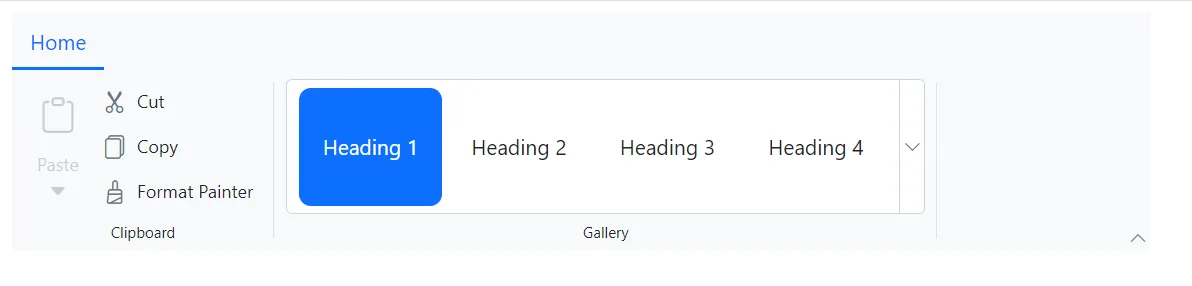
Setting item count
You can customize the number of items to be displayed in Ribbon gallery by using the ItemCount property. By default, the ItemCount is set to 3. The following example showcases the utilization of the ItemCount property, displaying a ribbon gallery with 4 items.
@using Syncfusion.Blazor.Ribbon;
@using Syncfusion.Blazor.SplitButtons;

<div style="width:60%">
    <SfRibbon>
        <RibbonTabs>
            <RibbonTab HeaderText="Home">
                <RibbonGroups>
                    <RibbonGroup HeaderText="Clipboard">
                        <RibbonCollections>
                            <RibbonCollection>
                                <RibbonItems>
                                    <RibbonItem Type=RibbonItemType.SplitButton Disabled=true>
                                        <RibbonSplitButtonSettings Content="Paste" IconCss="e-icons e-paste" Items="@formatItems"></RibbonSplitButtonSettings>
                                    </RibbonItem>
                                </RibbonItems>
                            </RibbonCollection>
                            <RibbonCollection>
                                <RibbonItems>
                                    <RibbonItem Type=RibbonItemType.Button>
                                        <RibbonButtonSettings Content="Cut" IconCss="e-icons e-cut"></RibbonButtonSettings>
                                    </RibbonItem>
                                    <RibbonItem Type=RibbonItemType.Button>
                                        <RibbonButtonSettings Content="Copy" IconCss="e-icons e-copy"></RibbonButtonSettings>
                                    </RibbonItem>
                                    <RibbonItem Type=RibbonItemType.Button>
                                        <RibbonButtonSettings Content="Format Painter" IconCss="e-icons e-format-painter"></RibbonButtonSettings>
                                    </RibbonItem>
                                </RibbonItems>
                            </RibbonCollection>
                        </RibbonCollections>
                    </RibbonGroup>
                    <RibbonGroup HeaderText="Gallery">
                        <RibbonCollections>
                            <RibbonCollection>
                                <RibbonItems>
                                    <RibbonItem Type=RibbonItemType.Gallery>
                                        <RibbonGallerySettings ItemCount="4" Groups="galleryGroups">
                                        </RibbonGallerySettings>
                                    </RibbonItem>
                                </RibbonItems>
                            </RibbonCollection>
                        </RibbonCollections>
                    </RibbonGroup>
                </RibbonGroups>
            </RibbonTab>
        </RibbonTabs>
    </SfRibbon>
</div>

@code{
    List<DropDownMenuItem> formatItems = new List<DropDownMenuItem>()
    {
        new DropDownMenuItem{ Text = "Keep Source Format" },
        new DropDownMenuItem{ Text = "Merge Format" },
        new DropDownMenuItem{ Text = "Keep Text Only" }
    };

    List<GalleryGroup> galleryGroups = new List<GalleryGroup>
    {
        new GalleryGroup
        {
            Header = "Title and Headings",
            Items = new List<GalleryItem>
            {
                new GalleryItem { Content = "Heading 1" },
                new GalleryItem { Content = "Heading 2" },
                new GalleryItem { Content = "Heading 3" },
                new GalleryItem { Content = "Heading 4" }
            }
        },
    };
}
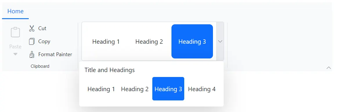
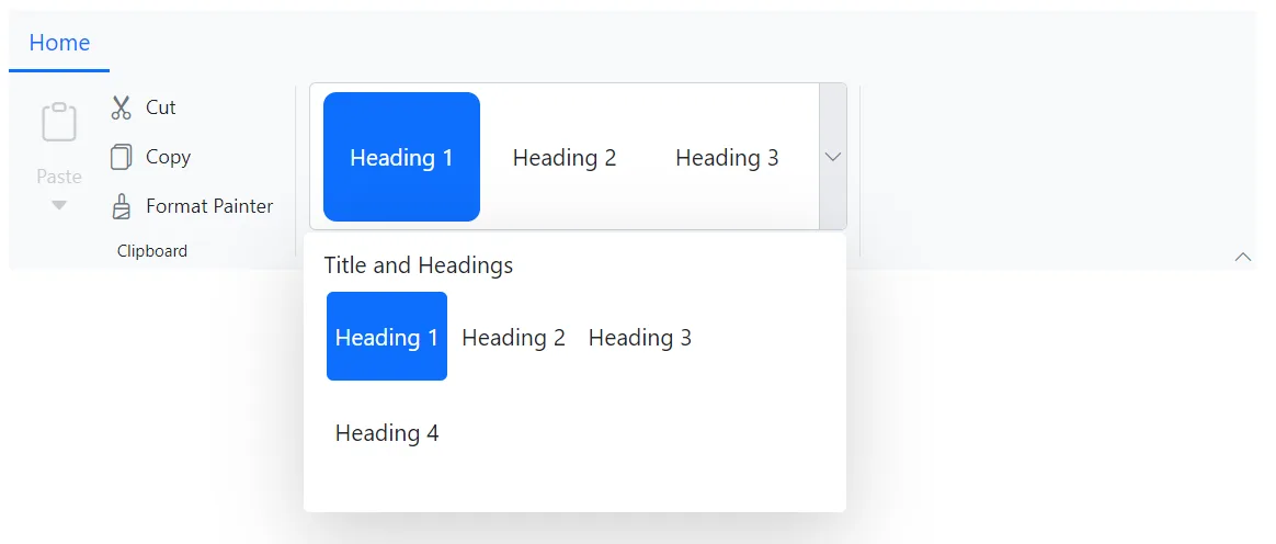
Setting selected item
You can use the SelectedItemIndex property to define the currently selected item in the Ribbon gallery items.
@using Syncfusion.Blazor.Ribbon;
@using Syncfusion.Blazor.SplitButtons;

<div style="width:60%">
    <SfRibbon>
        <RibbonTabs>
            <RibbonTab HeaderText="Home">
                <RibbonGroups>
                    <RibbonGroup HeaderText="Clipboard">
                        <RibbonCollections>
                            <RibbonCollection>
                                <RibbonItems>
                                    <RibbonItem Type=RibbonItemType.SplitButton Disabled=true>
                                        <RibbonSplitButtonSettings Content="Paste" IconCss="e-icons e-paste" Items="@formatItems"></RibbonSplitButtonSettings>
                                    </RibbonItem>
                                </RibbonItems>
                            </RibbonCollection>
                            <RibbonCollection>
                                <RibbonItems>
                                    <RibbonItem Type=RibbonItemType.Button>
                                        <RibbonButtonSettings Content="Cut" IconCss="e-icons e-cut"></RibbonButtonSettings>
                                    </RibbonItem>
                                    <RibbonItem Type=RibbonItemType.Button>
                                        <RibbonButtonSettings Content="Copy" IconCss="e-icons e-copy"></RibbonButtonSettings>
                                    </RibbonItem>
                                    <RibbonItem Type=RibbonItemType.Button>
                                        <RibbonButtonSettings Content="Format Painter" IconCss="e-icons e-format-painter"></RibbonButtonSettings>
                                    </RibbonItem>
                                </RibbonItems>
                            </RibbonCollection>
                        </RibbonCollections>
                    </RibbonGroup>
                    <RibbonGroup HeaderText="Gallery">
                        <RibbonCollections>
                            <RibbonCollection>
                                <RibbonItems>
                                    <RibbonItem Type=RibbonItemType.Gallery>
                                        <RibbonGallerySettings @bind-SelectedItemIndex=@gallerySelectedItemIndex
                                                               Groups="galleryGroups">
                                        </RibbonGallerySettings>
                                    </RibbonItem>
                                </RibbonItems>
                            </RibbonCollection>
                        </RibbonCollections>
                    </RibbonGroup>
                </RibbonGroups>
            </RibbonTab>
        </RibbonTabs>
    </SfRibbon>
</div>

@code{

    private int gallerySelectedItemIndex = 2;

    List<DropDownMenuItem> formatItems = new List<DropDownMenuItem>()
    {
        new DropDownMenuItem{ Text = "Keep Source Format" },
        new DropDownMenuItem{ Text = "Merge Format" },
        new DropDownMenuItem{ Text = "Keep Text Only" }
    };

    List<GalleryGroup> galleryGroups = new List<GalleryGroup>
    {
        new GalleryGroup
        {
            Header = "Title and Headings",
            Items = new List<GalleryItem>
            {
                new GalleryItem { Content = "Heading 1" },
                new GalleryItem { Content = "Heading 2" },
                new GalleryItem { Content = "Heading 3" },
                new GalleryItem { Content = "Heading 4" },
            }
        },
    };
}
Setting popup dimensions
You can specify the width and height of the gallery popup by using the PopupWidth and PopupHeight properties within the RibbonGallerySettings.
@using Syncfusion.Blazor.Ribbon;
@using Syncfusion.Blazor.SplitButtons;

<div style="width:60%">
    <SfRibbon>
        <RibbonTabs>
            <RibbonTab HeaderText="Home">
                <RibbonGroups>
                    <RibbonGroup HeaderText="Clipboard">
                        <RibbonCollections>
                            <RibbonCollection>
                                <RibbonItems>
                                    <RibbonItem Type=RibbonItemType.SplitButton Disabled=true>
                                        <RibbonSplitButtonSettings Content="Paste" IconCss="e-icons e-paste" Items="@formatItems"></RibbonSplitButtonSettings>
                                    </RibbonItem>
                                </RibbonItems>
                            </RibbonCollection>
                            <RibbonCollection>
                                <RibbonItems>
                                    <RibbonItem Type=RibbonItemType.Button>
                                        <RibbonButtonSettings Content="Cut" IconCss="e-icons e-cut"></RibbonButtonSettings>
                                    </RibbonItem>
                                    <RibbonItem Type=RibbonItemType.Button>
                                        <RibbonButtonSettings Content="Copy" IconCss="e-icons e-copy"></RibbonButtonSettings>
                                    </RibbonItem>
                                    <RibbonItem Type=RibbonItemType.Button>
                                        <RibbonButtonSettings Content="Format Painter" IconCss="e-icons e-format-painter"></RibbonButtonSettings>
                                    </RibbonItem>
                                </RibbonItems>
                            </RibbonCollection>
                        </RibbonCollections>
                    </RibbonGroup>
                    <RibbonGroup HeaderText="Gallery">
                        <RibbonCollections>
                            <RibbonCollection>
                                <RibbonItems>
                                    <RibbonItem Type=RibbonItemType.Gallery>
                                        <RibbonGallerySettings PopupWidth="330"
                                                               PopupHeight="170"
                                                               Groups="galleryGroups">
                                        </RibbonGallerySettings>
                                    </RibbonItem>
                                </RibbonItems>
                            </RibbonCollection>
                        </RibbonCollections>
                    </RibbonGroup>
                </RibbonGroups>
            </RibbonTab>
        </RibbonTabs>
    </SfRibbon>
</div>

@code{

    List<DropDownMenuItem> formatItems = new List<DropDownMenuItem>()
    {
        new DropDownMenuItem{ Text = "Keep Source Format" },
        new DropDownMenuItem{ Text = "Merge Format" },
        new DropDownMenuItem{ Text = "Keep Text Only" }
    };

    List<GalleryGroup> galleryGroups = new List<GalleryGroup>
    {
        new GalleryGroup
        {
            Header = "Title and Headings",
            Items = new List<GalleryItem>
            {
                new GalleryItem { Content = "Heading 1" },
                new GalleryItem { Content = "Heading 2" },
                new GalleryItem { Content = "Heading 3" },
                new GalleryItem { Content = "Heading 4" },
            }
        },
    };
}
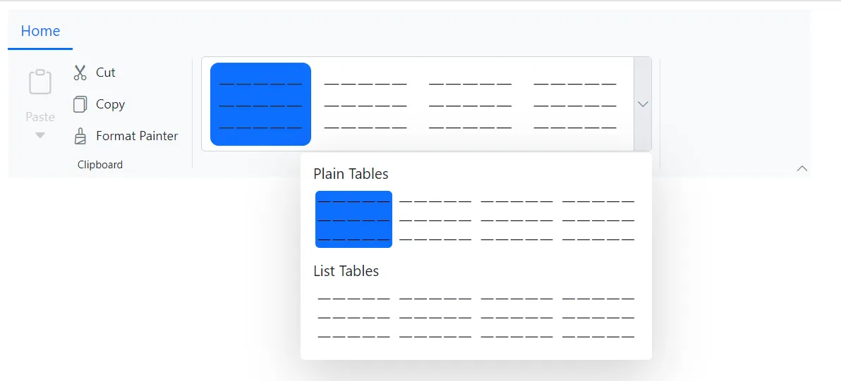
Template customization
You can customize the default appearance and content of Ribbon gallery items by using Template property. Similarly, you can also customize the appearance of Ribbon gallery popup by using the PopupTemplate property.
GalleryItemContext will be passed as context to both the templates. You can utilize it to create more customized gallery items. The below minimal example demonstrates the usages of both the Template and PopupTemplate properties:
@using Syncfusion.Blazor.Ribbon;
@using Syncfusion.Blazor.SplitButtons;

<div style="width:60%">
    <SfRibbon>
        <RibbonTabs>
            <RibbonTab HeaderText="Home">
                <RibbonGroups>
                    <RibbonGroup HeaderText="Clipboard">
                        <RibbonCollections>
                            <RibbonCollection>
                                <RibbonItems>
                                    <RibbonItem Type=RibbonItemType.SplitButton Disabled=true>
                                        <RibbonSplitButtonSettings Content="Paste" IconCss="e-icons e-paste" Items="@formatItems"></RibbonSplitButtonSettings>
                                    </RibbonItem>
                                </RibbonItems>
                            </RibbonCollection>
                            <RibbonCollection>
                                <RibbonItems>
                                    <RibbonItem Type=RibbonItemType.Button>
                                        <RibbonButtonSettings Content="Cut" IconCss="e-icons e-cut"></RibbonButtonSettings>
                                    </RibbonItem>
                                    <RibbonItem Type=RibbonItemType.Button>
                                        <RibbonButtonSettings Content="Copy" IconCss="e-icons e-copy"></RibbonButtonSettings>
                                    </RibbonItem>
                                    <RibbonItem Type=RibbonItemType.Button>
                                        <RibbonButtonSettings Content="Format Painter" IconCss="e-icons e-format-painter"></RibbonButtonSettings>
                                    </RibbonItem>
                                </RibbonItems>
                            </RibbonCollection>
                        </RibbonCollections>
                    </RibbonGroup>
                    <RibbonGroup HeaderText="Gallery">
                        <RibbonCollections>
                            <RibbonCollection>
                                <RibbonItems>
                                    <RibbonItem Type=RibbonItemType.Gallery>
                                        <Template Context="context">
                                            @RenderGalleryTemplate(context)
                                        </Template>
                                        <PopupTemplate Context="context">
                                            @RenderGalleryTemplate(context)
                                        </PopupTemplate>
                                    </RibbonItem>
                                </RibbonItems>
                            </RibbonCollection>
                        </RibbonCollections>
                    </RibbonGroup>
                </RibbonGroups>
            </RibbonTab>
        </RibbonTabs>
    </SfRibbon>
</div>

@code{

    private RenderFragment<GalleryItemContext> RenderGalleryTemplate => context => @<div class="gallery-template">
        <table class="table">
            <tbody>
                <tr class="row_one">
                    <td class="tableContent">—</td>
                    <td class="tableContent">—</td>
                    <td class="tableContent">—</td>
                    <td class="tableContent">—</td>
                    <td class="tableContent">—</td>
                </tr>
                <tr class="row_two">
                    <td class="tableContent">—</td>
                    <td class="tableContent">—</td>
                    <td class="tableContent">—</td>
                    <td class="tableContent">—</td>
                    <td class="tableContent">—</td>
                </tr>
                <tr class="row_three">
                    <td class="tableContent">—</td>
                    <td class="tableContent">—</td>
                    <td class="tableContent">—</td>
                    <td class="tableContent">—</td>
                    <td class="tableContent">—</td>
                </tr>
            </tbody>
        </table>
    </div>;

    List<DropDownMenuItem> formatItems = new List<DropDownMenuItem>()
    {
        new DropDownMenuItem{ Text = "Keep Source Format" },
        new DropDownMenuItem{ Text = "Merge Format" },
        new DropDownMenuItem{ Text = "Keep Text Only" }
    };

    List<GalleryGroup> galleryGroups = new List<GalleryGroup>
    {
        new GalleryGroup
        {
            Header = "Plain Tables",
            Items = new List<GalleryItem>
            {
                new GalleryItem {},
                new GalleryItem {},
                new GalleryItem {},
                new GalleryItem {},
            }
        },
                new GalleryGroup
        {
            Header = "List Tables",
            Items = new List<GalleryItem>
            {
                new GalleryItem {},
                new GalleryItem {},
                new GalleryItem {},
                new GalleryItem {},
            }
        },
    };
}
Events
The following events are available in the Ribbon Gallery.
| Name | Args | Description |
|---|---|---|
| PopupOpening | GalleryPopupOpenEventArgs | Triggers before the gallery popup opens |
| PopupClosing | GalleryPopupCloseEventArgs | Triggers before the gallery popup closes |
| ItemHover | GalleryItemHoverEventArgs | Triggers when hovering over a gallery item |
| ItemRendering | GalleryItemRenderEventArgs | Triggers during the rendering of a gallery item |
| Selecting | GallerySelectEventArgs | Triggers before selecting a gallery item |
| Selected | GallerySelectedEventArgs | Triggers after a gallery item has been selected |
@using Syncfusion.Blazor.Ribbon

<div style="width:25%">
    <SfRibbon>
        <RibbonTabs>
            <RibbonTab HeaderText="Home">
                <RibbonGroups>
                    <RibbonGroup HeaderText="Clipboard">
                        <RibbonCollections>
                            <RibbonCollection>
                                <RibbonItems>
                                    <RibbonItem Type=RibbonItemType.Button>
                                        <RibbonButtonSettings Content="Cut" IconCss="e-icons e-cut"></RibbonButtonSettings>
                                    </RibbonItem>
                                </RibbonItems>
                            </RibbonCollection>
                        </RibbonCollections>
                    </RibbonGroup>
                    <RibbonGroup HeaderText="Gallery">
                        <RibbonCollections>
                            <RibbonCollection>
                                <RibbonItems>
                                    <RibbonItem Type=RibbonItemType.Gallery>
                                        <RibbonGallerySettings Groups="galleryGroups"
                                                               PopupOpening="PopupOpening"
                                                               PopupClosing="PopupClosing"
                                                               ItemRendering="ItemRendering"
                                                               ItemHover="ItemHover"
                                                               Selecting="Selecting"
                                                               Selected="Selected">
                                        </RibbonGallerySettings>
                                    </RibbonItem>
                                </RibbonItems>
                            </RibbonCollection>
                        </RibbonCollections>
                    </RibbonGroup>
                </RibbonGroups>
            </RibbonTab>
        </RibbonTabs>
    </SfRibbon>
</div>

@code {

    private void PopupOpening(GalleryPopupOpenEventArgs args) { /* your actions here */ }

    private void PopupClosing(GalleryPopupCloseEventArgs args) { /* your actions here */ }

    private void ItemHover(GalleryItemHoverEventArgs args) { /* your actions here */ }

    private void ItemRendering(GalleryItemRenderEventArgs args) { /* your actions here */ }

    private void Selecting(GallerySelectEventArgs args) { /* your actions here */ }

    private void Selected(GallerySelectedEventArgs args) { /* your actions here */ }

    List<GalleryGroup> galleryGroups = new List<GalleryGroup>
    {
        new GalleryGroup
        {
            Header = "Title and Headings",
            Items = new List<GalleryItem>
            {
                new GalleryItem { Content = "Heading 1" },
                new GalleryItem { Content = "Heading 2" },
                new GalleryItem { Content = "Heading 3" },
                new GalleryItem { Content = "Heading 4" }
            }
        },
    };
}