How can I help you?
Help Pane in Blazor Ribbon component
31 Mar 20263 minutes to read
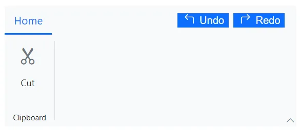
The help pane is dedicated area where the users can define help contents like controlling document permissions, sharing features, and more which appears on the right side of the Ribbon. You can use the HelpPaneTemplate tag directive within the SfRibbon to set the help pane contents.
@using Syncfusion.Blazor.Ribbon;
@using Syncfusion.Blazor.SplitButtons;

<div style="width:30%">
    <SfRibbon>
        <HelpPaneTemplate>
            <button class="action_btn"><div><span id="undo" class="e-icons e-undo"></span> Undo </div></button>
            <button class="action_btn"><div><span id="redo" class="e-icons e-redo"></span> Redo </div></button>
        </HelpPaneTemplate>
        <RibbonTabs>
            <RibbonTab HeaderText="Home">
                <RibbonGroups>
                    <RibbonGroup HeaderText="Clipboard">
                        <RibbonCollections>
                            <RibbonCollection>
                                <RibbonItems>
                                    <RibbonItem Type=RibbonItemType.Button AllowedSizes="RibbonItemSize.Large">
                                        <RibbonButtonSettings Content="Cut" IconCss="e-icons e-cut"></RibbonButtonSettings>
                                    </RibbonItem>
                                </RibbonItems>
                            </RibbonCollection>
                        </RibbonCollections>
                    </RibbonGroup>
                </RibbonGroups>
            </RibbonTab>
        </RibbonTabs>
    </SfRibbon>
</div>

<style>
    .action_btn {
        margin: 0px 3px;
        border: none;
        color: #ffffff;
        background-color: #0d6efd;
    }

    #undo, #redo {
        padding: 0px 3px;
    }
</style>