Items in Blazor Ribbon component
30 Jun 202624 minutes to read
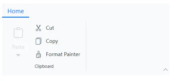
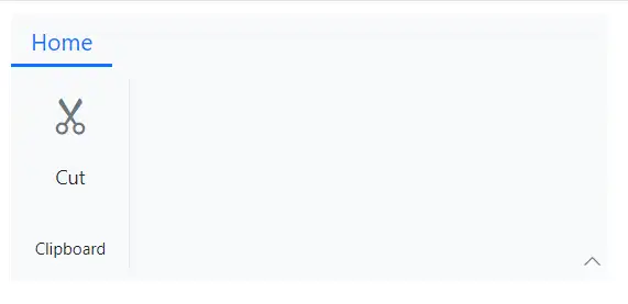
Button item
You can render the built-in Ribbon button item by setting the Type property as RibbonItemType.Button. You can customize the button item using the RibbonButtonSettings tag directive, which provides options such as IconCss, Content, IsToggle, and more.
Events
The following events are available in the Button item.
| Name | Args | Description |
|---|---|---|
| Created | EventCallback | The Created event triggers when the Ribbon button is initialized, allowing you to perform immediate actions. |
| OnClick | MouseEventArgs | The OnClick event triggers when the Ribbon button is clicked, enabling custom click actions. |
Below example demonstrates how to configure a Button item including it’s events
@using Syncfusion.Blazor.Ribbon

<div style="width:30%">
    <SfRibbon>
        <RibbonTabs>
            <RibbonTab HeaderText="Home">
                <RibbonGroups>
                    <RibbonGroup HeaderText="Clipboard">
                        <RibbonCollections>
                            <RibbonCollection>
                                <RibbonItems>
                                    <RibbonItem Type=RibbonItemType.Button>
                                        <RibbonButtonSettings Content="Cut"
                                                              IconCss="e-icons e-cut"
                                                              OnClick="ClickHandler" Created="Created">
                                        </RibbonButtonSettings>
                                    </RibbonItem>
                                </RibbonItems>
                            </RibbonCollection>
                        </RibbonCollections>
                    </RibbonGroup>
                </RibbonGroups>
            </RibbonTab>
        </RibbonTabs>
    </SfRibbon>
</div>

@code {
    private void Created() { /* your actions here */ }

    private void ClickHandler(MouseEventArgs args) { /* your actions here */ }
}
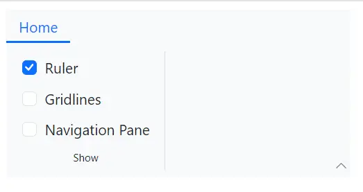
Checkbox item
You can render the built-in Ribbon checkbox item by setting the Type property as RibbonItemType.Checkbox. This item is used to toggle between selected and unselected states. You can customize the checkbox using the RibbonCheckboxSettings tag directive with options such as Label and Checked.
Events
The following events are available in the Checkbox item.
| Name | Args | Description |
|---|---|---|
| Created | EventCallback | The Created event triggers when the Ribbon checkbox is initialized, allowing you to perform immediate actions. |
| ValueChange | ChangeEventArgs | The ValueChange event triggers when the checkbox value changes, enabling actions based on the new value. |
Below example demonstrates how to configure a Checkbox item including it’s events
@using Syncfusion.Blazor.Ribbon
@using Syncfusion.Blazor.Buttons

<div style="width:30%">
    <SfRibbon>
        <RibbonTabs>
            <RibbonTab HeaderText="Home">
                <RibbonGroups>
                    <RibbonGroup HeaderText="Show">
                        <RibbonCollections>
                            <RibbonCollection>
                                <RibbonItems>
                                    <RibbonItem Type=RibbonItemType.CheckBox>
                                        <RibbonCheckBoxSettings Label="Ruler"
                                                                Checked="true"
                                                                Created="Created"
                                                                ValueChange="ValueChange">
                                        </RibbonCheckBoxSettings>
                                    </RibbonItem>
                                    <RibbonItem Type=RibbonItemType.CheckBox>
                                        <RibbonCheckBoxSettings Label="Gridlines"></RibbonCheckBoxSettings>
                                    </RibbonItem>
                                    <RibbonItem Type=RibbonItemType.CheckBox>
                                        <RibbonCheckBoxSettings Label="Navigation Pane"></RibbonCheckBoxSettings>
                                    </RibbonItem>
                                </RibbonItems>
                            </RibbonCollection>
                        </RibbonCollections>
                    </RibbonGroup>
                </RibbonGroups>
            </RibbonTab>
        </RibbonTabs>
    </SfRibbon>
</div>

@code {
    private void Created() { /* your actions here */ }

    private void ValueChange(ChangeEventArgs<bool> args) { /* your actions here */ }
}
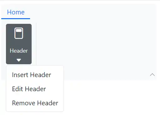
DropDownButton item
You can render the built-in Ribbon dropdown button item by setting the Type property as RibbonItemType.DropDown. This item displays a button with a dropdown menu for additional options. The RibbonDropDownSettings tag directive allows you to configure properties such as Content, Items and more.
Events
The following events are available in the DropDownButton item.
| Name | Args | Description |
|---|---|---|
| Created | EventCallback | The Created event triggers when the dropdown button is initialized, allowing you to perform immediate setup actions. |
| PopupOpening | DropDownPopupOpenEventArgs | The PopupOpening event triggers before the dropdown popup opens, enabling pre-opening configurations. |
| PopupClosing | DropDownPopupCloseEventArgs | The PopupClosing event triggers before the popup closes, allowing pre-closing actions. |
| PopupOpened | DropDownPopupOpenedEventArgs | The PopupOpened event triggers after the popup opens, enabling post-opening actions. |
| PopupClosed | DropDownPopupClosedEventArgs | The PopupClosed event triggers after the popup closes, enabling post-closing actions. |
| ItemRendering | DropDownItemRenderEventArgs | The ItemRendering event triggers during item rendering, allowing customization of dropdown items. |
| ItemSelecting | DropDownItemSelectEventArgs | The ItemSelecting event triggers before an item is selected, enabling selection conditions. |
Below example demonstrates how to configure a DropDownButton item including it’s events
@using Syncfusion.Blazor.Ribbon
@using Syncfusion.Blazor.SplitButtons

<div style="width:30%">
    <SfRibbon>
        <RibbonTabs>
            <RibbonTab HeaderText="Home">
                <RibbonGroups>
                    <RibbonGroup HeaderText="Header">
                        <RibbonCollections>
                            <RibbonCollection>
                                <RibbonItems>
                                    <RibbonItem Type=RibbonItemType.DropDown>
                                        <RibbonDropDownSettings Content="Header" IconCss="e-icons e-header" Items="@headerItems"
                                                                Created="Created"
                                                                PopupOpening="PopupOpening"
                                                                PopupClosing="PopupClosing"
                                                                PopupOpened="PopupOpened"
                                                                PopupClosed="PopupClosed"
                                                                ItemRendering="ItemRendering"
                                                                ItemSelecting="ItemSelecting">
                                        </RibbonDropDownSettings>
                                    </RibbonItem>
                                </RibbonItems>
                            </RibbonCollection>
                        </RibbonCollections>
                    </RibbonGroup>
                </RibbonGroups>
            </RibbonTab>
        </RibbonTabs>
    </SfRibbon>
</div>

@code {
    private void Created() { /* your actions here */ }

    private void PopupOpening(DropDownPopupOpenEventArgs args) { /* your actions here */ }

    private void PopupClosing(DropDownPopupCloseEventArgs args) { /* your actions here */ }

    private void PopupOpened(DropDownPopupOpenedEventArgs args) { /* your actions here */ }

    private void PopupClosed(DropDownPopupClosedEventArgs args) { /* your actions here */ }

    private void ItemRendering(DropDownItemRenderEventArgs args) { /* your actions here */ }

    private void ItemSelecting(DropDownItemSelectEventArgs args) { /* your actions here */ }

    List<DropDownMenuItem> headerItems = new List<DropDownMenuItem>()
    {
        new DropDownMenuItem{ Text = "Insert Header" },
        new DropDownMenuItem{ Text = "Edit Header" },
        new DropDownMenuItem{ Text = "Remove Header" }
    };

}
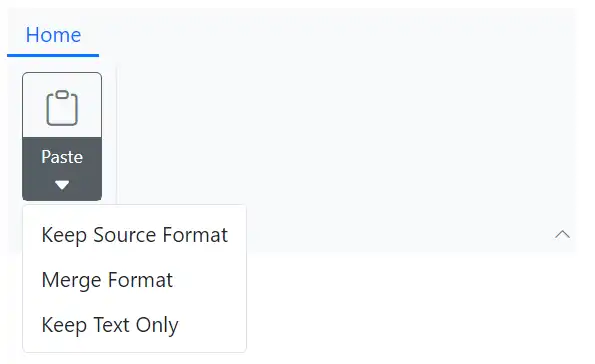
SplitButton item
You can render the built-in Ribbon split button item by setting the Type property as RibbonItemType.SplitButton. This item combines a primary button with a dropdown for secondary actions. The RibbonSplitButtonSettings tag directive lets you configure options like Content, Items and more.
Events
The following events are available in the SplitButton item.
| Name | Args | Description |
|---|---|---|
| Created | EventCallback | The Created event triggers when the split button is initialized, allowing you to perform any necessary initialization or setup. |
| Clicked | SplitButtonClickedEventArgs | The Clicked event triggers when the split button is clicked, enabling click-specific actions. |
| PopupOpening | SplitButtonPopupOpenEventArgs | The PopupOpening event triggers before the split button popup opens, setting conditions for the popup. |
| PopupClosing | SplitButtonPopupCloseEventArgs | The PopupClosing event triggers before the popup closes, allowing pre-closure actions. |
| PopupOpened | SplitButtonPopupOpenedEventArgs | The PopupOpened event triggers after the popup opens, facilitating post-opening actions. |
| PopupClosed | SplitButtonPopupClosedEventArgs | The PopupClosed event triggers after the popup closes, enabling post-closure actions. |
| ItemRendering | SplitButtonItemRenderEventArgs | The ItemRendering event triggers during item rendering, facilitating item customization. |
| ItemSelected | SplitButtonItemSelectedEventArgs | The ItemSelected event triggers when an item is selected, allowing selection-specific actions. |
Below example demonstrates how to configure a SplitButton item including it’s events
@using Syncfusion.Blazor.Ribbon
@using Syncfusion.Blazor.SplitButtons

<div style="width:30%">
    <SfRibbon>
        <RibbonTabs>
            <RibbonTab HeaderText="Home">
                <RibbonGroups>
                    <RibbonGroup HeaderText="Header">
                        <RibbonCollections>
                            <RibbonCollection>
                                <RibbonItems>
                                    <RibbonItem Type=RibbonItemType.SplitButton>
                                        <RibbonSplitButtonSettings Content="Paste" IconCss="e-icons e-paste" Items="@formatItems"
                                                                    Created="Created"
                                                                    Clicked="Clicked"
                                                                    PopupOpening="PopupOpening"
                                                                    PopupClosing="PopupClosing"
                                                                    PopupOpened="PopupOpened"
                                                                    PopupClosed="PopupClosed"
                                                                    ItemRendering="ItemRendering"
                                                                    ItemSelecting="ItemSelecting">
                                        </RibbonSplitButtonSettings>
                                    </RibbonItem>
                                </RibbonItems>
                            </RibbonCollection>
                        </RibbonCollections>
                    </RibbonGroup>
                </RibbonGroups>
            </RibbonTab>
        </RibbonTabs>
    </SfRibbon>
</div>

@code {
    private void Created() { /* your actions here */ }

    private void Clicked(SplitButtonClickedEventArgs args) { /* your actions here */ }

    private void PopupOpening(SplitButtonPopupOpenEventArgs args) { /* your actions here */ }

    private void PopupClosing(SplitButtonPopupCloseEventArgs args) { /* your actions here */ }

    private void PopupOpened(SplitButtonPopupOpenedEventArgs args) { /* your actions here */ }

    private void PopupClosed(SplitButtonPopupClosedEventArgs args) { /* your actions here */ }

    private void ItemRendering(SplitButtonItemRenderEventArgs args) { /* your actions here */ }

    private void ItemSelecting(SplitButtonItemSelectedEventArgs args) { /* your actions here */ }

    List<DropDownMenuItem> formatItems = new List<DropDownMenuItem>()
    {
        new DropDownMenuItem{ Text = "Keep Source Format" },
        new DropDownMenuItem{ Text = "Merge Format" },
        new DropDownMenuItem{ Text = "Keep Text Only" }
    };

}
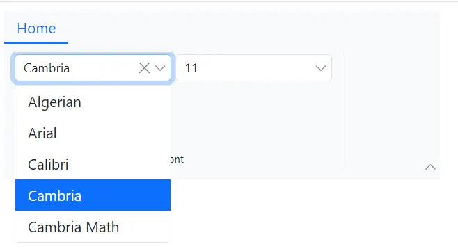
Combobox item
You can render the built-in Ribbon combobox item by setting the Type property as RibbonItemType.Combobox. This item provides a dropdown with optional search and filtering capabilities. The RibbonComboboxSettings tag directive allows you to configure properties like DataSource, AllowFiltering, Index, Placeholder and lot more.
Events
The following events are available in the Combobox item.
| Name | Args | Description |
|---|---|---|
| PopupOpening | ComboBoxPopupOpenEventArgs | The PopupOpening event triggers before the combobox popup opens, allowing setup actions. |
| PopupClosing | ComboBoxPopupCloseEventArgs | The PopupClosing event triggers before the popup closes, allowing cleanup actions. |
| PopupOpened | ComboBoxPopupOpenedEventArgs | The PopupOpened event triggers after the popup opens, enabling post-open actions. |
| PopupClosed | ComboBoxPopupClosedEventArgs | The PopupClosed event triggers after the popup closes, enabling post-close actions. |
| Filtering | ComboBoxFilterEventArgs | The Filtering event triggers during item filtering, allowing custom filter logic. |
| Selecting | ComboBoxSelectEventArgs | The Selecting event triggers before an item is selected, enabling selection validation. |
| ValueChange | ComboBoxChangeEventArgs | The ValueChange event triggers when the combobox value changes, enabling actions based on the new value. |
Below example demonstrates how to configure a Combobox item including it’s events
@using Syncfusion.Blazor.Ribbon
@using Syncfusion.Blazor.SplitButtons
@using Syncfusion.Blazor.DropDowns

<div style="width:50%">
    <SfRibbon>
        <RibbonTabs>
            <RibbonTab HeaderText="Home">
                <RibbonGroups>
                    <RibbonGroup Orientation=Orientation.Row HeaderText="Font">
                        <RibbonCollections>
                            <RibbonCollection>
                                <RibbonItems>
                                    <RibbonItem Type=RibbonItemType.ComboBox>
                                        <RibbonComboBoxSettings @bind-Value="@fontFamValue" ShowClearButton="true" AllowFiltering=true DataSource="@fontFamilyItems" FieldSettings="@fieldSetings"
                                        PopupOpening="PopupOpening"
                                        PopupClosing="PopupClosing"
                                        PopupOpened="PopupOpened"
                                        PopupClosed="PopupClosed"
                                        Filtering="Filtering"
                                        Selecting="Selecting"
                                        ValueChange="ValueChange">
                                        </RibbonComboBoxSettings>
                                    </RibbonItem>
                                    <RibbonItem Type=RibbonItemType.ComboBox>
                                        <RibbonComboBoxSettings Index="3" AllowFiltering=true DataSource="@fontSizeItems" FieldSettings="@fieldSetings"></RibbonComboBoxSettings>
                                    </RibbonItem>
                                </RibbonItems>
                            </RibbonCollection>
                        </RibbonCollections>
                    </RibbonGroup>
                </RibbonGroups>
            </RibbonTab>
        </RibbonTabs>
    </SfRibbon>
</div>

@code {

    public string fontFamValue { get; set; } = "Cambria";

    private class ComboBoxItem
    {
        public string Text { get; set; }
        public string Value { get; set; }
    }

    FieldSettingsModel fieldSetings = new FieldSettingsModel
    {
        Text = "Text",
        Value = "Value"
    };

    List<ComboBoxItem> fontFamilyItems = new List<ComboBoxItem>
    {
        new ComboBoxItem { Text = "Algerian", Value = "Algerian" },
        new ComboBoxItem { Text = "Arial", Value = "Arial" },
        new ComboBoxItem { Text = "Calibri", Value = "Calibri" },
        new ComboBoxItem { Text = "Cambria", Value = "Cambria" },
        new ComboBoxItem { Text = "Cambria Math", Value = "Cambria Math" },
    };

    List<ComboBoxItem> fontSizeItems = new List<ComboBoxItem>
    {
        new ComboBoxItem { Text = "8", Value = "8" },
        new ComboBoxItem { Text = "9", Value = "9" },
        new ComboBoxItem { Text = "10", Value = "10" },
        new ComboBoxItem { Text = "11", Value = "11" },
        new ComboBoxItem { Text = "12", Value = "12" },
    };

    private void PopupOpening(ComboBoxPopupOpenEventArgs args) { /* your actions here */ }

    private void PopupClosing(ComboBoxPopupCloseEventArgs args) { /* your actions here */ }

    private void PopupOpened(ComboBoxPopupOpenedEventArgs args) { /* your actions here */ }

    private void PopupClosed(ComboBoxPopupClosedEventArgs args) { /* your actions here */ }

    private void Filtering(ComboBoxFilterEventArgs args) { /* your actions here */ }

    private void Selecting(ComboBoxSelectEventArgs args) { /* your actions here */ }

    private void ValueChange(ComboBoxChangeEventArgs args) { /* your actions here */ }

}
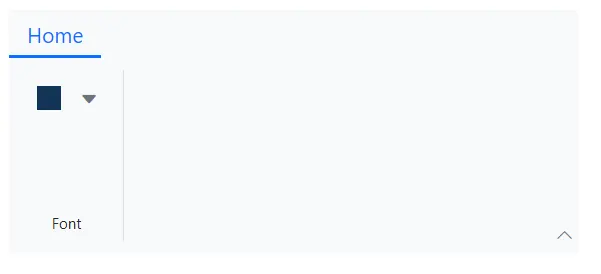
Colorpicker item
You can render the built-in Ribbon color picker item by setting the Type property as RibbonItemType.ColorPicker. This item provides a color selection interface, which can be customized using the RibbonColorPickerSettings tag directive with properties like Value, Mode and more.
Events
The following events are available in the Colorpicker item.
| Name | Args | Description |
|---|---|---|
| Created | EventCallback | The Created event triggers when the color picker is initialized, enabling setup actions. |
| Opening | ColorPickerOpenEventArgs | The Opening event triggers before the color picker opens, allowing initial configurations. |
| Closing | ColorPickerCloseEventArgs | The Closing event triggers before the color picker closes, facilitating pre-closure tasks. |
| Opened | ColorPickerOpenedEventArgs | The Opened event triggers after the color picker opens, enabling post-opening actions. |
| TileRendering | TileRenderEventArgs | The TileRendering event triggers during the rendering of each palette tile, supporting tile customization. |
| ValueChange | ColorPickerEventArgs | The ValueChange event triggers when the color value changes, facilitating color updates. |
| Selected | ColorPickerSelectedEventArgs | The Selected event triggers when a color is selected, allowing selected color handling. |
Below example demonstrates how to configure a Colorpicker item including it’s events
@using Syncfusion.Blazor.Ribbon
@using Syncfusion.Blazor.SplitButtons
@using Syncfusion.Blazor.Inputs

<div style="width:30%">
    <SfRibbon>
        <RibbonTabs>
            <RibbonTab HeaderText="Home">
                <RibbonGroups>
                    <RibbonGroup HeaderText="Font">
                        <RibbonCollections>
                            <RibbonCollection>
                                <RibbonItems>
                                    <RibbonItem Type=RibbonItemType.ColorPicker AllowedSizes="RibbonItemSize.Small">
                                        <RibbonColorPickerSettings Value="#123456"
                                                                   Created="Created"
                                                                   Opening="Opening"
                                                                   Closing="Closing"
                                                                   Opened="Opened"
                                                                   TileRendering="TileRendering"
                                                                   Selected="Selected"
                                                                   ValueChange="ValueChange">
                                        </RibbonColorPickerSettings>
                                    </RibbonItem>
                                </RibbonItems>
                            </RibbonCollection>
                        </RibbonCollections>
                    </RibbonGroup>
                </RibbonGroups>
            </RibbonTab>
        </RibbonTabs>
    </SfRibbon>
</div>

@code {
    private void Created() { /* your actions here */ }

    private void Opening(ColorPickerOpenEventArgs args) { /* your actions here */ }

    private void Closing(ColorPickerCloseEventArgs args) { /* your actions here */ }

    private void Opened(ColorPickerOpenedEventArgs args) { /* your actions here */ }

    private void ValueChange(ColorPickerEventArgs args) { /* your actions here */ }

    private void TileRendering(TileRenderEventArgs args) { /* your actions here */ }

    private void Selected(ColorPickerSelectedEventArgs args) { /* your actions here */ }

}
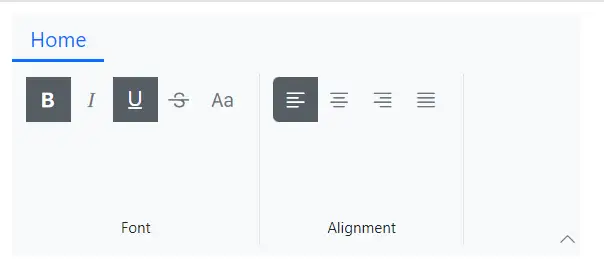
GroupButton item
You can render the built-in Ribbon group button item by setting the Type property as RibbonItemType.GroupButton. This item groups multiple buttons for single or multiple selection. Use the RibbonGroupButtonSettings tag directive to configure options like Items, Selection, and more. Items property accepts a collection of GroupButtonItem through which you can customize each group button item with options such as Content, IconCss, Selected and more.
Events
The following event is available in the GroupButton item.
| Name | Args | Description |
|---|---|---|
| ItemClick | GroupButtonClickEventArgs | The ItemClick event is triggered when an item in the Ribbon group button is clicked, enabling click-specific actions. |
Below example demonstrates how to configure a GroupButton item with both selection types including it’s event.
@using Syncfusion.Blazor.Ribbon
@using Syncfusion.Blazor.SplitButtons

<div style="width:30%">
    <SfRibbon>
        <RibbonTabs>
            <RibbonTab HeaderText="Home">
                <RibbonGroups>
                    <RibbonGroup HeaderText="Font">
                        <RibbonCollections>
                            <RibbonCollection>
                                <RibbonItems>
                                    <RibbonItem Type=RibbonItemType.GroupButton ID="formatGroupBtn">
                                        <RibbonGroupButtonSettings HeaderText="Format Styles"
                                                                   Selection=GroupButtonSelection.Multiple
                                                                   Items="@formatGroupItems" ItemClick="HandleSelection">
                                        </RibbonGroupButtonSettings>
                                    </RibbonItem>
                                </RibbonItems>
                            </RibbonCollection>
                        </RibbonCollections>
                    </RibbonGroup>
                    <RibbonGroup HeaderText="Alignment">
                        <RibbonCollections>
                            <RibbonCollection>
                                <RibbonItems>
                                    <RibbonItem Type=RibbonItemType.GroupButton ID="alignmentGroup">
                                        <RibbonGroupButtonSettings Selection=GroupButtonSelection.Single
                                                                   Items="@alignGroupItems" ItemClick="HandleSelection">
                                        </RibbonGroupButtonSettings>
                                    </RibbonItem>
                                </RibbonItems>
                            </RibbonCollection>
                        </RibbonCollections>
                    </RibbonGroup>
                </RibbonGroups>
            </RibbonTab>
        </RibbonTabs>
    </SfRibbon>
</div>

@code {

    List<GroupButtonItem> formatGroupItems = new List<GroupButtonItem>
    {
        new GroupButtonItem
        {
            IconCss = "e-icons e-bold",
            Selected = true,
            Content = "Bold"
        },
        new GroupButtonItem
        {
            IconCss = "e-icons e-italic",
            Content = "Italic",
        },
        new GroupButtonItem
        {
            IconCss = "e-icons e-underline",
            Content = "Underline"
        },
        new GroupButtonItem
        {
            IconCss = "e-icons e-strikethrough",
            Content = "Strikethrough"
        },
        new GroupButtonItem
        {
            IconCss = "e-icons e-change-case",
            Content = "Change Case"
        },
    };

    List<GroupButtonItem> alignGroupItems = new List<GroupButtonItem>
    {
        new GroupButtonItem
        {
            IconCss = "e-icons e-align-left",
            Selected = true,
            Content = "Align Left"
        },
        new GroupButtonItem
        {
            IconCss = "e-icons e-align-center",
            Content = "Align Center"
        },
        new GroupButtonItem
        {
            IconCss = "e-icons e-align-right",
            Content = "Align Right"
        },
                new GroupButtonItem
        {
            IconCss = "e-icons e-justify",
            Content = "Justify"
        }
    };

    private void HandleSelection(GroupButtonClickEventArgs args) { /* your actions here */ }

}
Custom item
The Ribbon supports rendering non-built-in items or your own HTML content by setting the Type property as RibbonItemType.Template. And then, you can use the ItemTemplate tag directive to define a custom RenderFragment for fully customizable content. RibbonItemContext is being passed as context to the template through which you can customize further based on the current state of the Ribbon item.
@using Syncfusion.Blazor.Ribbon

<div style="width:50%">
    <SfRibbon>
        <RibbonTabs>
            <RibbonTab HeaderText="Home">
                <RibbonGroups>
                    <RibbonGroup Orientation=Orientation.Row HeaderText="Inputs">
                        <RibbonCollections>
                            <RibbonCollection>
                                <RibbonItems>
                                    <RibbonItem Type="RibbonItemType.Template">
                                        <ItemTemplate>
                                            <input type="text" placeholder="Search..." style="width: 150px; padding: 8px; border: 1px solid #ccc; border-radius: 4px;">
                                        </ItemTemplate>
                                    </RibbonItem>
                                </RibbonItems>
                            </RibbonCollection>
                            <RibbonCollection>
                                <RibbonItems>
                                    <RibbonItem Type="RibbonItemType.Template">
                                        <ItemTemplate>
                                            <input type="date" style="padding: 8px; border: 1px solid #ccc; border-radius: 4px;">
                                        </ItemTemplate>
                                    </RibbonItem>
                                </RibbonItems>
                            </RibbonCollection>
                        </RibbonCollections>
                    </RibbonGroup>
                    <RibbonGroup Orientation=Orientation.Row HeaderText="Feedbacks">
                        <RibbonCollections>
                            <RibbonCollection>
                                <RibbonItems>
                                    <RibbonItem Type="RibbonItemType.Template">
                                        <ItemTemplate>
                                            <div style="display: flex; gap: 5px;">
                                                <span style="color: gold; font-size: 20px;">★</span>
                                                <span style="color: gold; font-size: 20px;">★</span>
                                                <span style="color: gold; font-size: 20px;">★</span>
                                                <span style="color: #ccc; font-size: 20px;">★</span>
                                                <span style="color: #ccc; font-size: 20px;">★</span>
                                            </div>
                                        </ItemTemplate>
                                    </RibbonItem>
                                    <RibbonItem Type="RibbonItemType.Template">
                                        <ItemTemplate>
                                            <div style="position: relative; display: inline-block;">
                                                <button style="padding: 10px; border: none; background: #007bff; color: white; border-radius: 4px;">Inbox</button>
                                                <span style="position: absolute; top: -2px; right: -7px;
                                                            background: red; color: white; font-size: 11px; padding: 0 5px; border-radius: 50%;">5
                                                </span>
                                            </div>
                                        </ItemTemplate>
                                    </RibbonItem>
                                </RibbonItems>
                            </RibbonCollection>
                        </RibbonCollections>
                    </RibbonGroup>
                </RibbonGroups>
            </RibbonTab>
        </RibbonTabs>
    </SfRibbon>
</div>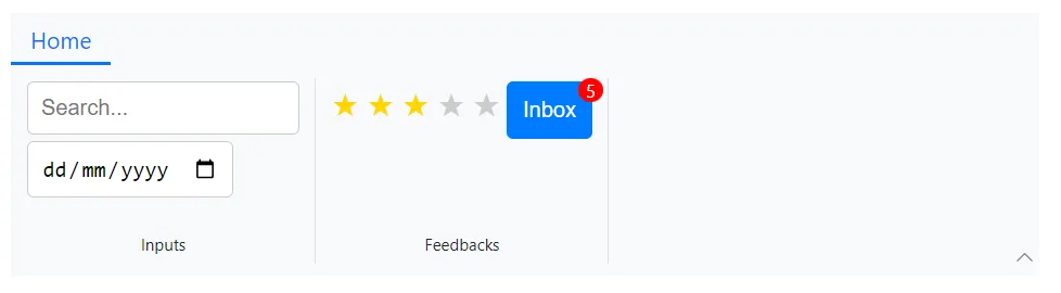
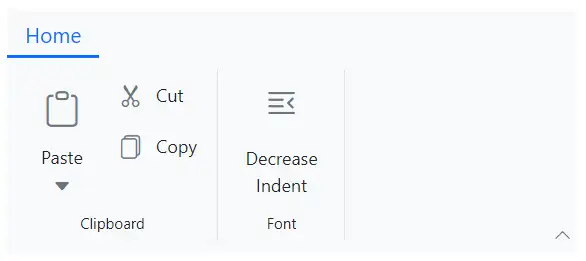
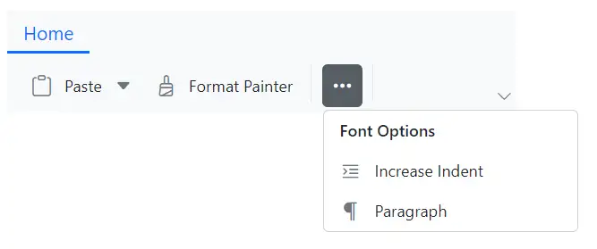
Items display mode
The DisplayOptions property determines how Ribbon items are displayed based on the Ribbon’s layout and overflow state. Available options include:
| Value | Description |
|---|---|
Auto |
The items are displayed in all layouts based on the ribbon’s overflow state(Default) |
Classic |
The items are displayed only in the classic layout group. |
Simplified |
The items are displayed only in the simplified layout group. |
Overflow |
The items are displayed only in the overflow popup. |
Below example demonstrates the usages of DisplayOptions property to control the visibility of Ribbon items based on the layout and overflow state.
@using Syncfusion.Blazor.Ribbon;
@using Syncfusion.Blazor.SplitButtons;

<div style="width:30%">
    <SfRibbon>
        <RibbonTabs>
            <RibbonTab HeaderText="Home">
                <RibbonGroups>
                    <RibbonGroup HeaderText="Clipboard">
                        <RibbonCollections>
                            <RibbonCollection>
                                <RibbonItems>
                                    <RibbonItem Type=RibbonItemType.SplitButton DisplayOptions="@((DisplayMode)DisplayMode.Classic | DisplayMode.Simplified)">
                                        <RibbonSplitButtonSettings Content="Paste" IconCss="e-icons e-paste" Items="@formatItems"></RibbonSplitButtonSettings>
                                    </RibbonItem>
                                </RibbonItems>
                            </RibbonCollection>
                            <RibbonCollection>
                                <RibbonItems>
                                    <RibbonItem Type=RibbonItemType.Button DisplayOptions="DisplayMode.Classic">
                                        <RibbonButtonSettings Content="Cut" IconCss="e-icons e-cut"></RibbonButtonSettings>
                                    </RibbonItem>
                                    <RibbonItem Type=RibbonItemType.Button DisplayOptions="DisplayMode.Classic">
                                        <RibbonButtonSettings Content="Copy" IconCss="e-icons e-copy"></RibbonButtonSettings>
                                    </RibbonItem>
                                    <RibbonItem Type=RibbonItemType.Button DisplayOptions="DisplayMode.Simplified">
                                        <RibbonButtonSettings Content="Format Painter" IconCss="e-icons e-format-painter"></RibbonButtonSettings>
                                    </RibbonItem>
                                </RibbonItems>
                            </RibbonCollection>
                        </RibbonCollections>
                    </RibbonGroup>
                    <RibbonGroup Orientation=Orientation.Row HeaderText="Font" PopupHeaderText="Font Options" EnableGroupOverflow="true">
                        <RibbonCollections>
                            <RibbonCollection>
                                <RibbonItems>
                                    <RibbonItem Type=RibbonItemType.Button DisplayOptions="DisplayMode.Classic">
                                        <RibbonButtonSettings Content="Decrease Indent" IconCss="e-icons e-decrease-indent"></RibbonButtonSettings>
                                    </RibbonItem>
                                    <RibbonItem Type=RibbonItemType.Button DisplayOptions="DisplayMode.Overflow">
                                        <RibbonButtonSettings Content="Increase Indent" IconCss="e-icons e-increase-indent"></RibbonButtonSettings>
                                    </RibbonItem>
                                    <RibbonItem Type=RibbonItemType.Button DisplayOptions="DisplayMode.Overflow">
                                        <RibbonButtonSettings Content="Paragraph" IconCss="e-icons e-paragraph"></RibbonButtonSettings>
                                    </RibbonItem>
                                </RibbonItems>
                            </RibbonCollection>
                        </RibbonCollections>
                    </RibbonGroup>
                </RibbonGroups>
            </RibbonTab>
        </RibbonTabs>
    </SfRibbon>
</div>

@code {

    List<DropDownMenuItem> formatItems = new List<DropDownMenuItem>()
        {
        new DropDownMenuItem{ Text = "Keep Source Format" },
        new DropDownMenuItem{ Text = "Merge Format" },
        new DropDownMenuItem{ Text = "Keep Text Only" }
        };
}
Enable/Disable items
You can use the Disabled property to disable particular Ribbon item. It prevents the user interaction when set to true. By default, the value is false.
@using Syncfusion.Blazor.Ribbon;
@using Syncfusion.Blazor.SplitButtons;

<div style="width: 30%">
    <SfRibbon>
        <RibbonTabs>
            <RibbonTab HeaderText="Home">
                <RibbonGroups>
                    <RibbonGroup HeaderText="Clipboard">
                        <RibbonCollections>
                            <RibbonCollection>
                                <RibbonItems>
                                    <RibbonItem Type=RibbonItemType.SplitButton Disabled=true>
                                        <RibbonSplitButtonSettings Content="Paste" IconCss="e-icons e-paste" Items="@formatItems"></RibbonSplitButtonSettings>
                                    </RibbonItem>
                                </RibbonItems>
                            </RibbonCollection>
                            <RibbonCollection>
                                <RibbonItems>
                                    <RibbonItem Type=RibbonItemType.Button>
                                        <RibbonButtonSettings Content="Cut" IconCss="e-icons e-cut"></RibbonButtonSettings>
                                    </RibbonItem>
                                    <RibbonItem Type=RibbonItemType.Button>
                                        <RibbonButtonSettings Content="Copy" IconCss="e-icons e-copy"></RibbonButtonSettings>
                                    </RibbonItem>
                                    <RibbonItem Type=RibbonItemType.Button>
                                        <RibbonButtonSettings Content="Format Painter" IconCss="e-icons e-format-painter"></RibbonButtonSettings>
                                    </RibbonItem>
                                </RibbonItems>
                            </RibbonCollection>
                        </RibbonCollections>
                    </RibbonGroup>
                </RibbonGroups>
            </RibbonTab>
        </RibbonTabs>
    </SfRibbon>
</div>

@code{
    List<DropDownMenuItem> formatItems = new List<DropDownMenuItem>()
    {
        new DropDownMenuItem{ Text = "Keep Source Format" },
        new DropDownMenuItem{ Text = "Merge Format" },
        new DropDownMenuItem{ Text = "Keep Text Only" }
    };
}